13 designers on how they found their perfect font
-
 The MOO Team
Share the post
Got a taste for type? Join the club. Finding the perfect font for your brand is tough – especially with so many swoon-worthy serifs to choose from. Check out our roundup of the typefaces our creative community are loving.
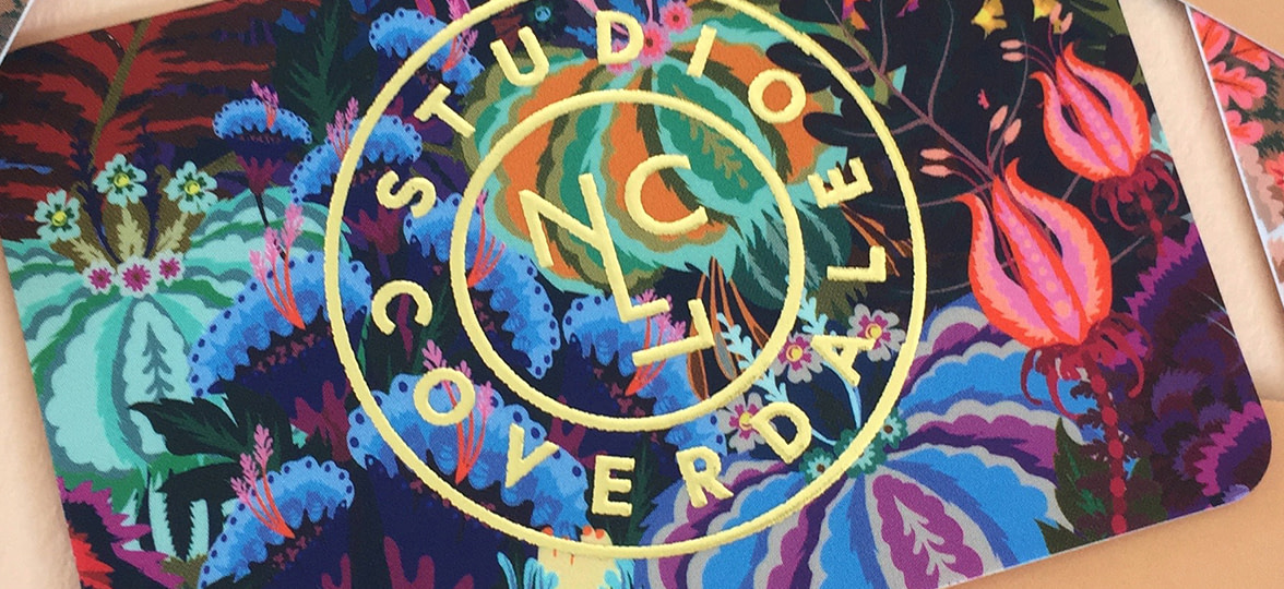
Studio Coverdale
Graphic designer Natasha Coverdale founded Studio Coverdale in May 2018, creating fantastical, floral, giclée art prints, posters and accessories that blend luxury with a pinch of playfulness. Her vibrant style is influenced by her time living in Hong Kong, Texas and Bangkok.
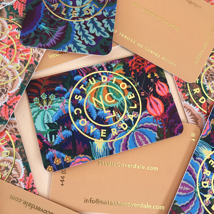
“For my business cards, I chose the Super Soft Touch paper with Gold Foil finish and Rounded Corners for a super opulent, luxurious feel. I wanted them to be desirable to represent my products, and be something people want to keep. I used a very simple sans serif typeface – Europa-Bold – it’s clean and timeless. The letter spacing and type design is simple enough to work well with my often maximalist designs, while being weighty enough to be stamped or foiled and still easy to read at a small scale.”
Studio Gika
After over a decade working as a graphic designer and illustrator, Aspa decided to shift her focus to visual art and painting. She now runs Studio Gika, where she showcases her nature-inspired art, and offers boutique design services.
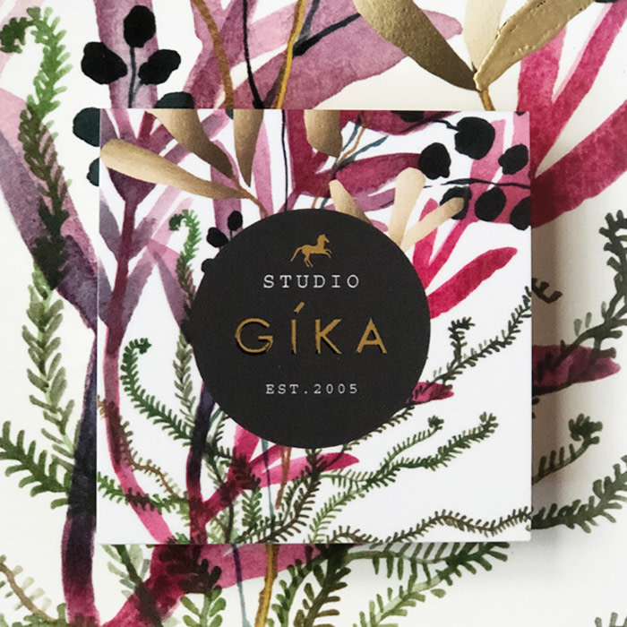
“Since my paintings are mainly botanicals, I wanted to use a modern sans serif font with simplicity, so Acumin Pro wide was perfect for my branding—plus it looks great with the Courier Std font. With Printfinity, I can showcase multiple paintings, and because I use copper and gold accents in my work, the Gold Foil option was a great way to connect my cards to my branding. The overall effect is modern, yet elegant and luxurious.
Johanna Kanzler
After steadily building up her freelance projects, Germany-based graphic designer Joanna decided to spend time developing her own brand aesthetic. For her business cards, Joanna visualized the idea of functionality in graphic design, reducing the card’s content to minimalist typography, lines and tactile elements, but without a stiff and serious feeling.
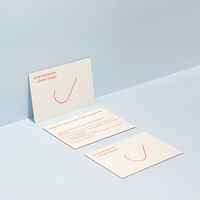
“For my font, I chose Adrian Talbot’s Kamerik 205. I love the sense of structure it creates on the J and K of my initials. It has the perfect line weight to stand on Luxe uncoated paper, and still appears subtle, which I think suits my personality. To keep the design light and human, I introduced a bold red. As lines play a big role in my design elements, I matched this to the coloured seam that runs through the paper. This extra detail emphasizes the printed lines, and makes the card feel more like an object as opposed to just a card.”
Next Creative Co.
With a passion for all things branding, Next Creative Co. help businesses communicate their authentic identity through branding, content, production and web development services. They’re inspired by the bold envelope-pushers who always look for the ‘what’s next?’ in the creative industry.
“We like to keep our brand bold and clean. So our cards only carry necessary information,” Digital Director, Rich Evenhouse, tells us. “We felt that anything more would just be clutter. We don’t like clutter. To create that ‘thud factor’, we chose Luxe paper. We wanted something that makes a statement, and between the weight of the card and the pop of color in the middle, it does that for us. The font is modern and versatile, and we like to think we’re the same way. Like Montserrat, we can be bold and loud when we need to be, or subtle and refined when we don’t. Almost every time we hand our cards out, it stops people and often initiates conversation about our brand.”
Jae Dollason
Jae is an art director and graphic designer with a passion for design strategy. Her recent reinvention of her own personal brand was launched with the aim of showcasing her authentic creative identity to potential clients.
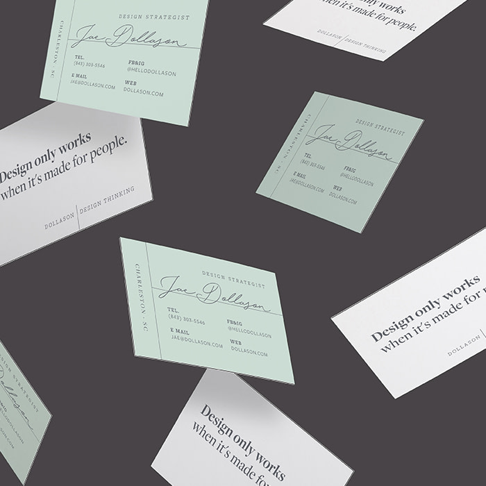
“I’ve always been aware that I’m obsessively more organized than the average creative. So, when it came to selecting typefaces, I wanted something that reflected my own personality. The Freight suite had everything I was looking for: versatility, professionalism, clarity, and balance. I chose to print on Luxe paper because of its tactility when you hold it – I want recipients to link that sense of wonder and depth to my own brand identity. The reaction has been great! Lots of ‘oohs’ and ‘aahs’, which is amazing. We’re most critical of ourselves, so when you’ve worked really hard to design something you absolutely love, you know you’ve done a good job.”
Jhonny T
Jhonny T is an independent creative, working towards his dream of becoming a clothing designer. With the ethos of less corporate more independent, Jhonny wants his label to blend “sporty chic” with timeless design to create ready to wear garments for men and women.
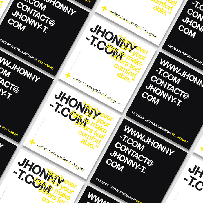
“I needed my cards to be a direct representation of me as a designer – I’m simple yet bold, and I tell stories. When it comes to typefaces, I always work to find the perfect marriage between contracting weights and cases of fonts. My style is versatile, and the consideration of the type on my design really gets that across. Sustainability is really important to me, so when I saw the eco-conscious choice of using Cotton stock, there was no question I’d go for it.”
Monique Renée
When she’s not developing graphic design courses for college students, Monique is running her own graphic design studio, specializing in editorial design and typesetting for everything from print through to digital media. Her passion for lifestyle and fashion and the 2019 Pantone Color of the year inspired the design for her bold thank you cards.
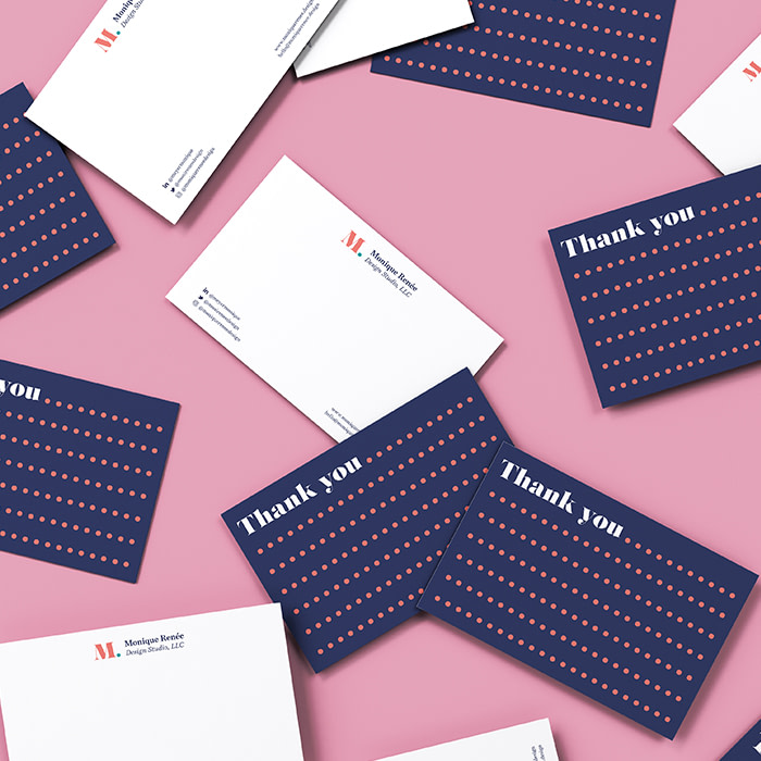
“I love luxury fashion magazines and display fonts, so didones have always drawn me to their beauty. Salome (atipo foundry) is a fat didone, and lets me communicate that my brand is sophisticated and professional, without coming across as too lavish. I incorporated ellipsis marks in the Postcard design, because I always have so much more I want to say. I’m ‘old school’ when it comes to sending handwritten, heartfelt messages – it can change a person’s day when they open the mailbox. I want to show that I put care into every detail, and take time to ensure what I do makes someone feel good. By having strong, beautiful, feel-good cards, I accomplish this with every note.”
Little Life Studio
With a background in photography and media production, graphic design student Beth Nash has launched her own freelance career, producing alternative movie posters, illustrations and designs.
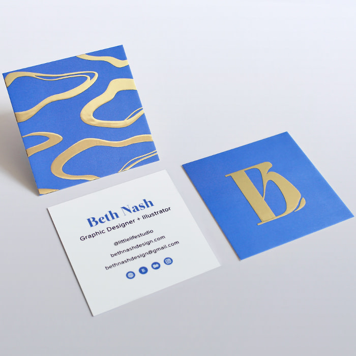
“I wanted to keep it simple and let my branding speak for itself. I went for Square Business Cards with a touch of Gold Foil to showcase my strong style and help me stand out to potential clients and agencies, plus I thought it would work well with my color palette. I’m glad I treated myself to foil – I love the cards and they’ve gone down a treat! I’ve recently had some industry interviews and they’ve been a great talking point. Everyone’s wanted to keep one (or two).”
Joyous Creative
Creative duo Jess Hain and Christina Newman founded their multidisciplinary design business in 2018 after deciding to join their creative skills and graphic design experience. Their Joyous Creative brand is all about playfulness and freedom to create. So when it came to creating a visual identity, they went for a fresh and bright look to communicate their ethos of originality and fun.
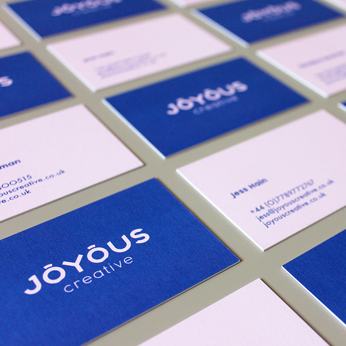
“Have you ever seen a logo with eyebrows? Now you have! We created a custom font design for our logo, featuring cutouts at the base of the ‘O’s to create ‘eyebrows’ that sit above the text. The fun and curiosity of the font coupled with a simple, Grotesk typeface below really captures our studio vibe. As a design agency, it’s important our business cards reflected the quality of work we produce, and these feel really special and solid. It’s quite hard to stand out in a sea of cards, but the Luxe finish definitely catches your eye.”
Thick and Thin Films
Wedding videography company, Thick and Thin Films add a personal touch for their clients by sending a small thank-you gift with every booking. “Nothing beats a handwritten card,” says co-owner Mary Betsy. “We mail another one when we deliver a couple’s video along with a small business card, printed with a request to leave a review.”
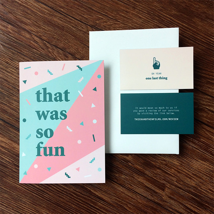
“For our Business Cards and Postcards, we used Minion Standard Black because we wanted a serif font to honor the tradition and elegance of weddings, then paired that with a lightweight monospace sans serif font – Letter Gothic Standard – to add a modern touch. We love how our cards make clients feel about our brand: consistent, thoughtful, and a little funky.”
Ben Kinde
Working as a graphic and web designer in Portland, Oregon, Ben Kinde works with an architectural aesthetic across elements of typography, color and space. His business cards were created to communicate authenticity and simplicity.
“For my typeface, I used Messina Serif in regular and italic. I love serif fonts for their human characteristics – their flare and imperfection. This felt like the right choice because it creates structural, geometric stability, while retaining its humanity. I went for the Cotton paper stock because it’s recycled, it’s soft and it ages beautifully. Over time, the identity of the product transforms for the user, and I think that’s pretty truthful of human experience.”
Megan Posas
Megan is a contemporary visual and performing artist, inspired by the architecture, people and natural beauty of her home in San Francisco. To house her ever-expanding portfolio, her business cards are printed with a selection of her latest paintings and old favorites.
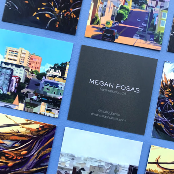
“I love that with Printfinity, I can include so many different examples of my work – sometimes people want my card just so they can have a ‘mini-painting!’ For my information, I used elegant fonts – Sackers Gothic, Neue Haas Light, and Helvetica Neue LT Pro Light. They each have a delicate, round finish to them, which I think looks beautifully clean, high end, and contemporary. I want my artwork to be presented in an elevated way, and for that to be reflected in all of my branding.”
Winter Studios
Winter Studios is a husband and wife wedding videography team, with a passion for creating keepsakes that couples can enjoy for a lifetime. Before launching their own business, Nathan had previously been working as a graphic designer and videographer for a non-profit business.
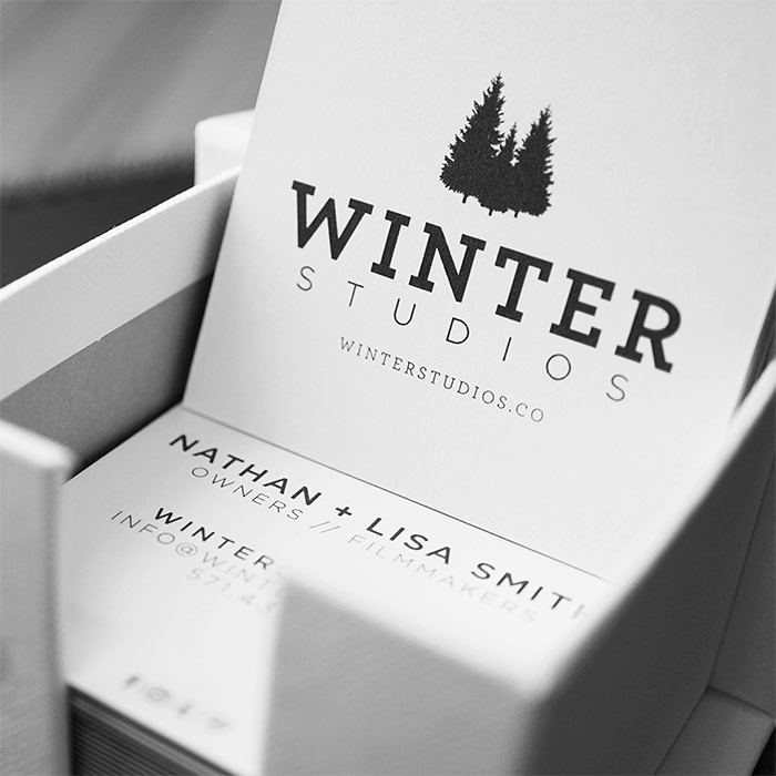
“We had just renamed our business after our daughter, and needed a new logo. For the logo, I created a subtle ‘W’ shape with the trees, and matched it to the black seam of our Luxe cards. We used two contrasting but complementary typefaces, Archer and Gotham, to create a clean simple style. I think the modern fonts show people that our brand is contemporary and stylish, and our cards shout professionalism.”
Print your typographic creations to life with our range of premium print products.
Keep in touch
Get design inspiration, business tips and special offers straight to your inbox with our MOOsletter, out every two weeks.
Share the post
Keep in touch
Get design inspiration, business tips and special offers straight to your inbox with our MOOsletter, out every two weeks.


