Throwing shapes: the secret messages of geometry in branding
Cut to shape. Made to stick. Your brand, in its boldest form.
-
 The MOO Team
Share the post
When you think of a brand you love, like Apple, Nike, or Coca-Cola, what comes to mind first? Probably not a mission statement. Or even a product. It’s the shape. A swoosh. A circle. A bullseye. Instant recognition. Instant emotion. That’s geometry at work.
Shapes are one of the most intuitive tools in branding. They cut through noise, transcend language, and trigger feelings faster than words ever could. Let’s dive into the psychology of form and discover why shape is such a powerful storyteller for your brand.
Circle: the shape of inclusion

A circle says, “We’re connected. You belong here.”
Smooth, endless, and symmetrical, the circle is all about wholeness and connection. It has no start, no end, just continuous movement. It’s one of the first shapes we learn to recognize, and it shows up everywhere.
Psychologically, circles create a sense of safety and softness. One study found that participants consistently rated circular logos as more harmonious and welcoming than angular ones.
That’s why brands like Mastercard, Pepsi, Spotify, IKEA, and the Olympic rings go round: they signal unity, motion, and an invitation to join in.
Square: the reliable one

A square says, “You can count on us.”
Sturdy, structured, and deeply familiar, squares and rectangles represent strength, logic, and dependability. You’ll find them everywhere in everyday life: screens, buildings, windows, books. They’re the quiet overachievers of design.
That everyday familiarity makes them a powerful choice in branding. Lego. Microsoft LinkedIn. Even Instagram’s original icon leaned on the square’s solid geometry to convey clarity and trust.
From a psychological perspective, squares suggest stability and order. They imply rationality, efficiency, and confidence — everything you’d want from a business that wants to be taken seriously.
Triangle: the mover and shaker

A triangle says, “We’re going places.”
Triangles are rarely passive. They point, lean, climb, and challenge. They create movement and tension, whether upright or inverted, which is why they’re used so often in logos that need energy and edge.
Brands like Adidas, Delta, and Mitsubishi all feature triangle-based logos. They’re deliberate and directional, pushing your eye and attention forward.
Triangles suggest power, growth, and motion, especially when oriented upwards. Perfect for fast-paced industries where momentum matters, like tech, travel, or finance.
Line: vertical vs horizontal

A vertical line says, “We’re bold and building.”
A horizontal line says, “We’ve made it easy.”
Lines might seem simple, but they can radically shift the feel of a brand. Vertical lines suggest structure, height, and ambition. Horizontal lines create calm, balance, and flow. Both can be powerful, depending on how you use them.
Take Cisco or SoundCloud. They all use vertical elements to suggest elevation, innovation, and strength. On the flip side, brands like Spotify, New Balance, or DHL lean into horizontal lines to indicate rhythm, speed, and ease.
The psychology of lines often connects to Gestalt theory, which tells us our brains naturally group and interpret shapes in specific ways. They guide the eye, create rhythm, and set the tone, which is why they’re often found in both logos and layouts.
Organic & Abstract: the standout shapes

These kinds of shapes say: “We’re different. And unforgettable.”
Some of the most memorable brands use organic, irregular, or abstract forms to stand out. These custom shapes often mirror nature — jagged mountains, fluid water, or even the softness of a silhouette. Think of Patagonia’s mountain range or the bite in Apple’s apple.
These brands don’t follow the rules, and that’s the point. Abstract shapes feel expressive, human, and unpredictable. They’re harder to pin down, and that friction makes them stick.
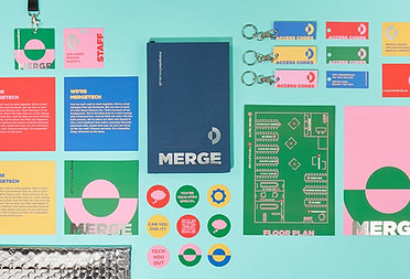
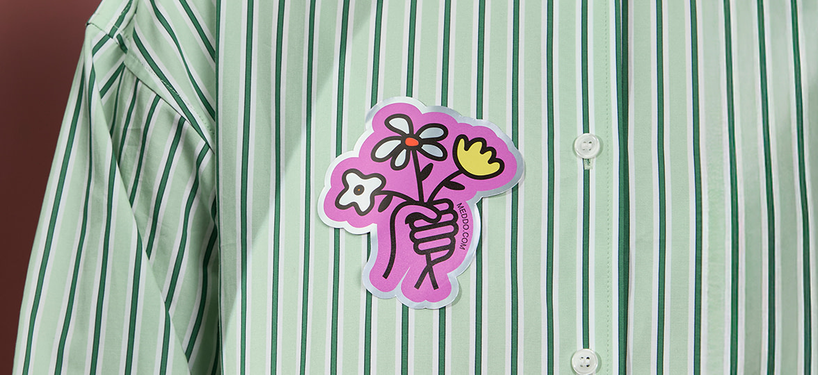
Before you say it, shape it.
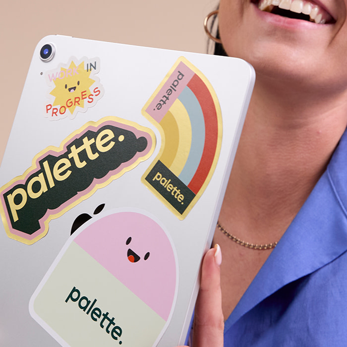
MOO’s Die-Cut Stickers let your design speak volumes, without saying a word. They’re perfect for product packaging, swag bags, events, or brand giveaways. And they’re great for boosting team engagement from the inside out.
Whether you’re going bold and geometric or soft and organic, we’ll cut your sticker to match. Discover our full range of Die-Cut Stickers.
Keep in touch
Get design inspiration, business tips and special offers straight to your inbox with our MOOsletter, out every two weeks.
Share the post
Keep in touch
Get design inspiration, business tips and special offers straight to your inbox with our MOOsletter, out every two weeks.