Anti-Trends: why 2026 is about timeless design
Forget chasing Pinterest trends. See how brands like Aesop and Patagonia built identities designed to endure.
-
 The MOO Team
Share the post

There’s a shift happening in the design world, and it’s not about what’s trending on Pinterest this week. While the internet churns out aesthetic after aesthetic, some of the most successful brands are ditching “trends” in favor of timeless.
Table of Contents
- Why trend fatigue is real
- The business case for enduring design
- What makes design timeless vs. trendy
- 5 design lessons from classic brands
- How to create a timeless brand identity in 2026 and beyond
Key Takeaways:
- Micro-trends now last only one month or season, forcing businesses into expensive rebrand cycles that damage customer trust.
- A comprehensive rebrand costs most businesses $150,000 to $350,000.
- Timeless design prioritizes simplicity, quality materials, strategic color choices, and clear values over fleeting aesthetic trends.
- Brands like Aesop, Patagonia, and The Row prove that refusing to chase trends builds stronger recognition and customer loyalty.
- MOO’s consistent curated color collection demonstrates how strategic restraint builds brand recognition faster than constant novelty.
Why trend fatigue is real
Scroll through design trends from the past five years and you’ll find a graveyard of once-hot aesthetics. Millennial pink had its moment. So did brutalism. Then came Y2K revival, cottagecore, dark academia, and whatever micro-trend is currently having its fifteen minutes.
The problem isn’t that these trends exist. It’s that building a brand identity around them means you’re essentially designing with an expiration date. What feels fresh and relevant in 2026 might look embarrassingly dated by 2027. And that’s expensive.
According to retail technology platform Lily AI, micro-trends now typically last only one month or season, compared to classic trends that endure for several seasons or years. Global Fashion Agenda notes that micro-trends often have such short lifecycles that “the latest trend might be old news by the time the parcel has even arrived on your doorstep.”
For businesses trying to build recognition and trust, this creates an impossible situation. You’re either constantly rebranding to keep up, or you’re accepting that your identity will age poorly.
Enter the anti-trend movement. More brands are realizing that the best design decision isn’t to follow trends at all. It’s to build something that transcends them.
The business case for design that endures
Let’s talk numbers. According to branding agency Ignyte Brands, most small and medium-sized businesses can expect to invest $150,000 to $350,000 on a comprehensive rebrand. But the real expense isn’t the upfront investment. It’s what happens when a rebrand doesn’t land.
A poorly executed brand refresh can alienate loyal customers, confuse your market position, and ultimately damage sales.
We’ve seen major companies face public backlash after abandoning established identities for something more “on-trend,” only to watch trust and revenue plummet.

Jaguar’s 2024 rebrand serves as a cautionary tale: the British carmaker overhauled decades of brand credibility with a new logo mixing uppercase and lowercase letters and revealed a concept car in Miami Pink, sparking significant controversy and fierce criticism from longtime customers.
Compare that to brands with timeless identities. They evolve, certainly. But their core visual language remains consistent enough that customers recognize them instantly, year after year. This consistency builds trust, creates emotional connections, and makes every marketing pound work harder because you’re not starting from scratch every few years.
Timeless design is practical design. It’s the choice that respects both your budget and your audience’s need for reliability.
What makes design timeless vs. trendy

The difference between timeless and trendy isn’t always obvious at first glance. Both can look modern. Both can be beautifully executed. But timeless design has certain qualities that help it age gracefully.
- Simplicity over complexity: Timeless brands favor clean lines and uncluttered aesthetics. They resist the urge to add unnecessary flourishes just because they’re currently popular. Think classic serif or sans-serif typography rather than the latest display font everyone’s using.
- Considered color choices: While trending brands might embrace whatever Pantone declares the Color of the Year, timeless brands build palettes around classic tones—blacks, whites, navy, earth tones—that won’t feel dated in five years. When they do use bold color, it’s purposeful and tied to their core identity, not borrowed from what’s hot right now.
- Quality materials and craftsmanship: Brands built to last emphasize substance. They talk about materials, processes, and durability rather than simply hopping on aesthetic bandwagons. This grounds them in something real.
- Flexibility within constraints: The best timeless brands aren’t rigid. They can adapt to new contexts and applications while maintaining their essential character. Their design systems are strong enough to absorb change without cracking.
- Clear values over vague vibes: Trendy brands often chase feelings and aesthetics. Timeless brands anchor themselves in concrete values and missions that remain relevant regardless of what’s happening on social media.
5 design lessons from classic brands
Want to know what timeless design actually looks like in practice? These brands prove the point better than any design manifesto could.
1. Aesop: Let your design philosophy be visible in every detail

The Australian skincare brand has maintained its commitment to amber bottles, minimalist typography, and literature-referencing copy since 1987. It’s built a visual and verbal identity so distinctive that customers recognize it immediately. Their approach to design prioritizes function and authenticity over flash.
2. Penguin Books: systematic design beats one-off brillianc

Penguin’s classic cover designs show how timeless visual identity works in publishing. The simple, grid-based layouts and color-coded genres have made Penguin covers instantly recognizable since the 1930s. They’ve evolved carefully over the decades, but the core visual language and iconic orange color means that you can spot a Penguin book across a room.
3. The Row: refuse to participate in the trend cycle altogether

Founded by Mary-Kate and Ashley Olsen, the brand has captured attention precisely because it refuses to chase trends and represents timeless luxury in fashion. Clean silhouettes, quality fabrics, muted palettes—these pieces are designed to be investment items that work season after season.
4. Patagonia: make your values visible, not just your product

This favourite outdoor brand has spent decades perfecting a brand identity built around environmental responsibility and durable design. Their logo hasn’t fundamentally changed since the 1970s. Their commitment to making products that last runs counter to fashion industry norms. And it’s made them one of the most trusted outdoor brands globally, with customers who are fiercely loyal precisely because Patagonia hasn’t tried to be something new every season.
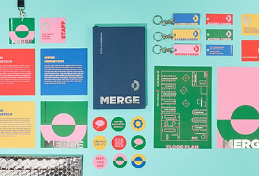
5. MOO: curation is a competitive advantage

We don’t introduce new colors every year just because we can. Our curated color collection remains consistent because it works. Customers know what to expect. They can reorder Business Cards, Pens, Notebooks, and Drinkware with confidence. We’re not constantly chasing whatever shade happens to be trending on Instagram. That consistency is exactly what makes MOO reliable (and award-winning). When you’re building a brand designed to last, curation is as important as creativity.
How to create a timeless brand identity in 2026 and beyond
Creating a brand identity with staying power requires different thinking from the start. Here’s how to approach it.
- Start with strategy, not style: Define what your brand actually stands for. What problem do you solve? What values drive your work? What promise do you make to customers? Timeless brands are built on substance, and that substance needs to be clear before you make any design decisions.
- Choose typography that serves function: Classic typefaces exist for a reason. They’re readable, versatile, and they age well. You need something that works well across applications and will still look professional in a decade. Strong sans-serifs or serif fonts with good proportions rarely go out of style.
- Build a restrained color palette: Select colors that align with your brand values and industry context. If you’re using bold colors, make sure they’re tied to your brand story, not borrowed from this year’s trend forecasts. And include plenty of neutrals to give your palette longevity and flexibility.
- Design systems, not just assets: Think beyond your logo. How will your brand identity work across different sizes, contexts, and mediums? A strong system gives you consistency while allowing room to adapt. Document your choices so everyone using your brand guidelines understands the thinking behind them.
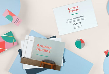
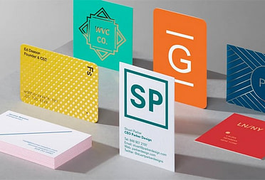
- Invest in quality materials and production: Whether it’s Business Cards, packaging, print materials, or digital presence, quality signals permanence. If you want people to see you as built to last, show them through every touchpoint.
- Test for longevity: Before finalizing your brand identity, ask yourself if it will still make sense in five years. Does it feel tied to a specific moment, or does it have qualities that transcend time? If you’re not sure, you might be chasing a trend without realizing it.
- Allow evolution, not reinvention: Timeless brands do refresh their identities occasionally. But they do it thoughtfully, making incremental updates that modernize without abandoning their core.
Your brand deserves better than a mid-life crisis every year
Create Marketing Materials designed to last. MOO’s curated color collections, premium printing, and quality materials reflect your commitment to timeless brand identity.
For businesses ordering at scale, MOO Business Service provides dedicated support, custom pricing, and seamless team ordering. To get started, fill in this simple form, and one of our team members will be in touch shortly.
Keep in touch
Get design inspiration, business tips and special offers straight to your inbox with our MOOsletter, out every two weeks.
Share the post
Keep in touch
Get design inspiration, business tips and special offers straight to your inbox with our MOOsletter, out every two weeks.