Here come the disruptors: meet the best design in fintech
Le$$ jargon, more joy.
-
 The MOO Team
Share the post
Finance brands don’t look—or behave—the way they used to. A new generation of fintech players like Klarna, Chime, Venmo, Monzo, and others are leading the charge, showing that finance doesn’t have to look formal, distant, or traditional anymore.
The fresh face of finance is bright, bold, and refreshingly human, with design leading the way. Out goes the stuffy jargon and grayscale branding; in comes playful visuals, radical transparency, and a genuine focus on customer experience.
These disruptor brands are using design to build trust, grow loyal communities, and make money matters feel less intimidating and more inclusive.
Why now is the moment for design-focused fintech brands
As digital-first experiences become the norm, more fintech companies are realizing that how they show up is just as important as what they offer.
Today’s customers expect clarity, personality, and ease. They want interactions that are intuitive, not intimidating. And they’re more likely to trust brands that feel approachable and human from the first touchpoint.
And great design is giving them that competitive edge. Companies that invest in design grow nearly twice as fast as their industry peers. A strong visual identity makes financial services feel more accessible and trustworthy.
Let’s take a closer look at the brands setting the standard for the best design in fintech.
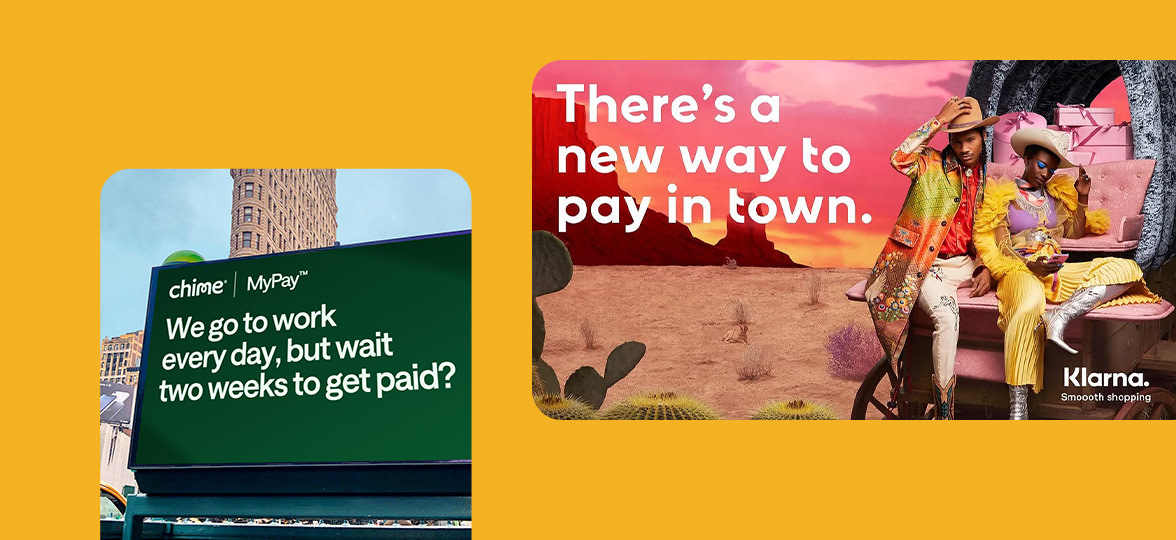
Klarna: turning pink into a power move
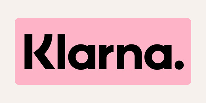
Klarna is perhaps the best example of how bold design can cut through in a crowded, conservative market. Once known primarily as a “buy now, pay later” service, Klarna has established itself as a lifestyle brand, not just a finance tool.
Its signature pink is a provocation. In a sector that’s historically been dominated by heavy, somber palettes, Klarna’s visuals are playful, hyper-modern, and a little irreverent. Their typography is clean and confident, often offset by surreal imagery or bold campaign visuals that wouldn’t look out of place in a high-fashion magazine.
But Klarna’s real genius is making finance feel fun. Their campaigns are witty and accessible, using humor and pop culture to turn payments into something people actually talk about. Klarna’s pink is a signal that finance can be lighthearted, inclusive, and modern.
Monzo: the coral card that sparked a movement
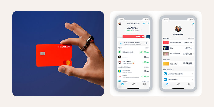
Monzo disrupted banking with its now-iconic hot coral debit card—a simple design move that did two things: made people want to flash their wallet, and made the brand instantly recognizable.
Monzo is one of the best fintech companies when it comes to creating a user-friendly interface. The app is clean, intuitive, and speaks in plain English. Transactions are tagged and visualized. Spending summaries are laid out in digestible, visual formats.
The brand prioritizes user experience and design just as highly as the service itself. And with 73% of global banking interactions now happening online, its focus on clarity and connection sets a new standard for what digital banking can be.
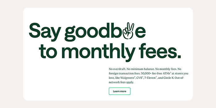
Chime: championing financial well-being through simplicity
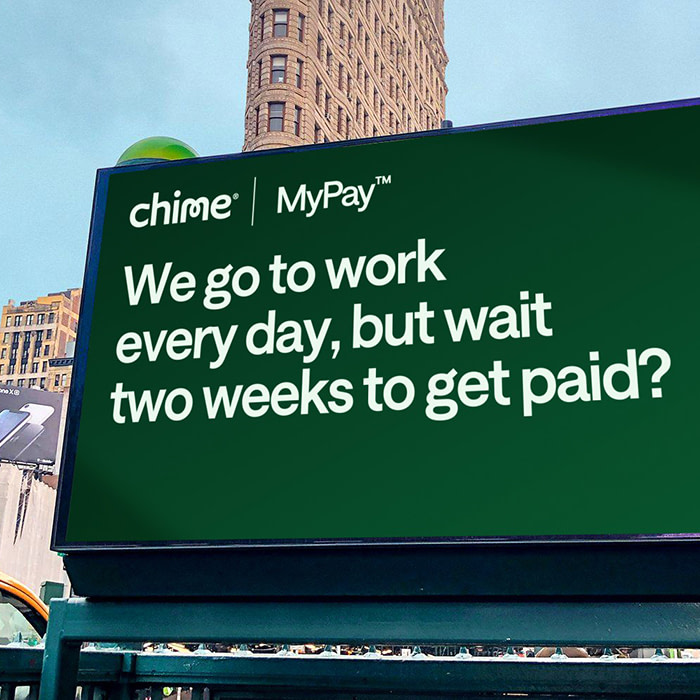
Chime takes a different route, using minimal design and straightforward messaging. It’s a digital bank built for people who want no-fuss finances, and its visuals reflect that. Clean white backgrounds. Calming greens. Simple typography. Clear, direct messaging like that stands out in an industry known for complexity.
Chime’s design works hand-in-hand with its mission to help users gain financial control. Their 2024 campaign, Unlocking America’s Pay, challenges the outdated two-week pay cycle and helps users access their earnings sooner. It’s a bold idea, made accessible through clear messaging and confident design.
Venmo: finance meets social media

Venmo brought peer-to-peer payments into the social age. At the heart of its experience was a design system that feels more like a messaging app than a bank. The Venmo feed—where users can see their friends’ payments (minus the exact amounts)—is casual, lighthearted, and often emoji-filled.
The UI is simple, with bold blue tones, rounded icons, and a conversational tone of voice that feels distinctly modern. Venmo makes payments feel social, not transactional.
Venmo also understands something traditional banks don’t: younger users want to feel connected through technology, not just served by it. Venmo’s design reflects that cultural shift, helping redefine how money moves. As fintech revenues are growing three times faster than traditional banks, Venmo’s approach is a masterclass in meeting users where they are.
How design is driving change
The best design in fintech is changing how people feel about money. While each brand brings something different to the table, they’re all united by one thing: design is strategic. They’re clear on what they stand for and confident in how they communicate. From tone of voice to color palette to user experience, they’re using design to break boundaries, build connection, and prove that finance isn’t just for the elite. It’s for everyone.
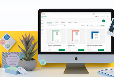
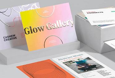
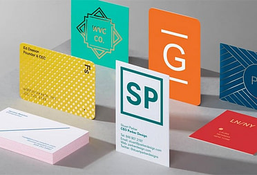
Bring your boldest ideas into the real world
Design-led brands don’t just live online. They’re always finding creative ways to show up in real life, too. Whether it’s a welcome kit or eye-catching direct mail, print can turn a moment into something memorable.
At MOO, we help bring your campaigns to life with premium print that matches your ambition. And with MOO Business Services, you can get on-demand support from our expert team. To get started, fill out this simple form and one of our team members will be in touch shortly.
Keep in touch
Get design inspiration, business tips and special offers straight to your inbox with our MOOsletter, out every two weeks.
Share the post
Keep in touch
Get design inspiration, business tips and special offers straight to your inbox with our MOOsletter, out every two weeks.