The MOO Color Challenge: Timothy Goodman
Timothy Goodman takes on the challenge of using the Pantone Color of the Year 2019, Living Coral, in a unique set of Postcard designs.
-
 The MOO Team
Share the post

Three artists, chosen for their distinctive approach to using color, were given 48 hours to incorporate Living Coral, the Pantone Color of the Year 2019, into eye-catching designs. We spoke with designer and illustrator, Timothy Goodman, on how he took on our challenge to use the color in his work.
Timothy Goodman has something to say. And he’s spreading the word by emblazoning his inspirational messages on everything from murals and magazine covers to homeware and t-shirts.

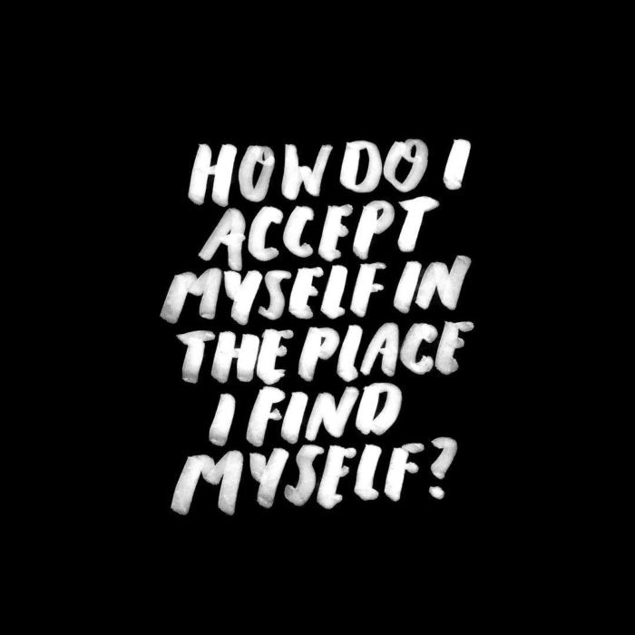
From the funny (‘Cheap coffee > no coffee’) to the profound (‘How do I accept myself in the place I find myself?’), Timothy’s lettered pieces explore intimate themes such as love, friendship and loneliness.
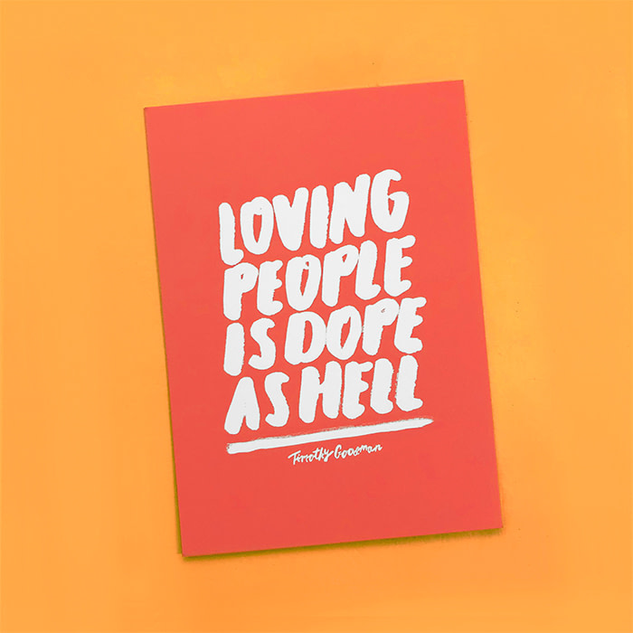
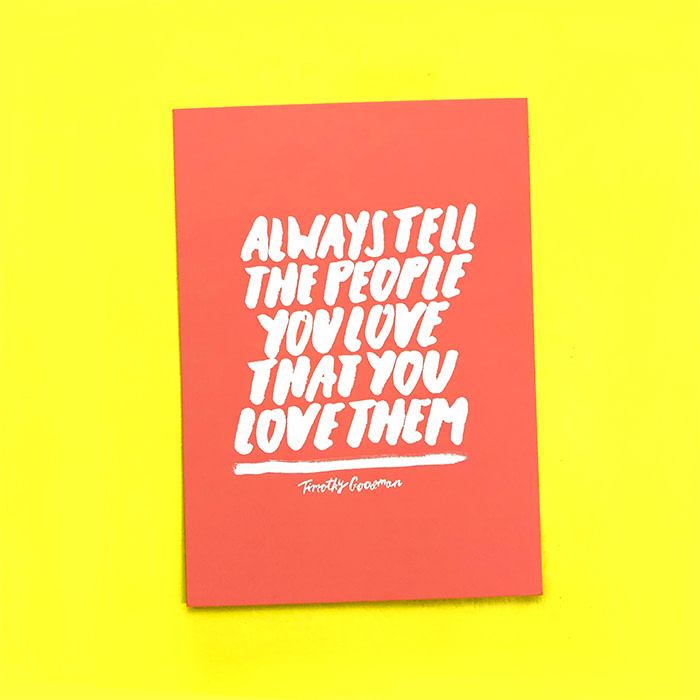
The artist’s relatable messages felt just right for the MOO Color Challenge, so we asked him to come up with three Postcard designs, using Pantone’s Living Coral color. “When I saw it, I instantly wanted to put big white quotes on a sea of color,” Timothy says.

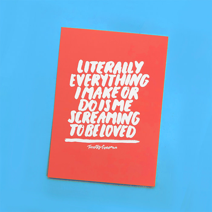
His designs use Living Coral as a vivid backdrop to three bold statements about love, including one of his most personal recurring messages: “Literally everything I make or do is me screaming to be loved.”
We spoke to Timothy about his unique approach to the challenge, and his evolution from traditional graphic designer to a creative with a cause.
How did you get into illustration and design?
After barely graduating high school, I started working for a guy named Dave, who ran a painting and home-improvement company in Cleveland, Ohio. For three years I worked full-time painting homes, while taking night classes at a local community college.
Next, I moved to New York City to study graphic design at the School of Visual Arts. After graduation, I began my career as a book jacket designer at Simon & Schuster. I spent a year there, before taking a job in branding at Collins, then working for Apple in San Francisco.
While at Apple, I had the opportunity to create a mural for the Ace Hotel in NYC. I locked myself in a hotel room for three days with a paint marker, and never looked back.

From then on, I decided to have more of a hand in my own work, and it changed the trajectory of my entire career. I evolved from being a more traditional graphic designer working in branding, to working for myself and creating a variety of murals and installations for clients all over the world. How did you grow your client list from there?
By constantly going after jobs, sharing my work and sending emails to clients and art directors. I’d go home every night and spend two hours on email. All of my work went on social media, too, and I’d do some jobs for free – including my first three murals.
I obviously don’t condone that, but you have to evaluate what’s possible for yourself. I knew I could get mileage out of them creatively and that they’d help propel me towards paid gigs with big brands if I kept at it.

How do you approach briefs from those big-name brands?
I approach everything the same, setting parameters no matter what. I’ve done several large-scale personal projects in collaboration with other creatives: 40 Days of Dating, 12 Kinds of Kindness, Build Kindness Not Walls, People of Craft and Friends With Secrets.
With all of these, we gave ourselves deadlines, parameters, and challenges. We were our own clients, and there was no difference.

How would you characterize your work?
I focus on trying to make work that both stimulates me and emotionally connects to an audience, in both big and small ways. I feel designers have unique abilities to tackle topics and talk about things that are important to themselves and others. And I want to say that visually, in the strongest way possible.
Sometimes I want to be more playful, sometimes I want to be more stylized, but I also want to be as human as possible.
How do you develop the style and scheme for each piece?
Generally, the more immediate the statement is, the more simple and immediate I want the style to be. I love massive, wonky block letters on wall murals, and I think you can really change how a passerby relates to an environment in that way.
I’ve learned that the greatest joy I have as a designer is connecting to another human being through my work. I also believe that sharing your personal stories is a sort of activism. Creating work from the standpoint of a human, not as a ‘creative,’ is my main goal.
What role do color schemes play in your process?
I don’t use a ton of color, and when I do, I don’t really consider it until later in the process. It’s always about the idea, the content, and the composition first.
What was your response to the Pantone Color of the Year?
When I saw the Pantone Color of the Year 2019 announcement, my initial thought was, I LOVE THIS COLOR. When I do use color, my black and white style pairs perfectly with warm colors such as Living Coral. I’ll definitely be using this color again – I love it.
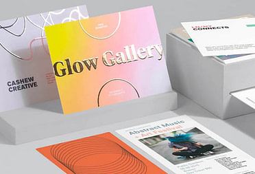
Get inspired by the diverse approaches of the artists taking on the MOO Color Challenge.
Keep in touch
Get design inspiration, business tips and special offers straight to your inbox with our MOOsletter, out every two weeks.
Share the post
Keep in touch
Get design inspiration, business tips and special offers straight to your inbox with our MOOsletter, out every two weeks.