Clear label design ideas: master the “no-label” look
Sleek, stylish, and won’t break the bank.
-
 The MOO Team
Share the post
Minimal packaging has a way of making the little details pop. When there’s less going on, your type, spacing, and finishes have to do more work. That’s why the “no label look” feels so satisfying when done right.
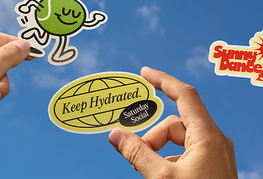
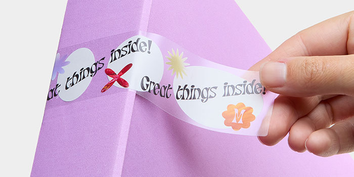
Printing directly on packaging can be tricky (and expensive). Clear Stickers are your shortcut to the same polished effect with more flexibility and less stress.
With the right eye for contrast and spacing, these labels don’t just sit on the pack – they become part of it. Here are a few clear label design ideas and professional tips to help you get that “is-it-printed-on-there?” magic.
Table of Contents:
- Why choose clear labels for your brand?
- Label design tips for clear packaging
- How to design transparent labels for different surfaces
- How to make transparent Stickers for packaging that last
Key Takeaways
- Clear labels give you the minimalist “no-label” aesthetic without the cost and complexity of direct printing.
- Contrast and readability are your top priorities, especially on glass or colored packaging.
- Always test your design on the actual packaging materials before printing to avoid unwanted surprises.
Why choose clear labels for your brand?
Transparent Stickers are remarkably versatile. On glass, they let your product do the talking. And on boxes, kraft paper, or pouches, they blend in while keeping your brand front and center.
Perks for businesses:
- Premium vibes without premium pricing.
- An elevated, intentional aesthetic that quietly says: “We’ve got style.”
- Flexible for small batches, seasonal runs, or constantly changing packaging.
The bottom line: Clear labels suggest your product is so good, it doesn’t need a loud outfit to get noticed.
Label design tips for clear packaging
The transparency of Clear Stickers is more than just a feature. It’s a design element you can work with. Here are some tips for doing it well.
1. Contrast is key
The biggest mistake in clear label design is forgetting that your text still needs to be readable. So, if your product is dark, you’ll want to use a light-colored text on your Stickers (and vice versa).
MOO tip: Don’t guess… test. Create mockups with your actual products before finalizing. What looks sharp on your screen might pull a vanishing act once it’s applied to a glass bottle.
2. Embrace negative space
With transparent labels, less is more. Negative space (the empty area around your design elements) is just as important as the text itself. It’s where your label gets to breathe. Let your product, or the packaging material beneath, show through in strategic places. Think of your design as floating elements rather than a filled rectangle. This creates visual calm and helps you highlight only the most important details.
MOO tip: The emptier the space around key elements, the more your design pops. It’s like giving your logo its own VIP section.
3. Finish matters: matte vs. glossy
Shiny labels can look fancy, but in real life, reflections can glare and make your text unreadable. Matte finishes are your best friend: readable from every angle, premium-looking, and easy on the eyes. As a nice bonus, matte finishes tend to look more expensive, providing a subtle, quality-assuring sheen that whispers sophistication rather than shouting for attention.
How to design transparent labels for different surfaces
To be effective, your clear label needs to work with the specific challenges of its intended home.
For glass packaging
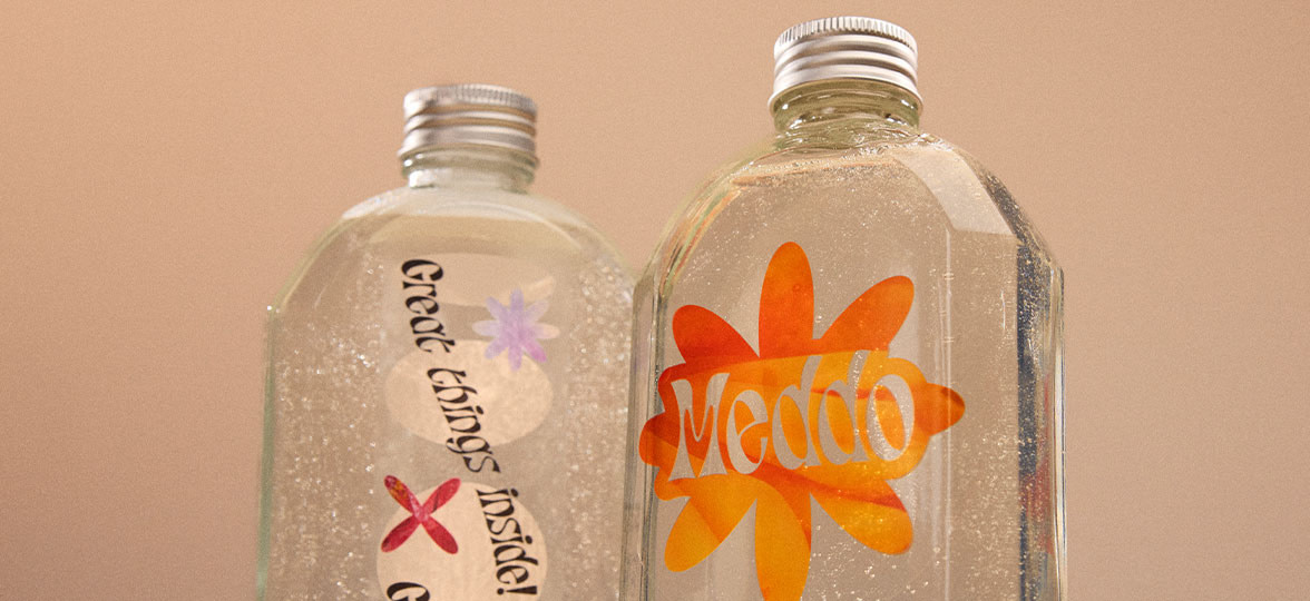
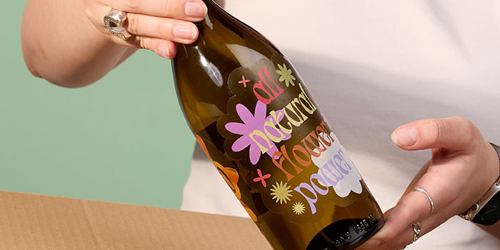
Glass is the ultimate backdrop for Clear Stickers because its no-borders transparency amplifies the “no-label” aesthetic. The sticker virtually disappears, leaving only your design visible against the glass.
Placement is key. Position your logo, product name, and essential text where they’ll stand out clearly against the glass. If your brand colors are light or pastel, consider adding a white underbase to those elements so they don’t disappear against the glass. Use the transparent areas of the label intentionally, too. This means letting them frame your brand elements, rather than competing with them.
For other packaging materials
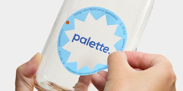
Clear labels on materials like cardboard, kraft paper, or specialty pouches let the texture and color of your packaging become part of your brand aesthetic. Use waterproof Clear Stickers so your branding stays crisp and your product still looks beautiful by the time it reaches your customer – even after handling, shipping, or exposure to humidity.
How to make transparent stickers for packaging
Professional-quality transparent Stickers and labels are DIY-able. To do it right, though, you’ll have to make sure you’re prioritizing material choice just as much as design. Pay attention to these details:
- Permanent adhesion – Your Stickers should stay exactly where you put them. That also means you don’t want them to start peeling along the corners after a few weeks, nor do you want them sliding down low-friction surfaces.
- Smooth surface – Prevents air bubbles and gives you even ink coverage if you’re printing with color. A smooth application also means your labels look professionally applied, not like something you just slapped on.
- Weatherproof and waterproof protection – A must for labels that won’t fade, smudge, or peel when exposed to humidity or rain. Your packaging might sit in a humid warehouse, get handled with wet hands, or encounter rain during shipping. Materials that can withstand these conditions mean your branding stays crisp from production to the customer’s hands.
Get the no-label look with MOO
Explore our Clear Stickers and start designing packaging that lets your product shine.Need help perfecting your design or planning a larger order? MOO Business Services gives you access to dedicated design support and account management. Fill in the form below, and one of our team members will be in touch soon.
Keep in touch
Get design inspiration, business tips and special offers straight to your inbox with our MOOsletter, out every two weeks.
Share the post
Keep in touch
Get design inspiration, business tips and special offers straight to your inbox with our MOOsletter, out every two weeks.