10 top professional color combinations to inspire your next design
Pick the perfect color palette.
-
 The MOO Team
Share the post

Looking to redesign your logo? Or want to know how to choose your eye-catching brand colors for the first time? Color is important, especially when it comes to creating memorable marketing material for your brand.
Maybe you have a soft spot for light pastel pink, or you can’t resist a bright, bold yellow – whatever color is your cup of tea, it’ll have a perfect color match. You can use these pairings together to form the basis of your color scheme for your Business Cards, Postcards and all marketing material.
Why do color combinations matter?
The importance of your color palette shouldn’t be underestimated. Just look at Pantone’s Color of the Year, an industry-wide celebration of color, and affirmation that a single shade can speak volumes about a brand.
Everyone’s got a different process, but you might find that color is one of the final pieces of the design puzzle – you mock up your new logo or Business Card design, then color it all in at the end. But if you consider color combinations as a fundamental part of your image, you may find your design takes on a whole new dimension.

How to find colors that go together
Trusty (and eye-popping) color combinations can be found using the color wheel. This isn’t just an art class gem from school – it remains an important tool for everyday design to create a strong color palette. To find complementary colors, simply look at the opposing side of the wheel.
Through this method you’ll be able to find these classic color combos:
- Yellow and purple
- Red and green
- Blue and yellow
- Orange and blue
Our top 10 best color combinations
Here are our top 10 recommendations for cool color combinations that ooze style…
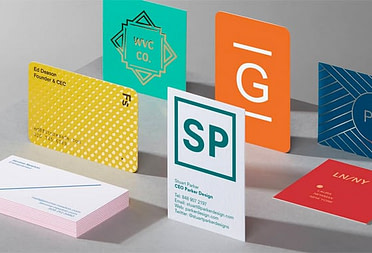
1. Black and white
A top “color” combination. Simple, timeless, faultless. Check out more black and white business card inspiration.

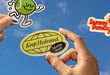
2. Leaf green and Yellow
This eye-catching color palette is a classic choice for health brands as these shades suggest freshness.

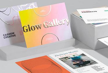
3. Purple and yellow
These colors are both bright and playful, but also have connotations of grandeur. An eye-catching color combo for a brand that wants to appeal to a broad age range.
4. Orange and white
Bright, bold and simple, it’s one of the best color combinations for business as it promises a professional brand that’s big on enjoyment.
5. Baby pink and blue
Innocent, elegant, feminine, and perfect for brands that want a soft, dreamy appeal – like skincare and beauty businesses.

6. Pink and grey
A mix of feminine pink and earthy, urban grey, this palette is both modern and timeless, making it one of the best color combinations.
7. Pink and black
The bold urgency of this powerful color scheme will promise impactful branding. Add some white for an injection of freshness.
8. Cool greys and blues
Icy and calm – perfect for wintery designs. A cool color combination if there ever was one.

9. Pantone’s Classic Blue with white
A timeless way to evoke nautical charm and a calm, collected vibe, these two make a great color combination.
10. Mint green and white
Clean and fresh. Green gives an earthy, uncomplicated tone, while white is simple and pure. A fresh color combo with a touch of serenity.

Color combinations to avoid
The fact that there are better color combinations for design also means that there are less good ones. In many cases, there aren’t any wrong answers. But if you want to have the best impact on your customers and stand out from competitors, you should avoid color combinations that aren’t so easy on the eye.
The color combinations below are referred to as ‘vibrating colors’ – which means the brightness of both colors causes more of a clash than complement, almost merging into one hectic visual for your poor customers’ eyes…
- Red on green/green on red
- Blue on orange
- Green on blue
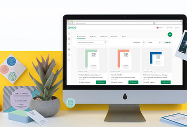
Ready to put your eye for the best color combinations to great use? Take your pick of premium print products at MOO.com. To get started, fill out this simple form, and one of our team members will be in touch shortly.
Keep in touch
Get design inspiration, business tips and special offers straight to your inbox with our MOOsletter, out every two weeks.
Share the post
Keep in touch
Get design inspiration, business tips and special offers straight to your inbox with our MOOsletter, out every two weeks.