10 best business card fonts
Head-turning fonts that command attention for your brand.
-
 The MOO Team
Share the post
When it comes to creating the best Business Cards, every detail matters—especially the font. Typefaces are often overlooked but play a huge role in seamlessly tying the overall design and shaping brand perception. Whether you’re aiming for a clean, professional vibe or something bold and snazzy, the right font can transform your business card into a conversation starter.
Before you choose your font, it’s worth knowing that fonts fall into three main styles: Serif,Sans Serif, and Script. Each type has a distinct vibe and purpose and brings something fresh to the table. Choosing the right one can help you match your design perfectly to your brand personality.
Serif font
Elegant and timeless, serif fonts have small strokes (or “serifs”) at the ends of letters, creating a sense of tradition and sophistication. These fonts have a classic feel rooted in the traditional typesetting techniques of letterpress printing.
Brand examples:
- The New York Times uses its iconic serif typeface to reflect authority and heritage.
- Tiffany & Co. uses a classic serif font to exude luxury and elegance.
Perfect for: Luxury brands, publishing, and professionals like lawyers or consultants.
Serif fonts for best business cards
1. Clarendon

An industry classic, Clarendon is an often-mimicked slab-serif font originally designed in 1845. The serifs in this font are bracketed, giving each letter a strong geometric presence. Clarendon is also known for its decorative letters, such as the capital Q and capital R, which all end with curved, elaborate strokes. Its versatility makes it an excellent choice for both vintage-inspired and modern business cards, especially for brands looking to combine tradition with flair.
Why it makes the best business card font: The geometric nature of this slab-serif font makes it ideal for standing out on the printed page. Using Clarendon on your business cards will surely command attention at first glance.
2. Lapture
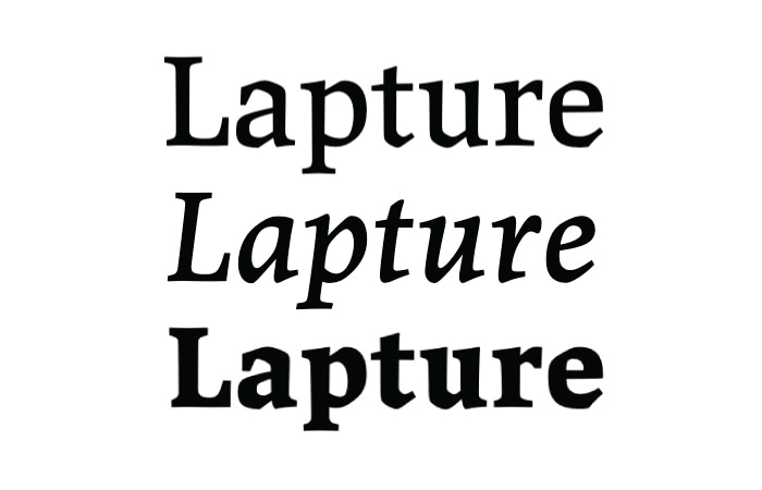
Designed by Just Another Foundry, Lapture brings a fresh twist to a modern serif font. The subtle geometric details in the rounded parts of each letter add a bit of personality without overdoing it. It’s a great choice if you want your personal brand to feel professional but still have a little edge.
Why it makes the best business card font: Lapture’s bold design makes it easy to read, even in smaller sizes. It’s super flexible, so you can tweak the spacing without worrying about it looking messy. Its clean lines print beautifully, making your business card look sharp and polished every time.
3. Plantin
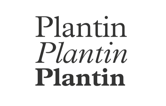
Developed in 1913, Plantin is a timeless serif typeface that’s still going strong over a century later. Its sturdy design and well-spaced letters set the stage for many modern fonts, including the iconic Times New Roman.
Why it makes the best business card font: Most famously used in Monocle Magazine, Plantin is a reliable choice for print at any size. It comes in various weights and styles, making it easy to highlight key details like job titles or phone numbers while keeping your business cards looking neat and consistent.
4. Rockwell
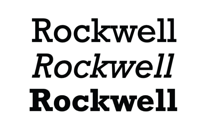
Released by Monotype in 1934, Rockwell is an iconic slab-serif font with a bold, approachable personality. With a variety of weights and styles, from bold italic to condensed, Rockwell keeps its charm no matter how you use it.
Why it makes the best business card font: Like most slab serifs, Rockwell’s strong, blocky serifs give text a grounded and balanced feel in any design. Its neat, symmetrical circular strokes on letters like ‘o’, ‘q’, and ‘p’ pair perfectly with geometric layouts, making it a great choice for clean and structured Business Cards.
San Serif font
Literally meaning “without serif,” sans serif fonts are simplistic, modern fonts typically used in web design. The clean and simple nature of sans serif typefaces makes them ideal for pairing with more ornate typography and logos. They’re a great choice for business card details, which are usually easier to read.
Brand examples:
- Airbnb uses its signature sans serif font for a clean, welcoming vibe.
- Nike pairs its bold logo with Futura to keep things simple and iconic.
Perfect for: Tech companies, startups, and creative industries.
San Serif fonts for business cards
1. Akkurat
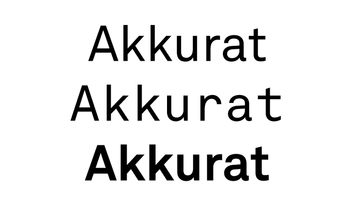
Since its inception in 2004, Akkurat has become a favorite in the design world, showing up on websites, print materials, and branding projects. Its simple but expressive style makes it easy to read, and great at getting a message across without feeling too formal.
Why it makes the best business card font: If your logo or branding is loud and attention-grabbing, Akkurat can balance things out with a more grounded, professional feel. It’s easy to read, works well in any layout, and gives your contact details a clear and polished look.
2. Avenir
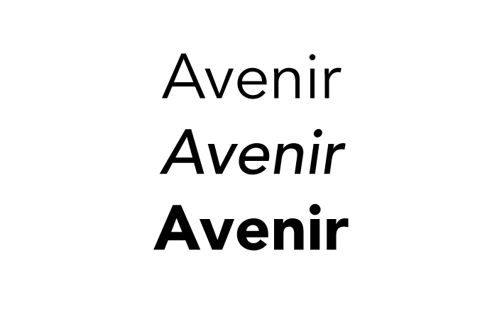
Inspired by the iconic Futura font, Avenir takes its clean, modern look to the next level. Avenir is a crowd-pleaser with refined curves and an inviting yet sophisticated nature—perfect for font and logo pairings.
Why it makes the best business card font: Avenir is easy to read and looks polished without being too formal. With different font weights, like Book and Roman, you can highlight key details like your name or contact info while keeping the design simple and balanced.
3. Helvetica Neue
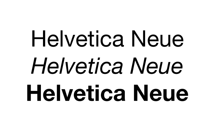
Helvetica Neue takes everything people love about the classic version and gives it a fresh, modern twist. With the same clean, timeless style as its namesake, Helvetica Neue offers a familiar yet upgraded appeal. With 51 different character weights, it’s one of the most flexible fonts out there.
Why it makes the best business card font: You can use bold weights to highlight important details and pair them with lighter or slanted styles to keep the design simple and balanced. Its timeless, no-nonsense style ensures your business card looks professional and easy to read, no matter how you design it.
Script font
Flowing and elegant, script fonts mimic handwriting or calligraphy, adding a personal and creative touch to your business cards. These fonts are perfect for brands that want to convey artistry, individuality, or a bespoke feel.
Brand examples:
- Instagram uses a playful script font in its logo to emphasize creativity and connection.
- Ralph Lauren uses handwritten-style fonts to highlight exclusivity and craftsmanship.
Perfect for: Creative industries, boutique brands, and personal brands.
Script fonts for business cards
4. Cortado Script
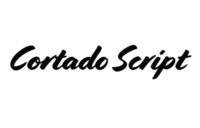
Cortado is an energetic brush script with a natural, handwritten feel that stands out on any design. Its alternate glyph options add variety, making your text look more organic and less repetitive. The angled strokes guide the eye smoothly across the card.
Why it makes the best business card font: It would be labor-intensive to handwrite your details and names on each business card you hand out. But Cortado is an inspirational font that can provide an easy alternative to giving your brand a handwritten and human touch.
5. Fabfelt Script
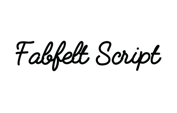
Fabfelt provides a welcoming feel without the brushmark and grain effect common with brush strokes. It’s the perfect modern adaptation of classic signage we know and love, making it ideal for adding a touch of nostalgia.
Why it makes the best business card font: Fabfelt’s weight works perfectly at any size, with even letter widths that make it super easy to read. The little script flourishes add just enough retro charm to keep things interesting without being too much. It’s a great pick for Business Cards that need to feel polished but still have a bit of personality, making your details both clear and memorable.
6. Manus
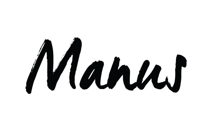
A true alternative to handwriting, this script typeface will make even the seasoned designer do a double-take to check for wet ink. With plenty of flourishes and organic strokes, Manus creates a sense of brush writing without all the paint.
Why it makes the best business card font: As a bold brush typeface, Manus works well when printed in larger point sizes, making it ideal for names and logos that you want to broadcast. As the point size shrinks, some of the nuances start to disappear, so think of Manus as a counterweight to more modern sans serif fonts. This balance helps create a dynamic, eye-catching design that feels bold and creative without losing its professional edge.
Tips for choosing your business card font
Font sizes
When choosing a font, make sure it works well at smaller sizes, as that’s how it will appear on the actual card. Zoom out to see your design at business card size and check that all the text is clear and easy to read.
Font weights
Font weights describe how thick or thin each letter looks, from bold to light. Heavier weights often print better, while thinner fonts might not be as clear, especially at small sizes.
Legibility
No matter how stylish a font looks, it has to be easy to read. Avoid overly decorative fonts that could make your details hard to decipher, especially at smaller sizes.
Print techniques
If you’re going for Special Finishes like Gold Foil, choose fonts that can handle it. Thin or delicate fonts may not print as well as bolder ones
Compatibility
Pairing fonts can enhance your design, but they need to work well together. Experiment with serif and sans serif combinations or scripts that complement your logo for a cohesive look.
Create the best business cards for your brand MOO
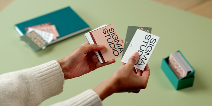
MOO is the home of great business cards, offering premium designs and tools to make your cards stand out. Whether you’re designing for yourself or a whole team, explore our Business Card range and discover how MOO Business Plans can streamline your branding.
Keep in touch
Get design inspiration, business tips and special offers straight to your inbox with our MOOsletter, out every two weeks.
Share the post
Keep in touch
Get design inspiration, business tips and special offers straight to your inbox with our MOOsletter, out every two weeks.