How Fuze used color to beat the competition
-
 The MOO Team
Share the post

How can four different brands unite under one umbrella? That’s a good question and one that Fuze thought over tirelessly before undergoing a global rebrand earlier this year. The result is a unique and vibrant rebranding project that utilized color to carve out a place in a saturated market. We spoke with the team behind the rebrand for an in-depth look.
The story behind the brand
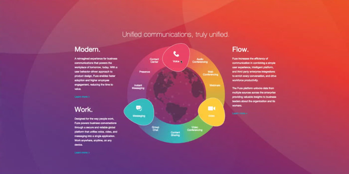
Of the all the brand refreshes we’ve covered, Fuze has undergone the biggest redesign by far. The company, formerly known as ThinkingPhones, was founded in 2006 as a cloud-based phone system which simplified the cost and complexity of business communications. By November 2015, the company had made several acquisitions and was integrating multiple technologies into a single, far more powerful communications platform encompassing voice, video, messaging, and collaboration technologies in one application.
As a result, the rebranding had the challenge of creating a new global visual system that could unify employees from diverse company cultures. To top it all off, the team in charge of this enormous reboot was small—three people, to be exact.
Why rebrand?
Drew Allison—Fuze’s Worldwide Creative Director—joined ThinkingPhones just as it acquired Fuze, a San Francisco-based video conferencing software. At this point, the brand was expanding in the unified communications category, and the name ThinkingPhones was incredibly limiting.
The goal to fuse together voice, video, messaging, and collaboration into a single app
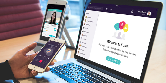
The company’s vision was to provide a single platform for companies and their employees. The goal was to fuse together voice, video, messaging, and collaboration into a single app, allowing people to connect anywhere–on any device–securely and efficiently.
The company needed a rebrand that expressed these new features—starting with a name change. Rebranding the company as Fuze was the answer.
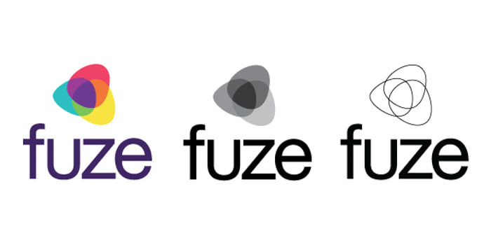
Recreating the logo
Allison knew that they needed to create a symbol that captured the energy of the new direction while retaining some of the former brand equity. So, he started the design process by thinking about what to leverage from the old logo:
The team started with the three ThinkingPhones circles and looked at the competitive space, and analyzed the color set. Several competitors were utilizing blue, some orange, and many with red as their palettes. The team proposed that Fuze could uniquely own purple. It was also the perfect combination of ThinkingPhones blue and the former Fuze red:
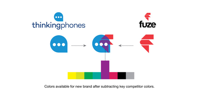
The team modified the former three circles to distinct and overlapping colored shapes. The resulting symbol expressed the energy, integration and collaboration embodied in the Fuze product.
“We looked at hundreds of logos variations, but this one stood out and inspired everyone that saw the early rounds,” Allison said.
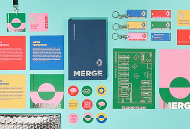
Choosing brand colors and business cards
The new design allowed Fuze to have a liberal color palette. While purple is the dominant color and is mainly how Fuze distinguishes itself across many touch points, a variety of other colors can be utilized to visualize the brand in a bright and lively way.
Fuze uses its new color palette across the brand from trade show booths, in product, and of course, in their MOO Business Cards.
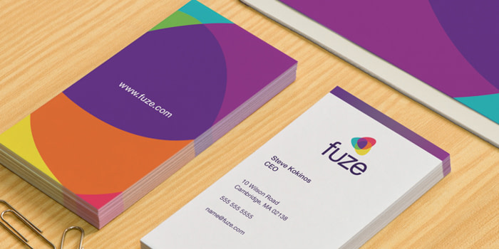
“We get compliments on our business cards all the time,” Allison said. “It’s a manifestation of brightness and energy.”
To help Fuze employees understand their company’s new look, Allison created a brand website with their logos and design palette, plus multiple options for business cards. “There are a bunch of variations that people can choose from,” Allison said. “Everyone loves the flexibility.”
Onboarding employees with the new brand message
The transition from ThinkingPhones to Fuze wasn’t totally painless. After all, an international rebranding, no matter how well managed, will come with its fair share of challenges. For example, it was difficult to get all of Fuze’s new offices to get accustomed to their brand’s new message. There are hundreds of employees, most of whom were suddenly working for a company with a new name.
“It was also difficult to create a brand that is flexible, represents the fluid nature of our business, and stands the test of time,” Allison said. “We wanted to express the energy of all the companies that came together, and also create something new. Getting everyone to feel like they were well represented was a challenge.”

It transpired that the most efficient way to create a unified, consistent global brand was to condense their messages into three words: Simplicity, productivity, and security. The motto is short, but effectively conveys the focus of the rebrand and the value that Fuze can bring.
Lessons from a global rebrand
ThinkingPhones made the transition to Fuze extremely quickly. As a result, the creative team was crunched for time. “We were working through the holidays,” Allison said.
Yet the short timeline was a blessing in disguise. It forced the entire team to make quick decisions. “We didn’t belabor the process. I think the fact that we were small and nimble, allowed us to do that,” Allison said. “Our logo just spoke to everyone—I’m not sure if that’s luck or skill or a combination of both.”
In order to keep the decision-making process speedily, Allison recommends keeping major design choices within the executive team.
However, it’s also important to keep employees aware of what’s happening behind closed doors. “We didn’t do everything in a vacuum,” Allison said. “We were exposing our ideas to employees along the way, and people were excited.”
When asked for his last piece of design advice, Allison said this: “Always keep the end user in mind, and show how the product can help people. That’s the most important thing.”
Looking to get your brand looking its best? Start with MOO Business Services.
Keep in touch
Get design inspiration, business tips and special offers straight to your inbox with our MOOsletter, out every two weeks.
Share the post
Keep in touch
Get design inspiration, business tips and special offers straight to your inbox with our MOOsletter, out every two weeks.