How to use Pantone’s color of the year
-
 The MOO Team
Share the post
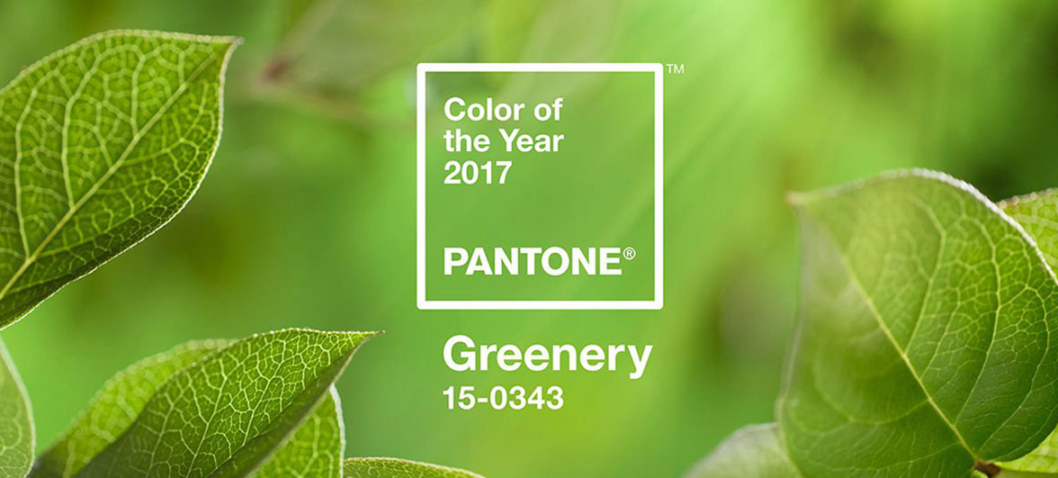
Greenery is a fresh, bright green that evokes the natural world – and it’s Pantone’s color of the year for 2017. But how can you use it in your design projects, or put it to work for your business?
Freshly cut grass, spirulina smoothies, our grandmas’ houseplants and Kermit memes – just some of the things that Pantone’s newly announced color of the year, Greenery, reminded our team of.
What is the color of the year?
Every year, Pantone, the global color authority, calls together a panel to select a color of the year. They review influences from the design world and beyond, looking to entertainment, art, popular travel destinations and even, in their own words, ‘new lifestyles and socio-economic conditions’.

It’s a choice intended to capture the mood of the time – and certainly, for anyone in the design world, it’s a steer that can influence projects of all kinds, from web builds to textiles.
But what does it mean for the rest of us? What might small business owners, keen crafters or companies going through a re-brand take from this announcement? We spoke to 3 of our in-house experts to find out what the color of the year might mean for you.
Designing with Greenery
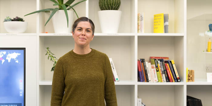
Anna Ebubedike, Head of Brand Design
I love this color – it’s so uplifting. It’s a juicy, clean, healthy color. That’s why shades like Greenery are always popular choices for food companies. Equally, brands that want to show strong environmental credentials will use colors like this (ironically, quite often it’s the least environmentally friendly brands that make use of this association!).
Conversely, it’d be a bolder choice for a traditionally corporate business – sectors like financial services who often steer towards blues. So if you work in those areas and you’re looking to stand out (without losing the perception of being serious about business), you could do a lot worse than working with less predictable shades like this instead.
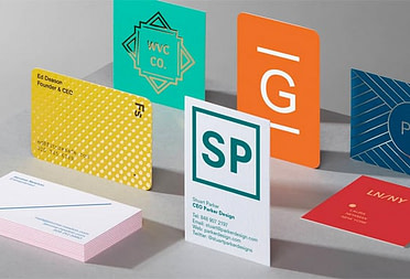
Printed products
Felix Ackermann, Senior Product Designer

It reminds me of house plants – succulents, those kinds of things. A kind of modern 70s feel. It’s a very calming, trustworthy color. I’ve been looking at using some similar shades to this alongside a neutral kraft brown in a product we’re developing, so I like it.
This kind of green is typically quite a hard color to replicate exactly in digital printing, particularly in fine detail or small text. So if you’re thinking of using it as a dominant color for your brand – printing all your business cards in this color, for example – you would do well to print a few test projects before you commit to be sure you’re happy with the end result.
The view from UX
Jaime Robb, Experience Designer

There’s a concept known as ego depletion that happens in cities and offices. Over the course of a day, being in contact with the sharp edges and dull colors of an urban landscape can wear out your mental resources and make you feel tired. Conversely, being in nature has the opposite effect – even looking at pictures of natural landscapes can restore our sense of ego and make us feel energised. So I see this kind of green as a very positive shade.
It’s a safe color. In user experience, this kind of color is always used for confirmation and approval. Green is go, green is good, green is yes. So in digital design, Greenery would obviously make a terrible choice for error messages. It would also make for pretty unreadable body copy too – so if you’re thinking of using it for any kind of text, tread carefully.
Does any of this matter to me?
Still not sure whether Greenery means anything to you? Don’t fret – as with any point of style, it’s not going to be for everyone. “Trends like this are a great way to gauge the bigger picture,” explained Anna.
“They’re a waypoint, not an instruction. But ultimately, any business – whether you’re a freelance photographer or part of a global corporation – has loads to gain from reviewing its choice of brand colors every so often. Now’s as good a time as any to take a fresh look.”
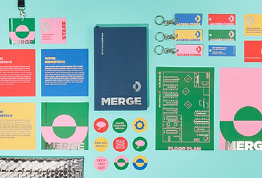
Leaf through our green designs.
Keep in touch
Get design inspiration, business tips and special offers straight to your inbox with our MOOsletter, out every two weeks.
Share the post
Keep in touch
Get design inspiration, business tips and special offers straight to your inbox with our MOOsletter, out every two weeks.