These Business Cards are just our type
-
 The MOO Team
Share the post
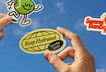
When beautiful typography meets awesome Business Cards, it makes for the perfect pairing that’s totally worth shouting about!
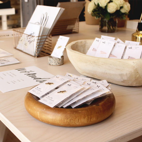
Here, 3 of our wonderful customers share their fab designs, and the inspiration behind them. Keep your eyes peeled for awesome Luxe that ‘exudes quality’, Cotton that leaves people ‘wanting extras’, and Raised Spot Gloss that’s instantly ‘attention grabbing’. These designs will leave you wanting to create new cards – when you finally stop swooning, that is.
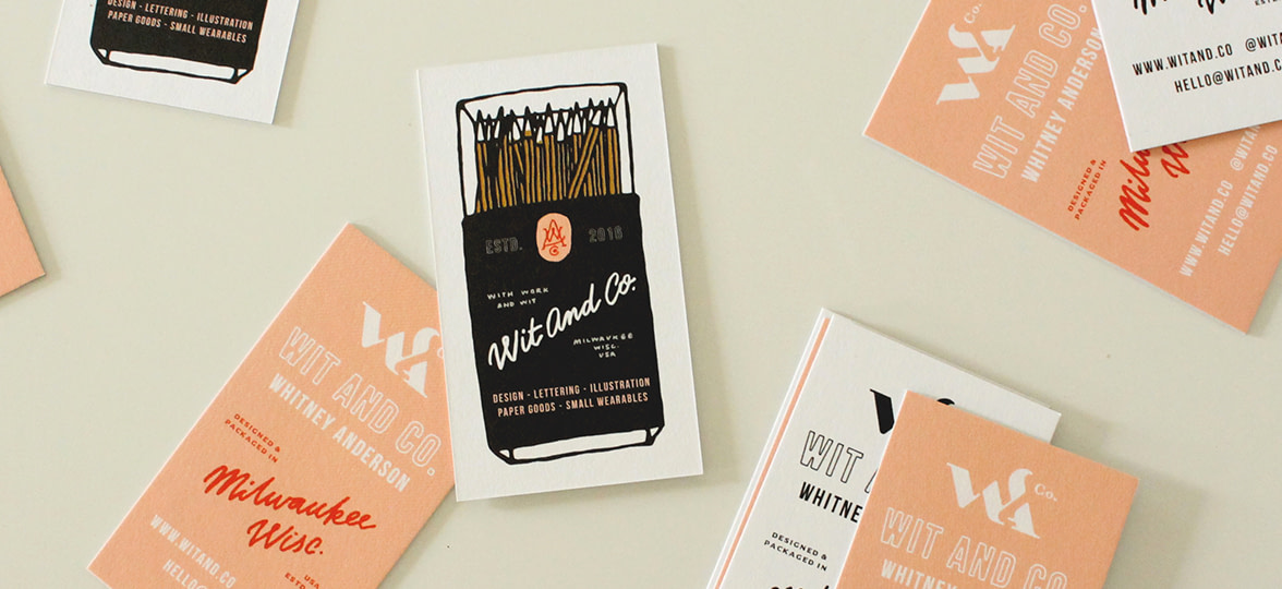
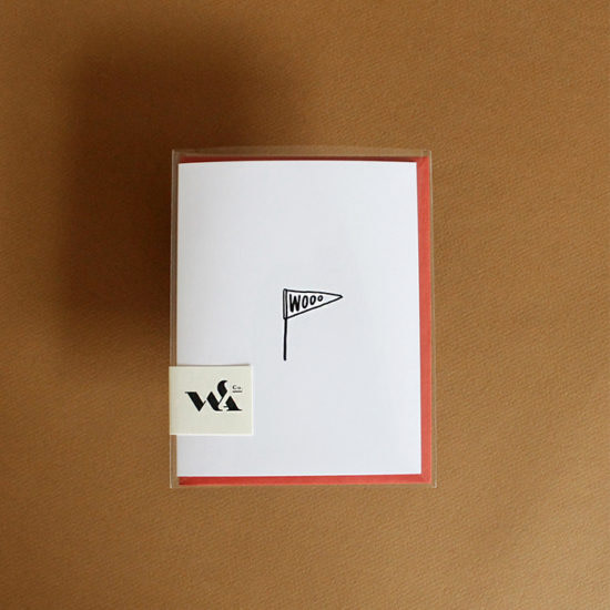
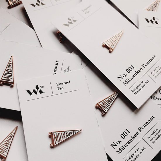
Wit And Co.

Whitney Anderson is graphic designer from Milwaukee, WI, specializing in hand lettering and typography. Whitney set up Wit And Co. in 2016 as her design outlet – a place for her personal creations to live. Whitney has always loved paper goods and now designs her own greeting cards, art prints, note pads, enamel pins and bandanas. Her dream is to create things for others to enjoy just as much as she does. Whitney also works on commissioned illustration and lettering work for brands and businesses, as well as freelance design, branding, and packaging projects.
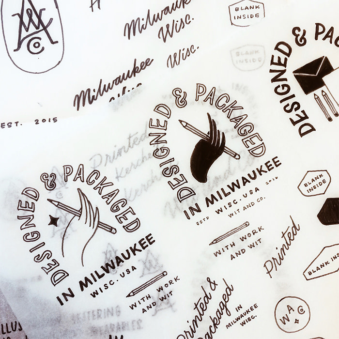
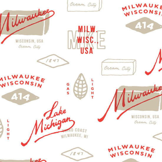
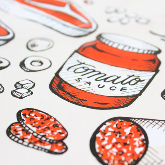
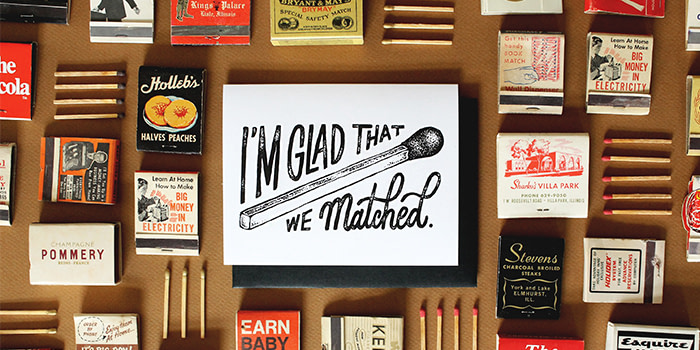
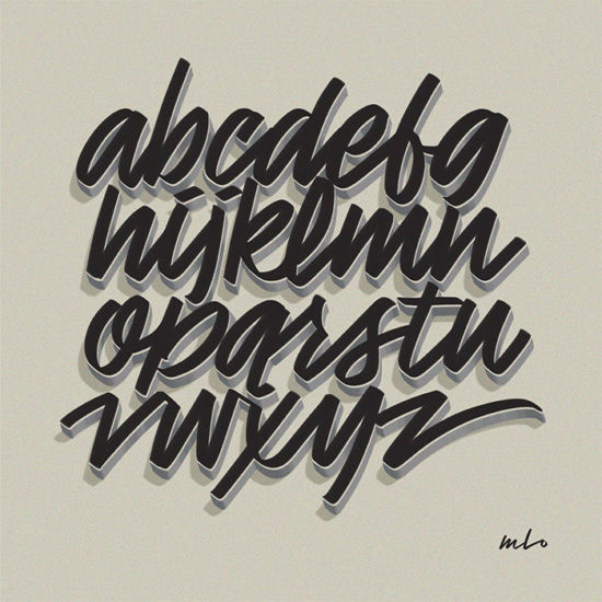
A lot of Whitney’s inspiration comes from antique stores – she loves looking at the typography and illustrations on old packaging, advertising and especially old matchbooks: “you’ll see some common themes in some of my pieces that relate to matches and matchbooks, I’ve just always been drawn to the way that they look and I have a huge collection of old matchbooks and matchboxes that inspire me.”
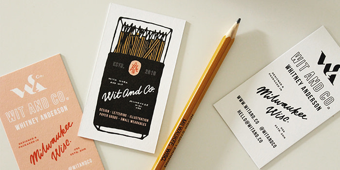
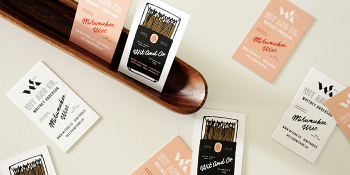


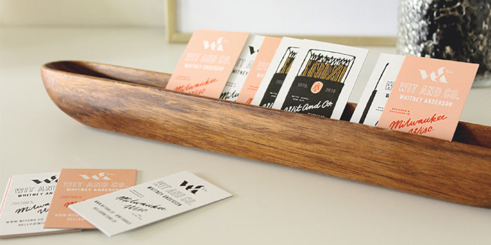
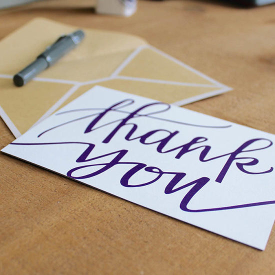
Whitney’s love of matchbooks can also be seen throughout her Business Card designs – she wanted to create something fun that people would want to keep, as well as showcasing her work and skills: “the illustration was inspired by a matchbook (of course) but instead of filling it with matches, I filled it with pencils – one of my tools of choice. The Luxe paper just exudes quality – I love the heaviness and the texture – it really gives off a great first impression! My cards include all the important info and I was able to print multiple designs on the front which is great as I couldn’t decide which one to go for – I couldn’t be more pleased with the result!
Give off a great first impression with Luxe
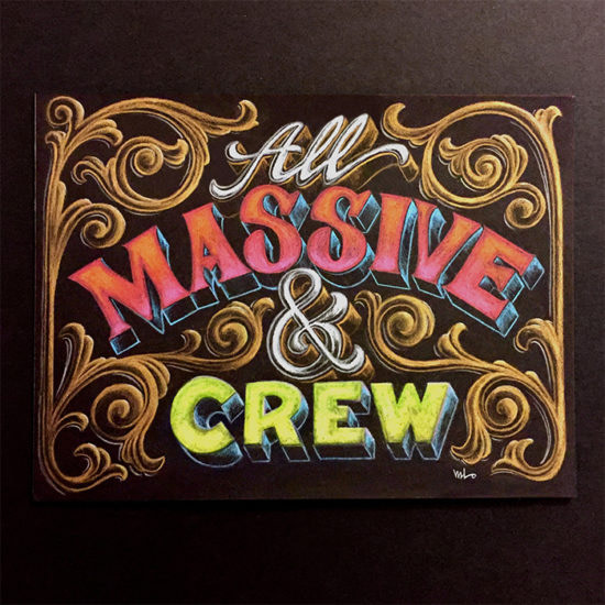
DesignerMike

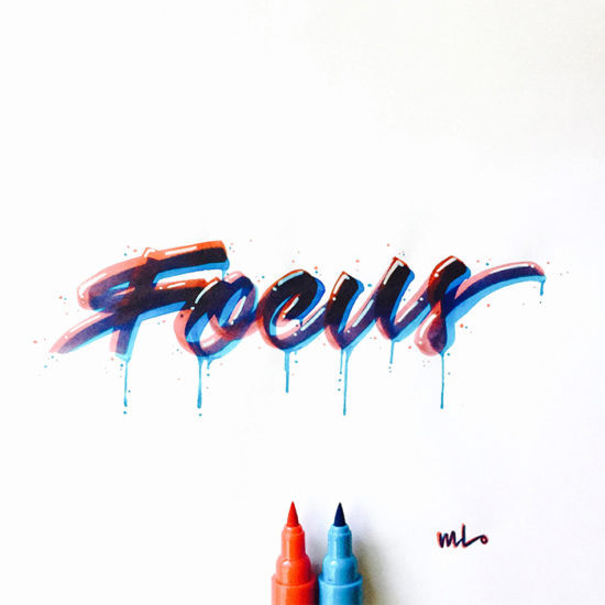
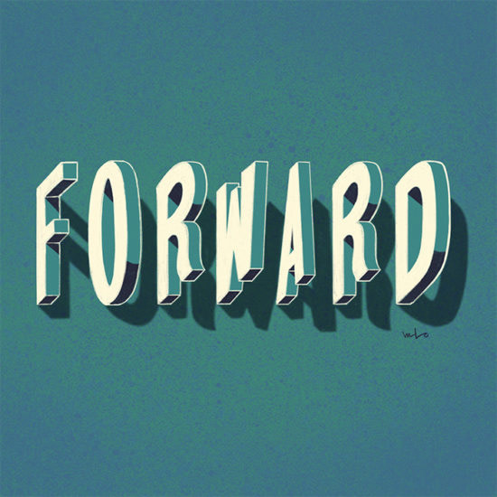
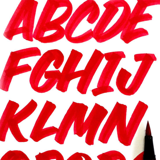
Michael Lopez aka DesignerMike is a graphic designer and lettering artist based in Toronto. Mike helps people who are expanding their business by creating visual identity systems that are “distinct, stylish, and versatile enough to grow with them.” Mike also specializes in hand-lettering and art direction for brand marketing, ads, signage, packaging, labeling, apparel graphics, print publishing, and online content. Before becoming a designer, Mike worked at an international comic book publisher, learning advanced Photoshop and illustration techniques from some of the industry’s top digital colour artists and comic book illustrators.
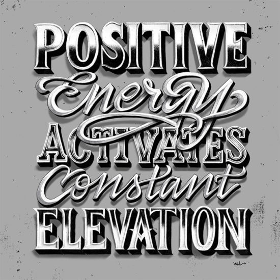
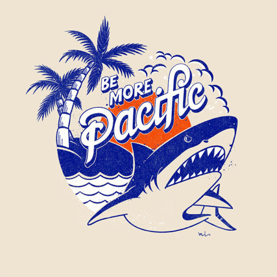
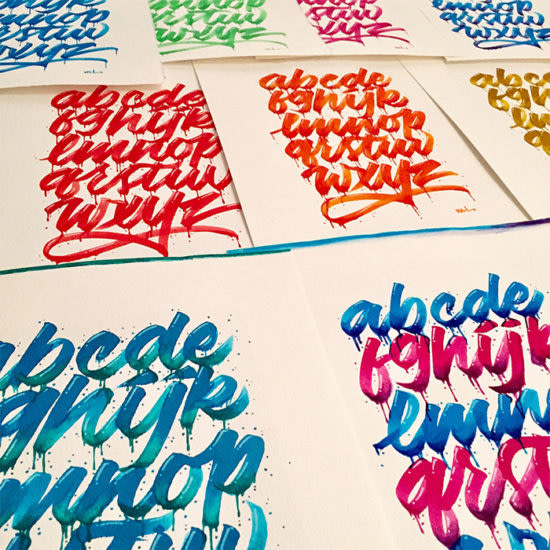
Mike’s inspiration comes from everyday life: “whenever I go out anywhere, I always notice interesting styles and forms of signage, graphics and type.” Back in the studio, Mike likes to surround himself with “niche art and design reference books, good coffee, and some laid-back music.” Over the years, Mike has found that the best way to get inspired is to “keep on making things” and when he’s totally stuck for an idea, he goes back to “practicing foundation skills, like writing out the alphabet, trying to master a technique, or experimenting with different medias and styles.”


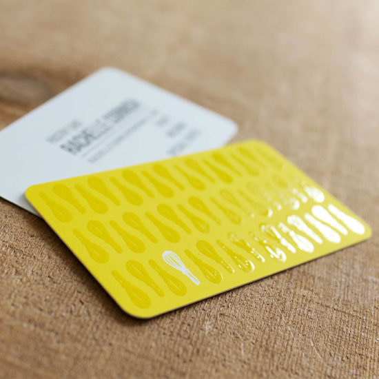
When designing his cards, Mike wanted to create something that was “easy-to-share” whilst also showcasing his “personal script style.” He knew that he wanted to feature an ampersand as it’s his “favorite ligature”, and represents his approach to design: “to appreciate and consider how different elements work both individually and together as a whole.” Mike printed his designs on Cotton – he wanted a “sturdy card with a natural texture” and “loved the fact the paper’s made from recycled shirts” adding that “people usually take one, look at it, rub it, flip it around, then ask if they can have two.”
Magenta&Green
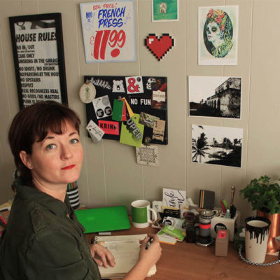
After graduating with a degree in graphic design, Toronto-based Jo Drayton went on to work for a number of studios and agencies with digital and print clients – from website development to magazine publishers – Jo turned her hand to a little bit of everything. Over time, she naturally fell into a project and accounts manager role but craved more design time. Jo now runs her own consulting and design studio – Magenta&Green – allowing her to focus on her love of typography and print. Jo works with calligraphy, offset printing, murals, letterpress, enamel sign painting and packaging.
Piles of inspiration can be found on Jo’s office walls, in her bag and on her iPhone: “I tend to grab print things that speak to me, everything from bar coasters and packaging to art prints and restaurant menus. Thankfully, I’ve also started snapping quick photos of great things I see, so there is a little less clutter now.” When finding inspiration for a particular project, Jo starts by “sifting through the piles to find key pieces” – it can be anything, from anywhere – “a paper stock or a foil on something, signage I saw on a trip or pen I picked up at the art store.”
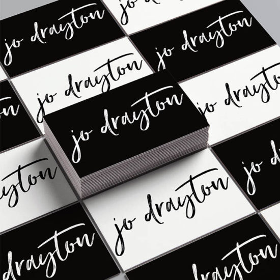
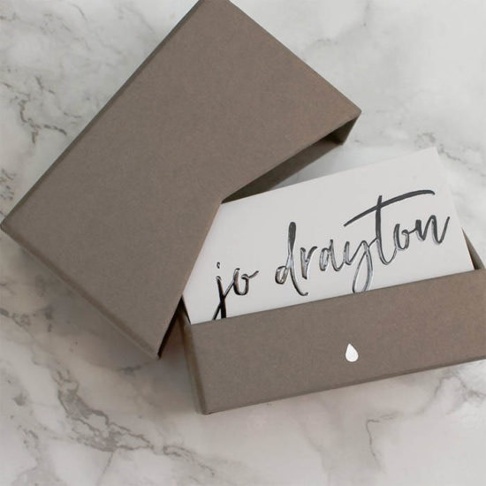
When Jo works in print, her first thought is always “how will it feel?” – “we’ve become so digitally focused – but it can mean that sometimes we forget that our work is there to be experienced.” Business Cards are a crucial part of Jo’s branding: “people still ask me for a card and there’s nothing better than being able to hand something over that represents you and what you do – then getting that little head bob of acknowledgement in return. As a designer, I want people to trust me with their brand, so my cards have to represent me. The Soft Touch finish gave me the right surface feel and the Raised Spot Gloss draws attention to my wordmark, making people rub their thumb over the stock, rotating it to hit the light. I’ve had clients who probably don’t need a card, but take one just to have it anyway (or hopefully pass it on).
Make your brand shine with Raised Spot Gloss
Keep in touch
Get design inspiration, business tips and special offers straight to your inbox with our MOOsletter, out every two weeks.
Share the post
Keep in touch
Get design inspiration, business tips and special offers straight to your inbox with our MOOsletter, out every two weeks.