4 silver foil designs that deserve a gold medal
Here are four creatives who deserve a gold medal for their eye-catching Silver Foil designs.
-
 The MOO Team
Share the post
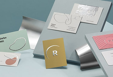
Everything that glitters ain’t gold – but that doesn’t mean it doesn’t deserve to shine. While gold sparks an opulent, rich feel, silver has that more subtle, toned-down elegance that screams (or whispers) modernity and class. And that applies to print, too. Silver Foil brings that extra shine that takes any card to the next level.
Here are four creatives who deserve a gold medal for their eye-catching Silver Foil designs.
Kane Banner: eyes on the prize
Based in Australia, Kane Banner is nothing if not multifaceted. In-house designer for a hospitality group by day, he also freelances for record labels and creates his own designs at kanebanner.com by night. He plays with intricate gothic and metal fonts, retro-inspired illustrations and pop culture references to create designs that catch the eye.
When creating his Business Cards, Kane chose Silver Foil to play with perceptions and the idea of “viewer”. He worked from his Instagram icon, a minimalist eye design and used foil to give it a mirror effect. “Everyone stares into the phone, I wanted to make something that stares back and shocks them […] I used the Silver Foil cards as I needed to stand out and wanted people to be able to interact with the card and hold up to their own eye.”

The square format gives his silver design an almost talisman-like aura, but it’s also ideal to carry. “[My favorite part is] the fact I can slip them in my phone case and give them away on the go. Perfect size.”
Sweet Pea Studio: metallic realness
Laura Carr is the founder of Sweet Pea Studio, where she wears the hats of graphic designer, marketing consultant and lead creative. From logo design to social media and PR, the British studio specializes in branding and marketing strategy, with a commitment to helping businesses reach their full potential.
For her client Niall Williams Sports Massage Therapy, Laura created a set of marketing materials including stunning Loyalty Cards. She chose Silver Foil Business Cards for their attention-grabbing metallic finish – that incidentally also evokes bright new gym equipment. “I absolutely love the finish on these cards. It adds that extra wow factor, even to the simplest of designs.[…] We really wanted to use the Silver Foil against the matte black as it would be super impactful. I created this signature style logo for the client, who has had it printed onto the wall of his studio, so to have matching marketing material with the slick, silver finish was a must!”
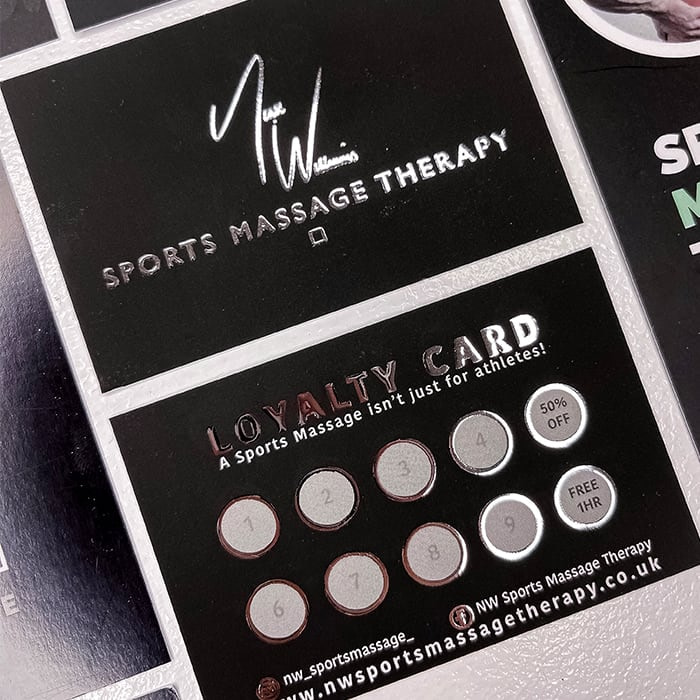
What does she like most about the cards? The contrast brought by the Silver Foil design, that makes the cards stand out in a striking yet subdued way. “I love the way the silver foil shines against the matte black. It’s subtle, but so powerful!”
Bright Spot Papier: beautiful words
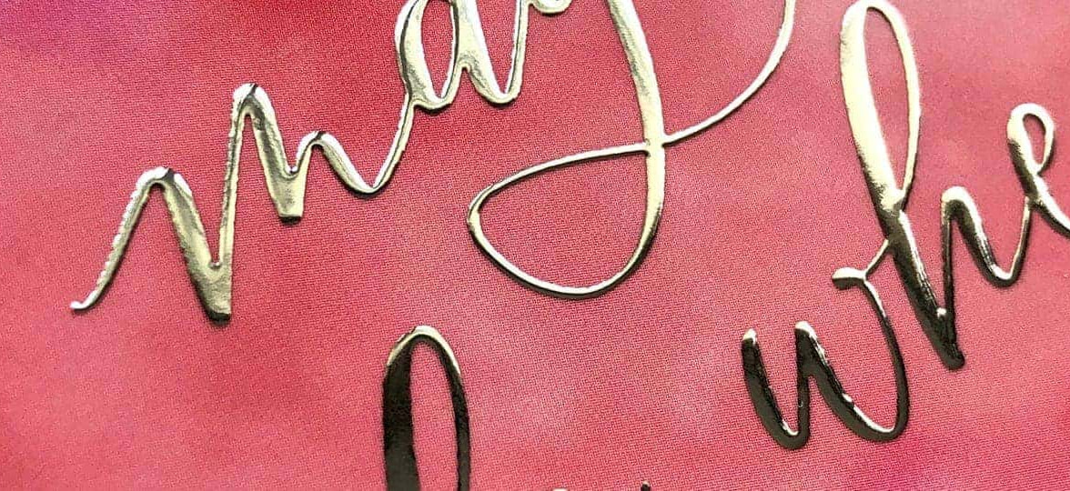
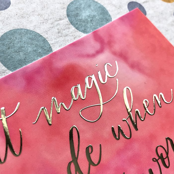
Based on Prince Edward Island, Canada, Tania Pendergast is the mind behind Bright Spot Papier & Art. A calligrapher, illustrator and hand-lettering artist, the beauty of language is at the core of her practice. She describes herself as a “curator of beautiful words”, dedicated to conveying the feelings they evoke through lettering. With her brand Bright Spot Papier, Tania channels the power of words into inspiring artworks and Greeting Cards.
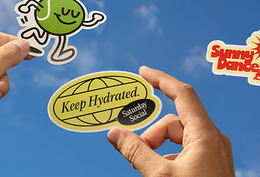
When looking to update her brand’s unboxing experience, Medium Silver Foil Postcards seemed the perfect fit to treat her customers to a beautiful Thank You Card. “I feel that when I package up an order, it’s like sending a gift out in the mail, so joyful details matter. To me, the idea of marrying words with Silver Foil really felt like a beautiful touch. When I send out an order, I wrap each item in my happy polka dot paper, pop in an extra vinyl Sticker and write out a little note too.”
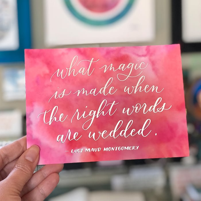
Because words are at the heart of her work, Tania picked them carefully for her Thank You Cards. “I referred to my collection of notebooks full of quotes that I’ve collected over the years. Each time I create a new design, I go in search of words that move me. This time, I chose a quote specifically about words that was by Lucy Maud Montgomery, who was an accomplished and world-renowned author from the province that I now call home (think Anne of Green Gables).” She highlighted them with our shiny Silver Foil to add an extra layer of sophistication to her beautiful calligraphy work.
Her favorite part? “They are just the perfect bright spot to add to each of my orders! I love how they highlight both my calligraphy and my love of words. They are also a size that’s standard for framing (5×7), on a beautiful weight of paper, so they can be displayed if my customers so choose.”
Lindsay Shutt: iconic shine
Lindsay Shutt is a designer and illustrator based in Portland. After starting her career in a design studio, she moved to freelance work, creating powerful visual assets for bands, festivals and record labels around the world. The sense of freedom brought by this new stage in her career inspired her to think outside the box and create bold designs with a purpose. From print to digital design and apparel, she applies her creativity to a variety of mediums for clients from Portland and beyond.
For her Business Cards, Lindsay wanted to add some extra pizzazz to her bold design with a shiny Silver Foil finish. “I love [it] because it’s, in a word, EXTRA! The foil accents really pop and add a wow factor.” Passionate about music, she found her inspiration in iconic female musicians: “I was listening to a lot of female rappers and early 70s female rockers. Suzi Quatro, Mariska Veres of Shocking Blue, Leikeli47 and Princess Nokia in particular. These designs were inspired by dynamic, bold women.”
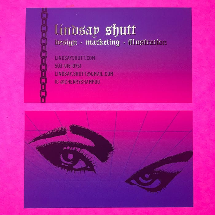
With these fun, colorful foil Business Cards, Lindsay successfully showed off her bold personality and unique style. “My favorite thing about these cards is I didn’t create them with any future employers in mind. I created these cards for me and had fun with them. I can’t wait to design my next set!”
Want the shine without the bling? Create your own silver designs with Silver Foil Business Cards and Postcards from MOO.
Keep in touch
Get design inspiration, business tips and special offers straight to your inbox with our MOOsletter, out every two weeks.
Share the post
Keep in touch
Get design inspiration, business tips and special offers straight to your inbox with our MOOsletter, out every two weeks.