MOO’s branding exercises: fictional brands we wish were real
Get inspired with some of our favorite branding exercises by MOO’s Creative team.
-
 The MOO Team
Share the post
Here at MOO, we think branding is an art form. Through an engaging tone of voice, meaningful visuals and impactful design, you can translate a company’s mission into a powerful brand identity. Conveying a sense of personality through your brand assets takes hard work and a good dose of creativity. Just what our Creative team never lacks.
Over the years, they’ve created a range of fictional brands to inspire you and give you branding ideas for your own business. Get inspired with some of our favorite branding exercises by MOO’s Creative team.
Paw Paw
This fictional healthy dog food company is a real treat. Denoting passion and energy with a warm red that also evokes delicious dog treats. The brand’s color palette is completed by two rich greens that suggest natural, healthy ingredients. These complementary colors make each other – and the brand – stand out with a playful yet trustworthy combination.
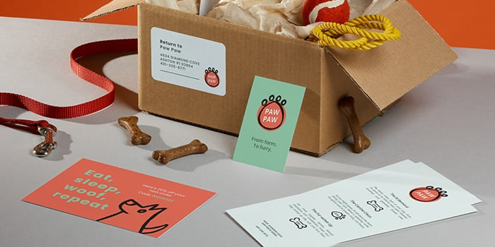
The minimal yet friendly Sans Serif font reinforces this feeling, showing a brand that both prioritizes quality and values fun. The hand-drawn logo and illustrations which can be found on Paw Paw’s Loyalty Cards and Menus wraps up this portrait of a lovable, friendly brand that cares about our four-legged friends.
Paw Paw is one of our Head of Design Millie Davies’ favorite fake brands that MOO has created: “The mix of hand drawn type, clean type, bold colors and illustration makes it very human and also eye-catching. If I had a dog, I would definitely shop here!”
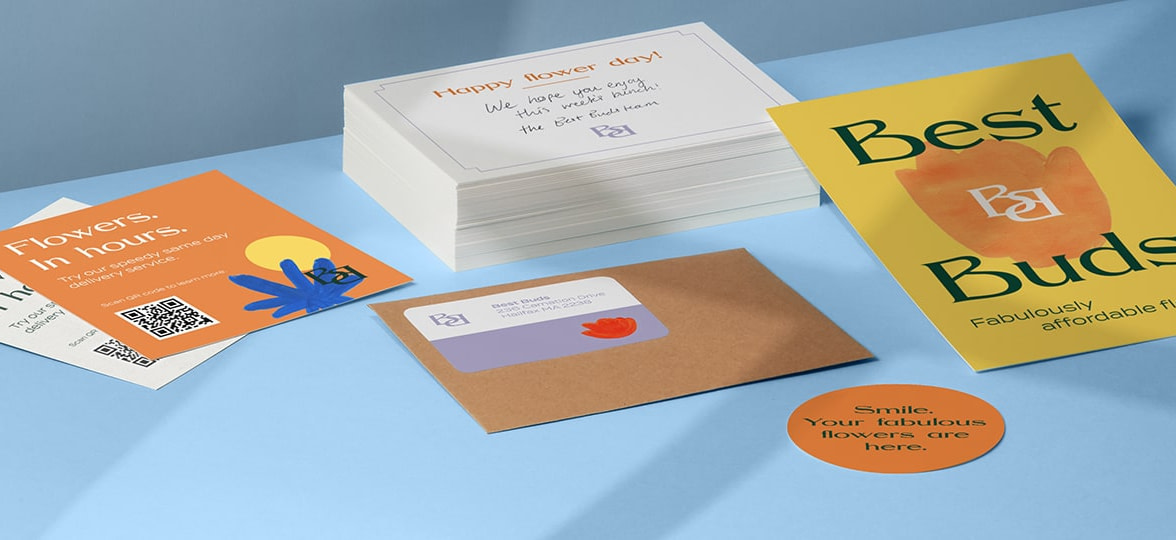
Best Buds
Inspired by the rise of flower delivery services during the pandemic, Best Buds is our very own take on florist branding. For this branding exercise, MOO’s Creative team combined minimalism and Art Nouveau influences to create a sophisticated yet modern brand.
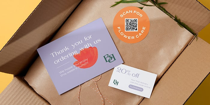
Their print collaterals are adorned with minimalist flowers made of simple brush strokes and vibrant colors and inspired by Matisse’s famous cut-outs. Playing with analogous colors, the brand subtly moves from cold tones to warmer hues, evoking both flowers and the artist’s palette. The double “B” logo borrows its elegant curves from Art Nouveau with a wide Serif font, while body copy uses its minimalist, lightweight Sans Serif cousin to balance out the headline’s opulence.
Phil Bailey, Senior Graphic Designer at MOO, tells us more about his choices for Best Buds: “I wanted to use an elegant art nouveau inspired typeface fit for a modern day florist and came across BN Canyon, which worked perfectly. Pair that with a vibrant color palette and hand painted floral graphic elements to create a bold identity that is rooted in craft.”
Looking for real-life inspo? We met the founder of floral studio Rooted in Rosemary here.
VBQ
This playful vegan barbecue brand plays with the codes of traditional grill food to introduce some plant-based goodness into your summer parties. With a vibrant color palette that evokes barbecue garnish and abstract shapes reminiscent of patties and sausages, VBQ creates a memorable brand universe that subtly modernizes the good ol’ BBQ.

When it comes to type, VBQ is all about conveying a friendly, welcoming vibe. Starting with a textured, charcoal effect typeface for the logo, the brand asserts its place as a barbecue-centric food company. A clean yet warm Sans Serif font makes the main copy both readable and engaging, while tips and notes are written with a hand drawn type that helps the brand cement their identity as a “buddy brand”.
VBQ’s mission is to bring people together and make plant-based barbecue a reality. As a vegan brand, the focus had to be on breaking the misconceptions around veganism being boring and flavorless. That’s why our Creative team designed helpful print materials with instructions, recipe ideas and a range of fun line illustrations of barbecue food to make the brand even more festive and accessible. Fake brand, real fun.
Sancerre
Sancerre is our aspirational skincare company. This fictional brand revisits premium beauty with a soft and elegant approach. With soothing, muted colors borrowing the shades of natural beauty, Sancerre’s color palette has an immediate calming effect – just like their skincare products. The Cocteau-esque line drawing of a face we can find on their Hardcover Notebook and other print products also reflects this taste for simplicity.

Sancerre’s work on typography elevates the brand through subtle font pairing. By sprinkling italic characters into the primary Sans Serif font, our Creative team gave the skincare brand a sense of uniqueness and personality. For subtext such as “skincare” and the website handle, they chose a lightweight typewriter font that highlights the brand’s authenticity and trustworthiness.
Feeling inspired? Bring your branding ideas to life with MOO Business Cards, Postcards, and Stickers.
Keep in touch
Get design inspiration, business tips and special offers straight to your inbox with our MOOsletter, out every two weeks.
Share the post
Keep in touch
Get design inspiration, business tips and special offers straight to your inbox with our MOOsletter, out every two weeks.