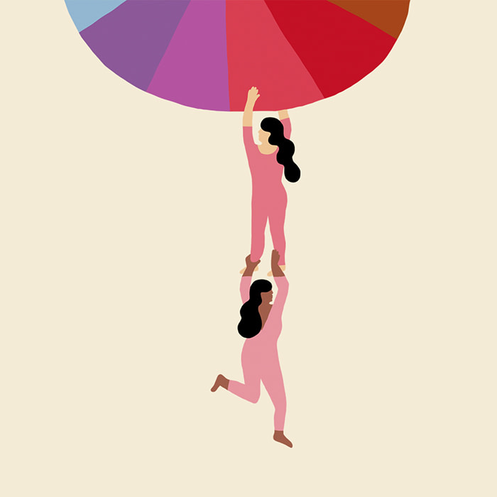
How to choose your business brand color palette
There are many things to consider when choosing your brand’s color palette. Get started with our guide.
-
 The MOO Team
Share the post

From brand color psychology to tints, tone and logo color schemes, we demystify the color jargon so you can get on with the fun part – branding your business.
Why is your brand color palette so important?
For businesses big and small, a color palette is one of the most crucial considerations. Along with your tone of voice, fonts and brand values, your color scheme helps people understand who you are and why you’re here – which, in turn, attracts the right customers to your brand.
“Choosing the right colors for your brand is like putting the right clothes on in the morning,” says MOO’s Head of Design. “It all says something about what you stand for and represent.”
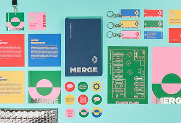
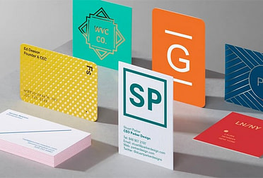
Nailing your brand color palette will help determine the look and feel of your company website, Business Cards, Flyers and any other marketing material – keeping your brand consistent and, in time, recognizable.

Start with some color inspiration
If you’re wondering how to choose colors for your brand, take the time to find inspiration. Start by creating a mood board of any colors and images you feel align closely with your brand identity. You can find inspiration anywhere – from packaging and fashion to nature and interiors.
You can follow artists you admire on Instagram or use Pinterest to create dedicated boards by color. Pinterest is a great resource for pooling content, and by sharing boards with colleagues, you can widen your color inspiration net even further.
Consider brand color psychology
As you do your research, you’ll notice whether you’re drawn to warm or cool colors. Picking colors for your brand shouldn’t be done lightly. The connotations and moods evoked by the hues you’ve chosen should also reflect your brand values and personality.
Color theory is the idea that any hue can be linked to a mood or value. When applied to branding, it’s also known as “brand color psychology”. Some of these links are instinctive, whereas others are a little more subtle. Whichever you choose, they can all have a big impact on how your brand is perceived.
Here’s a rundown of some common color schemes and their associations to help you choose brand colors:
Yellow color palette
This sunny hue is on the warm side of the color wheel and is associated with positivity. Think of the golden arches on the side of a Happy Meal.

Green color palette
From vibrant lime green to rich forest colors and khaki, a green color palette is varied and evocative of nature – like that of Tropicana.

Blue color palette
Blue has the benefit of projecting calmness, making it a sign of stability and especially useful for tech or finance businesses like PayPal, Visa and Samsung.
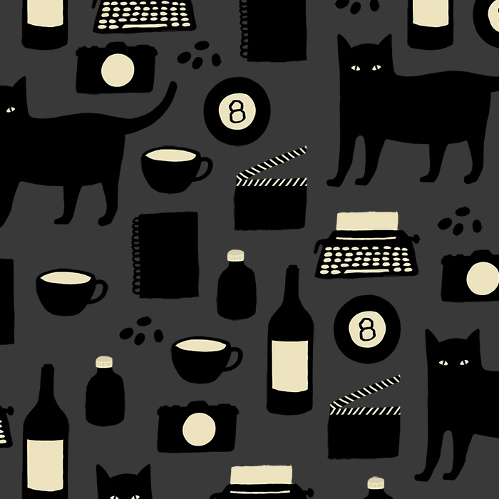
Black color palette
When used well, black can show sophistication. This link has been harnessed by numerous high-end brands, including Prada, Chanel and Gucci.
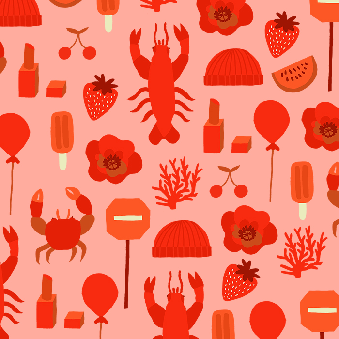
Red color palette
Fiery hues denote excitement, passion and energy. Red Bull is a great example of a brand that has aligned color connotations with their values seamlessly.
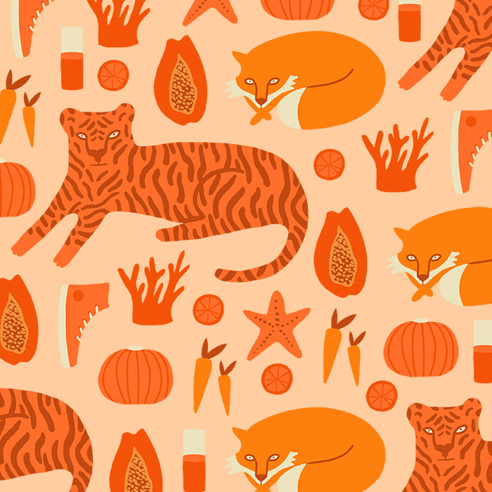
Orange color palette
Orange is an invigorating, warm color that inspires creativity (think of the classic covers of your favorite Penguin books).
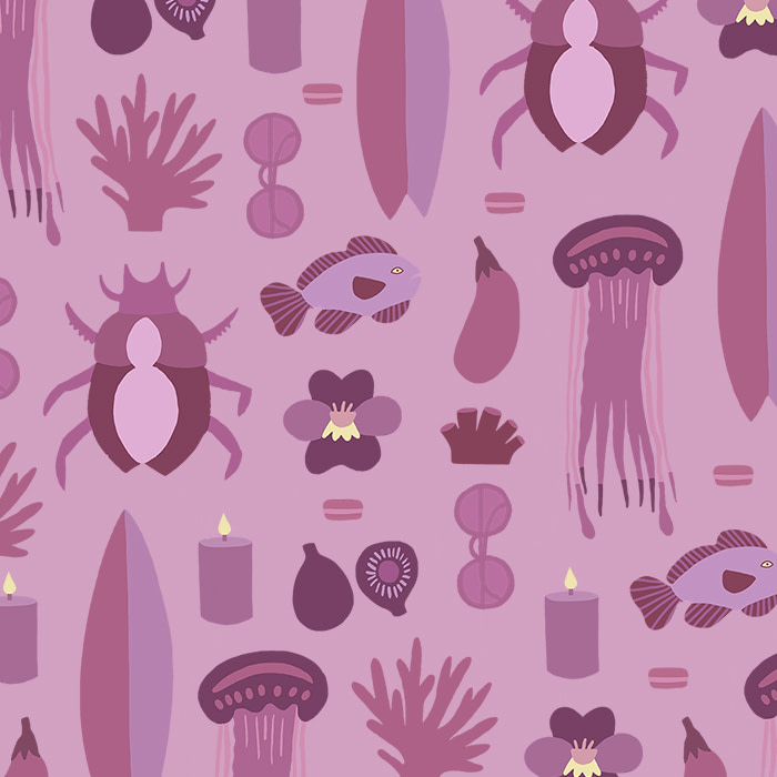
Purple color palette
Shades of purple can evoke luxury, richness and quality. This indulgent hue has been used by many luxury brands such as the premium card makers, Hallmark.
Once you’ve identified a dominant color that projects the right image for your brand, you can decide which accent colors will best complement it to make up your complete brand color palette. This is where the color wheel, along with color theory, really come into play.
Color terminology explained
Once you’ve identified a dominant color that projects the right image for your brand, you can decide which accent colors will best complement it in your brand color palette. This is where the color wheel, along with color theory, really come into play.
-
Color wheel
A visual that demonstrates the relationship between the 12 primary (red, blue and yellow), secondary (purple, green, and orange) and tertiary colors. This is a great tool for finding contrasting and complementary colors, especially if you’re wondering how to decide on your brand color palette.

-
Hue
One of the 12 single colors found on the color wheel.

-
Tint, shade or tone
The different ways of transforming hues into a variety of colors. A tint is a hue mixed with white, while a shade is a hue mixed with black. A tone mixes a hue with black and white.


Creating a mixed brand color scheme
Once you’ve got to grips with the different colors, you can start using your knowledge to build out color schemes. A color scheme is simply the way colors are combined or arranged. Want more inspiration? Check out these eye-catching color combinations.
Monochromatic
A palette comprising just one hue, with different tones or shades. Think Oreo’s different shades of blue.
Analogous
A palette made from colors that complement each other, as seen in agricultural firm John Deere’s brand color palette of greens and yellow.

Complementary
Colors that are opposite each other on the wheel. When used side-by-side they can help you create a stand out color scheme. Think 7 Up’s logo.

Compound
Also known as “split-complementary” this palette takes two adjacent colors on the wheel, and matches them with a color on the opposite side.

Triad
A palette built from three colors taken from evenly-spaced parts of the wheel. Burger King’s red, blue and yellow is a classic example.

Choosing and testing your brand color palette
Once you’ve got to grips with the color wheel and scheme options, it’s time for the fun part – playing around with different palettes based on your dominant colors. You could even test out a few of your favorite combinations.
It’s also worth researching how your business colors compare to your competitors – and whether they’re going to make you stand out – and what your business’s color palette means in a global context. For example, in France and Germany yellow denotes envy, while in the UK green is the traditionally envious color.
Next stop: getting creative with your logo color schemes, Business Cards and website. You could also head to our beginner’s guide to branding for more tips.
Ready to go further? MOO Business Services can help you with all things print and design. With three service plans that cater to different business needs, there’s never been an easier way to make your brand shine.
Simply fill in your details and a member of our lovely team will be in touch.
Keep in touch
Get design inspiration, business tips and special offers straight to your inbox with our MOOsletter, out every two weeks.
Share the post
Keep in touch
Get design inspiration, business tips and special offers straight to your inbox with our MOOsletter, out every two weeks.