Easy design tips to avoid business card fails
Discover our top tips to make your business cards memorable – in the good way.
-
 The MOO Team
Share the post

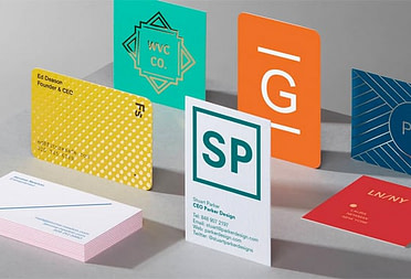
We’ve all seen some beautifully tragic business card fails in our days. We’re probably even still suffering from the WordArt aftermath. But while 3D curved fluo gradient text is a clear no-go for most people, there are other, less obvious mistakes you can make when designing your business cards.
Want to avoid business card mistakes? Discover our top design tips to make your business cards memorable – in the good way.
Think hierarchically
You want to bring focus to the most important information on your card. Think about your ideal scenario once people have your business card in hand. Do you want people to call, visit your website, follow you on social media? The answer should be the most prominent element of your business card – after your name and brand, obviously.

Don’t overload
A common business card mistake is to include every single detail about you. Too much information will drown the essential and make your business cards less striking. Your design needs breathing space! By overcrowding your design with less important details, you’re depriving key information from a prominent place and making the call to action less clear. Plus, potential clients probably don’t need your MySpace.
Sim-pli-fy
Less is more. A business card is a physical product – that means your full site URL or Instagram link are not needed, because no one is going to copy paste them into their browser. Replace your https://www.website.com/ with website.com – we swear people will understand! In the same way, you can use your @accountname for social media just once, especially if it’s the same for all platforms.

Prioritize readability
Another big revelation: business cards are not big (especially if you choose our irresistible MiniCards). An easy business card fail is to prioritize aesthetics over readability. Make sure you use a font that’s not too lightweight and avoid overcomplicated script fonts for small text. The size of your text should also be considered. Check your design at real scale to test how readable it is. Lastly, make sure the color of your text contrasts with the background without blinding the reader. No, bright red on fuchsia is probably not a good idea.

Be consistent
We’ll never repeat this enough: consistency is key! Your business card should represent your brand – even if your brand is just you. Make sure you use the same colors and fonts as your other materials – whether it’s your company branding or your résumé. A lack of consistency doesn’t make your business cards bad, but it makes them less memorable. Your potential clients or employers are more likely to remember you if you tell a visually consistent story.
Use the back
A bad business card is not necessarily an ugly one. Another very common mistake is being too… boring. Yes, your contact information is important, but so is what you’re promoting, whether it’s your coding expertise, your portfolio or your products. Use the back of your cards to show your range. With Printfinity, you can print a different design on the back of every Business Card in a pack at no extra cost. This way, you can showcase your favorite artworks like photographer Steve Carty or add a catchy tagline like on our All About Me template.
Forget about bad business cards! Design your own or use our templates to create memorable Business Cards with MOO. Worried about other potential fails for your business? Check out our guide to avoid packaging mistakes.
Keep in touch
Get design inspiration, business tips and special offers straight to your inbox with our MOOsletter, out every two weeks.
Share the post
Keep in touch
Get design inspiration, business tips and special offers straight to your inbox with our MOOsletter, out every two weeks.