We asked a designer to rebrand three (fictional) businesses
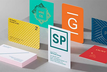
Three Business Cards, reimagined
-
 The MOO Team
Share the post

We’ve all seen those Twitter posts where a brand unveils its new logo. What you often don’t see is all the thought that goes into those rebrands. (Which might explain those “They paid a million dollars for THAT?!” replies.) So we asked our newest designer, Jonathan Davies, to redesign the Business Cards for three fictional brands.
Out with the old
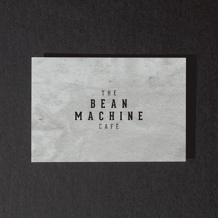
A lot of rebranding is about removing the fluff, the superfluous. That can be tough, especially when you feel attached to every bit of your brand. But it’s not about creating a bare bones version of what you do. It’s about making it feel more professional, more mature. What remains should be clear, instantly recognizable and, let’s face it, look really nice. “With all the designs, I removed a lot of unnecessary textures, graphics and illustrations,” says Davies. “Like with the Bean Machine cards, I took away the textured effect and focused on the typography. You could then bring in real texture through a paper like Luxe.”
Let there be lighter colors
“A few of the old designs are quite gloomy,” says Davies. “Take the Animal Doctors branding. It’s cute. But for a playful brand, it feels a little grey. So for the rebrand, I brought in a brighter palette of reds. Then that pop of color brings a lot of personality to the card.”
For the Christopher Gabriel hair brand, Davies did away with color entirely. “But because it’s now just black and white, it feels a lot clearer and lighter. Bolder, basically. Before you had a photo – which was strong and could work in a different setting, but it obscured the logo. So the new card is more about clarity.”

A new type of typeface
A well-chosen font can bring a huge amount of character to a brand. Again, it’s about focus. “The previous fonts weren’t terrible, but they weren’t working as well as they could. And some felt dated,” adds Davies. “Take the Bean Machine brand again. Just those two words now feel a lot more refined. And because we’ve gone fancy for the main font, I’ve used a sans serif for the ‘coffee and pastry’ strapline, so it’s not fighting against the logo.”
By using bolder, bigger typography, Davies has also been able to have more fun with the words. “Like in the ‘D’ of Animal Doctors, using it as a hidden bone. It’s like a little easter egg. That’s something you see in a lot of big brands – think the Amazon smile or the FedEx arrow. You can still be playful.”

You might have also spotted how Christopher Gabriel’s logo has been “cut off” along the bottom. Instead of just showing a pair of scissors, it’s a more abstract reference to what they do.
“And that’s the thing, really,” says Davies. “It’s about finding fresh ways to show what you’re about.”
Ready to give your own brand an update? Start with your Business Cards. Then share your new look with #hashtagMOO.
Keep in touch
Get design inspiration, business tips and special offers straight to your inbox with our MOOsletter, out every two weeks.
Share the post
Keep in touch
Get design inspiration, business tips and special offers straight to your inbox with our MOOsletter, out every two weeks.