How to design Stickers: 10 mistakes that lead to costly reprints
The 10 sticker fails that lead to reprints.
-
 The MOO Team
Share the post
Stickers are deceptively simple. Small in size, big on impact, what could go wrong? Quite a lot, as it turns out.
When it comes to how to design Stickers, even experienced pros tend to trip over the same print pitfalls. And with bulk orders making every oversight that much more expensive, it’s much better to design out the drama from the get-go.
The good news? Most sticker design mishaps are entirely avoidable. Here are the 10 that cause the most reprints, plus the sticker design tips you need in order to sidestep them.
Table of Contents
- 10 costly mistakes to avoid
- How to make professional Stickers: design checklist
- Good design deserves a good print job
Best practices for Sticker design: 10 costly mistakes to avoid
Thin borders. Low-res images. Too-small text. What might seem like a small error can have major implications for your final print. Get ahead of the game by proactively steering clear of the mistakes below, and spend less money (and less stress) to create standout Stickers for your brand.
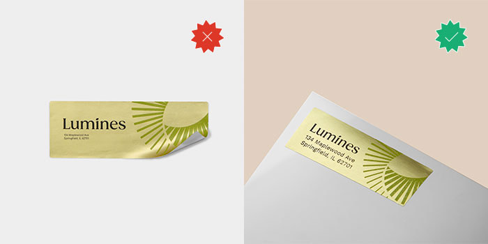
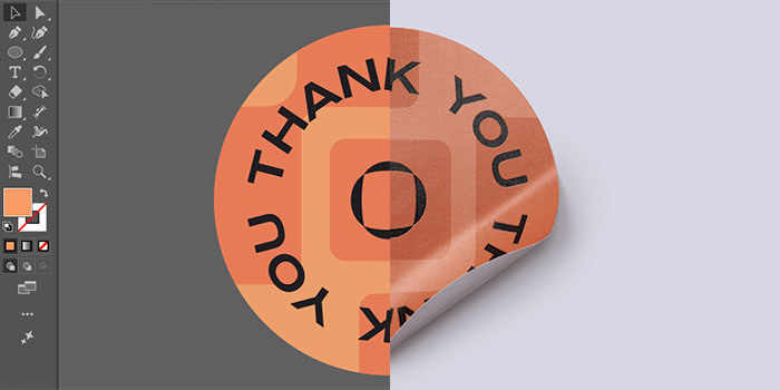
Mistake #1: no bleed in the file
Let’s start with the big one: sticker bleeds.
Bleed is the extra bit of your design that extends beyond the trim line (usually 1/8″ or 3mm). Printing machines are precise but not perfect, with lots of room for slight shifts and variances in the trimming process.
Without a bleed, those tiny shifts result in an accidental white at the edge of your sticker. Let your background run wild past the borders to keep things looking intentional.
Mistake #2: key elements too close to the edge
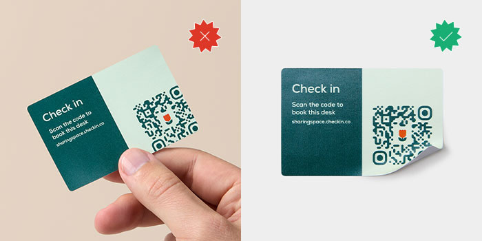
Bleed takes care of the outer edge. The safe zone takes care of the inner one.
Think of the safe zone as your design’s margin of error. Any critical elements – logos, QR codes, or your cleverest copy – should stay at least 1/8″ (3 mm) away from the trim line. It ensures nothing gets clipped and keeps your layout looking balanced, not claustrophobic.
This is especially vital for Die-Cut Stickers. Because custom shapes follow the silhouette of your artwork, a “fussy” cutline with sharp internal angles or tiny jagged points makes your safe zone a moving target. To keep things looking good, simplify your cut path into a smooth “bubble” or offset border. This gives your design breathing room and ensures the sticker is easy to peel without tearing.
Mistake #3: ultra-thin borders
A hairline border frame looks crisp on-screen. In print, it’s a trap.
Any slight variation in trimming will make an uneven border immediately obvious. And the thinner the line, the more it shows. Either use a border thick enough to absorb minor printing shifts, or skip the frame entirely. Both are better than a 0.5pt line that’s going to highlight every imperfection in your final sticker design.
Mistake #4: text that’s too small
Tiny text is the enemy of a great sticker. If you have to lean into your monitor to read your disclaimer or Instagram handle, your customers definitely won’t be able to read it on a laptop or Water Bottle. Always proof your file at 100% (actual print size) before submitting.
MOO tip: keep your body copy above 6pt, and anything you actually want people to read (like your brand name) above 8pt.
Mistake #5: low-resolution images
The 300 DPI isn’t a suggestion – it’s a requirement. Most web images are 72 DPI, which looks great on Instagram but prints as a blurry, pixelated mess.
- Raster (Photos): high-res only, please.
- Vector (Logos/Type): always use AI, EPS, or SVG files. They scale infinitely without losing their edge.
Mistake #6: RGB files sent to a CMYK printer
Screens use light (RGB), printers use ink (CMYK). If you don’t convert your file to CMYK before hitting “upload”, you’re leaving your colors up to fate. This is especially true for saturated blues, vivid oranges, and certain greens, all of which are uniquely prone to shifting in a conversion.
To keep your hues true, convert your file to CMYK before you finish, using Pantone references in areas where brand color accuracy is non-negotiable. You may still see some slight variations, but not the big surprises that might need a reprint.
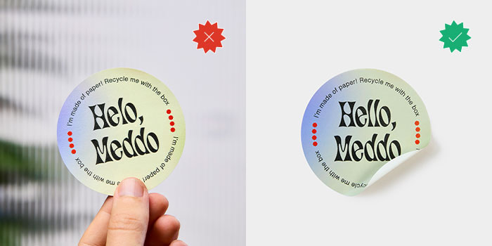
Mistake #7: underestimating contrast
Opaque stock is forgiving. Clear Stickers aren’t. Whatever surface the sticker lands on becomes part of your design, so a light-toned element that looks subtle against white can nearly disappear on a glass bottle or transparent packaging. Keep your design legible no matter what by sticking to bold outlines, solid fills, and/or a white backing – all of which add in contrast and prevent your labels from fading into the background.
Mistake #8: overly-complex details
Ink spreads slightly during printing, and fine details are the first casualty.
When you have incredibly fine lines or intricate patterns on a small sticker, they can bleed into each other and lose definition. If an element feels “busy” at 100% zoom, simplify it. Less is almost always more.
Mistake #9: material as an afterthought
Sticker material changes how your design looks when printed. Matte finishes absorb ink differently than Gloss, which can soften color vibrancy.
- Metallic Stickers interact with light-toned or transparent designs in ways worth testing.
- Coated Paper Stickers keep colors punchy with a semi-gloss finish.
- Matte Paper Stickers give you something softer and more tactile.
With so many variations between materials, you’ll need to decide right at the beginning what you’re going to use. Let design integrity guide your decision. Also pay careful attention to things like durability and the intended use of your sticker, since these are also impacted by printing material.
MOO tip: if your product is refrigerated, ships internationally, or gets handled a lot, waterproof and water-resistant materials are a necessity, not just a nice-to-have.
Mistake #10: not reviewing at 100% before submitting
Before you export, do one final check with your zoom set to 100%. This is exactly how your sticker will look in your hand. If the text is hard to read or the borders feel wonky here, they won’t get better in the mail. Check twice, print once.
How to make professional Stickers: design checklist
Run through this before you submit any file:
- Bleed added (typically 1/8″ / 3 mm beyond the trim edge)
- Safe zone respected, with critical elements at least 1/8″ from the trim line
- No ultra-thin borders near the cut edge
- Text legible at actual size (6pt minimum; 8pt+ for important copy)
- Images at 300 DPI, logos in vector format
- File in CMYK color mode
- Contrast checked for the material and surface
- Fine details simplified for small formats
- Material chosen based on finish, surface, and durability needs
- Reviewed at 100% before export
Good design deserves a good print job
Your design looks great on the screen. Now make sure it prints that way.
Custom Stickers from MOO come in a range of shapes, sizes, and materials, and are made for brands that take the details seriously. And with MOO Business Services, there’s even more support for bigger print needs.
Want to learn more? Fill in this simple form, and one of our team members will be in touch soon.
Keep in touch
Get design inspiration, business tips and special offers straight to your inbox with our MOOsletter, out every two weeks.
Share the post
Keep in touch
Get design inspiration, business tips and special offers straight to your inbox with our MOOsletter, out every two weeks.