Living Coral: designing with Pantone’s Color of the Year 2019
-
 The MOO Team
Share the post
It’s here! Pantone has announced their Color of the Year for 2019: Living Coral. So what does that mean for the world of design in the year ahead?
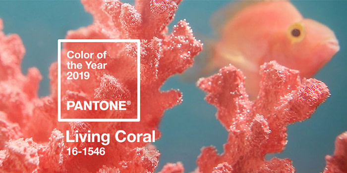
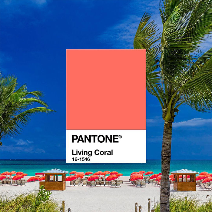
The Pantone Color Institute took to social media to reveal their 2019 Color of the Year is Living Coral, or to use it’s official Pantone code: 16-1546.
Sunsets on golden shores, shells, beaches, tropical coral reefs… just a few things that come to mind when we think of Living Coral.
We can agree it’s a bold and beautiful shade, and certainly a nice evolution from last year’s cosmic purple, Ultra Violet, and 2017’s refreshing Greenery hue.
And, as in previous years, Pantone’s Color of the Year comes with a mission:
“An animating and life-affirming coral hue with a golden undertone that energizes and enlivens with a softer edge.”
What is Pantone Color of the Year?
Every year, the biggest name in color chooses a hue that’s inspired by the year ahead. The Pantone Color Institute do some pretty big analysis during the selection process. Looking at everything from color trends, fashion design, art, interiors, culture and more. The Color of the Year is intended to represent a global snapshot of the year, encapsulated in a single hue.
This year, Pantone have chosen a bold, bright, pink powerhouse – Living Coral – as their color of the year.
So, how will Living Coral be used in design?
Colors can evoke different feelings, meanings and reactions. Although there’s an element of color psychology, our experiences can change our emotions towards certain shades, attracting us to some and repelling us from others.
So, what does this fiery-blush hue mean for the world of design? And how can designers and businesses alike incorporate this bold tone into their projects in the coming year? We chatted to three of our MOO designers to find out.
Living Coral in graphic design
Em Stokes, Graphic Designer

If I’m completely honest, my initial reaction to Living Coral was apprehensive! I first thought it was kind of dated; ‘80s coral swimsuits, lipstick and nail varnish and other fashion trends, but then I considered how I’ve used coral and similar peachy tones in color palettes. It’s a really positive, uplifting color with a freshness to it.
The name Living Coral naturally makes me think of beautiful coral reefs and the multitude of tropical sea creatures living in those surroundings. It makes me think of nature and the impact that other warm colors have on us emotionally. I feel like coral exudes warmth and has connotation of humanness and protection, making it quite comforting.
I’ve also heard that 2019 is the year of the pig in the Chinese zodiac. Colors that are considered lucky and influential in 2019 are all from the fire element, including pink, orange and red – all warm colors within the same realm as coral.
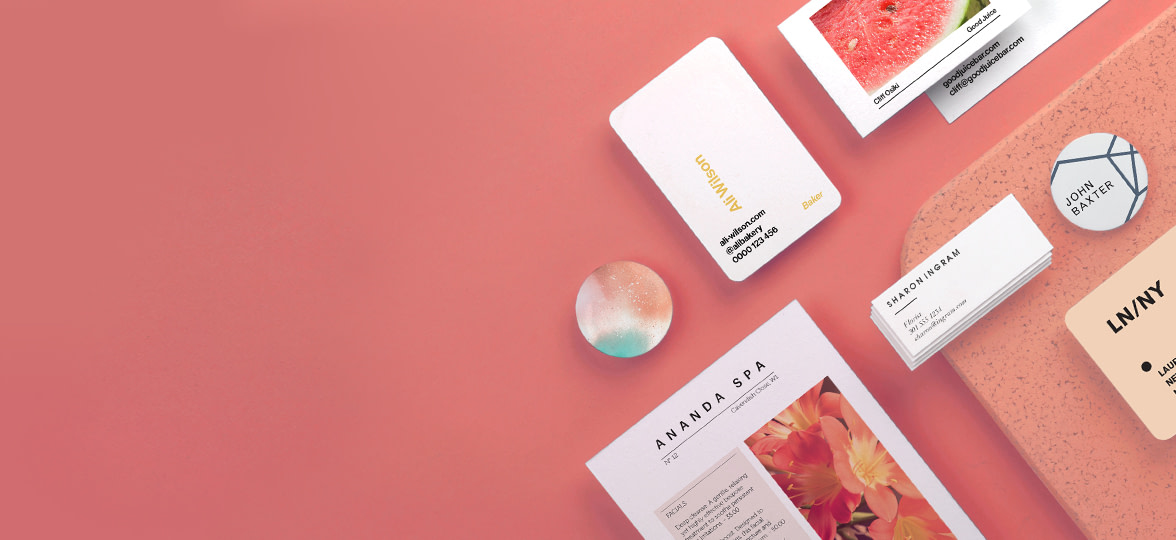
Living Coral will work great in Graphic Design. It looks amazing with pretty much any tint or shade of blue, and together they create a kind of idyllic feeling of positivity and lightness. This could be beneficial in design, maybe as a visual relief from the sometimes serious aspects of life.
Try mixing Living Coral and blue in your Business Card designs.
Product design’s take on Living Coral
Javier Ferrer, Product Designer

When I think of the color coral, my instant reaction is that it transports me somewhere I know, a familiar place, where it’s warm and bright.
To tie the color coral to a particular memory, it reminds me of visit to the Hortus Botanicus in Amsterdam where the vivid coral walls work magnificently against the green foliage in the foreground. It’s a beautiful scene, and I definitely recommend a visit. It also brings to mind that familiarity of the beach, at sunset, on the Mediterranean coast.
Coral is a bold, stand out shade that works well against both dark and light colours. This makes it extremely versatile in its application. I could see this being used in accents and details on a range of products to make them part of a collection, or to create an easily recognizable, stand out brand color palette.
Use Living Coral as part of your brand palette. Design your print products now.
The view on Living Coral from UX design
Byron Fernandes, Lead Experience Designer

When I think of Living Coral, I’m imagining myself lying on a sunny beach under a palm tree, sipping a cocktail the same color out of a coconut. It’s bold and playful, yet somehow relaxing and reassuring at the same time. Maybe I’ve been tricked into it by the name ‘Living Coral’, but I’m definitely getting tropical vibes.
Have you ever seen a pig blushing? I have. This is the exact colour of their cheeks. I do have to say though, I think Monzo got here first – the colour is strikingly similar to their iconic ‘hot coral’ bank cards that I see all over the place here in the UK.
I can see this being a great color for building a brand, but be mindful when using it on your interfaces. It’s quite lively, so too much of it might distract the users’ attention. Putting key actions in this color could help to make them more prominent, but make sure there’s enough contrast with any text you put over it so that it’s easy enough to read!
Want to stand out from the crowd? Use Living Coral for the key details on your Business Cards.
Kicking off the new year with a business rebrand? Check out these tips.
Keep in touch
Get design inspiration, business tips and special offers straight to your inbox with our MOOsletter, out every two weeks.
Share the post
Keep in touch
Get design inspiration, business tips and special offers straight to your inbox with our MOOsletter, out every two weeks.


