4 tips for consistent branding (and why it matters)
Learn more about the importance of brand consistency and how to make your branding more effective.
Establishing a strong brand identity that’s immediately recognizable is key to growing as a business. If people know who you are and what you stand for as a brand, they’re more likely to trust you – and become a customer. That’s why brand consistency is an essential when it comes to building awareness around your products and services.
Learn more about the importance of brand consistency and how to make your branding more effective with our pocket guide.
Why brand consistency matters
Let’s start with the basics: what exactly is brand consistency? It’s the sense of continuity and familiarity of your brand across assets, channels and time. It has a lot to do with being recognizable and giving a clear image of your brand to your audience. Despite external trends and changes in the business, your core identity as a brand should remain consistent and manifest itself through your communications.
Consistency offers many benefits for your brand. On top of helping you build awareness through immediately recognizable branding, it helps build trust through the notion of permanence. By being consistent, you’re showing your customers that you’ve put thought into building a brand that reflects your values, and that you won’t be fickle with them. Consistent branding helps you control how you’re perceived as a brand, and helps your audience better understand who you are, what you stand for, and how you can help them.
Ready to get started? Make your branding even more effective with our tips for consistent branding.
Create a brand book
The first step to consistent branding is to document it. A brand book is a document that gathers your branding guidelines for all channels to ensure your internal and external communications remain consistent and harmonious.
Your brand style guide should contain your graphic charter – logo, color palettes, fonts and more – as well as your tone of voice guidelines. You can also include dos and don’ts and brand consistency examples to help your team better understand how to use brand assets. Giving some of your employees the title of brand guardians can also help ensure your brand guidelines are communicated clearly and consistently, and people know who to ask questions.
Check out our tips on branding a new business here.
Adjust your branding to different channels
Being consistent as a brand doesn’t necessarily mean showing exactly the same thing on each and every one of your channels. The way you show your brand on social media shouldn’t be exactly the same as how you look and sound in internal comms, in newsletters or on print products. It’s all about creating a sense of familiarity.
Brand consistency shouldn’t jeopardize your marketing objectives. That’s why it’s essential to adapt your brand guidelines to follow the best practices for every channel. You should be recognizable as a brand, yes, but the format, layout and actual content of your assets should make sense for your audience on the specific channel.
Plan your campaigns carefully
Seasonality, market trends, competitors, new content formats… There are many (many) things to think about when planning a campaign, especially if it’s on several channels. Make sure you stay relevant to your core identity as a brand, and that your marketing choices still reflect it in an authentic way.
Consistent branding is not just about sticking your logo on every communication. It’s about what makes sense to you as a brand. The key is to look and sound like you in everything you do. If your brand is all about expertise and trustworthiness, a TikTok challenge might not be the way to go. However, if you’re a small creative business, a highly visual channel like TikTok could be just what you need to spread the word about your products.
Make templates
Create templates for your brand! It might seem like a hassle at first, but trust us, it’s bound to pay off. Making templates for different channels and types of communications could make everyone’s life much easier when preparing your next campaign – and will also help you stay consistent. Logo, fonts, colors… Create assets for various scenarios that you can easily adapt to your current needs. You won’t have to start from scratch every time.

Having editable templates available will not only help with keeping a consistent branding, but also make any brand refresh much easier for you to plan for. On top of ensuring brand consistency, these examples will give you an overview of all the types of assets you create, and help you assess which ones are still relevant and which ones need a little spruce. Now get out there and show yourself off!
Now you know more about the importance of brand consistency, create your own suite of print products with MOO.
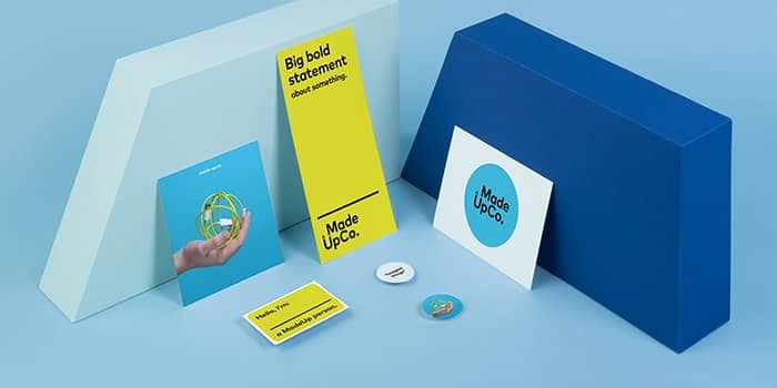
Here at MOO, we think branding is an art form. Through an engaging tone of voice, meaningful visuals and impactful design, you can translate a company’s mission into a powerful brand identity. Conveying a sense of personality through your brand assets takes hard work and a good dose of creativity. Just what our Creative team never lacks.
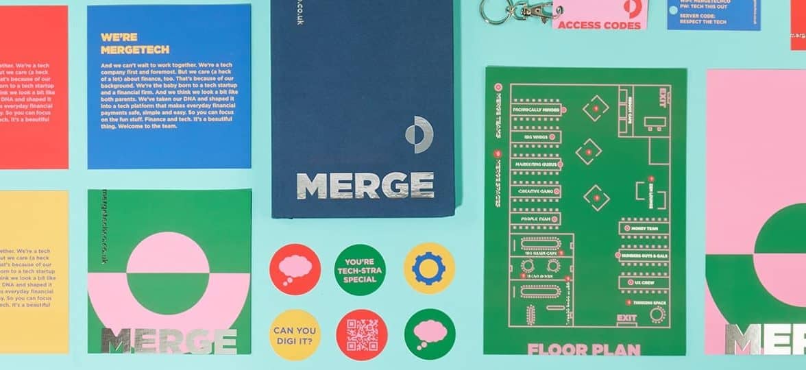
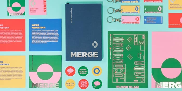
Over the years, they’ve created a range of fictional brands to inspire you and give you branding ideas for your own business. Get inspired with some of our favorite branding exercises by MOO’s Creative team.
Paw Paw
This fictional healthy dog food company is a real treat. Denoting passion and energy with a warm red that also evokes delicious dog treats. The brand’s color palette is completed by two rich greens that suggest natural, healthy ingredients. These complementary colors make each other – and the brand – stand out with a playful yet trustworthy combination.
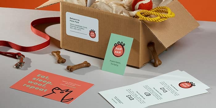
The minimal yet friendly Sans Serif font reinforces this feeling, showing a brand that both prioritizes quality and values fun. The hand-drawn logo and illustrations which can be found on Paw Paw’s Loyalty Cards and Menus wraps up this portrait of a lovable, friendly brand that cares about our four-legged friends.
Paw Paw is one of our Head of Design Millie Davies’ favorite fake brands that MOO has created: “The mix of hand drawn type, clean type, bold colors and illustration makes it very human and also eye-catching. If I had a dog, I would definitely shop here!”
Best Buds
Inspired by the rise of flower delivery services during the pandemic, Best Buds is our very own take on florist branding. For this branding exercise, MOO’s Creative team combined minimalism and Art Nouveau influences to create a sophisticated yet modern brand.
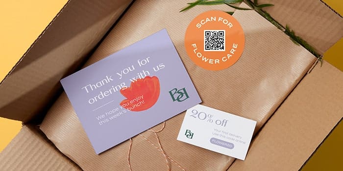
Their print collaterals are adorned with minimalist flowers made of simple brush strokes and vibrant colors and inspired by Matisse’s famous cut-outs. Playing with analogous colors, the brand subtly moves from cold tones to warmer hues, evoking both flowers and the artist’s palette. The double “B” logo borrows its elegant curves from Art Nouveau with a wide Serif font, while body copy uses its minimalist, lightweight Sans Serif cousin to balance out the headline’s opulence.
Phil Bailey, Senior Graphic Designer at MOO, tells us more about his choices for Best Buds: “I wanted to use an elegant art nouveau inspired typeface fit for a modern day florist and came across BN Canyon, which worked perfectly. Pair that with a vibrant color palette and hand painted floral graphic elements to create a bold identity that is rooted in craft.”
Looking for real-life inspo? We met the founder of floral studio Rooted in Rosemary here.
VBQ
This playful vegan barbecue brand plays with the codes of traditional grill food to introduce some plant-based goodness into your summer parties. With a vibrant color palette that evokes barbecue garnish and abstract shapes reminiscent of patties and sausages, VBQ creates a memorable brand universe that subtly modernizes the good ol’ BBQ.

When it comes to type, VBQ is all about conveying a friendly, welcoming vibe. Starting with a textured, charcoal effect typeface for the logo, the brand asserts its place as a barbecue-centric food company. A clean yet warm Sans Serif font makes the main copy both readable and engaging, while tips and notes are written with a hand drawn type that helps the brand cement their identity as a “buddy brand”.
VBQ’s mission is to bring people together and make plant-based barbecue a reality. As a vegan brand, the focus had to be on breaking the misconceptions around veganism being boring and flavorless. That’s why our Creative team designed helpful print materials with instructions, recipe ideas and a range of fun line illustrations of barbecue food to make the brand even more festive and accessible. Fake brand, real fun.
Sancerre
Sancerre is our aspirational skincare company. This fictional brand revisits premium beauty with a soft and elegant approach. With soothing, muted colors borrowing the shades of natural beauty, Sancerre’s color palette has an immediate calming effect – just like their skincare products. The Cocteau-esque line drawing of a face we can find on their Hardcover Notebook and other print products also reflects this taste for simplicity.

Sancerre’s work on typography elevates the brand through subtle font pairing. By sprinkling italic characters into the primary Sans Serif font, our Creative team gave the skincare brand a sense of uniqueness and personality. For subtext such as “skincare” and the website handle, they chose a lightweight typewriter font that highlights the brand’s authenticity and trustworthiness.
Feeling inspired? Bring your branding ideas to life with MOO Business Cards, Postcards, and Stickers.
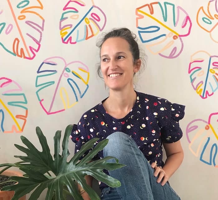
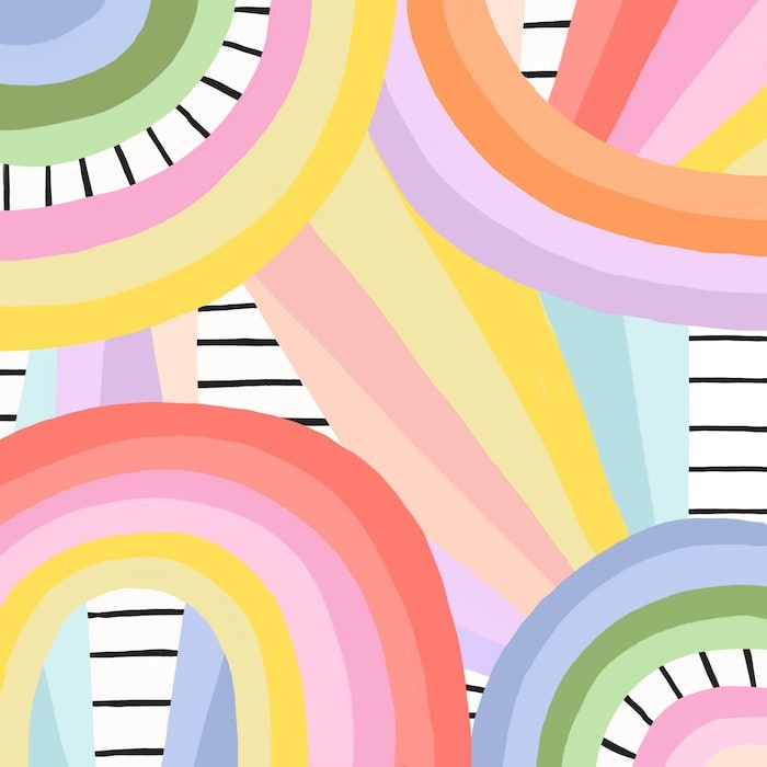
When Brook Gossen started creating again after a long hiatus, she didn’t know she’d soon see her colorful pattern designs live on clothing, stationery, and packaging all over the world. Inspired by the little joys in life, her playful designs ooze happiness and positivity. And she’s not afraid to share the love with a new art challenge.
We met Brook Gossen to talk about her journey as a surface designer and how she developed Let’s Play with Patterns, an art challenge encouraging creators to experiment with pattern design.
Tell us a bit more about yourself and your background. Where does your love for pattern design come from?
Hi! I’m Brook, an illustrator and surface designer based in Brisbane, Australia. I create colorful, feel-good designs, and pretty much just hope to brighten your day. Many of my artworks are made digitally, but I also love playing with paint and scissors and paper. My designs can be found on all sorts of products, like fabrics, clothing, greeting cards, chocolate packaging and album art to name a few!
I studied fine art at university in my early twenties but didn’t complete it, as an opportunity arose to move to the Philippines for work. I’m so glad I took that opportunity because, although I didn’t really enjoy the work, it’s where I met my husband! We lived there for a number of years and then moved back to Australia to start a family. I wasn’t creative at all during that time, and I missed it.
I took lots of courses, made lots of crappy art, and just kept working on improving my skills
Once time allowed it I started creating again, however it felt like I needed to relearn everything, and I had lost all confidence in my work. So, I took lots of courses, made lots of crappy art, and just kept working on improving my skills. It was during this time that I discovered patterns, via a course I was taking – I was asked to complete a brief for a rug design. My head exploded – my art on products? It opened up a whole new world for me. My rug design won the brief, was manufactured and it still lives on my bedroom floor. It’s a great reminder of where I came from and how I got started.
Fabric, stationery, packaging… Your work lives on a variety of surfaces. As a pattern designer, do you have a favorite “destination” for your art?
It never grows old seeing my designs on products, and I pinch myself every time! I would have to say my favorite destination for my art is clothing. It’s amazing to me that people want to wear my art on their bodies as a form of self-expression. Wow!
Your art has a joyful, fresh feel to it. How do you find the inspiration for pattern design?
I try to take the time to enjoy the little things in life as often as I can, and they inspire my practice. Since having three kids, time just seems to fly; and over time I have realized that what makes me truly happy is moments, and experiences rather than things. It can be as simple as just enjoying the clouds in the sky or picking a flower on my morning walk. I then take those moments and experiences and try my best to express them in my art.
Your colorful work is followed by more than sixty thousand people on Instagram alone. How did you build such a vibrant community?
Well, it sure didn’t come overnight! I’ve had my Instagram account since 2013, and have posted my art since 2016. It has taken time, persistence, consistency and some luck I guess. I try not to look at numbers, turn off like counts, and I don’t look at the likes on other posts. This allows me to enjoy being on Instagram and create, share and not compare. I create because I need to, to feel happy and fulfilled, and hope that people who see my work in their feeds might just stop scrolling for a second and smile. Being able to purchase my designs on products has definitely helped build that community too, and I’m incredibly grateful as it has brought me some wonderful opportunities.
You did the 100 days project a few years back, and you’ve just launched the first edition of Let’s Play with Patterns with other creatives. What do you like most about art challenges?
I love taking part in art challenges and have discovered lots of other incredible creatives that way. When I started my first 100-day project, it helped me make a commitment to share my work and hold myself accountable, even while still finding my voice. It made me show up, even when I was finding it challenging. Participating in challenges allows me to step outside of my comfort zone and try new things, experiment and play, all of which helps us grow as artists.

Can you tell us more about Let’s Play with Patterns? How did you come up with the idea?
Let’s Play with Patterns came about as a way to give back to the amazing community I am a part of. As I mentioned, I love participating in challenges, and love how the hosts share their favorites to their stories and foster a spirit of community, creativity and inclusivity. Anyone at any stage can participate and it doesn’t matter how many followers you have or how much experience. It allows us to give something a go and connect with other like-minded creatives.
I love participating in challenges, and love how the hosts […] foster a spirit of community, creativity and inclusivity.
I first had the idea last November to create a challenge for surface designers, and one that was a little different from the usual pattern design prompts, however, I was just too busy to make it happen at that time… A couple of months ago I decided to push through and do it no matter how busy I was, and I’m so glad I did!
With four prompts in a week and no restrictions on style or mediums, Let’s Play with Patterns gave more time and freedom to participants. Why was making this challenge inclusive important to you?
Making the challenge inclusive was incredibly important – I didn’t want anyone to feel like they couldn’t participate. We all start somewhere, and it’s really fun to look beyond your art and see it on a surface, or a product. Surface design is not limited to one medium – it can be from your iPad, a collage, a painting, or even quilting and photography. It’s great to help other creatives see the potential their art has!

How did you select winners for this edition?
For the three prize winners, we wanted to choose artists who contributed strong designs for each of the prompts. We – the hosts – all selected our favorites and then voted. We narrowed it down to a final few then took a final vote. The winners for this edition were Gwendoline Lefeuvre, Miou Studio and Claire Iglesias.
For the remainder of the designs to be chosen for the Postcards, we selected our favorite designs from each prompt, checked if they’d submitted designs for all four prompts and then voted on those too. Phew! It was amazing to see the quality of work that came in – and for those that missed out, keep going! It was so incredibly difficult to choose. Please don’t be discouraged, your work is amazing!

The winners are going to receive a set of MOO Postcards with their entry, the hosts’ designs and other favorites from the challenge. What do you hope to convey by bringing an online competition into the physical space?
Seeing one of your own designs on a product is just the best thing ever, it never grows old. So it’s exciting to be able to offer the chance for our participants to see their designs on a product! It can take a while to hone your style, build your portfolio, and get your designs out into the world and onto actual products – so having little boosts like this along the way can help keep you going.
Seeing one of your own designs on a product is just the best thing ever

Any plans to make Let’s Play with Patterns a recurring challenge with your co-hosts?
Definitely! We’ll do it around the same time next year. I’d love to have the same group of hosts: Zoe Wodarz, Ilana Griffo, Mable Tan, Ryhia Dank, Whimsy Kaleidoscope, Hufton Studio, and Kasey Rainbow. We’re all pretty busy though, so if time doesn’t allow it, then we’ll see who else might like to join. We’d love to offer a fabulous MOO prize again!
Do you have any other exciting projects coming up you’d like to share?
A new just-released favorite is Art x Scrubs, who design ethical, sustainable and super comfy scrubs and socks, all designed by Australian artists. I have a couple of phone cases coming with Casely and the first one will be released in August. I also have a packaging design project for an Australian startup called How We Roll launching very soon and eeep! Some dungarees for Lucy & Yak!
What piece of advice would you give to aspiring pattern designers?
One of my favorite quotes is “don’t think about making art, just get it done. Let everyone else decide if it’s good or bad, whether they love it or hate it. While they are deciding, make more art” by Andy Warhol. Just show up and create and keep on creating. And don’t compare. There’s enough room for all of us.
From Postcards to Custom Notebooks bring your pattern designs to life with MOO products.
The influence of Bauhaus on graphic design today is undeniable. Inspired by the modernist approach to architecture, art and typography, we tasked one of our in-house graphic designers, Philip Bailey, to recreate the MOO logo with five iconic Bauhaus treatments.
How is your personal style influenced by Bauhaus design?
For me, the stylistic elements of using clean lines, minimalism and block primary colors has really shaped how I design. I love experimenting with stark contrasting colors and the interplay of geometric shapes, while still maintaining the sense of logical simplicity that the Bauhaus style is known and loved for.
Talk us through how you approached the Bauhaus logo brief
The Bauhaus movement has had a ripple effect across so many industries – architecture, graphic design, art and product design – that if you work in the creative industry, it’s impossible not to feel the current. That’s what I wanted to really demonstrate in the execution. I focused on five influential figures, with varying disciplines across the Bauhaus school, then created a “Bauhaus” logo that really speaks to the role they played in bringing this movement to life across the industry.
Redesigning the MOO logo
In the style of Herbert Bayer
This logo is influenced by Bayer’s iconic 1968 “Bauhaus Poster”, which was created to celebrate 50 years of the movement. He depicted shapes in a mixture of flat, faceted and 3D forms in the distinctive primary color palette that is totally characteristic of his style.
For my own Bauhaus design, I wanted to distill Bayer’s playful interaction of shape and color into one simple, colorful logo. I created a 3D effect for the MOO drop and at the center of the “O”, then combined the drop with Bauhaus style typography to create the letter ‘M’. Although this design is inspired by Bauhaus, I also wanted to incorporate MOO’s passion for print. To do this, I overlapped the rectangles underneath the logo to create the subtle idea of mixing colors.

In the style of Marcel Breuer
This logo is influenced by a physical object rather than a piece of Bauhaus graphic design work. Breuer’s iconic 1925 Wassily Chair was a revolutionary innovation in the design world due to the use of tubular steel as a material – which had never been seen before. The design itself is inspired by bicycle frames, and I just love that idea of bringing a practical object indoors and transforming it into something functional, but still aesthetically brilliant.

The design of the chair is very linear, so I’ve duplicated the logo to create the effect of a frame, and then made it into one continuous line – similar to what Breuer would use in his furniture. I added a gradient to create a sense of physicality, and mirrored his use of leather panelling for the seat and back by mounting the type on a black silhouette.

In the style of László Moholy-Nagy
Moholy-Nagy is well known for his abstract style of work in fine art, so for this logo I wanted to recreate how he explores light and spatial relationships between shapes and colors.

True to his style, I included crossing lines to create an “M”, then added in geometric shapes to create the “O”s and MOO drop. His palettes are usually much more muted than the primary colors we often associate with the Bauhaus design style, so for this logo I selected more earthy tones, then overlaid different shades to create his characteristic impression of depth and scale.

In the style of Walter Gropius
The Bauhaus school building is the epitome of minimalist, functional architecture, so I wanted to celebrate the iconic design from Gropius in a really stripped back version of the MOO logo.

Gropius adhered to the International Style, designing buildings to be constructed from key materials like concrete and glass. In this logo, I’ve emulated the Bauhaus building by mounting a lowercase “Universal” inspired font on a stone-colored simple rectangle, mirroring the angular nature of Bauhaus-style buildings. For the type, I also included a stacked format with an offset shadow effect, to recreate the visual identity of the school.

In the style of Josef Albers
Albers’ famous “Homage to the Square” work felt like the natural place to draw inspiration from, as it encapsulates perfectly his playful, experimental approach to color theory. By layering paper, he created different geometric patterns, tonal and contrasting palettes and optically compelling executions.

For this Bauhaus-inspired logo, I wanted to marry a sense of Albers’ design identity with our own brand DNA. I layered geometric shapes in tonal shades of our primary brand colors, “MOO Green”, to create a playful interaction between color and shape. This is also carried through on the type for the logo by using our “Mark” brand font. The perfect circles of the “O”s in this typeface blend perfectly with the geometric Bauhaus style.

Want to explore color for yourself? MOO’s Color Study tool allows you to build your own palettes from colors that you pick from across the web. Once you’ve created your palette, print your color creations to life on a selection of patterns inspired by Bauhaus design.
Originally published on June 14, 2019
A powerful design can spark incredible opportunities for your brand. As a small business, creating memorable marketing materials is key to raising brand awareness and reaching new customers. But when you’re juggling the many responsibilities of managing a small company, learning the basics of graphic design might be one of the things you’ve kept pushing back on your to-do list.
Unleash the power of design and create print collaterals that pack a punch with our in-house design experts’ 5 simple graphic design rules to elevate your print.
Hierarchy is key
Assessing the importance of each element is essential to create a powerful design. The objective: making the most important piece of information in your design the most visible one. The sale, event, launch or any other occasion you’re promoting needs to be the one standing out. Your brand should be recognizable, but shouldn’t necessarily be the most prominent element in the design. When it comes to execution, hierarchy in graphic design translates to your choice of size, colors and placement.
For example, if you’re designing a Poster for a festival, you want the festival name to be prominently displayed, along with your headliners. You’ll notice that in some cases, the headliners are even bigger than the festival, but they’re usually in a different color or font to differentiate the “brand” (the festival) from the key selling points (the bands). The rest of the information, such as the date and location should be easy to find at a first glance, while the price and contact details can be smaller, as that’s secondary information.

Limit your colors
Mastering color is one of the basics of graphic design that can really turn a “meh” design into a “wow”. A good color palette will make important information stand out without distracting the eye. The key is not to overdo it. Take it from Millie Davies, Head of Design at MOO:
“Color is really important. You want to limit your colors so that it feels considered. Using one color but in a range of tones and then adding a contrasting color can be a good way for the design to feel cohesive whilst also unique.”
If you’re not sure where to start, find more tips to build a color palette here, from color psychology to terminology.
Pair fonts wisely
Effective font pairing is one of the most important principles of graphic design. Marrying fonts that complete each other without competing is a great way to establish a clear hierarchy in graphic design. Philip Bailey, Senior Graphic Designer at MOO, shares his tips for combining fonts:
“Font pairing is key! Mix Serif and Sans Serif fonts and establish a hierarchy so text is easy to digest – a separate font for headings and body copy helps a lot. Make sure the fonts complement each other – do they share similar qualities? Are they both geometric? Different weights can also help to add texture without choosing an additional font.”

Need some inspiration? We’ve compiled a list of 10 inspirational fonts for business cards to help you get your brand looking its best.
Make space
When it comes to visual design principles, space is so important. You might be tempted to fill all your free space to make text and graphics more visible – but crowding your design might do just the opposite.
Don’t be afraid of negative space. It’s an incredibly useful visual design principle to make your prints impactful and memorable. Empty space has the power to give key elements more breathing room. Think about your design components: could some copy be removed? Do you really need pictures to convey your message? Could the size be reduced slightly? Simplify your composition and play with sizes to bring focus to the most important parts of your design. Less is more!

Think in context
Context is often forgotten when we think about graphic design rules, yet it’s one of the pillars of good design. It’s all about conveying the right message to the right audience in the right way. Your design needs to be adapted to your materials and the environment you’ll use them in.
On top of the obvious size and format concerns (you wouldn’t create the same design for a Round Sticker and a Poster), you should consider how your print collaterals will be used to inform your design. Are you creating Flyers to distribute on the street? Business Cards to give out at a trade show or a networking event? Stickers and Postcard freebies to slip into your packaging for loyal customers? Someone ordering from you will need less information than a potential new customer, and you’ll want different elements to stand out depending on the environment and how much time people have to spend looking at your prints. All of this should impact the hierarchy of information on your print and your visual strategy.
Follow these simple graphic design principles and design unique print collaterals to promote your brand with MOO’s Marketing Materials.
Memorable. Eye-catching. Distinctive. Whether you just want to show off (silver foil for a jeweller? Yes please) or impress that potential new client – a shining foil Business Card is guaranteed to make your business the center of attention.
Simple or a bit more fancy, your design dazzles with the gilded finish of Gold Foil or the sleek and shiny finish of Silver Foil. What’s even better is you can add it to any part of your design – like text, logos, and shapes – for maximum impact (even if your designs are subtle).
We’ve made a checklist for fool-proof foil so getting instant shine is easy.

Step 1: Treat the foil as its own color
Foil will print on top of the rest of your design, covering anything underneath. So make your foil design a different shape to anything below it or it can look like a messy halo effect.

Step 2: Create your elements
Keep all your text at 10pt or higher to make sure it’s nice and legible. Sharp lines need to be at 1pt or thicker, too.

Step 3: Make two files
Create one file for your artwork and one for your elements. The artwork file will be the main design to be printed (anything that’s not foil) and the element file will be where you want the gold foil to go.
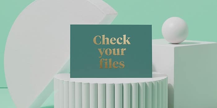
Step 4: Check your files
Nearly there! To finish, make your artwork a vector PDF, save photographs at 300dpi or higher and check your file size is a maximum of 25Mb.
And you’re done! Just upload your files and wait for the MOO magic to arrive. You can add foil to more than just Business Cards, too. Think glistening Gift Tags, sparkling Postcards and more. Or take a look at all MOO’s super special finishes like Foil, Spot Gloss, Raised Spot Gloss and Luxe for more Business Cards with a bit of drama.
Want to reset your brand without tearing down everything? A simple brand refresh can work wonders to spruce up your business and make it feel more current.
Make a fresh start with our brand refresh checklist to reset your brand and start anew.

Brand refresh versus rebrand
If your branding feels obsolete, it’s important to assess whether you need to refresh it or go for a full rebrand. A brand refresh can be seen as an update, with your core identity remaining the same. It can include tweaking your logo, changing fonts (here’s some inspirational fonts to get you started) or revisiting your color palette. A rebrand, on the other hand, is about creating a new identity for your brand from scratch.
Make sure you make the difference between the two concepts before devising your brand refresh project plan. If you’ve been through big changes and your brand identity doesn’t reflect the company’s values and mission anymore, refreshing your logo won’t be enough. However, if you’re looking to stay up-to-date with market trends and keep your competitive edge, a brand refresh might be just what you need.
Define what needs changing
The first step to a successful brand refresh is to assess your strengths and weaknesses. It might seem obvious, but a refresh can mean lots of different things, so it’s important to identify what needs updating and what doesn’t. Start by benchmarking your competitors to see what they feel, look and sound like.
Then, look at your brand guide – logo, color palette, fonts, tone of voice… Do they each stand out from competitors? Are they immediately recognizable? Can someone who doesn’t know the company immediately understand what you’re selling – or, at the very least, what industry you’re in? Add your weakest brand assets to your brand refresh checklist – they’re the ones that will need your attention.
Timing is everything
Resetting your brand should be a carefully planned decision. Your brand refresh might be long overdue, but make sure you release it at the right time to get the best results. A brand update is a great way to build momentum when you’re approaching the next milestone as a company. Planning a new product launch next year? You might want to make it coincide with your brand refresh announcement so all the eyes are on you when your product is finally available.

Empathize with your audience
Every good brand refresh starts with empathy. Chances are you’re currently considering a brand refresh exactly because you feel like you’re losing touch with your audience. Follow the principles of design thinking by centering your approach on people – specifically your current and potential customers – to put together an effective brand refresh project plan.
Your target audience should be considered every step of the way. Start by asking your customers for their feedback to better understand where you stand. Depending on your resources, a survey or a focus group with your target audience can help find the symbols, tone of voice, colors and fonts that best convey your message while resonating with them.
Explore your brand’s history
Resetting your brand doesn’t mean you’re getting rid of your history and core values. On the contrary, the objective is to show those in a more powerful way – getting rid of the superfluous to let your identity shine through. That’s why remembering where you’re coming from is essential for a successful brand refresh.
Look back at your journey as a brand. How did your business start? What was your objective then, and what is it now? What do you consider to be key milestones and achievements for your company? Asking yourself those questions will help you refine your brand identity and pin down your points of differentiation. Those will allow you to develop more cohesive and meaningful assets to represent your brand while preserving your integrity.
Just right
Take a lesson from Goldilocks here. Don’t go too little or too big when planning your brand reset. Too little, and all your hard work will go unnoticed. It can also affect consistency, as you want your branding to feel cohesive and tell a consistent story. If you’re refreshing your logo, for example, you have to consider how it fits into the rest of your assets – colors, fonts and so on.
Too big, and you might as well rebrand. A good brand refresh usually feels natural and non-disruptive. It’s a business organically progressing towards its next stage, and it should feel logical – and hopefully helpful – to your audience. Changing everything about your brand requires much more communication to introduce your new identity and reassure your customers.

Be consistent
Consistency and adaptability are key when it comes to branding. Your updated branding should be reflected in every facet of your business. Don’t forget any channel – digital AND print materials should be taken into account on your brand refresh checklist. Your updated assets should make your brand shine its brightest on every channel, from social media posts to newsletters and Business Cards.
It’s also important to consider your internal communications and how the brand refresh can – and should – impact them. It will be difficult to convince your employees to spread the word if they don’t feel like anything’s changed internally.
Spread the word
You’ve invested time and money into making your brand update a success, so don’t forget to share it! This is an essential step in your brand refresh checklist. Start with your team, making sure every employee in the business stands behind the plan and understands your decision as a brand. Your employees should always be your ultimate brand ambassadors, so it’s essential they’re on board with the refresh.
Working with your social media and PR team can be useful to spread the word about your brand reset, especially if you’re launching it in preparation of your next milestone as a business. Prepare assets such as blog articles, social posts and press releases to tell your story and reach out to potential new customers. You can also print Flyers and Posters to share the news on paper!
Make it stick
A successful brand refresh should last longer than the initial excitement of its early days. Communicate a clear plan and make useful resources and guidelines available for your team – it’s the best way to avoid mixing up the new charter with the old one again after the first couple of weeks.
Make sure everyone in the business knows where to find your tone of voice guidelines and graphic charter with real-life examples of branding dos and don’ts. You can nominate brand guardians who’ll help make sure the right assets are being used throughout the business for both internal and external communications.
Ticked all the boxes on your brand refresh checklist? Get the word out with Business Cards and Flyers.