5 Bauhaus-inspired logos celebrating the power of design
We tasked our in-house graphic designer to recreate the MOO logo in 5 iconic Bauhaus styles.
-
 The MOO Team
Share the post
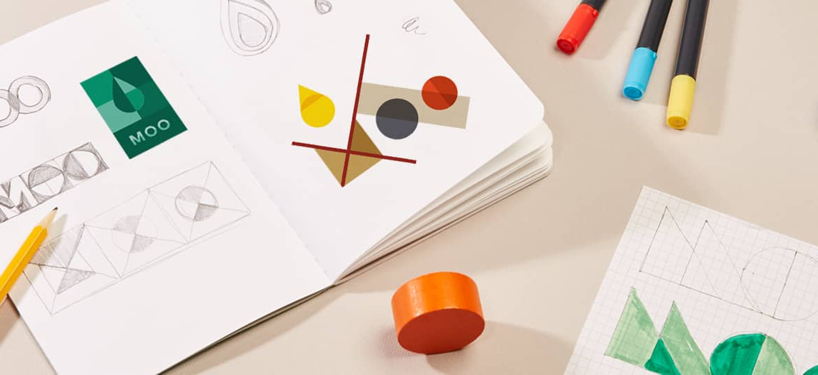
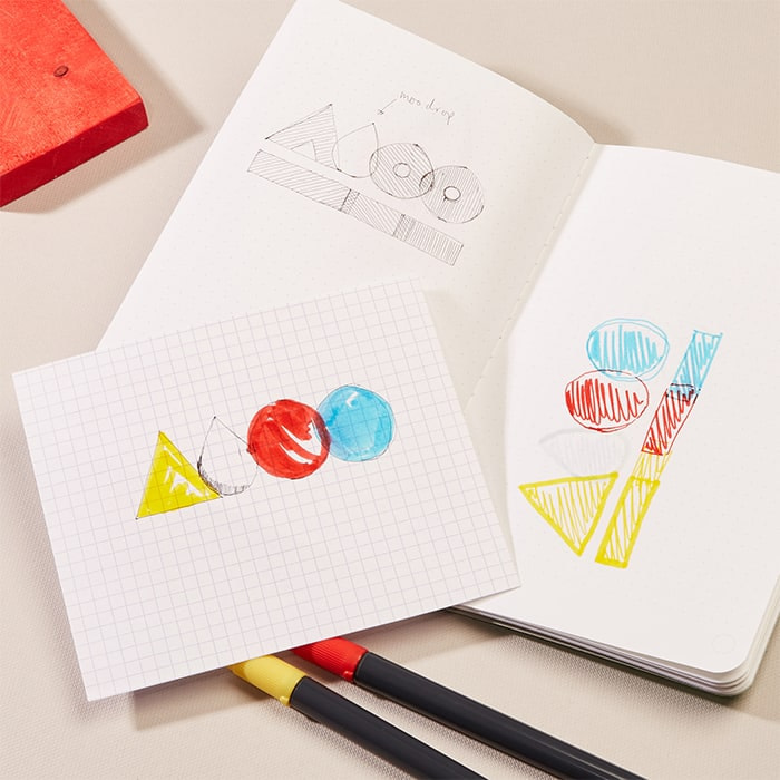
The influence of Bauhaus on graphic design today is undeniable. Inspired by the modernist approach to architecture, art and typography, we tasked one of our in-house graphic designers, Philip Bailey, to recreate the MOO logo with five iconic Bauhaus treatments.
How is your personal style influenced by Bauhaus design?
For me, the stylistic elements of using clean lines, minimalism and block primary colors has really shaped how I design. I love experimenting with stark contrasting colors and the interplay of geometric shapes, while still maintaining the sense of logical simplicity that the Bauhaus style is known and loved for.
Talk us through how you approached the Bauhaus logo brief
The Bauhaus movement has had a ripple effect across so many industries – architecture, graphic design, art and product design – that if you work in the creative industry, it’s impossible not to feel the current. That’s what I wanted to really demonstrate in the execution. I focused on five influential figures, with varying disciplines across the Bauhaus school, then created a “Bauhaus” logo that really speaks to the role they played in bringing this movement to life across the industry.
Redesigning the MOO logo
In the style of Herbert Bayer
This logo is influenced by Bayer’s iconic 1968 “Bauhaus Poster”, which was created to celebrate 50 years of the movement. He depicted shapes in a mixture of flat, faceted and 3D forms in the distinctive primary color palette that is totally characteristic of his style.
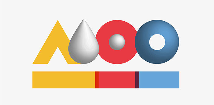
For my own Bauhaus design, I wanted to distill Bayer’s playful interaction of shape and color into one simple, colorful logo. I created a 3D effect for the MOO drop and at the center of the “O”, then combined the drop with Bauhaus style typography to create the letter ‘M’. Although this design is inspired by Bauhaus, I also wanted to incorporate MOO’s passion for print. To do this, I overlapped the rectangles underneath the logo to create the subtle idea of mixing colors.
In the style of Marcel Breuer
This logo is influenced by a physical object rather than a piece of Bauhaus graphic design work. Breuer’s iconic 1925 Wassily Chair was a revolutionary innovation in the design world due to the use of tubular steel as a material – which had never been seen before. The design itself is inspired by bicycle frames, and I just love that idea of bringing a practical object indoors and transforming it into something functional, but still aesthetically brilliant.
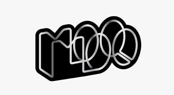
The design of the chair is very linear, so I’ve duplicated the logo to create the effect of a frame, and then made it into one continuous line – similar to what Breuer would use in his furniture. I added a gradient to create a sense of physicality, and mirrored his use of leather panelling for the seat and back by mounting the type on a black silhouette.

In the style of László Moholy-Nagy
Moholy-Nagy is well known for his abstract style of work in fine art, so for this logo I wanted to recreate how he explores light and spatial relationships between shapes and colors.

True to his style, I included crossing lines to create an “M”, then added in geometric shapes to create the “O”s and MOO drop. His palettes are usually much more muted than the primary colors we often associate with the Bauhaus design style, so for this logo I selected more earthy tones, then overlaid different shades to create his characteristic impression of depth and scale.

In the style of Walter Gropius
The Bauhaus school building is the epitome of minimalist, functional architecture, so I wanted to celebrate the iconic design from Gropius in a really stripped back version of the MOO logo.

Gropius adhered to the International Style, designing buildings to be constructed from key materials like concrete and glass. In this logo, I’ve emulated the Bauhaus building by mounting a lowercase “Universal” inspired font on a stone-colored simple rectangle, mirroring the angular nature of Bauhaus-style buildings. For the type, I also included a stacked format with an offset shadow effect, to recreate the visual identity of the school.

In the style of Josef Albers
Albers’ famous “Homage to the Square” work felt like the natural place to draw inspiration from, as it encapsulates perfectly his playful, experimental approach to color theory. By layering paper, he created different geometric patterns, tonal and contrasting palettes and optically compelling executions.

For this Bauhaus-inspired logo, I wanted to marry a sense of Albers’ design identity with our own brand DNA. I layered geometric shapes in tonal shades of our primary brand colors, “MOO Green”, to create a playful interaction between color and shape. This is also carried through on the type for the logo by using our “Mark” brand font. The perfect circles of the “O”s in this typeface blend perfectly with the geometric Bauhaus style.

Want to explore color for yourself? MOO’s Color Study tool allows you to build your own palettes from colors that you pick from across the web. Once you’ve created your palette, print your color creations to life on a selection of patterns inspired by Bauhaus design.
Originally published on June 14, 2019
Keep in touch
Get design inspiration, business tips and special offers straight to your inbox with our MOOsletter, out every two weeks.
Share the post
Keep in touch
Get design inspiration, business tips and special offers straight to your inbox with our MOOsletter, out every two weeks.


