5 calendar designs that we would make time for
Here are five creatives who took calendar design to the next level with MOO Postcards.
It’s that time of the year – a time of excitement, fresh starts, and more or less sustainable New Year’s resolutions. And what’s better than a creative calendar design to get ready for things to come when the clock hits midnight on December 31st?
Custom calendar designs can be a great way to get everyone excited about the new year – from clients to customers, employees, and loved ones. Get inspired by five creatives who took calendar design to the next level with MOO Postcards.
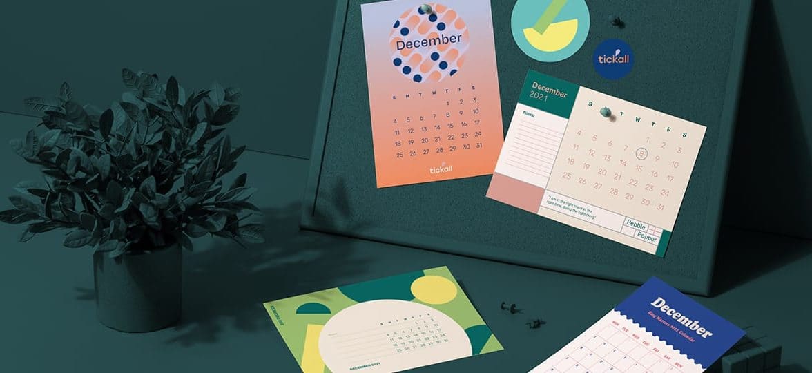
Studio Sara: shiny new beginnings
Based in Toronto, Sara is an advertising designer by day and a freelance creative by night. On Studio Sara, she shares her passion projects and inspirations on an impeccable, aesthetical masterpiece of a feed. With a keen eye for color and typography, Sara creates purposeful compositions that deliver a clear, powerful message.
For her calendar cards, she indulged in her love for typography and let her branding shine through in a subtle yet impactful way. “I wanted to create a desk calendar incorporating my personal branding and wanted to keep the design clean and simple. Typography is my favorite aspect of design, so I’m always looking for ways to use type in fun and interesting ways.”
Sara used our Super Postcards with a Gold Foil finish to bring her calendar design idea to life and add a festive touch, celebrating new beginnings. Thanks to Printfinity, she could easily create a different design for each month, adding a discrete little Easter egg for her birthday. “I love how these cards are so reflective of my style, and I love seeing it on my shelf every day. My favorite part is that the November card has a little cake in place of the 28th because that’s my birthday.”
Gweneroo: a taste of tomorrow
Another unique calendar design from Canada! Gwen is the artist behind Gweneroo and describes herself as an illustrator, mountain-hiker, and people person. As passionate about food as she is about drawing, she often combines the two in deliciously colorful artworks that radiate positivity, serenity, and a love for good things. “In general, my work aims to capture moments of peace or joy. It could be an illustration of a moment of calm in a bath of Earl Grey tea, a nap on a giant chocolate croissant, or cute, playful animals, but in general, I want my art to make people think of joyful moments in their own lives.”
With hope and joy at the core of her practice, Gwen aims to pave the way for a better tomorrow. “The world is full of suffering, which we need to actively work to fix and improve. I feel that to some extent keeping beautiful, happy, hopeful things in mind can help us remember WHY we need to keep fighting for the betterment of ourselves, our communities, and the Earth.”
When she came up with her calendar design idea, Gwen used MOO’s Original Postcards with a shine-free matte finish to let her illustrations speak for themselves. “[I] was absolutely BLOWN away by the quality! The instant I opened the box, I couldn’t believe how professional they looked and the vibrance of the colors.” With a series of illustrations depicting moments of “happiness and deliciousness”, her beautiful calendar design set the tone for a year of self-care and joy – and her community’s reaction showed this was much needed. “My favorite thing […] is how much these illustrations have seemed to connect with people. Art is so powerful! As for the physical aspect of the calendar cards, my favorite thing would have to be the vibrant colors! Being such a visual person, color fidelity and clarity is so important, and MOO definitely went above and beyond my expectations!”

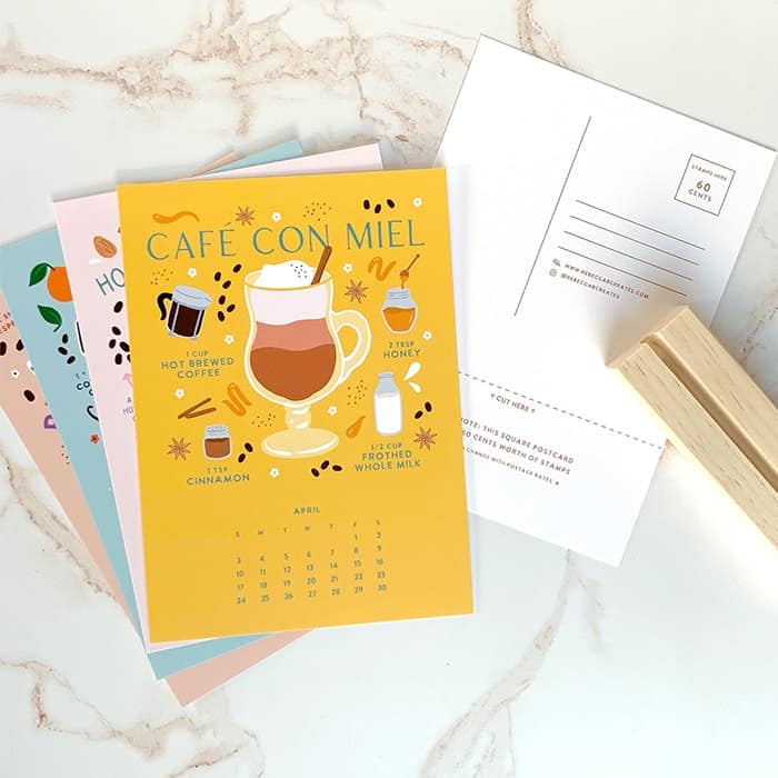
Rebecca B Creates: day after day
Based in Houston, Texas with her husband and two bulldogs, Rebecca Brown is the creative mind behind illustration studio and online shop Rebecca B. Creates. She specializes in wellness brands and eco-friendly products, with clients such as Mind Body Green and Birch Benders.
Her calendar project all started with her love for coffee. “Like most millennials, I love an extravagant coffee drink, but I often can’t justify coffee shop prices. That’s when I started creating and illustrating some of my favorite coffee drink recipes. My friends on Instagram also seemed excited about these recipes, so I decided to sell a calendar featuring these illustrations.”

Passionate about sustainability, Rebecca came up with the idea of a reusable calendar to avoid waste. “I hated the thought of it in the trash at the end of the year. I had the idea of repurposing the calendar as a postcard. On the back of each month, you’ll find a postcard. Just cut along the dotted line to remove the month portion of the card.“ Upcycling is as simple as that.
Rebecca used MOO’s Medium Postcards with our Original paper stock – thick enough to use as a postcard, but thin enough to fit into the dimensions of the wood stand. She paired it with a matte finish on the paper to match the look and feel of the pine wood stand and natural elements of the illustrations. Her favorite part of printing with MOO? “I love that MOO allows you to update different designs on the back of each Postcard. As a small business owner, it can be a challenge to find companies with small minimum order quantities. But with MOO, I was able to upload a different design on each card, allowing me to assemble my own calendars.”
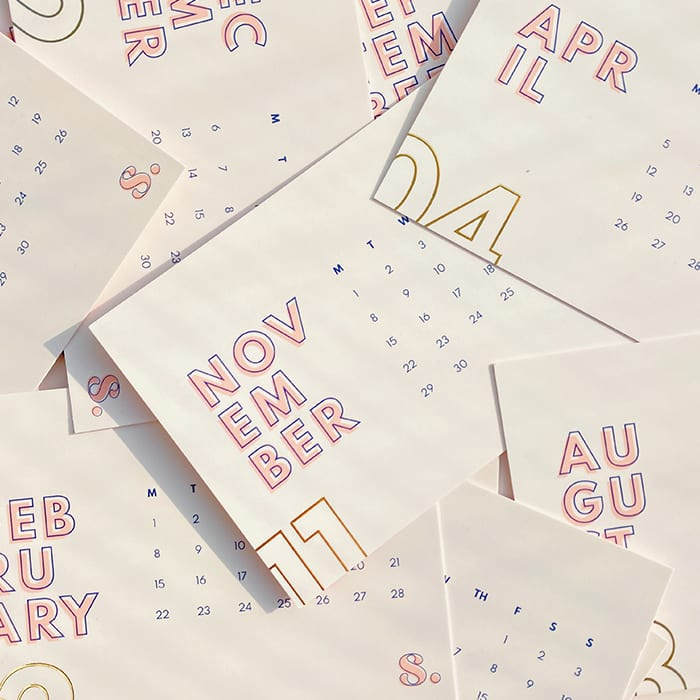
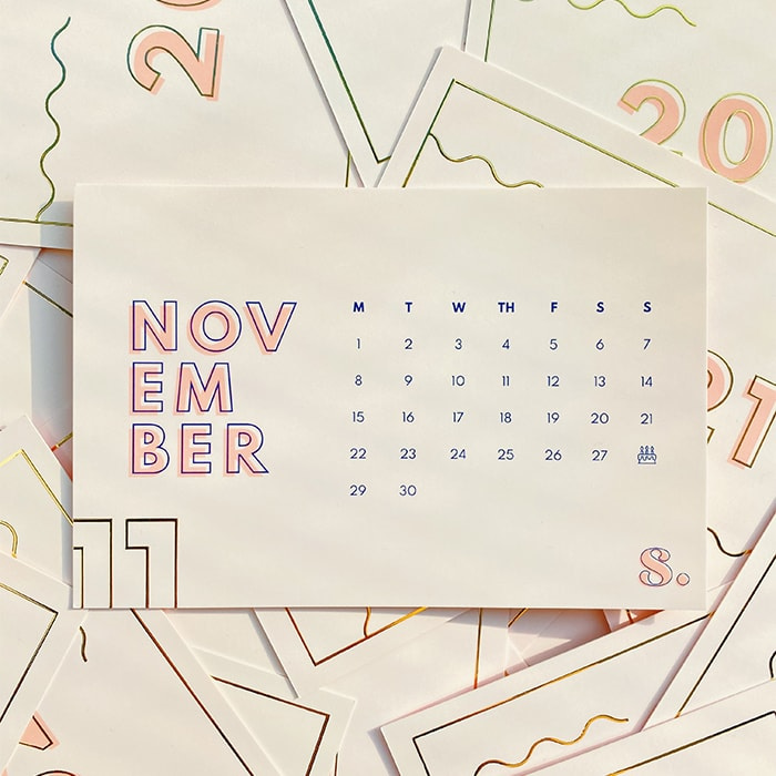
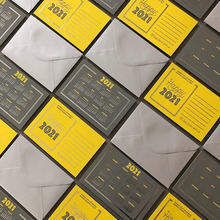
Long Live Simple: silver linings
Carley Lee is the owner and creative director at Long Live Simple, a North Carolina-based design agency focused on simplifying branding and website design for creative business owners. From beauty salons to real estate companies, the Long Live Simple team is dedicated to helping brands tell their stories in a unique, memorable way.
For the studio’s holiday calendar postcards, Carley wanted to inspire clients with a versatile product that could be used as a yearly calendar display or an office keepsake. She used PANTONE’s 2021 color combo – Ultimate Gray and Illuminating – to really capture the essence of the year with a message of strength and hope. To add the final touch to the custom calendar design, she highlighted this idea of resilience with a Silver Foil finish – for a literal silver lining. “The colors combined with the added Silver Foil effect by MOO really help the design stand out and leave a memorable impression.”
And she didn’t stop there. As a branding expert, Carley knew the power of consistency. She created a delightful experience from A to Z with matching StickerBooks as seals, Rectangular Stickers for the recipient address, and silver Envelopes. Her objective? “To achieve a luxurious calendar effect that would appeal to our studio design clientele.” Nailed it.
YEUNGLOVE: a year in color
Here at MOO, we’ve been fans of Janine brand’s YEUNGLOVE since her lovely backing card designs first popped up on our feed. Based in Toronto, the idea for YEUNGLOVE had been brewing in the designer’s head for some time before hatching in the summer of 2020. She describes it as a fun, explorative space where she offers a collection of handmade and printed products starring “all things fun, sad and cute”. Imagine our delight when we discovered her collection of calendar postcards.
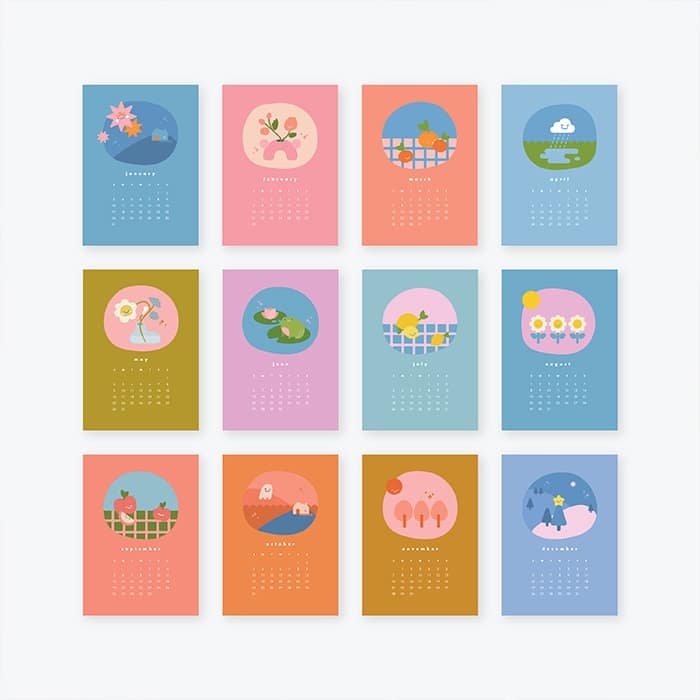
Her creative calendar designs reflect the different months with adorable, colorful illustrations. “I created small illustrations relating to thematic elements drawn from the characteristics of each month — from April showers and May flowers to apple-picking in September! Each month also features a different background color for distinctiveness. All the months and cards come together to form a bright and colorful set!”
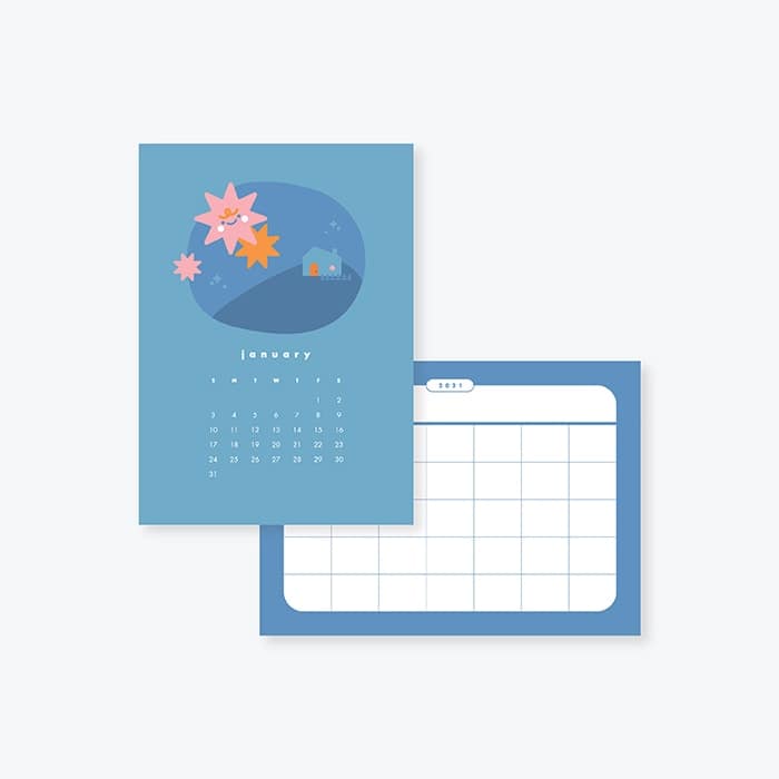
Janine picked our Medium Postcards in the Original paper stock to bring her designs to life. “I chose this option because the size complements its use as a small casual calendar set, which allows for the easy-switching and display of cards! At this size, these can also be easily framed!”. By choosing an uncoated back, she also made sure her calendar cards could be annotated. “Having the back as an uncoated finish allows for the writing of important dates with enough room for any pointless doodles! I designed the back of these cards with this in mind. You can flip over the front to reveal a mini blank calendar with enough space to note down all your events!”
Create your unique calendar designs with MOO Postcards. With Printfinity, you can print a different design on each card at no extra cost. Good times.
Since you’re here at MOO, there’s a good chance you know the importance of a strong brand, but what about personal branding?
Put super simply, personal branding is the way you present yourself to the (business) world, especially peers, clients, and potential employers. It includes your beliefs, purpose, values, and goals. It’s similar to business branding but the difference is that you’re marketing yourself.
In our always-on cultural shift and evolving job market, it’s helpful to stand out when applying for a job or starting your own company. A personal brand is for (almost) everyone, but not everyone uses it to their advantage. Branding yourself can play a key role in your career or your business and help you stand out from the crowd. It’s not just for individuals, it’s important for small businesses as well. Customers often choose or stay loyal to a brand because they like the person behind it.

So here are MOO’s five tips to stay on top by building your personal brand:
Be you
Building your personal brand needs a good look at who you are – like your core values, skills and beliefs – and figuring out how to convey them both online and offline. There’s really no other way to go about it. Being your best self means your brand feels authentic, genuine and original. It’ll also make your personal brand easier to maintain on a daily basis. As it’s just you, it’s easier to make content and have a consistent voice wherever you’re speaking – whether it’s directly to a customer or on social media. Don’t forget your Business Cards when you’re networking offline, too.
Say what you’re good at
The best personal branding is specific. Tell your clients or customers what you do and why you’re good at it! For example, at MOO, we help people build a brilliantly designed professional world they’re really proud of – and have a little fun along the way. Don’t be afraid to share your knowledge as well, and help everyone to benefit from your unique experience as well as build your expert reputation. If you’re super skilled at something in particular, your reputation alone can help you build the brand you want.
Consistency is key
Being consistent is similar to being specific – it’s much easier to get recognized for one topic if you consistently create content around it. To make sure everything you do is 100% you, it’s a good idea to sense-check your ideas against some guiding principles. Finding your voice helps your personality shine through in the way you talk. And email. And tweet. And blog. So whether you’re creating a fun brand or one that’s more conservative and corporate, consistency is key so your audience always knows it’s you.

Tell your story
Once you know who you are and what it is you want to say, it’s time to find an interesting way to say it. Instead of shouting about yourself or your brand into the social media void, create a story that sparks conversations and that your audience can engage with. Make a personal connection with your audience or potential clients and employers by sharing things you’re interested in and how you got there. Try different formats too – send a video message to make a personal connection with prospective clients and connect with co-workers.
Create a community
Create a community around you, by engaging with your audience and reaching out to like-minded people and brands by liking their posts and leaving comments. Have digital conversations instead of building a one-way channel that just broadcasts information. Be your audience’s number one fan and the kind of person who waters their plants when they’re away. Or feeds their fish. Keeping a positive attitude and helping others will nurture your community and help grow your brand in the long run.
That’s it! Creating a brand for yourself takes time but we can’t wait to see you out there. Go and put your best foot, face and brand forwards, and don’t forget your Business Cards when you’re networking. And if you’re a creative or business, show what you’re making with MOO using #hashtagmoo.
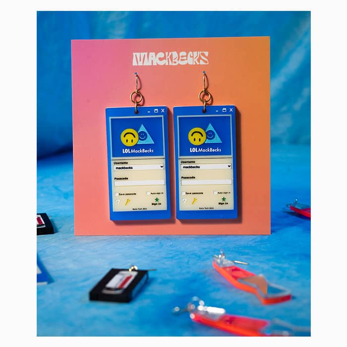
We spoke to Mackenzie Becker, the founder of bold, feel-good jewelry brand MackBecks.
MackBecks creates handmade wearables in small batches from their Kansas City design studio. Each piece is handmade slowly with multidisciplinary techniques like metalsmithing and industrial design to craft unique and authentic pieces.
Becker’s work varies in style from bold statement pieces, empowering feminist imagery, and childhood memories involving insects and plants. She works between her home studio and Cherry Pit Collective, a group of womxn-identifying artists that promote collaboration and community. She values her genuine and slow-made practice to bring beautifully hand crafted jewelry and heirloom quality pieces to anyone who wears them.
We asked Becker about all things jewelry design and running a busy business.
Tell us about MackBecks – what inspired you to start a jewelry brand?
I knew pretty early on in my education at Rockhurst University that I was more attracted to my studio classes over anything else, and quickly changed my major to most easily accommodate a studio practice since our school did not have an art major. I spent those four years focusing on painting and drawing, with the intention of painting full-time or getting a Masters in Fine Art.
I sourced some really tiny pliers and got to work at my coffee table in 2017
After graduating, I kept a pretty steady studio practice and experimented a lot in fiber work. I made a lot of embroidered and woven paintings while working a lot of simultaneous odd jobs. I started making jewelry mostly because I wanted wearables for myself that I could afford on a budget, after leaving my first not-so-exciting “9-5”.
I sourced some really tiny pliers and got to work at my coffee table in 2017. I had a lot of embroidery floss around from my experimental fiber pieces and began making the trend of the moment – tassel earrings. I was most surprised that friends were actually interested in the pieces I was creating – some of my first clients were good friends from college! (THANK YOU!!!)
As I continued to learn more about jewelry design, I became more enticed by working with metals and less excited by current trends. After my first handmade market that December, I used the funds to get my first jewelry saw and sheet metal. I began taking my own illustrations and taught myself how to cut each by hand. It felt like I could sell tiny drawings that people could wear on their ears and it has since become my favorite form of creative expression.
You call your pieces wearable sculptures, why?
As I deepened my skill set into metalsmithing, I continued finding myself creating tiny sculptures that were more interactive than just a simple earring. My favorite pair, our Cicada Earrings, have riveted wings that swing back and forth! During quarantine, I was really inspired by all of the empty parks and made interactive playground earrings – one was a swing set and another of monkey bars!

What do you want to convey with your jewelry?
The most important concept to me at the moment is creating pieces that make people feel good and authentic to themselves when they wear them. In doing this, I draw upon my own experiences with nostalgia and nature that bring me a lot of personal happiness. Making something that brings me a lot of joy is a huge plus when it brings someone else a lot of joy too!
The most important concept to me at the moment is creating pieces that make people feel good and authentic to themselves when they wear them
I am very concept-driven and am currently really excited about pieces that are either more complex in detail or have a lot of movement – or BOTH!
Do you have a favorite piece, past or present?
One of my favorite pieces to date is a discontinued design that was a pair of brass earrings that resembled hands knitting. They were originally a custom design requested by a client and became a best seller of 2020! That piece was one of the most difficult to make and was a huge labor of love!

How do you go about making your jewelry? What’s your favorite part of the process and what’s the most challenging?
My favorite part of the process is designing, which was a big realization I had earlier this year. I recognized that I did not allow enough design time with how our previous production practices were operating and decided to make some big changes, since we were growing quickly.
After years of hand-sawing every piece of metal, I decided to partner with a company based in Oregon that water cuts our designs, Portland Water Jet. I continue to do all of the metalsmithing and finishing of the raw parts, but this partnership has given me the opportunity to focus on new designs and expanding our business in other avenues!

We also invested in our own laser cutting machine, to produce our designs in a variety of other materials. I have spent much of this year teaching myself Illustrator and new industrial design techniques on the laser! I’d also like to thank my dear friend and studiomate, Paulina Otero for showing me the basics and investing in this machine together!
Now that we have grown, I have been focusing on how I can stay organized for my employees, while also trying to navigate a healthy work/life balance (oof it’s hard y’all!)
When I first started my business I was also hand-making all of my earring cards by embossing each card with gold. As I continued to grow, I wanted to outsource our earring cards, business cards, and marketing materials from a producer that had incredible quality with gold foil that resembled our past branding colors (black and gold.) I chose MOO originally because of the Gold Foil and quick turnaround, but stayed for the incredible quality and commitment to their customers! I now use MOO for all of our marketing materials from earring cards, biz cards, care cards, and Postcards!

The most challenging part of MackBecks today is being an organized/good boss! Since going full-time in 2019, I was very used to being on my own schedule and flying by the seat of my pants. Now that we have grown to two employees, I have been focusing on how I can stay organized for them, while also trying to navigate a healthy work/life balance (oof it’s hard y’all!).
What has it been like setting up your own creative business?
Oh gosh… I kind of can’t even believe it still, to be completely honest! In the first two years, I was simultaneously working multiple jobs during the day and working MackBecks at night and on weekends. I definitely was firing on all cylinders, if ya know what I mean. My favorite part of it all has been the discovery of a new process that shifts the business into different realms, and reimagining and designing our future to pivot along the way!
My biggest issue […] is the duality of imposter syndrome and not overworking myself, which really do go hand-in-hand
My biggest issue (that I am currently overcoming) is the duality of imposter syndrome and not overworking myself, which really do go hand-in-hand. I have been working really hard this past year to create a better balance in and out of work, so that I can enjoy both even more, and experience less anxiety when I am not at work. I would definitely recommend to anyone out there starting out, to always prioritize your time outside of your creative practice, because they are both so influenced by each other, and both need lots of rest and care!

How do your feminist values come into play in your brand? Are there any other values that are important to you in your business?
We truly want everyone to be able to equally interact with our work and feel like the best way to do this is through access! It is important for us to have accessible monthly inexpensive “Sample Box” sales that have a mystery piece of jewelry inside, so most people can shop at a larger discount.
What’s next for MackBecks? Any grand plans?
We are actually making some really big plans to move out West in 2022! We are really excited to be a part of that creative community and to participate in new handmade markets.
Feeling inspired? Turn your big ideas into a business with marketing materials by MOO.
Feeling rusty? You’re not alone. Approaching networking post-pandemic is a daunting prospect for many of us. These past two years have redefined the way we connect in a dramatic way, from digital solutions to mental health-conscious approaches.
Find out how the pandemic shaped the future of networking and get back in the game in a smooth way with our networking tips.
Growing still
Networking was a challenge for many businesses before and not being able to leave your home has not made things any easier. A pillar of growth – being able to connect with a relevant audience of clients, customers, and like-minded professionals – became nearly impossible when trade shows, fairs and networking events all disappeared in the blink of an eye.
How do you progress when you can’t go anywhere? Growing from home, especially as a small business, has required a serious dose of resilience and adaptability. In the absence of IRL events, fully online fairs and professional events started flourishing, along with an increased focus on social media presence. Digital solutions replaced crowds and handshakes and, while they drained some of the warmth from traditional networking, they also came with new opportunities.
Hybrid networking is more inclusive, offering more flexibility for smaller businesses
In a post-pandemic world that’s very much still absorbing the shock, the keyword is “hybrid”. While work events and trade shows are back in the flesh, their digital counterparts are here to stay. By making such events cheaper to organize and more accessible to those who can’t travel, they’ve allowed smaller organizations and more isolated entrepreneurs to access previously untapped opportunities. In that sense, hybrid networking is more inclusive, offering more flexibility for smaller businesses.

Old school is the new cool
Online events aren’t the only thing that redefined networking post-pandemic. Direct mail made a remarkable comeback during lockdown, curing our digital exhaustion with tangible items. From outreach letters to portfolio postcards and product samples, it’s provided brands and professionals with a physical way to connect with potential clients and customers, leaving a sustainable impression with a concrete, palpable introduction.
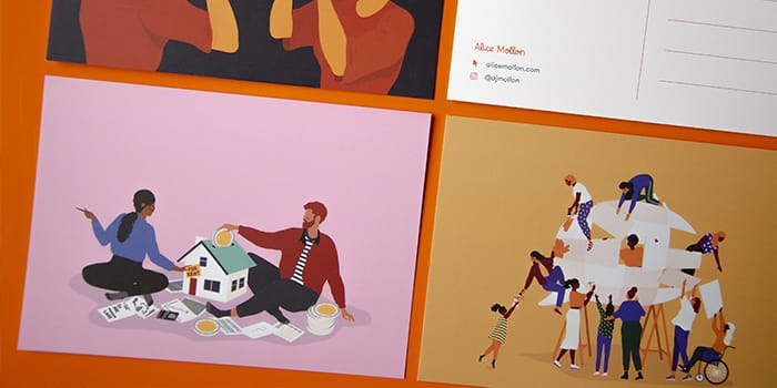
We’re now back “out”, but the need for tangible connections hasn’t disappeared. Whether you’re a growing startup or a freelance creative, going old school with direct mail is a sure way to stand out and leave your mark. Take a leaf out of illustrator Alice Mollon’s book and use Postcards to showcase your work to potential clients (with Printfinity, you can cater to all their preferences!). You can also drop your Business Card in relevant stores and venues if you think their regulars might be a good match for you.
Meaningful connections
With fewer opportunities to meet potential clients and peers, the pandemic has forced us to prioritize quality over quantity. It has emphasized the need to target relevant people and organizations, spending more time to develop meaningful connections with tailor-made materials and messaging. It might not be the networking tip you were expecting, but less is more!
Scaling down the way you approach networking post-pandemic is beneficial in many ways. Firstly, it reduces networking exhaustion – a very real symptom of overdoing trade shows and other events. It also leaves more time to prepare for your interactions, which helps you improve your return on investment thanks to a more relevant, better-suited messaging. More meaningful connections, more chances to find the right audience – and a better chance for growth.

Mental health first
Granted, it should have been at the core of our networking approach a long time ago. The pandemic brought mental health to the center stage, especially in work environments, due to the lack of IRL connections and the fading boundaries between work and personal life. This newly-found focus on mental health at work, paired with the social anxiety that some of us started feeling after multiple lockdowns, made it necessary to rethink the way we network.
You don’t have to be “always on”
What does prioritizing your wellbeing look like in the context of networking? It’s all about being measured. Listening to yourself and being attentive to the signs of social exhaustion is essential to make sure your business’s growth doesn’t hinder your mental health balance. If you suffer from social anxiety, take advantage of the evolution of the networking environment to find less draining solutions to connect, like direct mail and online events. You don’t have to be “always on”. Networking can take many forms and it’s up to you to shape it.
Ready for the future of networking? Get back in the game with brand new MOO Business Cards.
Nexamp, which is revolutionizing the future of clean energy, wanted premium business cards made with sustainable materials that aligned with its values. MOO had just the product the company was looking for.
About Nexamp
As a leader in solar and energy storage solutions, Nexamp has always been willing to go above and beyond to make a difference. The company has a hand in a variety of solar initiatives, including community solar farms and energy storage solutions that offer the kinds of savings that make renewable energy a viable option. Since 2007, Nexamp has set itself apart in the crowded renewable energy space with a model where the company owns and operates its solar and storage projects, managing each part of the process. The results speak for themselves, with the company coming off recent successes like the launch of a 35-megawatt solar portfolio in Maine and a massive new solar agreement with Walmart.
The team at Nexamp is deeply committed to reducing its carbon footprint. The company has committed to being carbon neutral by 2022 and by 2030 its supply chain will be too. When it came time to examine how that goal could be achieved throughout the supply chain, working with trusted printer MOO made complete sense.
The challenge
While Nexamp has always been a force for sustainability through its solar power initiatives, the company also wanted to find ways to cut its own carbon footprint at every level. One area that had the potential for change was the company’s business cards, which were made of traditional tree-based card stock — not the greenest option possible.
“At Nexamp, we’re driven by our belief that success means maximizing our positive environmental and social impact — that’s why sustainability and equity are at the center of everything we do,” said Dan Clarke, Senior Vice President of Marketing at Nexamp.
As a company built on constant outreach to individuals, communities and businesses across the country, business cards are often one of Nexamp’s first opportunities to make a lasting impression on a potential customer. The goal was to be able to demonstrate the team’s commitment to sustainability from the first handshake on.
Of course, greener materials weren’t the only things Nexamp needed from its new business cards. Each card needed to retain a premium look and feel that represents the professionalism of Nexamp. In addition, as a company that goes through thousands of business cards to make connections with customers, Nexamp needed a partner that could handle large reorders in a seamless manner.
When Nexamp needed to find a supplier that could help it balance sustainability and quality with cost efficiency, MOO proved to be the perfect choice.

The solution
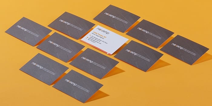
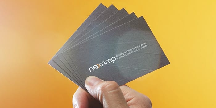
Luckily for Nexamp, MOO already has a product offering that meets the company’s high standards — both for low-carbon materials and quality. MOO’s Cotton Business Cards are made from 100% recycled T-shirt offcuts from U.S. manufacturers — a material that normally gets thrown away. As a result, the final product is completely tree-free.
In addition to meeting the sustainability goals central to the Nexamp mission, the Cotton Business Cards hold up to the usual levels of premium quality that they had come to expect from MOO. Each card is subtly textured and uncoated to be easily written on. The cards also don’t skimp on the thickness and are available in the same kinds of custom sizes as their traditional counterparts. When asked if switching to a tree-free option had meant sacrificing product quality, Clarke responded emphatically. “Not at all, especially from MOO.”

Not only do MOO’s environmentally friendly products align with Nexamp’s mission, but now the team can take advantage of a bulk order discount available to all MOO Business Services account users, creating added efficiencies across the product supply chain. Plus, with a user-friendly template located directly in the Nexamp portal, it’s simple to update the name and contact information on each order as new employees join the company.
We want to create an amazing experience for our employees when onboarding them to the company
For Clarke, moving in a more sustainable direction while also maintaining quality and cost efficiencies wasn’t just about showing existing and potential customers that Nexamp meant business. The business cards could also boost employee pride and morale.
“Not only are we looking for products that wow our B2B and B2C customers, but we want to create an amazing experience for our employees when onboarding them to the company. We want them to feel proud about products with the Nexamp brand on them,” said Clarke.

Results
Through the partnership with MOO, Nexamp was able to show off its values to customers, employees and the world — all while staying true to its brand.
“We trust that any product MOO produces is top market quality. I just wish they had added other products that I am currently ordering elsewhere.” Clarke said.
Moving forward, Nexamp’s relationship with MOO will make it easier to continue down the tree-free route. The templatization feature on MOO’s online platform, available to all MOO Business Plan users, has allowed Nexamp to streamline its ordering process, moving the burden away from individual team members and ensuring brand consistency.
What’s better than finding a premium, eco-friendly product? Finding a premium, eco-friendly product you can use again and again and again. Discover how MOO’s printing solutions can make your business greener from end to end.
Fill out the form here and a friendly Account Manager will reach out to you.
October 2022 update: This article references the way we used to make Cotton Business Cards. We now use a different process.
Rule-breaking winery The McBride Sisters Collection needed a paper supplier who could deliver premium materials for a new product launch, their first-ever Reserve Collection of wines. They found what they were looking for in MOO.
About McBride Sisters
As owners of the largest black owned wine company in the U.S., the McBride Sisters, Robin and Andréa, are used to standing out from the pack. Their namesake winery has built a reputation by breaking away from the stuffy attitudes and ingrained conventions typical of the wine industry, earning them a nomination for Wine Enthusiast’s Wine Star Awards “American Winery of the Year 2021”. Whether it’s working to break down gender and racial barriers through their SHE CAN Fund or naming a Pinot Noir “Cocky Motherf*cker,” the company fights the good fight and has fun doing it.

Getting started
The McBride Sisters story began in 1999, when Robin and Andréa, long-lost sisters raised on opposite sides of the world, were reunited. With both McBrides growing up in iconic wine regions of the world — Monterey, California and Marlborough, New Zealand, respectively — the pair soon discovered they had a shared passion for wine that transcended geography and the years apart.
When the sisters started out, they had limited experience and contacts in the wine industry. Breaking through as outsiders — in an industry where knowing the right people is key — took serious grit and confidence.
“At the time the wine industry was a very close-knit, closed-off industry, with a lot of deep tradition, which we respect. But at the same time not a lot of innovation, not a lot of disruption. So we looked very foreign in these situations,” said Andréa McBride John, speaking about the company’s beginnings on NPR’s How I Built This, a podcast where entrepreneurs and innovators tell their stories.
A new approach
In addition to their unique origin story, the sisters set out to handle their business a little differently than the competition. They wanted to sell wine that was as accessible as possible, no snooty posturing needed. In particular, the sisters wanted to speak to those who, as they saw it, had been largely spurned by traditional wine culture — including women, people of color and younger people. Each wine from the McBride Sisters is crafted to represent the place the grapes are grown and to reflect the sisters signature style of powerful aromatics, elegance and balance, exactly what appeals to their target audiences. Wine collections like McBride Sisters Black Girl Magic Bubbly Rosé and Bubbly Red bring visibility to black women in the wine industry. Other efforts include complimentary wine education courses on Facebook that help new wine drinkers feel comfortable with the norms and terminology of the space.

The challenge
With the launch of the Reserve wine collection, McBride Sisters once again wanted to do something a little different. Each bottle would use world-class grapes and adventurous branding to tell personal stories that connected to the Sisters’ childhoods. Each wine uses grapes hand selected from vineyards near the sisters’ childhood homes. The label artwork, meanwhile, is meant to represent “pivotal stories” from the sisters’ lives — both together and on opposite sides of the world. Their Reserve chardonnay, “The Great Escape,” features a red Volkswagen Bug cruising the Pacific Coast Highway in Monterey, California. The aforementioned “Cocky Motherf*cker,” is a tribute to the sisters’ father and his confidence and presence — with his trademark afro featured prominently on the head of a peacock.
The goal? Become the top-end celebratory bottle of choice for everyone — not just in-the-know wine snobs.

To truly capture these visuals, the team at McBride Sisters wanted an unboxing experience that used premium materials that matched the premium wine found in each bottle. This attention to detail helps McBride Sisters fully develop the customer experience and offer buyers the bells and whistles they expect when spending more for a special bottle of wine.
When looking to find a partner for this ambitious undertaking, the McBride Sisters marketing team “immediately thought of MOO.”
The solution
Fortunately for McBride Sisters, MOO was able to offer premium materials and finishes that emphasized the luxurious nature of the Reserve series. Together, the companies created a unique unboxing experience that tells a story about the wine in each bottle, the sisters who made it and the special community who drinks it.
Each bottle comes with a special postcard that’s not to be missed. The front of each card displays the label artwork while the back has detailed tasting notes and an invitation to learn more with a QR code that links to the McBride Sisters website. Each postcard was printed with a full bleed watercolor design on MOO’s Super Postcards with Soft Touch, a thick paper stock with a coating that adds a velvety look and feel. The postcards also utilize MOO’s Gold Foil to up the luxurious appearance.

The result has been a product that stands the test of time.
“The postcards were created as a keepsake, informative enough to reference while tasting the wines but beautiful enough to post on a pinboard,” said Stephanie Shore, Senior Vice President of Marketing for the McBride Sisters Collection.
Postcards weren’t the only place in the branding that the sisters injected a bit of their unique personal story. The McBride Sisters logo, a family crest that includes an interlocking ‘M’ and ‘S’ surrounded by a peacock and two lions, features prominently throughout the company’s branding. Getting the crest to jump off the page took the right materials for each project. MOO was up to the task.

“We have a very intricate, detailed McBride family crest that appears on all our materials. MOO’s printing perfectly replicated the crest across all our brand collateral, ensuring the marketing materials stayed true to our brand standards,” said Shore.
In addition to working with MOO on the Reserve collection, McBride Sisters has leaned on MOO for employee business cards and to print informational postcards for a brand influencer event. Working with MOO has made each of these projects significantly easier. Using the online platform that’s a key feature of any MOO business subscription, McBride Sisters can upload their custom artwork and print in bulk — a must for any company working on such a large scale.

Results
First released to the public in 2021, the Reserve collection tasted great, looked beautiful and was a big hit with customers, who overwhelmingly responded to an unboxing experience that went above and beyond.
“Our goal was to create a beautiful unboxing experience for our Reserve Collection gift set. Customers definitely appreciated the extra care and thought that went into the packaging. We got fantastic feedback on our social feeds and during the virtual tasting event,” said Shore. These gift sets have also sparked interest among both consumers and corporate clients for the upcoming Holiday season. Shore says companies interested in supporting black-owned businesses for corporate gifting can email shop@mcbridesisters.com.

Overall, for McBride Sisters, the value of working with MOO was having a partner they trust to maintain the high levels of quality that match their brand standards. In addition to high-quality materials, the MOO subscription service’s online platform has made repeat orders simple, and constant access to a dedicated account manager has helped the McBride Sisters team complete projects easily on a tight timeline.
“Working with MOO has made it easy to meet our deadlines, thanks to their quick turnaround times. Their team was easy to work with, highly communicative and responsive to all of our questions,” said Shore.
From their unlikely origin story to their innovative unboxing and philanthropic efforts, McBride Sisters winery is always looking for new ways to share great wine. An uncompromising spirit is a part of everything they do. Luckily, when they work with MOO, they know that compromising won’t be necessary.
For more information on how a Business Plan with MOO can help your organization take its branding to the next level, check out our business printing services.
Fill out the form here and a friendly Account Manager will reach out to you.
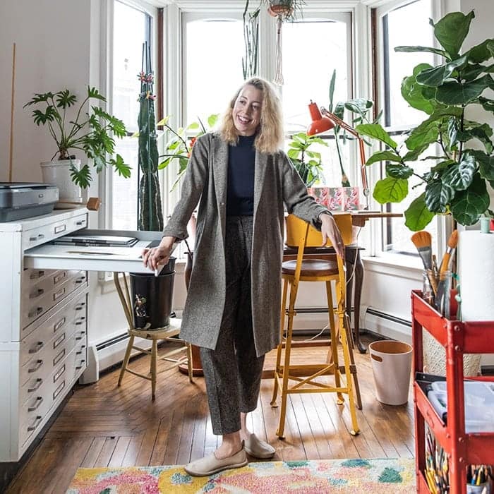
The holiday season is a busy time for any freelance designer, and Priscilla Weidlein is no exception. Based in Rhode Island, Priscilla’s arresting illustrations have been commissioned by clients including Terre Magazine, TED Talks and Revolver New York. Her aim is to explore our connection to one another, and to capture the light she sees emanat[ing] from all things.
The result is a lively portfolio filled with color, each piece telling a story within a moment of action or contemplation. The scenes captured in her work, including a unique holiday piece on the theme of peace, love and joy, are honest, authentic, and full of life.
We met Priscilla Weidlein to talk about holiday greeting cards, staying inspired, and capturing light, joy and color in her work.
Tell us a little about your business and your visual aesthetic.
I’ve always found great solace and joy in creating pictures, and I’ve made a business out of it because it allows me to share this joy with others. My work comprises part commercial illustration, part fine art – mostly painting portraits. My aesthetic is joy, and I draw inspiration from our colorful world.
How did you set up a studio space that keeps you inspired as an artist and card designer?
I work from my nice home studio, where for me, it’s all about light. I find it freeing. I’ve positioned my draft table to be surrounded by four large bay windows, which face the street. Sometimes I draw inspiration from the people walking by – I love it when I see a dog and their person looking identical to one another. This happens often, have you noticed?

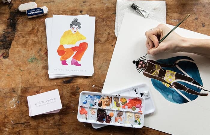
You’ve recently switched from using watercolors and pencil to digital illustration. How has that switch helped you explore your personal style?
The biggest benefit to digital work is being able to do it anywhere. I’ve made the switch commercially, but on the private commission side I stick to watercolor and pencil. I really like switching between digital and paper landscapes.
Watercolor is fun because it’s permanent, while digital is fun because it isn’t. It’s great to be able to take risks without wasting precious paper. Also, I can use the digital medium to mock up the work I later want to do by hand.

How long do you give yourself to research and conceptualize before starting your new pieces?
It really varies. If it’s personal work, I’ll often have an idea and rush to get it on paper (or iPad). If it’s work for a client, I like to collaborate to create a vision and, if I have the luxury, sit with the idea for a week or so before I physically get started.
As a freelance artist, what’s the holiday season like for you?
It is exciting! It is a busy time, mostly on account of receiving private commissions destined to be gifts for clients’ loved ones. I also aim to produce at least one holiday product every year, be it a Greeting Card, wrapping paper or prints.
I’ve been producing holiday greeting cards with regularity since 1993 – it was a childhood pastime that I’ve continued. I’m pleased to say the print quality has improved since then, though! The first cards I managed to convince a shop to carry were Xerox copies on colored paper, and I don’t think I sold a single one. Then around six years ago I started getting serious, and had a batch printed on the letterpress.
Since then, I’ve been experimenting with different techniques, and this year I’m releasing a couple of Greeting Cards myself, that will be printed by MOO.

How do you choose the imagery you use on your greeting cards?
I want my cards to evoke joy and to be all-inclusive. I’m interested in exploring the general themes of celebration, gratitude and togetherness that the holidays represent. In general, when considering a new greeting card design I like to start by thinking about different types of relationships that one could portray, then I choose one and flesh the scene out front there.
What was your inspiration for your cards this year and how did you start brainstorming the designs?
I designed two greeting cards this season — one for public consumption and one for personal use (which features a portrait of my partner, our dog and me). For the more, ahem, broadly appealing card, I came up with the design by considering the relationship of sisters, then thinking of joyful rituals unique to the season that capture the hygge of the holidays.
I started by sketching out the vaguely irreverent can-to-mouth whipped cream character, was sufficiently amused, and so built the rest of the scene around her. After choosing content, I consider the color scheme — what captures the essence of the season I am portraying? For both cards I chose to go heavy with pinks and reds, which I find enlivening, joyful and warm.

Once colors are chosen, I consider the planning phase complete and spontaneously assemble the card from there. For me it is important not to plan out every step in advance — it creates a more authentic product, and I can rest easy knowing that if I spoil it somehow, I can always start over.
What advice would you give to other designers and artists who are looking to design a limited-edition holiday greeting card?
In terms of design, my best advice is to imagine the most wonderful greeting cards you have received or given — and why they were such a hit. In my experience, the best cards are those that sincerely express love. That is the center that I move from.
In terms of production: this may not come as news, but the holidays have a way of sneaking up. My best advice is to start your designs before you are authentically feeling the holiday spirit, around October, so that by early November you can get them into production without it being a mad dash to the printer. My direct customers typically don’t begin purchasing holiday cards until around Thanksgiving, but I want to be sure I am stocked and ready for them.

For marketing, I find Instagram very useful. When selling cards “direct to consumer”, I mostly sell through my online shop along with a series of prints and a rotating collection of originals. I announce the greeting cards on Instagram once I have placed my order with MOO — listed as a “pre-order” item — then post again once they arrive at my studio for shipping.
I also typically participate in some local events, selling cards at independent gift shops and galleries. I recommend this — it’s really fun and rewarding to connect directly with customers in the community, and is a great way of learning what it is that people are drawn to in your greeting card designs. If you’ve never done this before and are wondering how to do it — visit shops you’d like to be featured in, introduce yourself as a card designer, and make friends. You may be surprised how eager shop owners will be to collaborate with you, now or down the line.
Bring your own Greetings Card designs to life with MOO this holiday season. Try MOO Printfinity and print as many designs as you like, at no extra cost.
Originally published on Oct 22, 2018