10 top professional color combinations to inspire your next design
Looking to redesign your logo? Or want to know how to choose your eye-catching brand colors for the first time? Color is important, especially when it comes to creating memorable marketing material for your brand.
Maybe you have a soft spot for light pastel pink, or you can’t resist a bright, bold yellow – whatever color is your cup of tea, it’ll have a perfect color match. You can use these pairings together to form the basis of your color scheme for your business cards, postcards and all marketing material.
Why do color combinations matter?
The importance of your color palette shouldn’t be underestimated. Just look at Pantone’s Color of the Year, an industry-wide celebration of color, and affirmation that a single shade can speak volumes about a brand.
Everyone’s got a different process, but you might find that color is one of the final pieces of the design puzzle – you mock up your new logo or Business Card design, then color it all in at the end. But if you consider color combinations as a fundamental part of your image, you may find your design takes on a whole new dimension.
How to find colors that go together
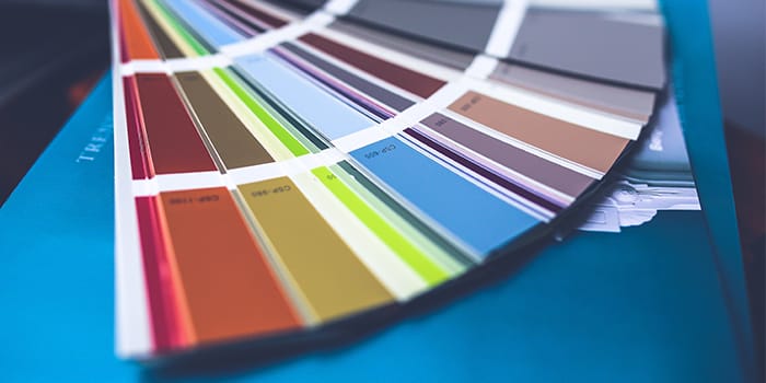
Trusty (and eye-popping) color combinations can be found using the color wheel. This isn’t just an art class gem from school – it remains an important tool for everyday design to create a strong color palette. To find complementary colors, simply look at the opposing side of the wheel.
Through this method you’ll be able to find these classic color combos:
- Yellow and purple
- Red and green
- Blue and yellow
- Orange and blue
Our top 10 best color combinations
Here are our top 10 recommendations for cool color combinations that ooze style…
1. Black and white
A top “color” combination. Simple, timeless, faultless. Check out more black and white business card inspiration.
2. Leaf green and Yellow
This eye-catching color palette is a classic choice for health brands as these shades suggest freshness.
3. Baby pink and blue
Innocent, elegant, feminine, and perfect for brands that want a soft, dreamy appeal – like skincare and beauty businesses.
4. Cool greys and blues
Icy and calm – perfect for wintery designs. A cool color combination if there ever was one.
5. Pantone’s Classic Blue with white
A timeless way to evoke nautical charm and a calm, collected vibe, these two make a great color combination.

6. Pink and grey
A mix of feminine pink and earthy, urban grey, this palette is both modern and timeless, making it one of the best color combinations.
7. Pink and black
The bold urgency of this powerful color scheme will promise impactful branding. Add some white for an injection of freshness.
8. Purple and yellow
These colors are both bright and playful, but also have connotations of grandeur. An eye-catching color combo for a brand that wants to appeal to a broad age range.
9. Orange and white
Bright, bold and simple, it’s one of the best color combinations for business as it promises a professional brand that’s big on enjoyment.
10. Mint green and white
Clean and fresh. Green gives an earthy, uncomplicated tone, while white is simple and pure. A fresh color combo with a touch of serenity.
Color combinations to avoid
The fact that there are better color combinations for design also means that there are less good ones. In many cases, there aren’t any wrong answers. But if you want to have the best impact on your customers and stand out from competitors, you should avoid color combinations that aren’t so easy on the eye.
The color combinations below are referred to as ‘vibrating colors’ – which means the brightness of both colors causes more of a clash than complement, almost merging into one hectic visual for your poor customers’ eyes…
- Red on green/green on red
- Blue on orange
- Green on blue
Ready to put your eye for the best color combinations to great use? Take your pick of premium print products at MOO.com.
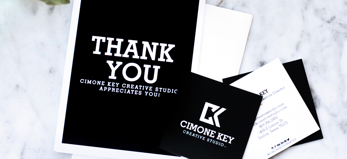
There’s so much more to creative branding than a striking logo. We spoke to Cimone Key of CK Creative Studio to learn how she brings all five senses into her brilliant branding and design.
Creating materials from look-books and logos to email campaigns and event branding, Dallas-based CK Creative Studio’s impressive client base includes Amazon, Adidas and Neiman Marcus.
The studio knows how visual identity can make or break a brand, and that’s what drives them to create stand-out tailored imagery.
We caught up with Cimone to talk about the evolution of her studio, the value of a five-senses branding strategy, and how MOO products help her clients stand out from the crowd.

What are the most important things to consider when building a creative branding strategy with print?
It’s so important to understand the industry the brand is in, and how you want the customer to feel when they pick up a piece of print material.
I tell my clients they should think about the paper too, because it exudes just as much personality as type and color. You wouldn’t want to be an engineer or construction firm with flimsy paper, and you shouldn’t be in the fashion or beauty industry and use stiff, non-textured paper.
To build a memorable brand, you have to consider the customer’s five senses, and touch is a big part of that.
How would you describe your approach to design?
My style and approach are dependent on each individual project. If it’s an illustration, I love to explore unexpected styles, because art is all about having fun, stepping outside the box and rejecting conformity. I love being spontaneous and discovering new ways to reach an audience with different styles of illustration. And I always think about touch, smell and all five senses when using print products.

How have you used MOO products to help clients stand out from the crowd?
I recently designed a beautiful gift for attendees at Amazon’s Black Women in Tech invite-only reception. Because it was an intimate event, I used MOO’s silky-touch Super Postcards to print my Hidden Figures illustrations, to really capture the essence and mood of the event.
I also used MOO’s Custom Notebooks with the event name and date printed in gold foil. It gave an elegant feel worthy of a keepsake. The attendees were impressed, not only with my illustrations, but with the luxurious feel of MOO’s paper and notebooks.
What are the benefits of using MOO products for a creative business like yours?
I feel I’ve gained clients specifically because of my MOO products. Whenever I hand out one of my business cards, I always get compliments about my logo and the quality of the cards themselves.
More recently, I started using MOO’s business account platform. It’s easy to navigate, and I love that I can design a Flyer, Luxe Business Card, or any type of printed material on the site.

What inspired you to launch your own business?
My biggest inspiration is my father. I learned at an early age how important it is to not let people tell you how much you’re worth per hour, and it’s always stuck with me. I’ve wanted to start my own business since I was 16 years old, and I love having the freedom to do my own thing.
But seeing others around me find success with their own business is also incredibly inspiring. I want to inspire others like me and show them they can do it too. They can be a talented African-American man or woman and not only own their own business, but thrive in that business.
What challenges has your business faced so far?
Being undervalued as an African-American woman is one of the biggest challenges I’ve faced. But I’m dedicated to take this on and fight for equality.
What’s your vision for the future of CK Creative?
I’m launching a new business venture called CK Complements – luxurious, modular chocolates sourced in Australia, using the highest-quality ingredients in their purest form. Truly effective brands must touch all five senses, and I’m doing just that.
I have my sights set on expansion, too. I’m focused on growing internally, welcoming new employees and expanding my studio to serve creative entrepreneurs in the area.
I want to give creatives – from graphic designers, photographers and copywriters to stylists, motion artists, and everything in between – a physical space to work and collaborate in, while having the freedom to be their authentic selves.
For more information on MOO’s custom products, get in touch.
Beginning her artistic journey with a passion for portraiture, London-based artist Venetia Berry has explored many mediums; from etching to painting and pottery. But at the core of her work there’s a constant drive to reverse the male gaze, celebrating feminine and non-binary forms through organically undulating pure line.
We caught up with Venetia Berry to explore her stripped-back style, how she’s fighting the male gaze, and the process behind planning her first solo exhibition.


Your work is full of abstract, fluid marks and pure line. Talk us through how you developed your style.
I’ve always aimed to create something that’s both minimal and complex. For me, the use of the pure line often means only using the marks that are essential for each work. It’s been present in artists’ works for centuries within their drawings, but more recently, the line is used as an art form in itself.
There’s something beautiful about returning to the roots of art — the simple drawn line; it can be so evocative and open to interpretation. When working in portraiture I was always focused on layering paint and using lots of it. As I’ve focused more on the female form, I’ve loved bringing back the simplicity of the line in my work; marrying together painting and drawing throughout the process.


How do you want people to feel when they see your pieces?
I want my work to feel optimistic. There’s a lot of negativity in the world and art has the opportunity to bring a moment’s respite. I want people to look at a piece and feel confident in themselves and their bodies — and think twice about criticising them. My work is celebratory, but also highlights issues of mental health and anxiety.


You work across lots of different disciplines. What are the challenges of working with so much variety?
The time to do it all! You can never stop learning with art, and each discipline has its own character and place.
I often find each practice weaves into the other and they don’t seem like different disciplines, more just another way to work. It’s important for me to have something in my creative bucket that isn’t for sale. It allows me to return to the reason I create in the first place.


How do you keep your style looking distinctively ‘you’ when working in different disciplines?
A certain amount of adaptation is needed; for example, pottery and painting are very different mediums. But I think it’s more a case of adapting the medium to suit my style rather than vice versa. For me, it’s so important not to force anything. It should be a natural movement from one discipline to the next with the ‘me’ aspect there, naturally.
Why do you choose to work in a pastel palette? Has your choice in color evolved over time?
My palette has definitely evolved. When I started art school I was obsessed with Caravaggio and chiaroscuro painting. I try not to plan too much, but when I start a painting I usually have an idea of the color scheme in my head, but it always turns out completely different in the end!
I tend to work with 3-5 pastels to create a sense of balance in a painting. I’m not sure why these colors speak to me, but I love their muted nature. For me, straight ‘out of the tube’ colour can feel too garish, but this could all change next week! That’s the thing I love about painting — the instinctive nature of it. It’s like someone else has chosen the colors for me, and I put them down without considering how they’ll work together.


Your work aims to ‘celebrate the female form and to reverse the male gaze’. Talk us through how you channel this message through your art.
The female nude has been painted and drawn for centuries by male artists for a predominantly male audience. As a female artist, it’s important for me to portray women through the eyes of a woman.
Although my figures are too abstract to represent reality, they aim to be inclusive to all shapes and sizes. As someone who grew up in a world where only one look and size was advertised as the ‘right’ one, it’s so important to me to rise up against that expectation. I want my work to take back the ownership of the female form. To be a woman, painting women, for a predominantly female audience. Each person has their own way of speaking out and using their voice. Mine happens to be through art.

What sparked the drive to create art that celebrates women?
As someone who has always lacked body confidence, it makes so much sense to me why I paint what I paint. I think it is important to change the way we see ourselves, compare ourselves and criticise ourselves.
As much as my work is about celebrating the body, we must also remember that our bodies are just the thing that carries our character, thoughts and personality around. We are so much more than just our bodies, and I always consider myself to be painting for my younger self, as she could have done with some more self-confidence. And if my work makes one girl, woman, boy, man, non-binary person rethink their criticisms of themselves, then I’ll be happy!
Have you found a community in the creative sphere with other artists who share your passion for celebrating women?
Definitely! We live in such an online world, which is brilliant for artists who often spend the days alone. Through being a part of Partnership Editions, I really feel that I’ve become part of a solid community, and I’m so delighted to be a part of it. There’s often negative press surrounding women climbing over one another to achieve success, but in my experience the opposite has been true. I feel so lucky to be surrounded by such supportive and inspirational women.
You’ve held some fantastic solo exhibitions. How did you know when it was time to take the leap?
For my first show I was incredibly lucky, as my cousin, Alex Eagle, owns an exhibition space in Soho that she allowed me to use. It took me about a year to create a body of work to show.
Having my friends there as moral support was fantastic, as well as being a great way to fill up the room and get the atmosphere buzzing. Since then I’ve built more of a client base and see more new faces when I exhibit.
What’s the most challenging part of holding an exhibition?
The biggest stress is usually getting the paintings to the space — usually very early in the morning — and hanging before people arrive for the Private View. One day I dream of having a couple of days to set up! I tend to work better under pressure and am often working right up until the week before the exhibition opens. There is no right way to do it, but I found a pace that suits me.
Every exhibition is scary, but there was something about the first that felt very soul bearing. I wasn’t sure whether I’d be able to continue in an artistic profession before that first show, so there was a lot riding on it. I remember having a very sore face from all the smiling and talking to people.
Do you have any advice for artists looking to hold their first exhibition?
If you’re lucky enough to know anyone with connections, write them an email. You might be surprised at how many people want to help out. If not, approach a space yourself; some rental venues might lower their prices. It’s also good to get the word out as much as possible, too. I wrote to lots of newspapers and magazines — it’s worth a try!
If you are really keen on one particular gallery or paper, write a really personalised letter to them. I’ve made invitations with MOO for all of my previous exhibitions. People love receiving and displaying them at home, and I think it’s because in a world of technology, there’s nothing better than getting something hand-written in the post.


Finally, if you had one piece of advice for other creatives, what would it be?
It would be to be yourself — there is only one you! Having your own voice is so important. Make something that is ‘you’ through and through, and don’t be tempted to follow a trend. Go with your gut.
Creativity is in hot demand. Not just in art, but in business too. So if you’re heading into the new year with a resolution to improve your creative skills, we feel you. Here are 8 ways to be more creative…
What is creativity?!
There are four distinct types of creativity, each using different areas of the brain.
- Subconscious creativity
This is the phenomenon where you suddenly have a moment of clarity and a new idea or a solution to a problem pops into your head, as if by magic. The theory is that your subconscious mind has been working away on the information in your brain while you weren’t aware of it – usually when you were zoned out, relaxing or thinking about something else.
- Emotional creativity
A rush of creative energy that’s triggered by strong emotion, whether it’s a result of hearing music, looking at a painting or watching a beautifully-made film. This type of creativity doesn’t require a lot of knowledge or study, but it does mean you need the artistic skills available to express what you’re experiencing.
- Reflective creativity
When something goes wrong, we enter a period of reflection where we review what has happened and think about how things could have been done differently. Because it’s about increasing your self-awareness, this reflective phase can be a time for coming up with your best ideas.
- Cognitive creativity
This type of creativity involves a trial-and-error approach to getting results. You work through all possible solutions to a challenge until you come up with the best one (or one you’re satisfied with at least!) What’s creative about that? Well, it means combining your existing knowledge about a subject in novel ways to develop an original idea.

How to be more creative
Ever hear the saying, ‘creativity is like a muscle – the more you use it, the stronger it gets’? There’s a lot of truth behind this. Developing practices that support your creative faculties, and allow you to use them on a regular basis, will strengthen your creative potential and make you more open to ideas and inspiration.
Wondering how to be more creative? You’re in good company. Follow these tips and discover achievable, fun ways to be more creative.
-
Make mistakes
Reflective creativity (the kind where you look back on what’s happened and learn from it) is at the heart of this one. As well as setting off your reflective creativity circuits, making mistakes is a really efficient way of learning, and can remind you how to do things better. The occasional mishap helps you understand the limits of your skills and materials, and force you to think up new ways of doing things.
2. ‘Steal’ ideas
According to creativity expert Austin Kleon – who wrote the best-selling book Steal Like an Artist – one of the best ways to boost your creativity is to let go of the idea that you need to be original. Instead, embrace the influences around you. Of course, plagiarising other people’s work is a no-go, but you can (and should) reference, remix and extend other ideas.
In other words, absorb other people’s work, ideas and philosophies to enrich your own. One way of doing this is by attending an industry event where you can connect with other design professionals. (Don’t forget your business cards!) This can fuel your cognitive or subconscious creativity by adding more reference material to your brain’s library of knowledge, leading to a burst of creativity.

3. Set intentions
Intention-setting has become something of a trend recently, thanks to its ability to give us focus and perspective. Doing this on a regular basis is a way of sparking reflective creativity.
Review what you’ve achieved and whether or not you’ve met your goals. That way you’ll be prompted to think in new ways, and plan for what you could achieve in the future.
4. Make time for creative practice
Creative ability is sometimes seen as a talent – something you either have or you don’t. But the reality is that creative skills are strengthened and improved with use and effort, just like any other type of skill.
Carve out time in your schedule to practice creative skills like drawing, digital artwork, crafts or even cooking. If you’re more of a cognitive creative, use that block of time to learn about new subjects and deepen your knowledge on things.

5. Do something unfamiliar
We look up to those who can ‘think outside the box’ – AKA take existing ideas and perspectives and turn them around, or recombine them in ways most people wouldn’t have thought of.
One way to encourage yourself to do this? Break out of what’s familiar. Make a change to your surroundings – move things around on your desk, work in a new location or even try learning about things unrelated to the task at hand. This fuels creativity by making you look with fresh eyes at what’s around you, rather than falling into habitual and routine ways of thinking.
Why not let your media be your muse? Exploring the possibilities of new kinds of paper, card, cloth and extra embellishments like foil can provide new grounds for your imagination.
6. Talk about your plans
It’s true – talking about how to be more creative can actually improve your creativity. We all know sharing knowledge and talking about what you know to another person can accelerate your own learning, as well as theirs.
Why? Because teaching someone else makes you remember what you already knew, strengthening your knowledge in the process. And since knowledge is key to at least two types of creativity, that can only be a good thing.
Talking about your ideas and goals has another benefit – you’re simultaneously giving another person a window on your creativity, inspiring them and helping develop a creative community.
Sometimes, creative communities coalesce around a trend, with collaborators fuelling one another’s creativity and building off one another’s ideas so a design movement appears. For example, 2019 saw a lot of excitement around hand-drawn type and illustration.
7. Keep a note of your ideas
Creative skills are built over time, and so is the knowledge that drives cognitive imagination and subconscious creativity. Get into the habit of keeping a notebook with you and write down any ideas you’ve come up with. Not only will your notebook be a handy reference when thinking about how to be more creative, it’ll free up space in your working memory for new ideas to fill.
8. Free-associate
Give your imagination complete free rein. Free-association is a technique for letting ideas flow from your mind and capturing them without judgement, so you can look back at what you’ve created later on.
To get your ideas flowing again, try sitting down for a set period of time with either a pen and paper or a computer and writing down exactly what comes into your head. Don’t censor, hesitate, or delete anything you’ve written. Once the timer stops, you can read back what you’ve written and keep whatever you like. As well as being useful, it’s one of the most enjoyable and therapeutic creativity skills going.
So, now you have the hacks you need, what better time is there than the new decade to improve your creativity?
Got a taste for type? Join the club. Finding the perfect font for your brand is tough – especially with so many swoon-worthy serifs to choose from. Check out our roundup of the typefaces our creative community are loving.
Studio Coverdale
Graphic designer Natasha Coverdale founded Studio Coverdale in May 2018, creating fantastical, floral, giclée art prints, posters and accessories that blend luxury with a pinch of playfulness. Her vibrant style is influenced by her time living in Hong Kong, Texas and Bangkok.
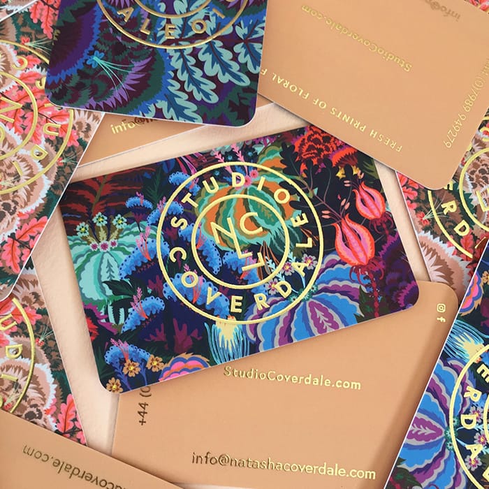
“For my business cards, I chose the Super Soft Touch paper with Gold Foil finish and Rounded Corners for a super opulent, luxurious feel. I wanted them to be desirable to represent my products, and be something people want to keep. I used a very simple sans serif typeface – Europa-Bold – it’s clean and timeless. The letter spacing and type design is simple enough to work well with my often maximalist designs, while being weighty enough to be stamped or foiled and still easy to read at a small scale.”
Studio Gika
After over a decade working as a graphic designer and illustrator, Aspa decided to shift her focus to visual art and painting. She now runs Studio Gika, where she showcases her nature-inspired art, and offers boutique design services.
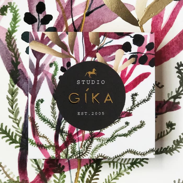
“Since my paintings are mainly botanicals, I wanted to use a modern sans serif font with simplicity, so Acumin Pro wide was perfect for my branding—plus it looks great with the Courier Std font. With Printfinity, I can showcase multiple paintings, and because I use copper and gold accents in my work, the Gold Foil option was a great way to connect my cards to my branding. The overall effect is modern, yet elegant and luxurious.
Johanna Kanzler
After steadily building up her freelance projects, Germany-based graphic designer Joanna decided to spend time developing her own brand aesthetic. For her business cards, Joanna visualized the idea of functionality in graphic design, reducing the card’s content to minimalist typography, lines and tactile elements, but without a stiff and serious feeling.

“For my font, I chose Adrian Talbot’s Kamerik 205. I love the sense of structure it creates on the J and K of my initials. It has the perfect line weight to stand on Luxe uncoated paper, and still appears subtle, which I think suits my personality. To keep the design light and human, I introduced a bold red. As lines play a big role in my design elements, I matched this to the coloured seam that runs through the paper. This extra detail emphasizes the printed lines, and makes the card feel more like an object as opposed to just a card.”
Next Creative Co.
With a passion for all things branding, Next Creative Co. help businesses communicate their authentic identity through branding, content, production and web development services. They’re inspired by the bold envelope-pushers who always look for the ‘what’s next?’ in the creative industry.

“We like to keep our brand bold and clean. So our cards only carry necessary information,” Digital Director, Rich Evenhouse, tells us. “We felt that anything more would just be clutter. We don’t like clutter. To create that ‘thud factor’, we chose Luxe paper. We wanted something that makes a statement, and between the weight of the card and the pop of color in the middle, it does that for us. The font is modern and versatile, and we like to think we’re the same way. Like Montserrat, we can be bold and loud when we need to be, or subtle and refined when we don’t. Almost every time we hand our cards out, it stops people and often initiates conversation about our brand.”
Jae Dollason
Jae is an art director and graphic designer with a passion for design strategy. Her recent reinvention of her own personal brand was launched with the aim of showcasing her authentic creative identity to potential clients.

“I’ve always been aware that I’m obsessively more organized than the average creative. So, when it came to selecting typefaces, I wanted something that reflected my own personality. The Freight suite had everything I was looking for: versatility, professionalism, clarity, and balance. I chose to print on Luxe paper because of its tactility when you hold it – I want recipients to link that sense of wonder and depth to my own brand identity. The reaction has been great! Lots of ‘oohs’ and ‘aahs’, which is amazing. We’re most critical of ourselves, so when you’ve worked really hard to design something you absolutely love, you know you’ve done a good job.”
Jhonny T
Jhonny T is an independent creative, working towards his dream of becoming a clothing designer. With the ethos of less corporate more independent, Jhonny wants his label to blend “sporty chic” with timeless design to create ready to wear garments for men and women.

“I needed my cards to be a direct representation of me as a designer – I’m simple yet bold, and I tell stories. When it comes to typefaces, I always work to find the perfect marriage between contracting weights and cases of fonts. My style is versatile, and the consideration of the type on my design really gets that across. Sustainability is really important to me, so when I saw the eco-conscious choice of using Cotton stock, there was no question I’d go for it.”
Monique Renée
When she’s not developing graphic design courses for college students, Monique is running her own graphic design studio, specializing in editorial design and typesetting for everything from print through to digital media. Her passion for lifestyle and fashion and the 2019 Pantone Color of the year inspired the design for her bold thank you cards.

“I love luxury fashion magazines and display fonts, so didones have always drawn me to their beauty. Salome (atipo foundry) is a fat didone, and lets me communicate that my brand is sophisticated and professional, without coming across as too lavish. I incorporated ellipsis marks in the Postcard design, because I always have so much more I want to say. I’m ‘old school’ when it comes to sending handwritten, heartfelt messages – it can change a person’s day when they open the mailbox. I want to show that I put care into every detail, and take time to ensure what I do makes someone feel good. By having strong, beautiful, feel-good cards, I accomplish this with every note.”
Little Life Studio
With a background in photography and media production, graphic design student Beth Nash has launched her own freelance career, producing alternative movie posters, illustrations and designs.

“I wanted to keep it simple and let my branding speak for itself. I went for Square Business Cards with a touch of Gold Foil to showcase my strong style and help me stand out to potential clients and agencies, plus I thought it would work well with my color palette. I’m glad I treated myself to foil – I love the cards and they’ve gone down a treat! I’ve recently had some industry interviews and they’ve been a great talking point. Everyone’s wanted to keep one (or two).”
Joyous Creative
Creative duo Jess Hain and Christina Newman founded their multidisciplinary design business in 2018 after deciding to join their creative skills and graphic design experience. Their Joyous Creative brand is all about playfulness and freedom to create. So when it came to creating a visual identity, they went for a fresh and bright look to communicate their ethos of originality and fun.
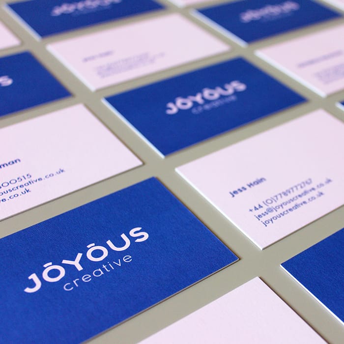
“Have you ever seen a logo with eyebrows? Now you have! We created a custom font design for our logo, featuring cutouts at the base of the ‘O’s to create ‘eyebrows’ that sit above the text. The fun and curiosity of the font coupled with a simple, Grotesk typeface below really captures our studio vibe. As a design agency, it’s important our business cards reflected the quality of work we produce, and these feel really special and solid. It’s quite hard to stand out in a sea of cards, but the Luxe finish definitely catches your eye.”
Thick and Thin Films
Wedding videography company, Thick and Thin Films add a personal touch for their clients by sending a small thank-you gift with every booking. “Nothing beats a handwritten card,” says co-owner Mary Betsy. “We mail another one when we deliver a couple’s video along with a small business card, printed with a request to leave a review.”

“For our Business Cards and Postcards, we used Minion Standard Black because we wanted a serif font to honor the tradition and elegance of weddings, then paired that with a lightweight monospace sans serif font – Letter Gothic Standard – to add a modern touch. We love how our cards make clients feel about our brand: consistent, thoughtful, and a little funky.”
Ben Kinde
Working as a graphic and web designer in Portland, Oregon, Ben Kinde works with an architectural aesthetic across elements of typography, color and space. His business cards were created to communicate authenticity and simplicity.

“For my typeface, I used Messina Serif in regular and italic. I love serif fonts for their human characteristics – their flare and imperfection. This felt like the right choice because it creates structural, geometric stability, while retaining its humanity. I went for the Cotton paper stock because it’s recycled, it’s soft and it ages beautifully. Over time, the identity of the product transforms for the user, and I think that’s pretty truthful of human experience.”
Megan Posas
Megan is a contemporary visual and performing artist, inspired by the architecture, people and natural beauty of her home in San Francisco. To house her ever-expanding portfolio, her business cards are printed with a selection of her latest paintings and old favorites.

“I love that with Printfinity, I can include so many different examples of my work – sometimes people want my card just so they can have a ‘mini-painting!’ For my information, I used elegant fonts – Sackers Gothic, Neue Haas Light, and Helvetica Neue LT Pro Light. They each have a delicate, round finish to them, which I think looks beautifully clean, high end, and contemporary. I want my artwork to be presented in an elevated way, and for that to be reflected in all of my branding.”
Winter Studios
Winter Studios is a husband and wife wedding videography team, with a passion for creating keepsakes that couples can enjoy for a lifetime. Before launching their own business, Nathan had previously been working as a graphic designer and videographer for a non-profit business.

“We had just renamed our business after our daughter, and needed a new logo. For the logo, I created a subtle ‘W’ shape with the trees, and matched it to the black seam of our Luxe cards. We used two contrasting but complementary typefaces, Archer and Gotham, to create a clean simple style. I think the modern fonts show people that our brand is contemporary and stylish, and our cards shout professionalism.”
Print your typographic creations to life with our range of premium print products.
The Pantone Color of the Year announcement is always a hotly-anticipated date in the design calendar. To celebrate this year’s color, we decided to set our community a very special challenge… enter #MOObriefs.

What is Pantone Color of the year 2020?
Every year, the experts over at Pantone Color Institute choose a shade they feel will best reflect the year ahead. This is based on various things – from fashion design and interior trends to current affairs and world news. The chosen hue is intended to represent a snapshot of the world.
This year, the Pantone Color Institute has selected Classic Blue. A timeless and enduring blue hue: elegant, calm and peaceful.
Here’s Executive Director at the Pantone Color Institute, Leatrice Eiseman, on why Classic Blue is the one for 2020:
We are living in a time that requires trust and faith. A boundless blue evocative of the vast and infinite evening sky, Classic Blue encourages us to look beyond the obvious to expand our thinking; challenging us to think more deeply, increase our perspective and open the flow of communication.”
What is #MOObriefs?
Following the announcement, we set our Instagram community a unique one-line brief: create a self-portrait inspired by Classic Blue. The entrants had one week to design, photograph, paint, sew (you name it) their self portraits. We saw over 100 entries and were so excited and inspired by the talent and creativity that lives in our online community. The creative team here at MOO had the tricky task of choosing just three winners. The winners received $250 MOO credit and their self-portrait printed on MOO Postcards.
So, ready to meet the winners? Drum roll, please…
1. Gail Armstrong

Gail is a London-based illustrator working entirely in paper sculpture, a medium she discovered while studying at the Glasgow School of Art. She was recently included in Creative Boom’s ‘Exciting Illustrators to Follow in 2020’ list and her client list includes brands such as Paperchase, Kleenex, United Nations, Nestlé and Macy’s. Her paper sculpture approach to her self portrait in Classic Blue made her entry one of our favourites. Here’s more about Gail, her entry and her work, in her own words…
Talk us through your entry…
I work as a paper sculpture illustrator and have been planning to do a portrait for a while, but I just couldn’t decide who! Then when I saw the brief for this, I thought “perfect!”
What did you think of this year’s Pantone Color of the Year, Classic Blue?
I love creating paper sculptures in single colour, but generally I use all white, so using a rich, dark colour was a new challenge. Often darker colours absorb too much light so the image can seem flat and ‘dead’, and details get lost in the shadows. But the Classic Blue works incredibly well in paper, catching light and shade really well and giving the image a good sense of depth and form. It’s also a good foil for other colours, so I will be using it more in future images.
What feeling does it bring to mind?
The immediate association when someone says “blue” is something melancholy or depressing, but not in this case. I find this blue implies a feeling of authority and calm assurance. I love the sense of richness and depth it brings.
If you could sum up your self portrait in 3 words, what would you say?
Realistic, flowing and papery.
How do you stay inspired?
I’m fortunate living in the vibrant and creative city of London, with all the galleries and exhibitions it has to offer, but my main inspiration is from paper. Be it patterned, textured, or just a plain colour, this everyday, humble medium can be completely transformed with a simple cut or fold, into an object of beauty. I spend hours at a time just playing with paper.
What’s the best advice you’ve been given in your creative career so far?
Keep pushing your own boundaries. Once you start falling back on old tricks and set ways of doing things, the creativity goes, the boredom sets in and the joy has gone. I treat each new project as a fresh challenge, and, once I’ve committed to a project, I give it my all, to make it the best it can possibly be, regardless of whether the finished image will be seen by millions or sit hidden in a box in my studio. That’s why I love what I do.
Inspired by Gail’s designs? Make your own Postcards here.
2. Justine Senee

Justine is a Motion Design artist in her last year at university in Paris. She runs a design and branding agency LA MAIN,with her partner, Erwan – their services include visual identity, branding, illustration, motion design and more. Justine’s playful, graphic video entry to our #MOObriefs competition was a hit with our MOO creative team. We chatted to Justine to find out more about her design and her work.
Talk us through your entry…
I saw the Instagram post explaining the #MOObriefs competition. I thought it was a fun and challenging reason for me to create new content, so I thought, “Let’s do it!”
What did you think of this year’s Pantone Color of the Year, Classic Blue?
For me choosing a blue colour was maybe a bit of a safe choice, I wish I’d been more surprised. But what I like about this colour is its strong and deep aspect.
What feeling does it bring to mind?
Confidence.
If you could sum up your self portrait in 3 words, what would you say?
Observant, smiling, adventurous.
How do you stay inspired?
Reading, watching movies, travelling… I think we can find inspiration in everything. I also like looking at the work of other designers. I was curious to see all the self-portraits people created for the #MOObriefs competition, all the different interpretations, techniques and ideations were so interesting.
What’s the best advice you’ve ever been given in your creative career so far?
“Always try to create something to stand out from the crowd”. I don’t know who said that but it became my motto and still is.
Go square and design your own Postcards.
3. Yulia Grabuzova

Yulia is a freelance designer and graphic design student at the Chelsea College of Arts which is a part of the University of the Arts London. Her beautiful, chaotic, intricate design made its mark on our creative team. Here’s a bit more about Yulia, her design and how she’s found her way to “enjoy the confusion”…
Talk us through your entry…
I love MOO, I love myself. Creating a self-portrait for MOO seemed like a logical thing to do.
What did you think of this year’s Pantone Color of the Year, Classic Blue?
Even though I am definitely drawn to its simplicity, I can’t say that this is my favourite colour. Perhaps because I find it too universal and democratic. However, it’s been amazing seeing everyone’s interpretations of the Classic Blue in this competition. This only proves that this is just a colour and it’s in our power to give it a new meaning.
What feeling does it bring to mind?
It feels like standing in a queue to an ATM and having a conversation with some old gentleman about the weather.
If you could sum up your self portrait in 3 words, what would you say?
Chaos. Routine. Celebration (of chaos and routine).
How do you stay inspired?
I’m not always inspired. In fact, I’m learning how to be ok with that. But I do find a lot of inspiration in Scandinavian, Japanese and soviet graphic design, as well as in people-watching, listening to music from the 50s and 60s and watching videos of old people dancing on TikTok. I have another trick that really helps me when I need a dose of inspiration ASAP. I do is I turn the lights off, put earplugs in, lay down and let my mind wander off. Sometimes that leads me to the craziest and most exciting ideas. However, there is always a risk of falling asleep, so use this power carefully.
What’s the best advice you’ve ever been given in your creative career so far?
One of my favourite tutors on my BA course once told us to “enjoy the confusion” (Shout out to Nigel “Papa Nige” Bents, the true legend). It applies to both my daily life and my work. Things don’t always work out, your ideas are not always successful, it’s ok to be a beginner in something, it’s ok to fail and not understand why, it’s ok to be confused. Life is messy and chaotic and that shouldn’t stop you from trying new things, from taking risks. Instead, find beauty and peace in how unpredictable and confusing everything is. And that’s what my self-portrait is all about.
Make your Postcard Designs stand out with Classic Blue.
The world of work is always evolving. As a startup founder, it’s important to keep up with the business trends around the world—and in your city—to build a memorable brand that attracts the brightest talent.

Startup Guide is a creative content company with a mission: to guide, empower and inspire people to start their own business anywhere. The company makes startup guidebooks to help aspiring entrepreneurs get the most out of their surroundings. With 17 different city guides made and a growing team of passionate employees, the company is showing no signs of stopping soon. MOO spoke with founder Sissel Hansen and COO João Mira about the origins of this unique startup.

Tell us about Startup Guide. How did you come up with this unique idea?
SH: Startup Guide is a creative content and publishing company that produces guidebooks and tools to help entrepreneurs navigate and connect with different startup scenes around the world. I founded the company in 2014, after moving from Copenhagen to Berlin to start a business and realized how difficult it was to find resources, practical information and people to talk to about this process. Soon enough, I noticed a lot of people were in the same boat and while gathering research on this, I thought, ‘Why not make this information accessible to others to help them navigate the startup scene in Berlin?’ That year, Startup Guide Berlin came out—and it sold out in 48 hours.

Now, we have books in 17 cities across Europe and the Middle East and have opened two physical stores in Berlin and Lisbon, which also serve as our offices, to promote and sell products by startups. We’ve grown to a 20-person team based in both cities. Recently, we also launched a platform that complements our books and aims to streamline the process of setting up a business in each city by simplifying administrative tasks such as registering for a bank account, sifting through legal requirements or getting a VAT number among other things.

What exactly do you cover in each edition of the Startup Guide?
JM: The Startup Guide books are based on traditional guidebooks that can be carried around everywhere and each edition is packed with facts and figures about the city, practical information, inspiring entrepreneur stories, coworking spaces to work at and insightful interviews with local experts.

What are the common threads between each of these cities and their cultures?
SH: All startup ecosystems consist of more or less the same elements: talent, funding, universities, corporations, investors, a good infrastructure – meaning a society that fosters and allows innovation. In terms of culture, we’re seeing that cultures where more people are willing to take risks have a tendency to generate more startups.
JM: Another common thread between the cities we’ve covered is the nature of the startup cultures. They all seemed to be influenced by the same well-known entrepreneurs, companies and startup stories. And this is undoubtedly because of the internet.


What do modern startups need from their cities in order to thrive as a business?
SH: Every startup can tap into the network of their own city to grow. Whether it’s a lawyer or an accountant, it’s so important for a startup to leverage the contacts in their local network because the closer you are with these people, the more likely you’ll receive the help you need. Instead of looking beyond their home city right off the bat, there’s so much value in looking within your city for info, a network and advice first. That was one of the main driving ideas behind Startup Guide—to help entrepreneurs make the best out of their local resources, programs, experts and network.
JM: More and more, startups are also needing their cities to modernize administrative services and tasks so things can happen more effectively and efficiently. Businesses are very different than they were a decade ago and I think everything from tax regulation and bureaucratic processes need to be updated in order for “modern startups” to thrive.

Do you have any tips to share with aspiring business owners on what to look out for when starting a business?
SH: For me, the “learning by doing” approach has been invaluable and I think it’s especially important when someone is just starting out in entrepreneurship. Of course, it’s important to educate yourself through reading, learning new things and talking to people, but you can’t only just sit and read and think to build a business. You have to actually do things and test them – and maybe fail – in order to learn, and then go from there.

As for the most overlooked aspect of starting a business, I definitely think it’s the processes and tasks needed to set up a company in the very beginning. I completely agree with João that these kind of admin tasks need to be modernized. In business school, we might be taught about how to target certain users or develop business models, but we never learn about the paperwork behind setting up a company, how to set up payroll or what a standard freelance contract might look like. People tend to underestimate these tasks at the very start, but they often end up being very time-consuming and complex. These are the kinds of things we want to help make simpler with our new platform.

What print products are most important to have when starting up a business?
JM: For us, it’s definitely been Business Cards. Even in 2018, everyone expects you to have a business card. Since we have two physical stores, people often come by and ask for our contact details because they have a product they want in the store or need our help with something. That’s when our Business Cards come in handy.


What’s featured on your MOO Business Cards and what did you hope to convey about the Startup Guide brand?
JM: Most of us use the Cotton Business Cards, which our Head of Design Joana Carvalho designed to convey key information about the company and what we do in a straightforward manner while still revealing a bit about our culture and team. We chose the MiniCards for our store managers. For those, Joana put the contact information for our stores in Berlin and Lisbon and intentionally left some blank space in the design to write down additional messages, if needed.


SH: For my cards, Joana chose to have three backside image options: a photo of the team, a picture of our main product – our books – and our logo. The idea is that I can pick one of three options to give out, depending on the conversation I’m in. For example, the team picture looks like one of the photos one might have of their loved ones in their wallet and could be a good ice breaker and at the same time it reflects the company spirit. It was great that MOO allowed us to make one order where there was more than one image on the backside of the cards.

Tell your brand story with MOO Business Services
At MOO, we’ve been helping people make their mark in the world with amazing quality print products for over a decade. And as our customers have grown, so has our service offering. That’s why for bigger businesses—with 10+ employees—we now offer MOO Business Services. It’s MOO + benefits. MOO Business Services combines dedicated account management with an easy online ordering platform and expert design services. It’s a complete package for businesses to give you more brand control and consistency—while saving you time, stress, and money in the process. Fill out the form here and a friendly Account Manager will reach out to you.
You don’t need to be a mega-corp to have mega business skills. Take a cheeky bite out of a big company’s years of experience with these lessons from the blue-chips.
1. It’s all about the relationships
Even in a world of automation and digital business, there’s one essential ingredient that only human beings can provide: trust. Without it, deals aren’t made, sales aren’t placed and things simply can’t happen.
One trust-fuelled success story is Airbnb, one of the big kahunas of the sharing economy. With a business model built around customers opening their homes with strangers, the trust factor is make or break. Airbnb has made it work using a strong brand built on ideas of connection, friendship and hospitality, backed up with a big investment in customer service to iron out any problems early in the process.
You can build trust in your business by keeping person-to-person connections solid with both staff and customers, being ready to talk face to face, and always following up on what you’ve said you will do. Conveying personal warmth in your branding, communications and deliveries helps too.

2. Be ready to fail to succeed
When you get things wrong, you learn stuff. The philosophy of being open to failure (or even ‘celebrating failure’) has a big following in the tech world, and it’s a habit well worth borrowing.
Apple is a great example of failing to succeed. Although it leads the list of today’s smartphone and computer must-have items, its journey to the top has been full of expensive and embarrassing mistakes – such as the PDA device that was ridiculed on The Simpsons, or the online ‘eWorld’ community that folded after two years in the 90s.
Failing well is all about asking what went wrong, why it happened and how to make things better in future. It works well on any scale, and it’s definitely better than ignoring or minimising negative outcomes, tempting though those approaches might be – just ask Steve Jobs. Check out our article on how to revive your failing business here.

3. Keep moving forward
What do you do when you’ve got a successful company that’s re-defining an entire industry? If you’re Elon Musk of Tesla, you open two more companies and keep all of them running at the same time. Musk added SpaceX (space travel) and Neuralink (brain-computer interfaces) to his to-do list alongside his senior role at the electric luxury car enterprise, and has investments and holdings in many more places.
Not that we’re saying you need to be a serial investor with multiple sci-fi-style projects on the go, but Musk is a great example of thinking big and refusing to rest on your laurels. If you’ve got the energy and ideas – use them. If today’s going great, what’s next? Can you make tomorrow even better?

4. Balance work and life
Google’s employees enjoy legendary benefits and perks, including free on-site gyms, education and learning benefits, time to pursue passion projects and amazing healthcare coverage. One of their most complimented strengths on employer review site Glassdoor is work-life balance.
Whether you’re a small start-up, a growing organization or a one-person business, the lesson is the same – people matter, and to get the best out of someone’s professional abilities, you need to treat the whole person with care and respect, including the times they’re not actively producing results for the business. This can be especially tough to do when you’re working for yourself, so make sure you prioritize self-care.