The Making of Monogram
Say hello to our handy new app!
-
 The MOO Team
Share the post

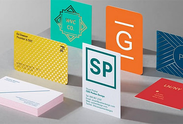
We’re all about helping our customers put their best face forward. While the Business Cards is one of the most effective ways to introduce yourself to potential clients, what about those times you need to show your work while on the move? We put our brightest minds on the case, and they built something special. Like, uber special.
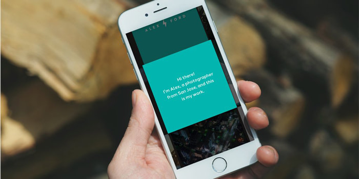
Ta da! Monogram is a free new mobile app that’s built to help you share what you do, simply and beautifully. It makes it easy to share your latest creations over a cup of coffee or in an impromptu networking opportunity. Living somewhere between the simplicity of a business card and the richness of a website, Monogram is your mobile portfolio, which you can now carry around in your pocket.
So how did Monogram come to be?
We sat down with Chad Jennings, VP of Product and Design here at MOO, to find out. All day every day, Chad and his team figure out what products we’re going to build, how we’ll build them, and then fine-tune the slick user experience to add a splash of delight.
They’ve been busy building futuristic tools like NFC-enabled Business Cards and the Paper+ platform, genius right?!
This time around, they decided to really shake things up by taking a different approach. “We set up a small team in a different office away from our London headquarters to allow us to get together and think about problems in a new way,” Chad said.

Exploring the challenge
The team set off to explore new possibilities for what this thing could be. “The big breakthrough was focusing on the in-person meeting,” Chad explained. “Say you’re an illustrator, a business owner, or a designer. When you sit down with someone, or even just meet them in passing or while networking, you’re sharing something personal. We thought about, step-by-step, what that experience is like, and the tools that could really help you show your work.”
Sure, you could pull up your online portfolio as a meeting prop. But as Chad pointed out, “many people update their portfolio once every few years when they’re looking for a job or clients,” he said. “What we imagined is something that can be much more flexible, curated, and updated regularly.”
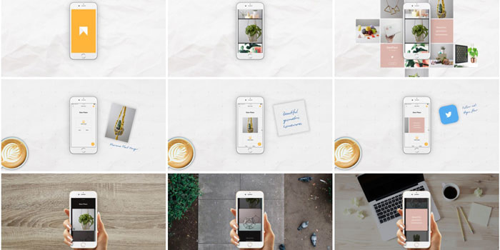
The team looked to the physical world for ways to turn what they had imagined into reality. Creative eyes fell upon the stacks of Square Business Cards piled high around the office. They started sketching directly on the cards, with each square representing an item you might share with a curious acquaintance: screenshots, product shots, Instagrams. In the process of sorting and resorting these cards, the tool began to come to life.
MOO’s Head of Digital Products explains in a Product Hunt thread; the idea was “to let you create something that was between an online profile, portfolio, and a CV that lived on your mobile phone and used a bunch of services you connected to it.”
Design, test, repeat
With preliminary designs at the ready, the team turned the idea into a working iOS prototype. OK, maybe it had some bugs… But being able to tap through an actual app, the team learned a lot about what worked and what may be missing from the experience.
The team didn’t hesitate to get the product in front of people early on. Approximately 800 MOO customers and friends used initial iterations of the app, providing feedback along the way. “We built a new version of the app about every two weeks,” Chad said. “That’s been an important part of our process to make this easy to use.”
Plenty of the feedback blew the team away, like this one: “I really love how flexible it is. It lets me tell a story.” But, as any good beta test does, this phase also unveiled a few key issues—for one, people were getting lost navigating the app. With that in mind, designer Jesse began experimenting with subtle movements that guide people through the app. You can get into the specifics behind Monogram’s user interface design over on Medium.
“We’re excited to see what creative uses people come up with.”
Another issue that came up was personalization. “Of course we could have tons of customization, but this is really about celebrating people’s own projects and enabling the work to stand out,” Chad explained. That said, the team gave people the ability to customize colors so they can brand the experience while still letting the work itself shine brightest.
Conversations with early testers also showed some unexpected approaches. One beta tester created a Monogram to tell a behind-the-scenes story, using images to guide listeners from a project’s nascent stages all the way to launch.
The most exciting possibilities still lie ahead, as Chad says. “We don’t really know exactly how everyone will use it, and we’re excited to see what creative uses people come up with.”
We’re excited to see how YOU use Monogram to show your work and the process behind it.
Written by Katherine Leonard
Keep in touch
Get design inspiration, business tips and special offers straight to your inbox with our MOOsletter, out every two weeks.
Share the post
Keep in touch
Get design inspiration, business tips and special offers straight to your inbox with our MOOsletter, out every two weeks.