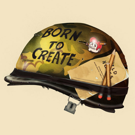
Spot gloss: taking your designs to a whole new level of awesome
-
 The MOO Team
Share the post
For seriously covetable Business Card designs, that include hidden treats head this way.
We just can’t help but let out an excited shriek when beautifully designed Business Cards cross our path – and that’s exactly what we did when we saw Tyler’s, Kane’s and Xavier’s awesome creations. Find out what influenced their designs and which paper they chose to help them stand out from the crowd.
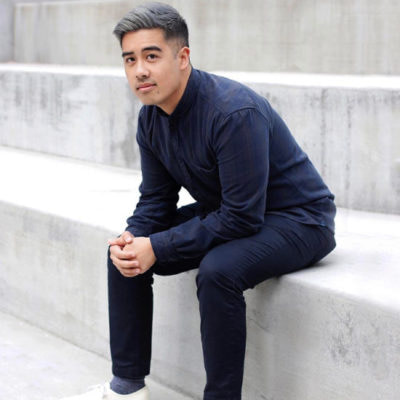
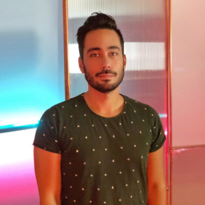
Tyler Pate

Tyler Pate is based in Charleston, SC. By day, he’s an illustrator and art director at Blue Ion – a digital marketing agency. By night, you’ll find Tyler working on freelance design projects. Tyler has always had a passion for art and design but painting was his real driving force. After high school, Tyler went on to study visual communication at college which introduced him to new mediums and new ways of working.


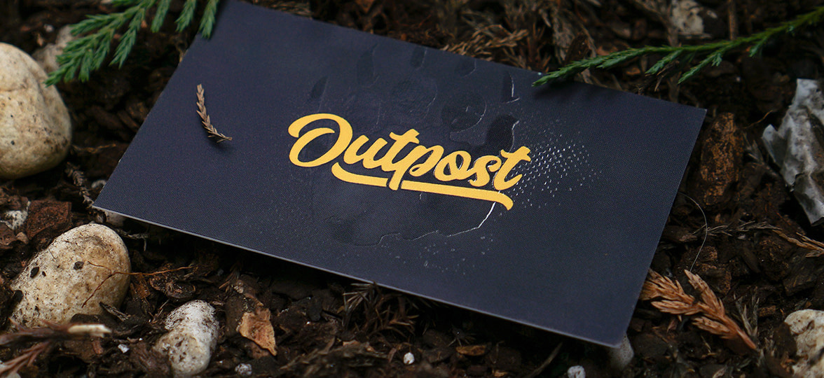
Tyler recently worked on a project with Blue Ion called ‘Outpost’ and the Business Cards he created really caught our eye! “Outpost is an initiative that focuses on exploring the essential connection between people and nature”, Tyler told us. “It’s all about getting ourselves outside and into nature more. As professional marketers, writers, designers and programmers we spend too much time indoors, sitting in front of a computer screen. We’re part of a larger project that encourages people to strike a balance between doing the work they love and refilling the well – and we wanted to be part of the solution.”


When working on the Outpost creative direction, Tyler was inspired by “the rugged textures you get from lino carvings, along with the simple and clean badges you might find in the Boys Scouts.” Tyler printed his Business Card designs on Super and added a spot gloss finish: “I had these exact specs in mind way before I even started designing the look of the cards. The Super paper is a great weight and I’m a huge fan of spot gloss – I love pushing simple designs with subtle attributes. And, for those who appreciate the details, like myself, the spot gloss designs are hopefully a hidden little treat bringing everything to a whole new level of awesome!”
Add hidden treats to your designs with Spot Gloss
Kane Ordonez
Kane Ordonez is an industrial design student at San Jose State University in California. He’s going to be graduating at the end of this year and can’t wait to get into the design industry. Kane’s interest in art and design started from a young age – he was always been drawn to crafts and DIY projects. In high school, he was introduced to digital media design and graphic design but it wasn’t until college that Kane discovered industrial design (also known as product design). This opened up new doors for Kane, allowing him to innovate whilst creating his ideas in 3-dimensional forms.


Industrial design has taught Kane to look at the world differently – taking in the smaller details and recognizing shapes and patterns in everything. His inspiration comes from the Mid-Century Modern era: “I really appreciate the simplistic furniture design, colors and pattern that can be seen throughout the era and I aim to bring these influences into my work.”


As Kane is coming towards the end of his studies, he wanted to create his own branding and designed Business Cards in preparation for his senior project show: “I designed my own logo – I wanted ‘K’, the first letter of my name to be the focus – the 4 lines represent the four letters in my name and I took inspiration for my color pallet from the Mid-Century Modern era. Kane loves the “matte, soft touch quality” of his cards and the thickness of the Super paper adds a “premium and sophisticated feel”. Kane included his Business Cards on his presentation table at his senior project show – they were a real hit, helping him to really stand out on the day.
Brand yourself with Super Business Cards
The Last Dodo
Xavier Segers is a freelance graphic designer based in London working under the pseudonym of The Last Dodo. Before going freelance, Xavier was working full time as an art director in a brand activation agency. He’s always focused on his attention on graphic design, with logo design and illustration being a particular passion for as long as he can remember. Xavier loves visiting art galleries and exhibitions – it’s his chance to “have a peek at the creative journey that other people have made and see which thought processes and results they use.” He also sees it as an opportunity “to get out of your creative bubble and to tap into somebody else’s.”


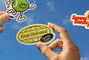
Xavier uses MOO for both personal and client projects – his most recent being a branding piece for a startup called PROEF who coach professionals in the restaurant industry. Xavier created a hand-painted logo using aquarelle textures and wanted a “quality print” that worked in harmony with the subtle tones. PROEF’s new identity was a “major success” and gave them “the boost and recognition” they needed. Xavier also told us that MOO’s “budget friendly options were perfect for a fledgling business” and products like Stickers “allowed PROEF to brand things that were not yet possible to customize in the startup’s early stages.”


Xavier has also recently created a series of Postcards featuring his personal designs that he now sells in shops. Because of this, Xavier chose Luxe: “I wanted the Postcards to be firm, not flimsy when people picked them up. Like with all of my work, I want to achieve a certain level of quality and I think this heavy weight paper contributes to that.” For Xavier, his Postcards symbolize the “new, creative freedom” that he now has in his life and it’s got him thinking of ways to extend his range. We can’t wait to see what he comes up with next!
Brand EVERYTHING with Stickers
Keep in touch
Get design inspiration, business tips and special offers straight to your inbox with our MOOsletter, out every two weeks.
Share the post
Keep in touch
Get design inspiration, business tips and special offers straight to your inbox with our MOOsletter, out every two weeks.