The MOO Color Challenge: 3 designers react to Pantone Color of the Year 2019
-
 The MOO Team
Share the post
48 hours. 3 designers. 1 color. How will these creatives incorporate Pantone Color of the Year 2019 into their designs?
The Pantone Color of the Year announcement is a serious save the date in any designer’s calendar. To celebrate the big reveal, we decided to set some awesome designers a unique challenge…
What is Pantone Color of the year 2019?
Every year, the color connoisseurs over at Pantone Color Institute choose a shade that they feel will best reflect the year ahead. This is based on various factors, from fashion design and interior trends, to current affairs and world news. The chosen hue is intended to represent a snapshot of the world.
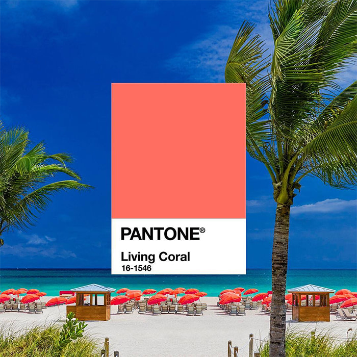
This year, the Pantone Color Institute have selected Living Coral. A bold, invigorating pink that exudes warmth.
Here’s Executive Director at the Pantone Color Institute, Leatrice Eiseman on why Living Coral made the top spot:
“With consumers craving human interaction and social connection, the humanizing and heartening qualities displayed by the convivial Pantone Living Coral hit a responsive chord.”
Find out more about Living Coral, the new color of the year
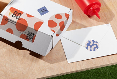
What is the MOO Color Challenge?
Following the announcement, we set 3 designers – all renowned for their use of color – a unique 48 hour challenge to create their own Business Card or Postcard designs, inspired by the peachy Living Coral shade.
So, ready to meet the designers? Drum roll, please…
Timothy Goodman
After collaborating on a brand new limited edition Notebook last year, we just had to invite New York based illustrator and designer, Timothy Goodman back for another challenge.

Timothy’s bold graphic work has landed him some amazing projects with big brands like Uber and Uniqlo. His work has adorned everything from large scale murals to magazine covers (even the bonnet of a Ford Focus on one occasion). Whatever his canvas, Timothy’s playful typography is human, storytelling, and always made with passion.
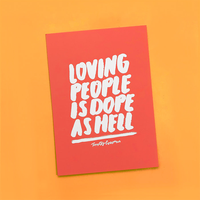
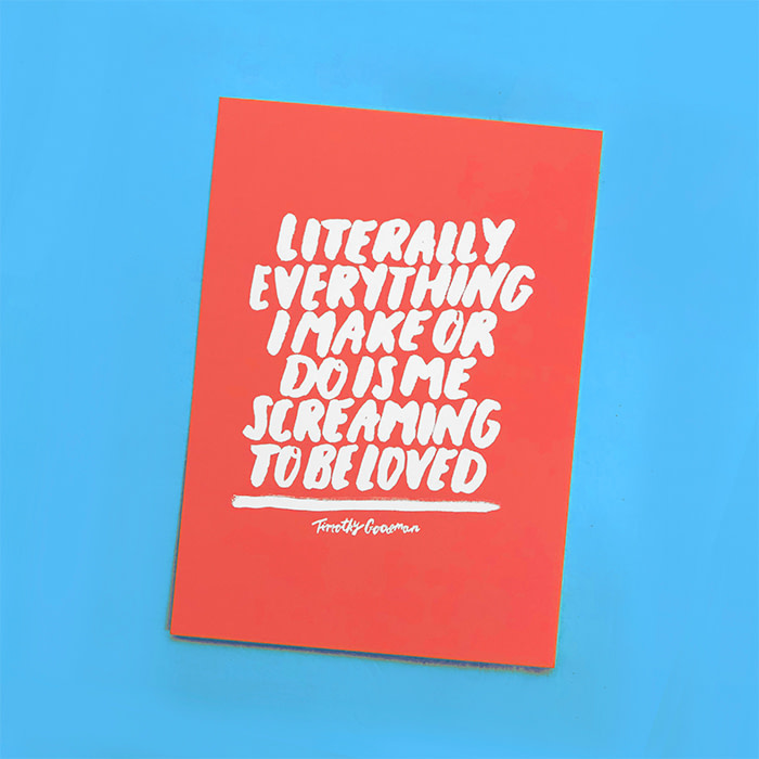
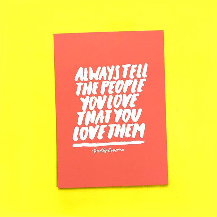
When Pantone revealed their Color of the Year, Timothy immediately had a strong vision for his designs. “I absolutely love this color!” he says, “When I first heard the announcement, I instantly knew how I wanted my work to look – big white quotes on a sea of Living Coral. I don’t usually use a ton of color in my work, but my black and white style pairs perfectly with warm colors like this. I’ll definitely be using it again.”
Inspired by Timothy’s Postcards? Start designing your own now
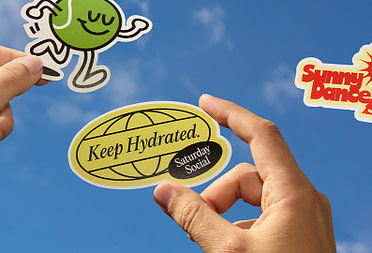
Hattie Stewart
When we first saw Hattie’s work, we were immediately hooked on her colorful, tongue-in-cheek style. She’s got that classic-meets-contemporary balance spot on – all while having subversive commercial appeal.

Hattie works with a bold, irreverent aesthetic, and her signature “doodle-bomb” on high-profile magazines has hit the covers of titles such as Vogue, Dazed and V Magazine.
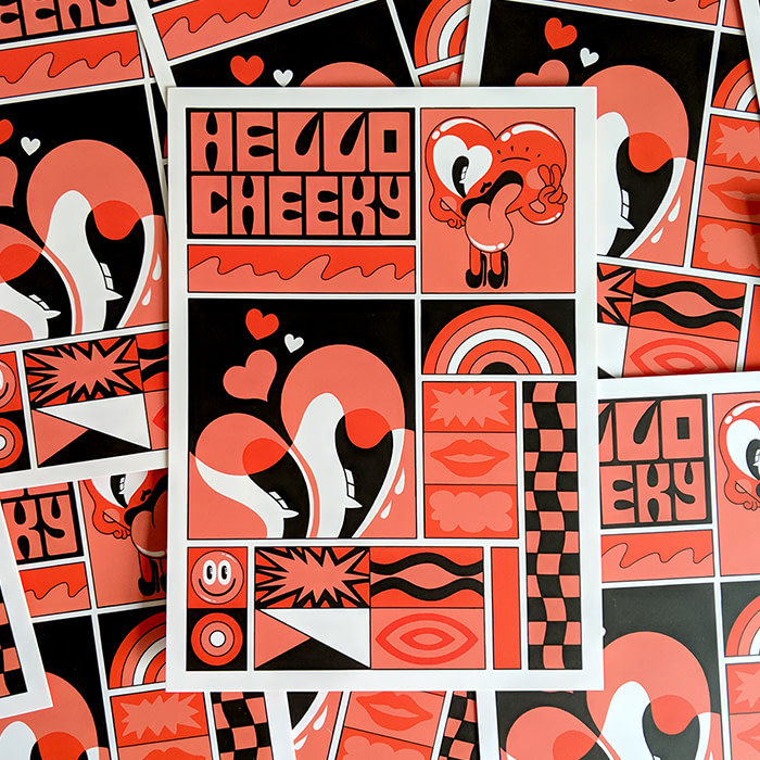
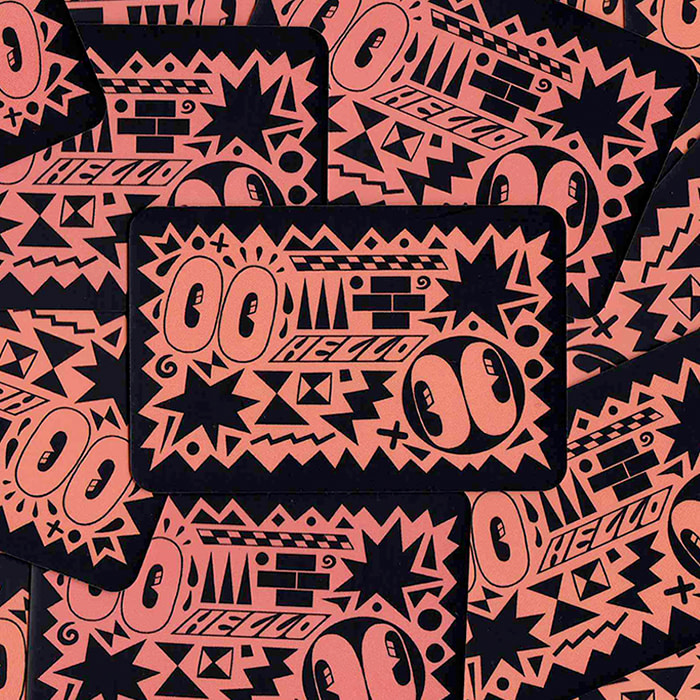
As soon as the new Color of the Year was announced, Hattie knew she could use Living Coral to make her designs pop. Her aesthetic welcomes a bright palette so Hattie was “thrilled that this color was chosen.” The coral “complements the black line-work and the sentiment behind the ‘Hello Cheeky’ tagline perfectly” she told us. The result? “Designs that are simple, but really visually engaging.” We couldn’t agree more!
Make your Business Card designs ‘pop’ with Living Coral
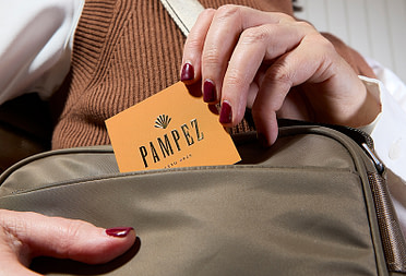
Zipeng Zhu
New York City based art director and designer Zipeng creates visually arresting animations and graphics. His bright designs and bold statements are fun, playful and bursting with color and aim to make everyday feel like “a razzle dazzle musical.”

Zipeng’s versatile style has attracted some exciting projects too, like reimagining the branding for the Jewish Museum in New York.
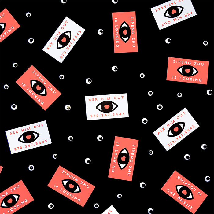
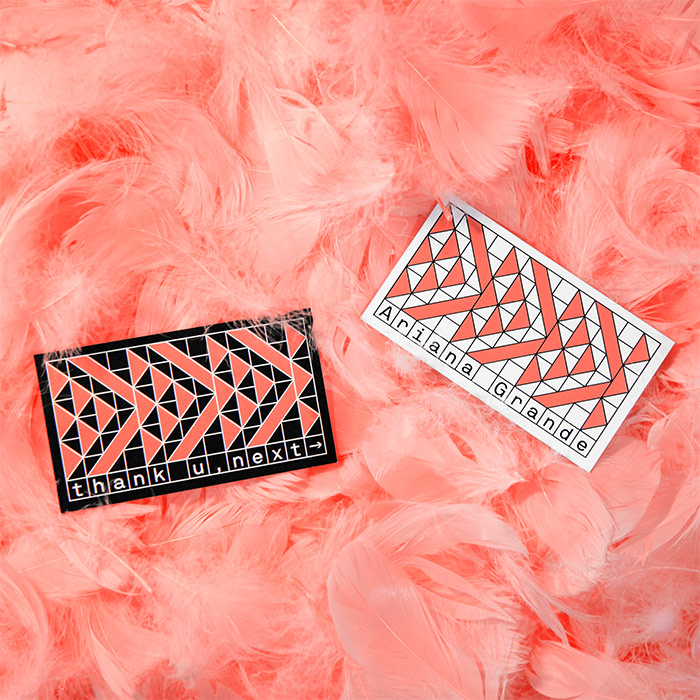
Although he was surprised by Pantone’s choice, Zipeng used his natural eye for color to bring his Living Coral designs to life. “I was so shocked it wasn’t yellow, but I think it’s a very accurate shade for 2019.” he says. “Choosing which colors to use in my design was instinctive for me. When I’m working on a set color scheme, I try to complement or create contrast in my choices.”
Stand out from the crowd. Use Living Coral in your Business Card designs
Where can you check out the designs?
Not only have Timothy, Hattie and Zipeng created completely original designs, they’ve also photographed and documented their creative process. We’ll be sharing all of this – plus the juicy behind the scenes work – with you over on Instagram.
Stay up to date with the MOO Color Challenge. Follow us on Instagram and check out #MOOcolorchallenge.
Keep in touch
Get design inspiration, business tips and special offers straight to your inbox with our MOOsletter, out every two weeks.
Share the post
Keep in touch
Get design inspiration, business tips and special offers straight to your inbox with our MOOsletter, out every two weeks.