The psychology behind Notebook cover colors
The wrong color could be costing you 80% of your brand recognition. Here’s how to fix it.
-
 The MOO Team
Share the post
First impressions happen in seconds. And when someone picks up one of your branded Notebooks, the color is already telling them a story about who you are before they’ve read a single word inside. Understanding color psychology helps you create intentional design that actually connects with your audience.
Table of Contents
- What is color psychology?
- Color meaning in Notebook design: how color influences perception
- Choosing Notebook Cover colors that match your brand values
- Custom Notebook design considerations
- Notebook design mistakes to avoid
- Cohesive branding tips
Key Takeaways
- Color alone can account for up to 90% of someone’s first impression of your branded notebooks
- Different hues trigger specific emotions and associations that influence brand perception
- Custom Notebook design options (cloth, full-print, foil) affect how color appears and feels
- Strategic color choices strengthen brand recognition by up to 80%
- Consistency across all branded materials builds lasting brand recognition
What is color psychology?
Color psychology is the study of how different colors affect human behavior, emotions, and decision-making. In design, it simply means choosing colors on purpose to create a certain mood or reaction.
A 2025 review of branding-color psychology found that effective color usage can “increase brand recognition, foster emotional connections, and influence purchase decisions.” Studies suggest that color alone can account for up to 90% of an individual’s first impression of a product and that carefully chosen color palettes can raise brand recognition by as much as 80%.
Color meaning in Notebook design: how color influences perception
When it comes to branded Notebooks and Planners, color psychology plays a big role. The Notebook someone reaches for in a meeting, the Planner they keep on their desk, the Journal they pack in their bag – these choices aren’t random.
Color influences not just whether someone picks up your Notebook, but also how they feel when they use it and the associations they form with your brand.
Here’s what different colors say about your brand:
Blue: trust, professionalism, and calm
Blue inspires feelings of stability, calm, and dependability. That’s why so many corporate brands lean into navy or lighter blues for their notebooks. Blue suggests reliability without feeling stuffy.
Green: growth, balance, sustainability, wellness
Green is connected with nature, balance, health, and tranquility. It carries strong associations with “nature, growth, health, harmony, balance, tranquillity, safety, and environmentalism,” and is often considered calming. Its use in wellness, eco-friendly, or health-oriented branding taps into those associations almost instinctively.
Red: attention-grabbing, energetic, bold, dynamic

Red commands attention. It’s bold, energetic, and impossible to ignore. Red is consistently linked to “positive and negative, arousing, and high-power emotions” such as excitement, passion, anger, and energy. Red Notebook covers are great for creative studios and brands that like to make an entrance.
Yellow and orange: warmth, optimism, friendliness, creativity

Yellow and orange are naturally friendly colors that reflect positive, high-energy moods like joy and enthusiasm. They’re perfect for brands in education, creative industries, or anywhere you want to spark conversations and bring that feel-good energy.
Purple: luxury, creativity, uniqueness, wisdom, memorability
Purple has always hinted at luxury, creativity, and wisdom. And because it’s not overused in corporate branding, it tends to stick in people’s minds. Purple is associated with “empowering emotions,” such as pride, power, and love. This fits perfectly with brands that want to feel imaginative, bold, or a little unexpected.
Pink: creativity, playfulness, approachability, friendliness
Pink communicates creativity, playfulness, and approachability. It’s full of positive, feel-good emotions, which is why it works so well for brands building community or warmth.
Black, White, Grey: sophistication, minimalism, versatility, timelessness, clarity

The classics. White is calming and clear, while darker neutrals feel strong and authoritative (making it perfect for a premium Notebook cover). Neutrals are also great team players: foil details, colored edges, or embossing really pop against them.
How to choose Notebook cover colors that reflect your brand values
Choosing the right Notebook cover colors is a chance to express who you are as a brand. Here are a few things to consider:
Start with your brand identity
What three words describe your brand? What do you want people to feel when they interact with your materials?
If your brand is innovative and forward-thinking, you might explore brighter, unexpected colors. If you prioritize tradition and expertise, deeper, more classic tones could work better.

Take some inspiration from Bluestone Lane. Their softcover Notebook choices reflect their café culture – approachable, sophisticated, designed for the everyday ritual of great coffee and good conversation.
Consider your audience
Notebook cover colors for a tech startup might mean something completely different than choosing them for a luxury spa or a nonprofit. Your audience’s expectations and preferences matter.
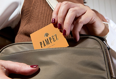
Femme Lead’s choice of orange cloth Hardcover Notebooks for their podcasting community works precisely because it speaks to their audience – creative, approachable, professional women who want materials that feel both polished and personal.
Think about context.
Where will these Notebooks live? If they’re gifts for high-level clients, you might lean toward a more premium look with cloth covers in sophisticated colors. If they’re swag for a festival, you can be bolder and more playful.
When Notion gifted custom full-print Hardcover Notebooks to event attendees, the design needed to work in that specific moment of excitement and connection.
Custom Notebook design considerations
Your cover type affects how color appears and how the Notebook feels in hand. Here’s how to decide which style suits your brand best.
Hardcover vs. Softcover
Hardcover Notebooks feel substantial and professional. They’re built to last, making them perfect for long-term planning, journals, or gifts that need to convey quality. Color on a hardcover – whether cloth or full-print – tends to feel more premium and permanent.

She Says chose full-print Hardcover Notebooks as gifts for mentors and mentees at their events, understanding that the weight and quality of a hardcover reinforce the significance of the relationship.
Softcover Notebooks are flexible and portable. They slip easily into bags and pockets, making them practical for everyday use. Colors on Softcover Notebooks can feel more casual and approachable, which works brilliantly for creative projects or event merch.

Full Punch, a creative agency, chose softcover journals precisely because their team needed something practical that still looked sharp. The flexibility matched their working style.
Customization options
The way you apply color to your Notebook cover changes the entire effect:
Cloth covers offer texture and a tactile experience. Color on cloth feels sophisticated and muted, with a natural quality that photographs beautifully. The material itself adds warmth.
Full-print covers give you complete creative freedom. You can use photography, patterns, illustrations, gradients – anything. This option works brilliantly when you want your branded Notebook design to make a bold visual statement.
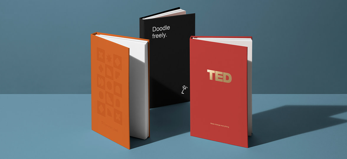
Foil stamping adds metallic accents to your cover color. A deep green cloth cover with Gold Foil creates instant luxury. Black with silver foil feels luxe and modern. TED’s Gold Foil Cloth Hardcover Notebook is a classic, elevated design.
Embossing creates subtle texture without adding color, letting your base Notebook cover color do the heavy lifting while adding sophistication through dimension.
Notebook design mistakes to avoid
Even with good intentions, it’s easy to make choices that undermine your Notebook design. Here’s what to watch out for:
- Using too many colors. More isn’t always better. A cover with five different colors competing for attention can feel chaotic rather than creative. Choose one or two main colors and use them intentionally.
- Ignoring contrast. If your logo or text doesn’t have enough contrast with your cover color, it becomes invisible. Dark text on a dark cover doesn’t work, no matter how much you love that specific shade of charcoal.
- Forgetting about practicality. Super light colors show every mark and smudge. Think about how your Notebooks will actually be used and handled.
- Choosing colors that don’t match your brand. If every other piece of your brand identity is warm and earthy, why is your Notebook electric blue? Consistency matters.
- Overcomplicating the design. Sometimes, a beautiful cloth cover in the perfect color with simple foil stamping is more powerful than a busy full-print design trying to do too much.
Cohesive branding tips

Your Notebook should be part of a larger, consistent visual identity. Here’s how to make everything work together:
- Keep your color palette consistent across all print materials. If your Notebooks are forest green, consider how that connects to your Business Cards, Stickers, or other Branded Merch. Consistency doesn’t mean everything needs to be identical, but there should be clear visual relationships.
- Place your logo thoughtfully. A small, subtle logo can feel more premium than a large one dominating the entire cover. Consider scale, position, and how the logo interacts with your chosen cover color.
- Match your typography. The fonts you choose for any cover text should align with your broader brand typography. This level of consistency makes everything feel more professional and intentional.
Find your perfect Notebook palette with MOO
Explore MOO’s Notebooks and see what happens when you match the right hues to your message.
If you need help bringing your vision to life, MOO Business Services offers expert design support to create branded notebooks that work. To get started, fill in this simple form, and one of our team members will be in touch shortly.
Keep in touch
Get design inspiration, business tips and special offers straight to your inbox with our MOOsletter, out every two weeks.
Share the post
Keep in touch
Get design inspiration, business tips and special offers straight to your inbox with our MOOsletter, out every two weeks.