Eurostar: A journey of digital and physical brand transformation
Discover the art of the rebrand with Eurostar
-
 The MOO Team
When it comes to high-speed train travel, Eurostar has been leading the way for more than 25 years. Connecting the UK, France, Belgium and the Netherlands. But last year, Eurostar Group took a bold move by merging with another iconic train company, Thalys. The goal? To become a single, and powerful brand that represents the best of high-speed train travel in Europe.
And with the help of design agency, Design Studio, they created a new brand and design system that translates across both online and offline channels, while simultaneously integrating the heritage of both brands.
So, how did they do it? We spoke to Eurostar’s Head of Brand Development, Mario Rauter, to find out.
Embracing the future and reaching new audiences
Much like their high-speed trains, Eurostar knew their brand couldn’t sit still. On average businesses rebrand once every 7-10 years. “A brand is always a sign of the time it lives in, and if it’s a sign of the time it was born in, then it probably isn’t very relevant,” said Mario.
The major reason for the rebrand was the merger with Thalys, a beloved French-Belgian train company. “Thalys is a very strong heritage brand. In Belgium, it’s more recognized than Apple. It was a big decision to take that away. Naturally, we had to replace it with something very good,” Mario told us.
Another driving force was Eurostar’s ambitious new vision of sustainable, accessible European travel. This entailed expanding their network, enhancing connections, and attracting 30 million passengers by 2030. “None of the two brands were suited for the next phase of Eurostar’s business growth,” explained Mario.
Through extensive market research, it was evident that Eurostar had greater recognition among international audiences. As Mario put it, “We held onto the name, but we built a completely different brand from the ground up.” This meant crafting a completely fresh identity from scratch while honoring both brands’ legacies.
But it wasn’t just about attracting more passengers; it was also about staying relevant and appealing to younger audiences. “The old Eurostar had a very premium language, that alienates almost an entire future generation of voices. In order to stay relevant with Gen-Z, who are now gaining earning power, we needed to build a brand that spoke to them,” explained Mario.
The need for a rebrand was clear: It was a strategic move to stay current, forge connections with new audiences, and embrace the future. Eurostar made the bold decision to reinvent themselves, but has it paid off?
Bringing the spark back
With a fresh logo, punchy color palette, stunning photography, captivating illustrations, and dynamic motion graphics, the new identity merges two companies under the Eurostar name. Design Studio faced a clear challenge: retaining the name while rebooting the brand. After an extensive discovery phase, immersing themselves in the history of Eurostar and Thalys, as well as embarking on various train journeys, their team presented multiple iterations of the innovative brand system.
“They were able to capture the premium element but also the young element of the brand by experiencing the product.”
On the re-branding process and capturing the brand’s essence, Mario said “It was a very intense and very personal collaboration, we touched many areas of the business that you wouldn’t usually touch. They all had very strong product experiences. So they were able to capture the premium element but also the young element of the brand by experiencing the product.”
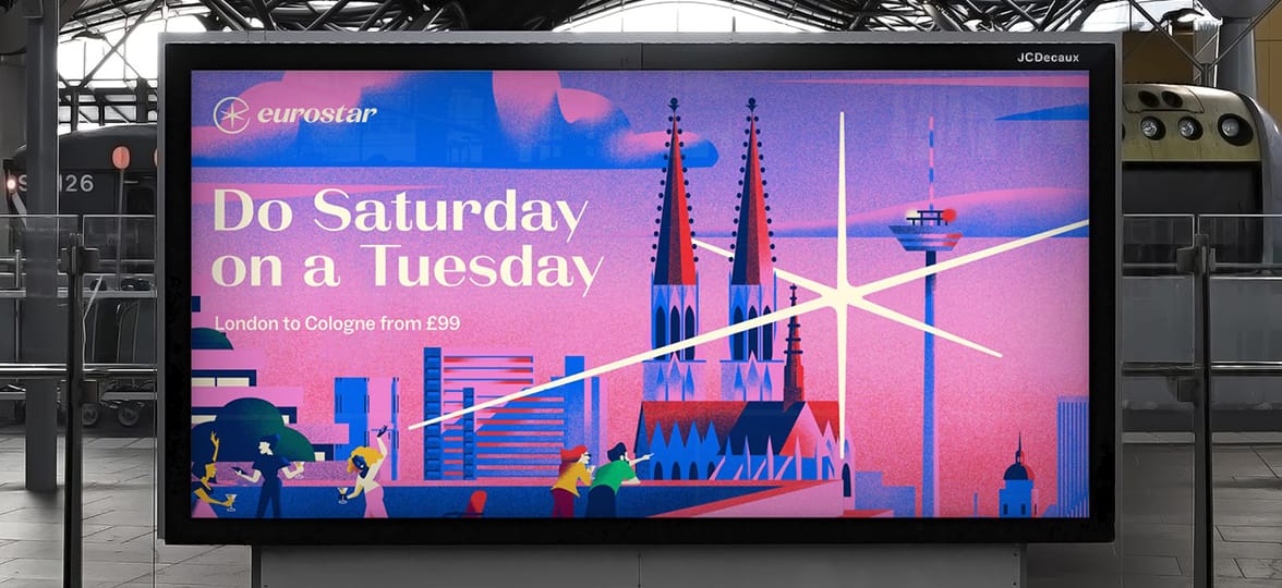
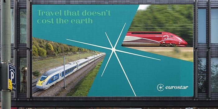
At the heart of this new brand identity, is the re-imagined North Star. It functions as a standalone graphic device, appearing across trains, stations, and digital platforms. According to DesignStudio’s press release, the spark is “the literal and metaphorical north star of the brand”.
The supporting headline typography, meticulously designed by Icelandic font studio Ortype, pays homage to the French origins and the era of glamorous travel. It was carefully chosen to reinforce customers’ association of Eurostar with Paris, as explained by Mario.

To capture the diversity and vibrancy of Europe, they collaborated with emerging illustrators from the five countries within the Eurostar network. “All the illustrators we chose were local to the city they were depicting and also heavily influenced by the Golden Age of travel. We wanted to strike a balance between nostalgic and modern,” said Mario. With these captivating updates, Eurostar’s refreshed brand promises to engage and inspire audiences across Europe and beyond.
Balancing on and offline consistency
As a complex business, Eurostar needed to brand everything from trains and digital tickets to front desks and napkins. Keeping the brand’s consistency across so many different spaces can be challenging. Distinctive brand assets are a crucial aspect of brand building. In an increasingly screen-first world, too much consistency can make brands look one-dimensional, and that’s where coherence is more important. Clear principles and varying manifestations can make a brand stay engaging and relevant.
Eurostar’s new branding exemplifies this approach. Mario reflected on the importance of communicating your brand’s needs when working with an agency like DesignStudio. “Although they come from a very digital space, they were able to translate the essence of the brand across many different estates and platforms, focusing on structure, texture, and materiality. We wanted to see what it would look like on our trains, front desk, napkins, signage, and even chandeliers in the lounge,” Mario told us.

According to DesignStudio’s creative director Julien Queyrane, the old Eurostar identity was 3D but couldn’t be applied digitally because it had been flattened. Modernizing the brand to create impact across digital platforms was a big part of the brief.
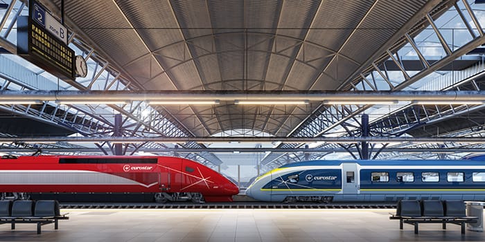
The newly designed (and iconic) Eurostar spark was designed to be a flexible and dynamic asset, that can be used across the full brand experience. From train livery and across stations, to digital platforms. The spark takes on a wide range of motion behaviors like rotating, extruding, and dropping into locations, acting like a navigational compass to guide you around your city destination.
A new brand merger paved the way for a fresh color palette. And Eurostar had to make some tough decisions about which colors to keep. Brand research revealed that Eurostar was seen as ‘cold’ while Thalys was seen as ‘warm’. “We took those colors and gave them a human touch. We also wanted to highlight our sustainability efforts as well as ensure our colors were easily accessible. That’s why we added vibrant greens, yellows, oranges, and reds. We wanted to make sure our messages were clear and legible, with the right amount of contrast. Accessibility is a top priority for us,” said Mario.
Engaging employees with a new brand

When it comes to communicating a rebrand, it’s crucial to make sure everyone understands the changes. This is not only important for customers and stakeholders but also for employees. Change can be overwhelming, especially for long-time staff and loyal customers who feel attached to a brand’s heritage. For any rebrand, having the backing from every member of your organization is key.
For Eurostar, this was a top priority, particularly in communicating with Thalys employees. Mario explained, “We created info hubs that traveled throughout our locations, where employees could learn about the rebrand, new loyalty programs, uniform designs, and more.” Mario and his team made strong efforts to engage with each employee multiple times, understanding the importance of making personal connections and sparking excitement.
“Thankfully, the new Eurostar, speaks for itself and does all the heavy lifting. People look at it and say ‘Oh, that’s gorgeous’.”
The big reveal

The new look and feel of the Eurostar brand was revealed in January 2023, allowing Mario and his team a flexible window to begin rolling out the various projects across the full estate.
Mario elaborated “We want to take the customers through the journey from an early point onwards. Because we know Thalys is a much-beloved brand. For them, it’s a further step than for the people who are used to Eurostar. For the Thalys customer base it’s a name and brand change for the Eurostar base the step isn’t as far.”
To build anticipation, they’ve maintained a constant drumbeat of revealing the new brand, including a major event in Paris in July 2023. During this event, a partnership with the Olympic teams for Paris 2024, was announced, solidifying their role as their official travel partner. The press attention generated from these partnerships has given people a glimpse into what the new branding looks like.
Rebranding trains is a complex logistical task, but Mario explained that this is very much underway. This preemptive action aims to put passengers’ minds at ease and create a seamless transition. “We are too complex to do a ‘switch on’. We’ve got stations that we are not fully in control of, we need to rely on our partners, and we’ve got signage, and logos in the Paris metro that we need to try and control. Digital goes first, a couple of days later, digital advertising, and then the big bang ATL Marketing campaign a couple of days later. Plus, a lot of press events in all countries,” said Mario.

Eurostar passengers can look forward to experiencing the future of Eurostar – the look, feel and ambiance by the end of 2023. Where will you be traveling?
Six branding lessons from Eurostar
So, what can we learn from Eurostar’s rebranding story? Here are six key lessons:
1. Embrace your brand’s heritage while embracing the future
Eurostar’s rebranding journey blends nostalgia with modernity, paying homage to the past while looking towards the future.
2. Consistency is key
A strong brand identity should be consistent across all touchpoints, from digital platforms to physical spaces. Eurostar’s rebranding ensures a cohesive experience for passengers at every step of their journey.
3. Engage your audience:
Eurostar’s new brand identity is designed to captivate and engage customers and employees, creating an emotional connection that goes beyond functional travel.
4. Stand out from the crowd
In a competitive market, it’s essential to differentiate your brand. Eurostar’s rebranding sets it apart with a unique visual identity that reflects its values and aspirations.
5. Balancing on and offline
Maintaining branding consistency across digital and offline spaces can be challenging but is essential for building a strong and recognizable brand identity.
6. Adapt to changing times
Eurostar’s rebranding demonstrates the company’s ability to adapt and evolve in response to changing customer expectations and industry trends.
At MOO, we help create remarkable experiences for your clients and staff. Whether you’re starting fresh or going through a full rebrand, our design team is on hand to help you leave a lasting impression with our incredible selection of print and branded products.
Simply fill in the form below and a friendly account manager will be in touch!
Keep in touch
Get design inspiration, business tips and special offers straight to your inbox with our MOOsletter, out every two weeks.
Share the post
Keep in touch
Get design inspiration, business tips and special offers straight to your inbox with our MOOsletter, out every two weeks.


