Make customers come back with stunning loyalty card designs
Get inspired with these loyalty card ideas and give clients one more reason to love your brand.
A free coffee. 20% off. A surprise gift. We’ve all been there – and we’ve loved it. Stamp cards are an awesome way to reward loyal customers and make them feel special. They’re also a great place to showcase your branding with an original design that’ll make them smile as they come back, day after day (after day).
Give customers one more reason to love your brand with custom stamp cards. Get inspired with some of our creative community’s most original loyalty card examples.
Brooke Henning: loyal from head to paw
British graphic designer Brooke Henning is passionate about branding and social media. However, the young entrepreneur behind Brooke Kimberly Creative is as fluent in print as she is in all-things digital. Committed to helping businesses small and large build a powerful and consistent brand experience, she designs beautiful promotional materials for various businesses, from cosmetics to grooming services.
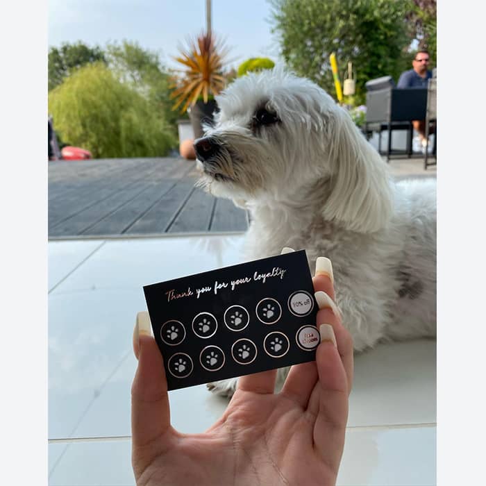
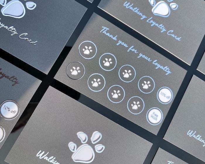
For pet service Scruffy to Fluffy, Brooke designed a range of marketing materials including two lovely loyalty card designs for their grooming and dog walking services. “The design was inspired by my client’s brilliant business name (I adore it!) – Scruffy to Fluffy – the deep grey resembles the ‘Scruffy’ and the silver resembles the ‘Fluffy’. I created Alice’s branding completely from scratch, with the help of Pinterest to kickstart my imagination.” By highlighting the paw designs and cursive font with Silver Foil, she gave an elegant, minimalist touch that makes the brand stand head, shoulders, tails and paws above the rest.
Ellie Barker: rise and shine
Ellie Barker is a brand identity and stationery designer from Manchester, UK. When she’s not creating beautiful Postcards and Greeting Cards for her brand Ellie B. Studio, she is committed to turning businesses into lifestyle brands that have personality and draw attention.
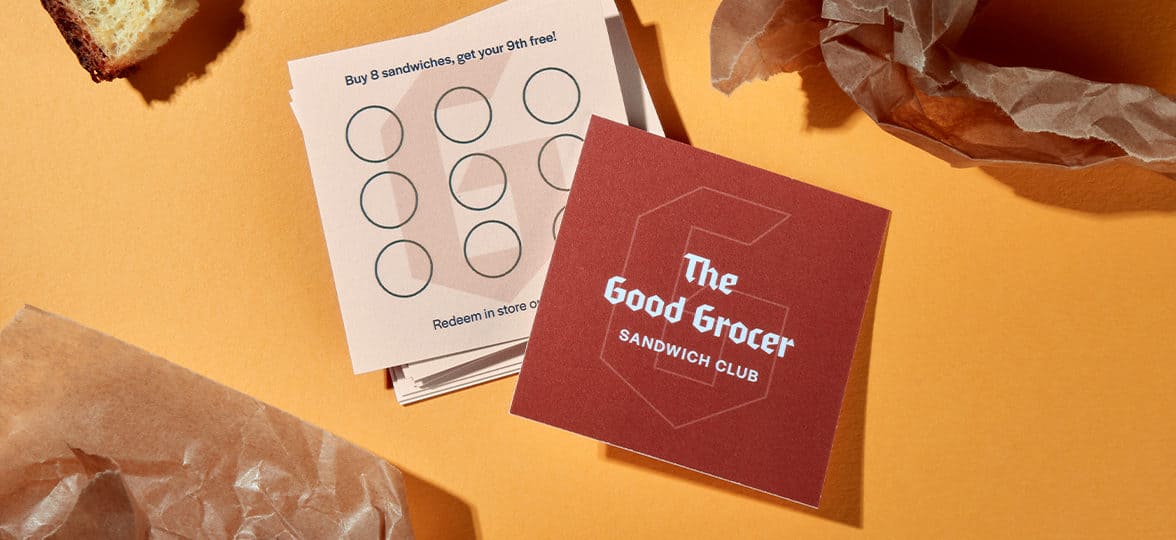
For Butt Naked Aesthetics, she created a versatile stamp card design that doubles as a Business Card. “The owner of Butt Naked, Khyre, is such a glam and gorgeous girl. I feel like these cards are her in stationery form. I went for [the Super paper] as we wanted the cards to be luxurious, and the Raised Spot UV really added that touch – plus, the matte finish was dreamy.”. Ellie’s clever use of Raised Spot UV Gloss to highlight the key details is a playful reminder of the brand promise: gorgeous, plump lips and a luxurious experience. Her favorite part? “The little butt naked stamp on the back of the loyalty cards, so cute”.

The Logo Page: the bank of loyalty
Twins Ellen and Alex started their Instagram account The Logo Page for fun, but what started as a hobby quickly turned into a successful business. Specializing in logo design and branding, they’re a big hit with fashion and beauty brands.
Looking for a fun way to brand Cloud 9 Nails’ marketing materials, the two sisters came up with a simple, yet clever loyalty card idea. Putting their own twist on the good old debit card design, they imagined a “bank of loyalty” card to reward the nail and beauty brand’s customers. “We love how fun and bold they look and the hidden details you wouldn’t notice until you look closely, such as the contactless icon and the cloud stamps to tie in the branding. We also like how you can write the client’s name on them, making [the cards] really personal”. And with a lovely Gold Foil finish, they look even better than the real thing.
![]()
Flubble Bubble: nailed it
With designs that pop and a healthy dose of humor, Laura, founder of Flubble Bubble, has one goal: to funk up your brand (and fund her pizza addiction). An enticing promise from the young entrepreneur – and one that she intends to keep with her bold and colorful designs.
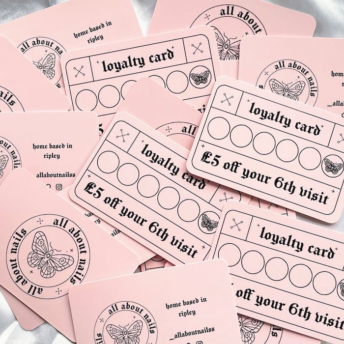
For Paige, the talented nail technician behind All About Nails, Laura combined millennial pink and gothic type for an indulgent naughties extravaganza. She also included a beautiful butterfly as a nod to Paige’s favorite nail art design. She turned the brand’s stamp card design into a beautiful collectible, with a thick, premium feel and rounded corners. For her, the cherry on top was adding a glossy Raised Spot UV finish: “[it] ticks every box, and if I could I’d cover my whole life in Spot Gloss! It is super popular with my clients too, which shows how a little bit of gloss can take your business a long way.”
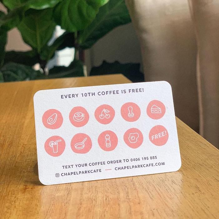
Rhianna B. Dunn: customer (and planet) friendly
Aussie designer Rhianna B. Dunn is the brains behind the eponymous web and branding studio. Working with a wide range of businesses, from tech companies to coffee shops, she masters analogue and interactive alike to provide her clients with beautiful design that reflects their brand.
For Chapel Park Café’s loyalty card design, Rhianna used Cotton, our planet-friendly paper made from 100% recycled T-shirt offcuts: “I used the recycled cotton paper, because it’s environmentally friendly and has a great natural texture. The uncoated finish is perfect for loyalty cards because you can write and stamp on it without smudging.” It gave the stamp cards a subtly textured feeling that screams authenticity, highlighting the Brisbane business’s love for simple, quality products. What she loves most about the cards? “I love what the quality of the cards adds to the whole brand identity experience, and the depth that the recycled paper gives to my chosen colors.”
Emily Bourke: 50 shades of loyalty
Emily Bourke is an Australian designer with a knack for graphic, branding & digital design. On a mission to bring her unique flair to every project, she juggles retro and modern aesthetics with artistry to illustrate her clients’ very own signature.
For Platinum Nail Bar’s loyalty card design, she combined a dreamy gradient with a clean yet spirited font, playing with light thanks to a subtle transparent Raised Spot UV finish. “I’m obsessed with Raised Spot Gloss! I encourage everyone I work with to get a spot gloss finish on pretty much everything. The gloss adds a touch of timeless opulence you just can’t achieve with other finishes.”


Ready to build customer loyalty? Create your very own loyalty card designs here.
Interested in joining the consulting industry? What makes a good consultant is not only their experience of a specific field. Great consultants also have a wide range of qualities that make them valuable to their clients – some learned, some based on personality traits.
Thinking of starting a consulting business? Take a look at the most important personal qualities of successful consultants before you take the leap.

1. You don’t just do – you teach
Part of the reason you’re being brought into a business is to fill a skills or knowledge gap. Sharing your techniques and principles with staff should be part of your service, leaving them better equipped when you leave than when you arrived. Being a great teacher also means you’ll have a place in their hearts over the long term, and you’ll be the first person they think of when the next big challenge comes along.
So if you’re articulate, patient and great at communication, you’ve got this one in the bag.
2. You can build trust
Coming into a business as an outsider means your first job is to develop good working relationships based on trust. To help this happen, you need to be straightforward about your role and what you’re there to achieve, so that people know what to expect from you.
Succeeding in the consulting industry is all about demonstrating your value and reliability. That means you’ll need to make sure you follow through on any agreements you make and stick to timelines. If you say you’ll be there for a meeting, be there – accountability goes a long way towards building trust.
People who are open, straightforward and sociable have a natural advantage here.

3. You leave your ego at the door
When you’re consulting, it’s all about your client. Yes, you’re fantastic at your job and you want to make a great impression, but the task in hand is to solve their business problems, which should come ahead of any self-consciousness or pride in your work.
Part of the nature of consulting is going into businesses where there are established ways of doing things, and challenging the status quo. Not everyone will appreciate this, and sometimes you’ll come up against resistance or criticism that you don’t recognize as valid. Instead of arguing your point, keep your goal in mind – it’s all about solving problems, not being right or wrong.
If you’re confident, thick-skinned and good at separating head from heart, you already know a lot about how to be a good consultant.
4. You’re adaptable and can think on your feet
You thought you’d been hired in to solve one business challenge – and somehow you’ve ended up in the middle of something completely different. Business priorities can change and adapt at hyper-speed, especially in fast-moving fields like technology or social media.
Thinking fast and being able to let go of existing ideas and soak up new ones is invaluable in the consulting industry. If you learn fast and you’re good at transferring your skills to different scenarios, even better.
The ideal personality traits for this part of your role? Creative, spontaneous and lively.
5. You know how to listen
It sounds so simple, but it can take real effort to listen well. As a consultant, you need to take in a huge quantity of new information before you can begin to do your job. Discovering the nature of the business you’re in, the challenges it’s facing and the style of communication used are all big listening jobs that lay the foundation for effective consulting.
If your approach tends to be reflective, thoughtful and detail-oriented, you’re off to a great start.
6. You’re your own brand ambassador
When you’re working inside someone else’s business, it’s easy to let their culture and corporate structures become your own. But if you’re planning to become a successful consultant and have more than one client over your lifetime, you’ll need a developed sense of your identity as an independent professional, regardless of who’s paying the invoices.
A good consultant is his or her own brand, with an established ethos and approach. Collateral like Flyers, Postcards and even Stickers are a great way to cement your brand identity, as well as market yourself to new clients.

Self-promotion is crucial to become a successful consultant. Create unforgettable Business Cards and Letterhead to make a lasting impression.
Are you a creative business looking to launch your first online shop? Take great-looking product photos that will have your wares flying out the door.
When it comes to selling online, few things are as important as your product pictures. They tell the story of your products’ colors, texture, size and shape, and how they can be worn or used. Showing your products in use helps customers visualize themselves enjoying your creations, making them more likely to buy. But how to take better product photos without a professional photographer?
It’s worth taking a little time over your product shots, but you don’t have to be Dorothea Lange to create your own scroll-worthy gallery goodness. You don’t even need a fancy camera for great product photography – most modern smartphones can do the job. Here are some tips to get you taking successful snaps, fast.

Light, light and more light
Forget fancy cameras – the most important ingredient when taking pictures of products (or people) is lighting.
Always shoot in daylight
That’s unless you have access to a professional studio where daylight conditions can be replicated.
Shoot away from the light source
The golden rule is to shoot away from the light source, not into it. So if your light is pouring in from a window, stand between the window and your products (being careful not to cast a shadow onto the scene).
Play with your space
No nice big windows? No problem – you can use a doorway to create a temporary light source. If you can, pop the door open and let the light flood in.
Clouds are in
You might not think so, but a cloudy overcast day is the best time to shoot product pictures for your online store. The clouds act as a natural diffuser, filtering the light so it’s more evenly distributed with no harsh bars of sunlight or strong shadows.
Set up in the shade
If you’re taking photos of your products outdoors, a large area of shade like the side of your house is a good place to set up.
LED it up
If you have limited natural light available – a common problem for people working around a day-job during the winter months – you could try arranging some household LED lamps around your shooting space and diffusing their light with some sheets of baking paper or copier paper.
Create a bright background
Placing smaller items like jewelry on a sheet of white foam board will give you a nice bright background without shiny reflections. You can also position white foam board around your shooting space to maximize the amount of light available when taking photos of your products.

5 product shots you need to take
Product photography is fun… the first few times. But taking lots of pictures from multiple angles and selecting the best ones quickly gets time-consuming. When your shop is up and running, you’ll want to spend less time picking through product photos and more on running your business. If you have a standard set of product shots, photographs become an easy-breezy task. Here’s our suggested list…
-
Thumbnail
A whole-product shot that will look great in thumbnail form and encourage people to click through to your listing. It should also work well on printed items like Flyers and Postcards. It’s a staple of online store photography.
-
Close-up
Using macro mode, if your camera or smartphone has it, zoom right in on the texture of your product so buyers can see the quality. Add it to your list of photos for your online shop. You won’t regret it!
-
Scale picture
A snap showing the item’s size relative to a common object like a coin, smartphone or doorway. Taking pictures of your products in use, for example in a hand or on a mannequin, is great for showing scale. If your product is clothing or fabric, it also shows off the drape and texture.
-
Reverse side
Let customers see the backs or bottoms of your item too – even if it’s rarely going to be seen when the product’s in use. It’s not necessarily the first thing you’d think about when taking pictures for your online store, but customers love it. The aim is to replicate what they would see if they were looking at it in real 360-degree life. How your items are stitched, bound or finished on the reverse can be a strong indicator of quality.
-
Range and packaging
If you’re wondering how to photograph products for your online store, don’t forget the million-dollar shot – your whole range. Show your product in a group with varied colors or styles, or alongside similar items in a range which might tempt buyers. Try showing the actual packaging they will receive – especially if you have a gift-like box or wrapping. This helps people imagine receiving their package and could give them that extra nudge they need to hit ‘add to cart.’

Watch out for…
Finally, a few areas where you need to tread carefully when taking product photos. Here are 3 things to watch out for when taking photos of your products:
- Digital filters and editing can make your product colors less true to life and could end up confusing customers (even if they make the product photos look nicer).
- Flash can create a harsh effect that washes out colors – try the lighting tips in this post before using the flash as a last resort.
- Background and reflections. Don’t be the person whose old socks (or worse) are visible in the distance behind a product, or reflected on a shiny surface.
Now you know how to take pictures for your online boutique. From Business Cards to Postcards, showcase your product range in style thanks to Printfinity by MOO.
Steve Carty took up photography as a teenager because he couldn’t paint. It proved a wise move. With talent, hard work, and a good dose of chutzpah, he’s become a sought-after portrait photographer in Toronto and beyond. With his vibrant, honest portraits he aims to capture the very essence of his models – which have included the likes of Pharrell Williams, Thom Yorke and Colin Firth.
We met Carty to talk about his journey as a portrait photographer, his artistic process and the clever ways he promotes his work.

Tell us a bit more about yourself. How did your interest in photography begin?
I started taking pictures when I was 14. My older brother Les is a photorealistic painter and was extremely talented from a young age, so he went to a school where his talent could be cultivated. I wanted to be just like him but, unfortunately, I couldn’t paint. My Pop bought a 35mm camera as all Dads were required to do in the 80’s, and sadly, he couldn’t even turn it on. I helped him figure out how to turn it on, focus, and take pictures. Weeks later, he took the roll of film in, and when it was developed, he shared the shots I took with his new toy.
Seeing my images appear in print form was all it took
Seeing my images appear in print form was all it took. At my young age, I truly thought my brother was wasting time and so much effort making his paintings look like photographs when all I needed to do was take a picture! My Dad rarely got to play with his new toy after that. It became a thing I was really good at.
In high school, I enrolled in a photography class and my teacher, a very talented photographer in her own right, was the first real person to spot my talent. She said: “you could be a photographer!”. My career path was set, I told my parents I wanted to be a professional photographer. When I saw Vogue for the first time, I was incredibly inspired. At 19, I went onto Ryerson University where I studied still photography, and soon after opened my first studio with my brother, who continues to be my biggest artistic inspiration and influence.
How did you land your very first gig as a photographer in Toronto?
My first gig as a photographer happened when I was 19. I showed my fashion portfolio, which at that time was a collection of pictures I took of friends and anyone that would sit in for me, mostly shot in my makeshift home studio, to a massive modelling agency here in Toronto. It was first thing in the morning. The agent looked at my portfolio and literally laughed. Then she said wait here, and went into a back office, shared with her other agents and then they all laughed. I could hear them. It was brutal. Then she came back and gave me my portfolio and literally said, thanks, I needed that laugh. I was a kid. I was devastated.

I had a second appointment that same day with another modelling agency and I literally had the phone in my hand to cancel. I said to myself “screw it, there’s no way I can get humiliated twice in one day.”, so I kept my appointment with the second agency. That agent, Celia Sears, had just found out she was pregnant with her first child. She was in a brilliant mood. She expressed quite honestly that my book was terrible, but she saw my potential. She showed me some real model portfolios. I was blown away. Then she did the thing that started it all: she gave me 2 new models to shoot. I set up the shoot, shot those models, shared the work with her, and she kept sending me models! At 19, I had just figured out a way to shoot for a modelling agency.
You started out doing fashion photography. What attracted you to portrait photography?
I love that you’ve done your research! I landed my first real win and transitioned into primarily being an editorial portrait shooter by showing my fashion photography work to Canada’s national newspaper, the Globe and Mail. The art director at that time looked at my fashion work and said “hey, great portfolio.” Then he sent me out to shoot a portrait, a job which I happily accepted. The images were well received, and on the spot, he sent me another portrait assignment. Before I left the office, I said to him “hey, you know that I’m a fashion photographer right?” He replied: “any hack with a camera can take perfect pictures of perfect models in perfect situations with perfect hair, makeup, clothing and light. It takes a real photographer to capture the rest of us. What kind of shooter do you want to be?”

I was 23 years old. This was life changing. I went on to shoot some of the most powerful and timeless images of my career for the Globe and Mail. Portraits of people like Roger Moore, Phil Collins, and Thom Yorke from Radiohead – all in black and white, all on film, never with any second chances.
How would you describe your style of photography? What do you want to express with your work?
Describing my own style of photography? It’s so much better when others do so, but I’ll explain it the best I can. I have a straight-up approach to making pictures that is timeless, modern and honest. It’s an understated approach, where my subject is the star and my role is simply to capture them in the most iconic and classic way. I have a strong technical ability, so I’m able to adapt quickly on location, and place and craft light in a studio – that allows my work to be recognizable without feeling boring or repetitive.
I’m always evolving, learning and trying to push my work to keep it fresh and inspired
I do have set styles, like my signature jet black background which I’ve been using to help my subjects pop out of the page since my early days as a photographer in the 1990s. It’s a style and vibe I’ve repeated throughout my body of work. I like to think I’m good with light and conceptualizing, but I’m always evolving, learning and trying to push my work to keep it fresh and inspired.

I’m in the business of “people promotion”. I can capture a person’s essence, quickly and often under pressure, so I’m often called upon to photograph yesterday’s, today’s and tomorrow’s stars. I also help “everyday” people elevate their personal brands so they can compete on a world stage, whatever it is they do. I bring celebrities back to earth with a realistic, honest approach and boost regular people by making them feel like superstars in front of my lens. My favorite part of the job is being someone’s favorite shooter. Feeling the love from a subject I’ve just met, just because I captured them in such a positive light, is incredibly fulfilling. Everyone is a star. Every session is the most important.
How do you prepare for photoshoots? What’s your favorite part of the process?
My preparation for photo shoots ranges greatly. It can go from one extreme to the other. From mood boards and visual inspiration, to client production meetings, more reference photos, sketches, all the way to the simplest idea I’m feeling while I walk with a subject on location looking for the right light, background, and vibe. I believe if you can’t find a spot to make magic within a 2 block radius of where you’re currently standing, you have a lot of work to do.
I like to create amazing atmospheres […], and much of it is my relationship with my subjects
I see locations daily, some I make mental notes of, some I shoot with my phone, some I spot while I’m moving to the original location, moments before I shoot. I allow accidents to happen. The best-laid photo plans rarely work out exactly. I like to create amazing atmospheres for great portrait photography to happen, and much of it is my relationship with my subjects, getting them comfortable with me, especially moments before I shoot. I’m always real. I have to find that common ground quickly.

At this point in my career, I really enjoy the process of making pictures in a found spot within an area I’ve dropped us in. I allow light and concept to reveal themselves organically. Mixing that with my studio look and feel makes photography worth it for me.
You photographed celebrities such as Thom Yorke and Pharrell Williams. How do you get people to open up in front of a camera?
It’s all about approach. As I touched on earlier, I’m fast. I see the idea quickly and spend most of my time, especially with celebrities, allowing them to talk. I try to draw them out and I listen. There’s nothing better than allowing your subjects to tell you a story.
They talk while I’m setting up, they talk while we move to the location, they talk all the way up to when I’m about to shoot my first frames. Most subjects don’t even notice what’s happening, and everyone loves talking. When I get them in the final spot, light or area, I shoot more tests.
For pros, 10 out of 10 isn’t good enough anymore
I’ll share the first “11 out of 10” images with my subject. For pros, 10 out of 10 isn’t good enough anymore. I have to shoot 11’s. As soon as my subject sees an 11, I have their full attention. I have them. I work super quickly, on location I move a lot, and I continue to show only 11’s and I’ll keep pushing for the highest form of the idea, shooting through the picture. I don’t stop on my first banger. I keep going. It’s how I’ve created my most iconic images.
You’ve been a photographer for more than 20 years. How do you feel photography has evolved over time? What are you excited about for the future of photography?
It’s actually my 30th year in business, so I’ve seen a lot. My first 20 years of photography training (from age 14-34) was all centered around film, including all my early studies of the history of photography and all my assignments at Ryerson. I didn’t touch a computer until I was 24, and only then to make invoices. When I started there was no internet, websites, or email. Phones were attached to walls and you had to lug around heavy hard copy printed portfolios. When I was 20 I got a Hasselblad (medium format camera) and developed all my own film until volume made it impossible. I always printed my own work. I’m a master printer, with 20 years experience manually printing both color and black and white.

In 2004, I began my change over to digital. Since then, the look of photography has changed a lot. Digital photography has opened up a world of possibilities for image makers, and seeing your images as you take them has made it much easier for people to get into photography without formal training. In the beginning of digital, it seemed like everyone with a camera thought they were a photographer. With most things, it’s leveled out a bit, with the talent still always rising to the top.
Mobile phone photography has had a similar effect, but that is leveling out as well. Most of us can spot facetuned or heavily post-processed images and categorize them accordingly. Some of my subjects definitely need to learn how to be in front of someone else’s camera, as most only take images of themselves by themselves or with friends, never getting any professional advice or feedback beyond social media likes or comments. It’s sad having to explain to a subject that I’m not going to shave hips, or add lips. It’s important for me to show real beauty, real people. It’s stylized reality but the work I make is never straight lying.
I’m excited by the way video has truly pushed how we can get our message out as creators
Looking towards the future, I’m most excited for photography to be seen more as a craft and less as something you just put on Instagram. I’m excited for the next generation’s work to shift the vibe, as it already has. I’m excited by the way video has truly pushed how we can get our message out as creators, by both speaking to the camera and making our visuals move. I’m excited by new camera tech, and how it’s filtered down from unattainable to accessible. I’m most excited about how we as creators can evolve the way we use photography to tell our stories.
How did you manage to grow your reach as a photographer? How did you approach your promotion strategy?
Growing your reach as a photographer is an ongoing and never ending movement forward. Since my first website way back in ’96 I’ve always tried to be at the forefront of technology and to use the latest ways to promote my work. I remember when I emailed my first photograph to an art director – it took 10 minutes to push through that 200KB file!
My website has been the main way potential clients discover my work, so I make sure to always update it and keep it fresh. I’m an editorial portrait specialist, so making sure my site comes up in the top search results in “editorial portraits, Toronto” is always important. There was a time when unsolicited emails were commonplace, so emailing potential clients usually got good results. Today, social media is king, so it’s important for me to have a strong presence on Instagram, and to constantly be massaging that feed. I wish Instagram didn’t have so much power over us with their strange algorithm, but as a shooter, I need to feed that beast to get noticed. Insta always pushes their latest offerings and currently it’s all about Reels. I’ve noticed a great amount of attention to my feed when I post Reels, way more so than posting to my regular feed.
YouTube is a great way for shooters to promote in this age of video domination
I’ve always posted the video content I create for clients to my YouTube page, and recently I’ve felt the pull to start talking to camera, offering a new perspective on the life of a professional content creator. It’s called Behind the Picture and I’m beginning to start that dialogue and upload to my channel. YouTube is a great way for shooters to promote in this age of video domination, so I’m jumping on that train to offer some of my perspectives.
The ongoing promotional strategy is to use video to promote all my offerings in creative and easy-to-digest ways. All without taking myself too seriously. I still reach out to potential clients, but being discovered or shared is key.
Can you talk us through how you use MOO to promote your work?
I use MOO for all my printed material, from my Business Cards to my Postcard promos. I’m able to show the full range of work that I do using the Printfinity option. I use the full 50 different fronts on my business cards orders so I know I have the right card for anyone that I could possibly meet.

I always have my cards on hand and I give a stack that includes the whole range of fronts to whoever I’m giving a card to. This allows potential clients to look through the different cards and choose the one they want, and it pretty much guarantees they’ll keep it. It allows me to show work from portraits to streetwear, and even my commercial work. They’re willingly forced to see my entire portfolio, and they happily pick their favorites, sometimes asking for more than one, usually to share with someone else that could use me.
These MOO cards for me are like little seeds. You give one out and a seed is planted.
I’ve heard stories from clients who have kept my cards on their art boards for years, and the fact that they got to choose their own seems to make our meeting something really memorable for them. These MOO cards for me are like little seeds. You give one out and a seed is planted. You never know how fast that seed will grow into a client but it always seems to happen.
MOO Postcards are bigger, with a huge impact. I use them as mailers, leave behinds, as well as thank you notes – again, all with different fronts targeted to a specific client range. The great thing about my cards is they always start a conversation. “They’re so great”, “What a great way to show your work”, and “How’d you get these done?” are the 3 comments I regularly hear.
I always send people to MOO, especially fellow creatives, because the offerings are unparalleled – it’s why I’ve been using MOO for well over 10 years. I’ve converted numerous creators to this promo format and all are still using it. It’s really a no brainer!
Do you have any projects coming up you’re looking forward to?
Upcoming projects are a bit in the dark during this crazy time. I’ve always used slower times to develop new offerings, techniques and personal work. My biggest upcoming project is my push on YouTube. It’s a non-linear promotion strategy that starts with me being in front of the camera and sharing insights on my life behind my pictures.
Some of the things I’ve shot recently which are just now reaching the public’s eyes include my images of George Stroumboulopoulos – aka Strombo –, which are being used to promote his new Apple Music Radio show. Another one is the promo images for the upcoming 4th season of the Great Canadian Baking Show, live on Netflix in Spring 2021.
I’m all about being in the lab right now, planting seeds and growing new ideas
Winter for creatives here in Canada involves slow downs at times. The darkness of winter is hard for many creatives, and I’m one of them. Add in Covid lockdowns and upcoming projects become more unpredictable and the situation is more challenging. Whenever my commercial work is a little slower, I know it’s the time for me to dive into self-directed personal projects, self promo, and strengthening my online presence. I’m all about being in the lab right now, planting seeds and growing new ideas.

One of my self directed projects, Multiplicity, is ongoing and I’m looking forward to adding to it this winter. It’s multi exposures on the same frame, all done in camera. I’ve been working on this technique for over 5 years. All my experimental work is done in camera, and always ends up being incorporated into my commercial work. This ongoing project is one of them.
Any advice for young photographers trying to get their work out there?
Advice for young photographers starting out now is much different than photographers starting out when I did. Social media is king. New shooters have the tendency to try to shoot everything. Having a body of work that ranges from weddings to cars to fashion to real estate to headshots and products and composites and and and… just results in being forgotten or missed all together. The biggest bit of advice I could offer is to create work that can be categorized and applied. Applied photography is work that gets work.
You have to be the best in your category. Be the best car shooter you can be. Or the best beauty shooter. Or the best product shooter – but don’t try to be all three.
Every top shooter that is a household name got famous for making one picture. As in one strong idea, one strong visual signature, applied to everything they shoot within that category. Specialize in fashion? Shoot it in your exact way. Portraits? Same thing. Art buyers want specialists, not generalists. They want the best in the category. You have to be the best in your category. Be the best car shooter you can be. Or the best beauty shooter. Or the best product shooter – but don’t try to be all three.

Hone your look, your style, your visual signature. Every single one of your favorite shooters works this way. Look again at the work of photographers you admire and notice that their “style”, their visual signature, is the real reason their images grab you. Their subject matter usually comes second.
A strong visual signature and a strong online presence is the formula for getting your work out there
Our style as content creators has to be consistent. If you’re creating a look and feel that is of the moment, your work will get noticed. A strong visual signature and a strong online presence is the formula for getting your work out there. Non-linear promotion is the future. Also respect your elders, find a mentor, don’t give up, always be learning, grow with the times, roll with the punches, stay positive and call your mom.
Showcase your portfolio in style with MOO Business Cards and Postcards.
It’s that time of year again. A time to start anew. A time to make things happen. A time to make the most of that “new normal” we keep hearing about and get excited about the (good) surprises 2021 has in store for us. So, new year, new design trends? We saw beautiful new styles, palettes and font inspiration last year, and we’re more than thrilled thinking about what’s ahead of us in the design world.
Discover the graphic design trends we’re looking forward to seeing more of in 2021.
Softer, muted color palettes
With lockdown restrictions around the world, we’ve all been more focussed on the essentials that help us through. The star colors of 2021 seem to have followed that trend with a resurgence of softer palettes reflecting a quieter year and a growing need for calming aesthetics. With a light yellow and a soft gray, Pantone’s 2021 colors of the year are a good illustration of a more muted palette with shades that complement each other harmoniously.

Closer to nature
The pandemic drove many of us away from cities, making us rethink our urban lifestyle and dream about the calm and quiet of a life in the country. But beside our housing preferences, the call of the wild will also keep reshaping design in 2021. Colors, materials, textures and shapes are increasingly influenced by the natural world, nurturing a more environmentally conscious side of design.

Back to serif fonts
Remember the golden age of Helvetica? If it’s not behind us just yet, serif fonts continue their comeback with elegant and playful retro-inspired typography. A touch of Art Nouveau, a hint of 60’s curves with a contemporary approach, our favorite fonts for 2021 are the love children of modernity and nostalgia. Whether they’re combined with subtle shades or deliciously regressive colors, fonts like Grand Slang or Glamour Absolute are a (welcome) throwback to easier times with their soft, elegant curves.

Lo-fi and chaotic type
Art reflects life. So do graphic design trends. In these times of uncertainty, typography has become as chaotic and unpredictable as our environment. Letters and words break free from their usual constraints to create a new order – a chaotic one. Less text, a layout dictated by randomly disseminated letters: forget about the rules and let typography illustrate these crazy times. Type, unchained.

Zine-inspired compositions
Reminiscent of the golden age of punk music, collage-like compositions are making a comeback. Zine culture’s liberated approach to creativity, combining various mediums in a joyously eclectic melting pot, inspires today’s designers to get out of their comfort zones. Less ‘clean’ than the sacrosanct minimalism and with a deep-rooted tradition of activism, they’re giving a more spontaneous, human face to design in 2021.

Next-level packaging design
Shopping from our sofas has replaced high street strolls for many of us (for obvious reasons). But it’s no easy task to replicate the personal touches of an in-store experience. One way that brands have managed it is with their creative packaging design. Every parcel is a chance to get personal. Each package can tell a bit more of a brand story. This year, we’re excited to see how businesses will continue to surprise us with their next-level unboxing experiences. The 2021 design trends we love are all about exploring different ways to translate a unique brand identity into indulgent mailbox surprises. Why not level up your own, with custom Stickers from MOO? For more tips on how to power up your unboxing appeal, click here.

Explore different styles and design trends in 2021 and showcase your portfolio on paper with Printfinity.
Amberlee Green is a London-based creative and mental health professional. With her brand, Line & Honey, she uses her unique experience of art and wellbeing to create moments of self-care through art. Minimalist line work and soft, natural colors are used across illustration, design and textile based products. Each piece conveys a sense of well-being and shines a warm, glowing light on the visibility of women of color.
We met the founder of Line & Honey to talk about her artistic journey, the links between art and mental health, and how more representation in art can empower and improve the wellbeing of Black women.

Tell us a bit more about yourself. Where does your love for illustration come from?
I’m a self-taught illustrator, researcher and full-time mental health practitioner in an arts university in London, UK. I have always worked in mental health – I spend a lot of time focusing on its impact on a person’s day-to-day life, but also on wellbeing and recovery.
My creative practice was born out of this, because I started drawing as a means of personal self-care when I needed it the most. I completed my postgraduate study at the Division of Psychiatry whilst working full time, and during my final research thesis, I found myself burnt out and exhausted. Illustration acted as a mindful activity to relax me during this time, and I picked up a stylus for the very first time – I used to paint. Wellbeing is at the root of everything I design.

I founded illustration studio Line & Honey about 3 years ago. I think the space between minimalism and maximalism is a spectrum, and whilst in many ways I am a maximalist – my character and humor perhaps–, I’ve always been drawn to minimal aesthetics, and I utilize design as a tool for balance the two. I feel that my illustrations really complement me and it’s a really soothing experience to create.
How would you describe your style, and how did it evolve over time?
My illustration style is line-based and intricate, which leads to pieces either very detailed, or almost abstract. It’s interesting because my minimal style is a direct result of the space I was in when I first started illustrating. Starting at such a stressful time in my life, the pieces I created were soothing for me – I was using slow-considered lines to create portraits of fictional people living fictional, peaceful lives.
I remember asking myself if I could create artworks that feel complete with as few lines as possible. This is how my trademark style was born. By creating a piece that was calming for me, the result was also calming for others, and this focus of wellbeing has stayed at the core of my work over the years as my creative practice has grown.

In some ways, much of my work is similar to when I first began, and though I have explored other things such as the use of color, the main thing that has changed is my experience and improved techniques. I used to add photographic background layers, but I’ve really challenged myself to keep it minimal in order to increase the impact of each illustration and what I am trying to communicate. As my confidence in my ability grew, I realized that I needed to strip back things that were unnecessary to leave room for what I actually wanted to depict. Looking back at my work, it feels it has matured alongside me.
What inspires you, and what do you want to express through your artwork?
My work is inspired by two main things: minimal design and Black women. Black women are key to my creative practice – I draw what I know, and when I first started creating, portraits of women just being is what came out the end of my pen. I am really inspired by the duality of Black women, and how we exist with multiple layers in this world, because we have to.
Line & Honey exists to provide a lesser seen view of Black women
Minimal design also really inspires my work, because it complements the why perfectly. Line & Honey exists to provide a lesser seen view of Black women. I focus on soft, vulnerable, reflective aspects of our existence because I want these sides of us to be visible – see our manifesto. The delicate line work lends to the intricacy and complexity of the subject matter; muted color palettes play off the colors of our skin; and the negative space in each piece gives the viewer room to breathe.

How did you end up launching your own brand, Line & Honey?
Line & Honey as an illustration studio happened really organically. What started as a self-soothing project for my eyes only, became something that had the same effect on others. As I slowly started to share the pieces I was drawing on Instagram (first post!), I slowly started to convince myself that this was something the world needed too.
I wanted Black women to be seen, and I wanted to own the lens we were seen through
Being a ‘creative’ or a ‘business owner’ was not a part of my experience at all at the time, so it was a lot of boldness and hoping for the best on my part. The key to the whole experience was knowing what I wanted to illustrate and how I wanted each piece to make people feel. I wanted Black women to be seen, and I wanted to own the lens we were seen through. This has translated well to the commission side of the business, as I illustrate brand assets for other businesses that have the same goal.

I create pieces I would hang in my home – and I actually do hang them all over my space. I am the kind of artist that hangs her own pieces up, and I’m not ashamed! The thing is, line art and minimal pieces are what I’m drawn to, and though many retailers sell simple art pieces, they don’t feature Black women or have the meaningful stories behind it. I am inspired by our complexity, and these are the things I want to be visible in the illustration space. This is the foundation of the studio – creating illustration pieces to hang in the home and illustrating for other businesses that want their visual design to be inclusive.
Intersectionality seems to play an important role in your work. How do you think the visibility of Black women in art is shaping their perception in society?
Intersectionality is key, because being a Black, young woman in the UK with Jamaican parents leads to a unique set of experiences that are invisible unless consciously brought to the forefront. I am very aware of all the strands of identity that make me me, and whilst I can celebrate this, I am also aware that these parts of my existence can also be subject to different layers of misinterpretation or prejudice.

Art has always been a vehicle for innovation, difficult conversations and representation of different time periods, therefore the visibility of Black people in art and illustration, as told by Black people themselves, is revolutionary. It brings permanence to our existence, gives us ownership of our own cultural capital, and allows us to tell our own stories in a way that can be enjoyed by everyone. This year, I co-authored an academic article in the Journal of Illustration exactly on this topic. I explored how the positive depiction of Black women in art not only promotes our mental health, but shows the world that we exist in ways the world never sees.
As an artist and mental health professional, how do you see art as a way to improve wellbeing? How does that extend specifically to women of color?
To me, art and wellbeing go hand in hand if used well. It all revolves around intention – this goes for both creating or engaging in art. Firstly, the physical act of drawing can be used as an exercise in mindfulness. Taking the time to identify a subject matter you love and using intentional lines – or whatever your medium is – to illuminate this is a fulfilling process.
Illustration can provide a common language that goes beyond words
Then there’s the idea that women of color specifically benefit from positive representation in art as it counteracts self-limiting views and opens up infinite possibility. Illustration can provide a common language that goes beyond words, and therefore has the potential to be more inclusive and accessible.

Lastly, I really see the benefit of communities centered around creativity. Women of color need these spaces to breathe and feel well, and we have so many rituals and aspects of our normal lives that are intrinsically creative and promote our wellbeing.
Do you face any challenges in your career as a Black female artist? Do you have any advice for fellow creatives struggling to get noticed?
This is one of the areas where intersectionality really does have to be considered. Female artists can often be unseen in the art & design industry, and Black creatives are grossly underrepresented across the board. So to be a Black woman absolutely comes with its fair share of challenges. Focusing on the things that help, there are so many things I implement to act as a direct buffer to the negativity that could come my way.
- Community. When I say this, I don’t just mean the support network you have around you. I am talking about identifying and consciously surrounding yourself with people that are in the same or tangential spaces to you – creatives of all kinds, whether you know them or not! Every time you open Instagram, you need to see people that look just like you, creating and being their authentic self each day. These people from your community, and you are reminded each time you see them, that what you are doing is possible.
- Boldness & Growth. What better antidote to negativity than success? I think it is central to keep at it and grow your creative practice, despite the challenges. For me, building a strong visual identity, and staying consistent helped build Line & Honey’s presence beyond the doubts I had from people with ‘more experience’ than me. Being bold with the plans for your brand is stronger than the people dedicated to misunderstanding you.
How do you use MOO to promote your brand?
MOO printed my first ever business cards, and I haven’t looked back. I use the Printfinity option to showcase all of my illustrations on my business cards, and my customers absolutely love them. A previous customer sent an image of it hung in her office space as she felt it was like a mini piece of art itself, and the quality reflects that. At the moment, I am using the Business Cards alongside glossy long Flyers as compliment slips. The slips have a choice of two different illustrations and an affirmation in our brand font, and on the back, I handwrite a thank you note for every single order.

This is a really important part of my brand experience, as I wanted to stay away from a generic typed message. These elements are put in a luxe translucent matte envelope alongside our brand manifesto printed on transparent paper and a shipping invoice printed on a beautiful recycled paper. Textures are really important in our unboxing experience. I can honestly say that it is my MOO pieces that make me feel excited to package up my illustration prints and send them to customers.
Which piece are you most proud of to date, and do you have any projects coming up you’d like to share with us?
Where do I start! I would love to share two: the first is a limited edition piece called ‘power & strength’, created shortly after this year’s Black Lives Matter campaigning for George Floyds’ life began. All of the proceeds were donated to Runnymede Trust, a British independent think tank dedicated to research on social justice and racial equality.
The second is also really personal, as it is this piece from the current collection based on a legendary Ebony magazine cover from 1970. At the end of last year, I became a solo homeowner(in London, I know!) and this was the first piece I commissioned myself for the space – it now lives proudly on my wall.

What’s the one piece of advice you would give to creatives to manage their mental health and stay inspired?
Create what you want to create. I would encourage us all to really ground ourselves in what we actually want to create and understand how we can bring ourselves into each piece. Whether it’s your personality, heritage, way with words, or aesthetic tastes, identify what you want to be the root of your work – the thing that everyone sees when they interact with it – and stay true to this as the art & design space can be overwhelming.
Get the word out in style with MOO Business Cards and Flyers.