Make your mark: logo design inspiration
-
 The MOO Team
Share the post
Designing a logo that really represents your brand is an exciting step, but where do you begin? We spoke to a group of designers, illustrators, and business owners on how they found their trademark.
Wit and Co.
Whitney Anderson founded graphic design company, Wit and Co. after taking the plunge into full-time freelancing. She now runs her design, paper goods and wearables business from her home in Milwaukee, USA.
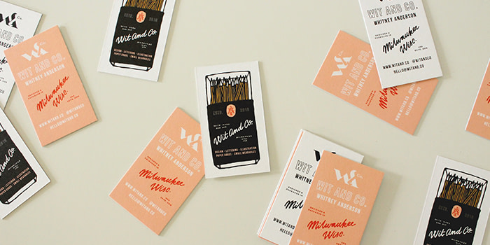
“I love logos that continue to unfold the longer that you look at them, and have always been intrigued by how letterforms play together, so I looked at combining my initials in an interesting way. Since the first three letters of my surname are ‘and’, I wanted to try and reimagine the ‘A’ as an ampersand. I printed my final design on Luxe Business Cards because I love the beautiful matte finish and the texture of the paper stock is lovely.”
BoundLove Creative
BoundLove Creative is a design, content creation and branding business lead by graphic designer and one-woman-show, Amelia Houghton.
![]()
“My logo is an illustration of a hand holding a Greeting Card, because that was the first item I ever listed for sale. It’s features on my Business Cards and personalised Postcards which go into every customer order to thank them for supporting my business. I always receive compliments on how beautiful and high quality the cards are.”
Luke Tonge, co-founder of the Birmingham Design Festival
UK-based graphic designer, Luke Tonge, took a leap into freelance work which led him to co-found the first ever Birmingham Design Festival.
![]()
“Branding the festival well was absolutely key, and we wanted flexible designs that felt rooted in Birmingham. What emerged was a modern take on the craft heritage the city is famous for, with a hallmark system of carrier shapes we could use in endless configurations.”
The Nook
The Nook is a café and coffee shop that serves up speciality teas, artisan brews, and cakes from local bakers from their cozy corner of downtown Hagerstown, Maryland.
![]()
“We have a ‘take a book, leave a book’ culture in our shop, so we wanted our logo to echo traditional elements from classic literature with a modern twist to stand out. We translated our branding onto Super Soft Touch Business Cards – we love the quality of the finish! People we hand them out to are always super impressed with the tactile smoothness – I’ve even seen people rub them on their faces!”
Suzie Shin
Suzie Shin is an illustrator and graphic designer based in Chicago. After moving cities, she began a personal branding project to help boost her freelancing work. Her new branding combines elements of her heritage and design aesthetic.

“The inspiration for my logo came from my cultural background. My parents immigrated from South Korea to America, and like most immigrants, they had to decide on two names for their children: one from our culture, and one in English. I was named Suzie, and 수지 (pronounced “Sooji”). In homage to my deeply integrated Korean-American upbringing, my logo features my short nickname “SUZ” and the first characters of my name in Korean. The logo reveals who I am personally and artistically through the use of Korean characters, variable textures and colour palette.”
Em Stokes
Em is MOO’s in house graphic designer, working at our London HQ. Tasked with creating a brand identity for a fictional sushi restaurant, she paired bold colour with hand drawn graphic elements.
![]()
“Business Cards felt like the most natural place to begin as I could use this format to play with different combinations of the logo. I felt it was important to have a really clean and simple typography mark, as well as a more illustrative version. I thought Postcards would be cool as a nice printed graphic that might be picked up from an event that the restaurant could take part in, it’s the kind of thing I collect myself!”
Studio Syllabe
During her time working for a greeting card company, Mélanie Ramamonjisoa fell in love with lettering, and soon knew her creative calling was in visual identity and typography. Three years later, she created Studio Syllabe.
![]()
“My logo was initially hand drawn to show my love of lettering, then reimagined digitally. The curves and movement of the letters represent that, with me, brands can write their own stories. The Studio Syllabe branding has been carried through into their business cards: “I went for Super Soft Touch Business Cards because I wanted durable, resistant cards but with a buttery texture. Strong and soft – the perfect combo! It really represents me as a person.”
Media House
Hair-stylist Kailey Resinger founded Social Media Management and Content Creation business, Media House, to help small, local businesses elevate their visual identity.

“My cards give me the ability to introduce the artistic approach that Media House represents – professional, clean, modern, and fun! The Super Soft Touch texture of the cards is so luxurious, and the Gold Foil option was the perfect way to add a touch of shine.”
Third Man Records
Founded in 2001 by Jack White of The White Stripes, Third Man Records focus on keeping the physical aspects of music alive – whether it’s a vinyl record, book, or band t-shirt. Just like their brand ethos, their business cards carry a distinct analog feel.
![]()
“Third Man’s Business Cards were designed to mirror the old-fashioned letterpress cards, but with a unique contemporary twist. The merging of old and new is what our business is all about.”
Katie Kortman
After juggling life as mother with teaching, colour-obsessed Katie Kortman decided to make a business from her two passions – art and sewing. She now runs classes from her home, while curating a colourful Instagram feed of her hand made garments on the side.
![]()
“My sister Caroline designed my logo. She wanted it to be dimensional – not flat – and for it to feel like something more dynamic than just my name. Why did we choose Rounded Corner Business Cards? They just look so much cooler!”
Bourne{creative}
With a background in fashion and digital design, Lesley Bourne specialises in providing branding, photography and web design services to his clients.
![]()
“When I designed business cards for my client, who is an interior stylist, I chose a minimal design and monochromatic colour palette to convey a contemporary, clean style. The quality, heavy, Luxe Business Card stock gives her brand a really professional and premium feel.”
Modern and Mint
Modern and Mint is a small woodworking business that designs and creates home decor. With a mid century modern aesthetic, their founder Victor aims to create designs that will make a house feel like a home.
![]()
“I wanted a logo that made sense visually, looked unique, and demonstrated my design style and attention to detail. I went for the Original stock with a matte finish – a business card really can be the first impression, so I wanted to ensure that mine stood out from the rest.”
Feeling inspired to get creative? Print your logo to life on Business Cards, or check out our templates for some ready-made design wonders.
Keep in touch
Get design inspiration, business tips and special offers straight to your inbox with our MOOsletter, out every two weeks.
Share the post
Keep in touch
Get design inspiration, business tips and special offers straight to your inbox with our MOOsletter, out every two weeks.