Keeping it personal: Chris Rogge on working beyond the 9 to 5
Graphic designer Chris Rogge chats to MOO about why mono-line illustration means so much to him, and how he balances personal projects with a 9-5.
-
 The MOO Team
Share the post
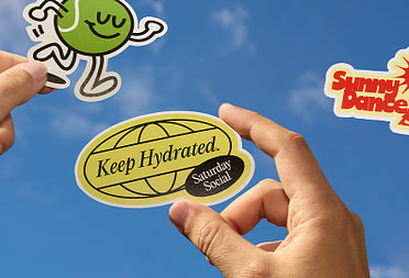
To celebrate our partnership with AIGA at SXSW in Austin, Texas, MOO asked three artists to design a postcard that reflects their unique interpretation of the city. We spoke with graphic designer Chris Rogge about finding his niche, balancing personal projects with a 9-5, and why he really loves print.
Designer Chris Rogge was drawn to illustration from a young age and spent years working on his style before hitting on a distinctive, mono-line look.
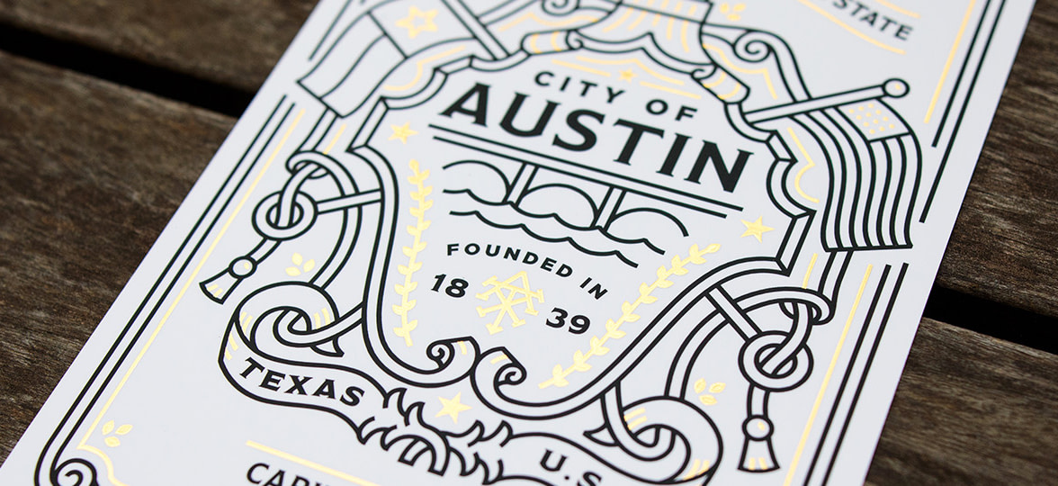
Describing himself as ‘a southern, pixel-slinging graphic designer who hangs his hat in Austin,’ Chris’s striking black-ink and gold-tinted Postcard draws from a wide range of inspirations, from European crests to his home city’s architecture.
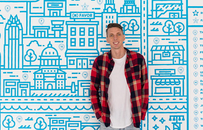
Currently an art director at Favor Delivery, we spoke to Chris about the influences on his work, his approach to using gold foil in his Postcard design, and his number-one piece of advice for art students.

Tell us about how you got into design, and how your style has evolved.
I studied art in high school, and wasn’t very good at it. But I still wanted to do something creative, and stumbled upon a communications design program at Texas State University, which really jumped out at me.
When I graduated, I had a passion for design, but no idea what to do with it. It was hard being a creative with images in my head that I couldn’t get down on paper. I had to put aside the notion that if I couldn’t draw a chair realistically, I couldn’t be a good artist.
I started doing odd jobs, developing my illustration style late at night. I explored hand-drawn lettering and package design, just trying things on. That’s when I hit upon mono-line illustration – it felt like I’d found a way of drawing that allowed me to convey my message at last.
Now, I’m working on pushing my boundaries instead of blending in. I want people to look at a piece without knowing it’s mine and be able to say, ‘That’s a Chris Rogge.’

Where do you find inspiration for your work?
My inspiration comes from three main areas. On a traditional art program, you learn a lot about artists such as Monet and Picasso, and the foundations of where art and design came from, which is a huge inspiration for me.
The second is looking at Dribbble, Instagram and Pinterest to keep up-to-date with new designers. I surround myself with them, and use what they create to fuel me. If an artist posts something amazing, it makes me want to keep going.
The third is the world around me, whether that’s a great billboard or the way flowers wrap around a tree. It’s important to be inspired by things outside your computer, to round yourself out.

What’s your best piece of advice for design students?
I told my mentor I’d always wanted to work for a clothing line, and she looked at my portfolio and asked, ‘Then why doesn’t any of your work reflect that?’ She pointed out that no-one’s going to commission me to do that kind of work if my portfolio doesn’t show it.
So for me, the most important thing is to do the projects you want to do yourself. It’s hard to give yourself a creative brief, boundaries and deadlines, but that’s what will help you develop your style.


What’s your process when working on a client brief?
I always do a lot of work upfront, getting to know the client, asking questions and going through a review before starting to design on Illustrator. I’ll decide what I think they want, go back with a pitch, and put rules in place – for example, I’ll specify three rounds of reviews. Even the best clients will ask for just one more change.
The illustrating itself takes a lot of time – the mural I created for CBRE’s offices in Houston took about five months, two of which were spent working on Illustrator. That’s the fun part, but I also knew those months wouldn’t be wasted, because the client and I were already 100% on the same page.

How did you approach the brief to design your Austin-inspired Postcards?
Just before starting my design, I went to Europe with my wife, and was inspired by the old city crests we saw. I started wondering, what if Austin and Texas were around at that time? What would an Austin crest look like?
There are plenty of things traditionally associated with Austin – tacos, food trucks, live music and cowboy boots – but I didn’t want to do something too obvious. I wrote down all things that reminded me of Austin and Texas, crossed out the ones that felt too stereotypical, and worked some of the rest into my crest.
I’ve included the bridge that goes through downtown, and a handful of stars to represent the lone-star state on my Postcard. The laurels are a traditional part of old-school crests, and I just liked the rope hanging down on each side.

Why did you choose to use gold foil in your design?
Printing has kind of gone to the wayside – a lot of designers don’t do much print, but I love having something tangible you can look at and touch after you’ve spent so long drawing.
I love elements such as gold foil, which make print stand out, and it’s also perfect for a crest. It makes it pop, giving it a look and feel that sets it apart.

How do you balance a 9 to 5 with your personal projects?
In the past, I did work on the side out of necessity, because I wasn’t happy in my job. I’d leave on the dot of 5pm to work on freelance projects, because I wasn’t fulfilled.
Now, I love my job – but still feel I’m a better designer when I’m working on passion projects, because I can pull the things I learn in my own time into my 9-5. I’ll wake up couple of hours early to spend time on my own stuff – I sleep a little less, but overall I’m a lot happier.
Find out how artist and ecologist Natalie Luz approached the Postcard challenge.
Keep in touch
Get design inspiration, business tips and special offers straight to your inbox with our MOOsletter, out every two weeks.
Share the post
Keep in touch
Get design inspiration, business tips and special offers straight to your inbox with our MOOsletter, out every two weeks.