UX tips to boost your online portfolio
-
 The MOO Team
Share the post

Whether your online portfolio is a bespoke website or an out-of-the-box profile, improving its UX will make it easier for potential clients to see your work.

The purpose of any portfolio is to show off your skills and creative potential. Your work is the star of the show, but to make it truly shine, you need to create a website experience that’s easy and enjoyable for visitors. With well thought-out navigation, concise and meaningful labels, straightforward menus and clear calls to action, you can make sure anyone using your portfolio can explore easily and see the whole breadth of your work (and hopefully make a commission).
Here are some tips to help you create a thoroughly user-friendly portfolio – without hiring in a UX expert.
Organize your portfolio from a visitor’s point of view
Step into your customer’s shoes when thinking about your portfolio’s navigation and menu items. What is this person’s goal? What brought them to your portfolio in the first place? They may be short of time, so make the most of their visit by keeping things clean, clear and straightforward. That way, you’ve made it super-easy for them to make a decision about working with you, and given them a positive experience at the same time.
They might be looking through a lot of portfolios and facing time pressure to make decisions, so if your site is hard to navigate or it’s not obvious how to get around, they may leave the page before seeing what you have to offer.
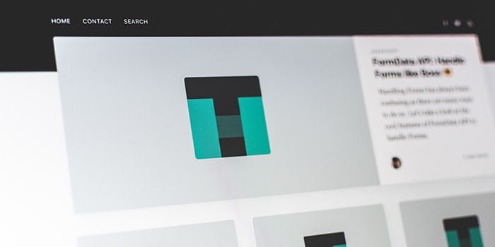
Most users spend only a few seconds on a website, so the first impression is crucial. Put your best work up front on the portfolio landing page rather than saving it for a big finale, and make your menu labels clear and straightforward in an easy-to-read font. This will help people find what they’re looking for faster.

Write menu text that’s clean, clear and appealing
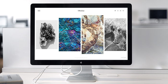
Your navigation menu is the main route into your portfolio, whether you use tiles, buttons or a navigation bar as your layout.
Choose menu categories that create a balanced overview of your work – you could arrange your menu according to client names, techniques and skills used, or the role you played on a project. Include a variety of projects and styles to showcase your range of experience and versatility. .
Play to your strengths here – if you’ve got a lot of different projects but only one or two client names, go for project names or art styles as your main categories.
Whatever approach you choose, don’t overwhelm your visitors with too many menu items as they might have difficulty choosing where to look first. Orbit Media recommends a maximum of seven links on a main page, but if you only need five, that’s even better.
Tag your work strategically
If you have a big catalogue of work, you can give your portfolio items tags to help keep things organized and allow visitors to explore your site more freely. If your portfolio setup allows it – most big online platforms do – people can click directly on an item’s tags to see other portfolio pages with the same identifier.
Tagging is also the backbone of great on-site search, so if your portfolio is part of an online community site, or even if you’re hosting it yourself and have a search bar, take some time to think about your tag strategy.

Tags that are too general don’t help narrow down the content, but if they’re too specific, they won’t include enough items to be worthwhile. Strike a balance by choosing tags that describe an aspect that several items share, but that isn’t used anywhere else in your navigation to group them together. For example, if your menu is organized by client name, tags like graphic design, typography and branding’ can give visitors who are interested in specific areas a more focussed way to explore your work.
Although impromptu hashtag-bombing is fine for Instagram, where content only appears in the short-term, website tags need to be used consistently to work well. Stick to a predefined set of tags and look out for spelling errors and different forms of words – for example, ‘collage’ ‘collage-making’ and ‘collages’ should all be standardized into a single tag.
Create compelling calls to action
The call to action is the text, button or link that prompts your visitor to do something – whether that’s watching a video,, buying a print of your work, or writing you a message.
Depending on your page design, you could put a call to action on each individual portfolio item as well as your ‘Contact’ page, or add it to a persistent element like the menu or sidebar so it’s always at hand whichever page your visitor is looking at.
Each call to action should be direct and straightforward, giving the visitor a single instruction to follow. Try putting the outcome before the task, so the benefit is what they see first. For example,
‘to request a limited edition Sticker set, email me’ sounds a bit more inviting than ‘email me to request a limited edition Sticker set’.

Keep visitors clicking with related recommendations
Move your visitors smoothly through your portfolio with thumbnail images showing work that’s related to the image they’re looking at. These can be used as well as a call to action, so you’re catering to people who want to continue browsing as well as those who are ready to get in touch with you.
For example, under an image that shows a digital illustration project you’ve done for a restaurant, you could place links to other food industry client projects, other digital illustrations, or projects that use related style or techniques.
Fancy some more portfolio inspiration? Online portfolios and printed versions make an unbeatable team. Have your best work ready to show off and share in person with a pocket-sized portfolio like these beauties.
Keep in touch
Get design inspiration, business tips and special offers straight to your inbox with our MOOsletter, out every two weeks.
Share the post
Keep in touch
Get design inspiration, business tips and special offers straight to your inbox with our MOOsletter, out every two weeks.