The power of branding for nonprofits
We spoke to the National Breast Cancer Foundation to find out why nonprofits need great branding too.

We spoke to the National Breast Cancer Foundation to find out why nonprofits need great branding too.
It can be tempting to see nonprofit organisations as a world apart from profit-making businesses – and to feel they require completely different marketing strategies, including when it comes to creating a brand identity.
But strong branding can be a crucial tool for nonprofits too, to help express their mission in a clear and effective way. Every element of your brand, from company colours right through to your chosen font can have a major impact on how the world sees your organisation.
We caught up with the National Breast Cancer Foundation (NBCF) to find out why they feel branding should be a priority for nonprofits, and how the charity’s distinctive pink-and-white branding, alongside their inspiring tone of voice, works for them.
Why do you believe in the power of branding for nonprofit organisations?
Strong branding is important for nonprofits because it helps to convey each organisation’s approach to their mission. Colour, language, imagery and attention to detail can all help convey to the audience the organisation’s personality and trustworthiness.
Great branding can also help differentiate nonprofits that are in the same field, but have a different focus.
What are the benefits for your organisation?
As well as reinforcing our core values in how we approach our mission, it helps us to be efficient and focused in terms of design, copy and the projects we take on.
As a nonprofit looking at branding, you always have to be aware of the mission and everyone who’s affected by it. At NBCF we are always mindful about how our branding and messaging can come across to our audience, at whatever point of the breast cancer journey they’re on.
When a customer walks away from a for-profit business, it’s the business that loses. But with a nonprofit, when a patient, donor or corporate partner walks away, the entire mission is impacted – which for us means someone might not get the help or support they need.
How has the NBCF brand identity evolved over time?
Our branding started off looking very corporate and institutional. Over time, it’s been simplified, and now we have a more approachable look and feel. Leading with compassion and hope is a core value of ours, and that’s reflected in the simplicity of our design, and our softer tones and language.
Our attention to detail and consistency have helped to build trust in our brand and organisation.
What does the NBCF branding look like?
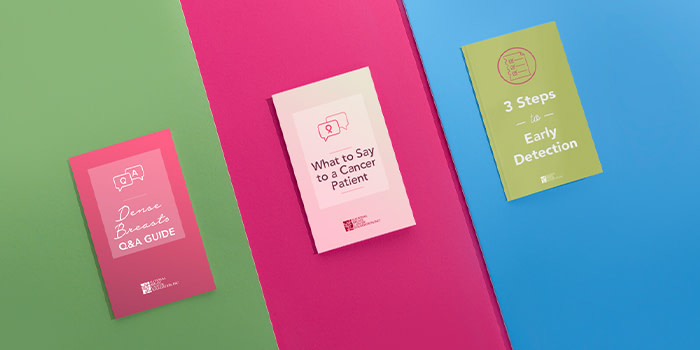
We’ve been able to use our simplified pink ribbon as a core element in designs for our corporate partners, and in the collateral pieces we give away when we’re out in the community – for example, at breast-health educational events.
Meanwhile, internally, we make sure we use a limited number of typefaces and colours for all our documents, including using templates for documents with branded headers, footers, and icons.
Through trial and error we’ve found (and accepted) that the creative team can’t always control every single piece of branded material that’s created by our organisation. A simple, compelling, and easy to understand branding strategy makes it easier to guide all our employees, and to make sure we’re all speaking the same visual language.
How did NBCF use MOO to help realise its branding strategy?
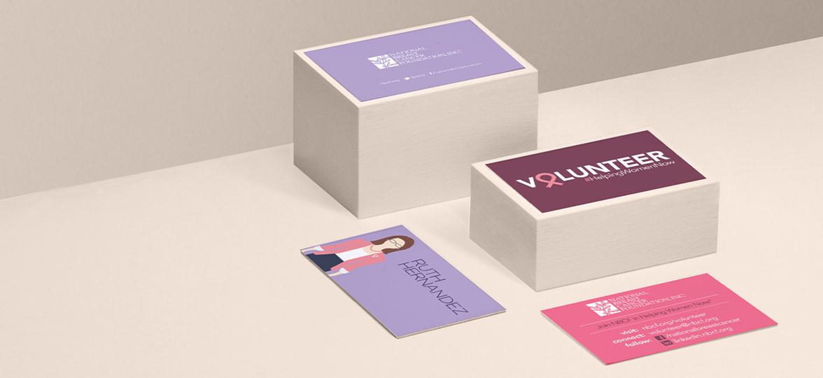
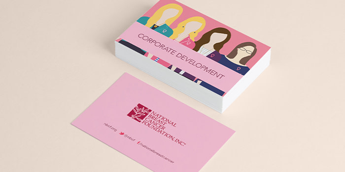
We’ve used MOO primarily for our nonprofit’s Business Cards, thanks to their durability and the many options available. We’ve used the standard business cards for most of our employees – they feature personalised illustrations of each employee as the main design element, to make them more memorable and personal.
We use Luxe business cards for employees who do a lot of networking, as the heavier weight and choice of colour seam make them stand out from the others, and also use MOO Cotton business cards for a lightweight card which still boasts a high-end look and texture.
Want to step up your nonprofit’s marketing strategy? Create your nonprofit’s business cards or visit MOO Business Services to get in touch with our team of experts. Or you can fill out the form here and a friendly Account Manager will reach out to you.
Originally published on Sep 1, 2020
Keep in touch
Get design inspiration, business tips and special offers straight to your inbox with our MOOsletter, out every two weeks.


