Make a positive impact using negative space
Master the power of blank space and learn how to use white space in design with our guide.
-
 The MOO Team
Share the post
Good design is not only about what’s there – it’s also about what’s not. In graphic design, white space can be an invaluable tool to bring out key elements and create eye-catching visuals.
What is negative space – or white space – in design? Master the power of blank space and learn how to use negative space in graphic design with our handy guide.
What is negative space?
To better understand negative space, you have to understand the concept of positive space first. Positive space is the area of interest in your design, the elements you want to draw attention to. Think of it as the subject. For example, on an artwork representing a chair on a blank background, positive space would be the chair itself.
Negative space, on the other hand, refers to the rest of your piece – the background, for instance. Also called “white space” (no, it doesn’t have to be white), it’s the quiet areas of your design that help it feel less crowded and bring focus to the key elements. In the example above, white space would be the blank background behind the chair.
Why is it so important?
We can’t stress enough the importance of negative space in design. Without it, there’s no focus – and with no focus, creating a memorable design is a lost battle. If it’s too crowded, you’re not offering the viewer a clear visual journey. It creates a confusing information overload – which, if it needs to be specified, is never a good thing.
White space gives your designs breathing room. It brings definition to your focal points, highlights your text, makes your images stand out, and helps you create a piece that makes sense visually.
How to use white space in design
Using white space in graphic design is all about finding the right balance between positive and negative space. This ratio can be what separates an OK design from a great one. Here are some tips to use negative space in design:
Alternate positive and negative space
To create balance and a sense of rhythm in your design, make sure you give each of your design elements enough room to stand out. You can group your elements by objective to assess how much space should be left between each item. For example, if you’re creating a Flyer for a festival, you might want to group the lineup together and put information such as the website and contact details in the same area. That means you’ll need to consider white space around each of these groups.
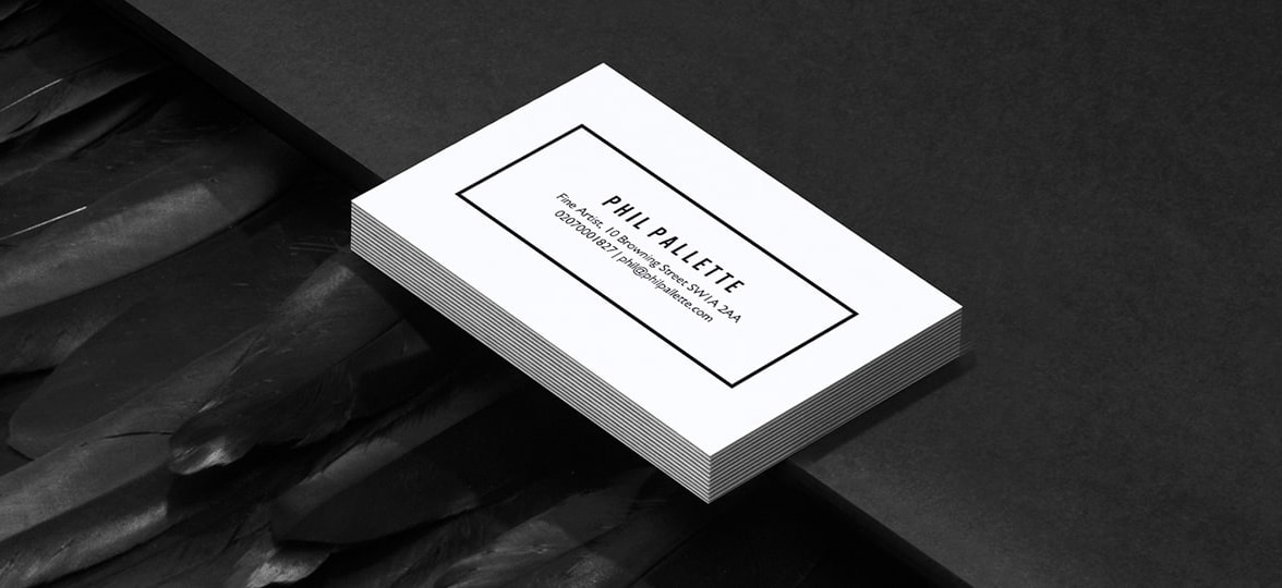
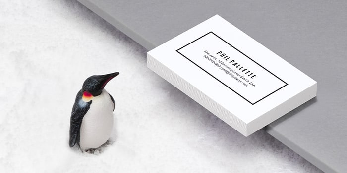
Discover how to play with empty space to create powerful minimalist business cards here.
Give more breathing room to key elements
While key elements will vary depending on your design, it’s essential that you identify the focal points before starting it. This way, you’ll be able to help viewers navigate it easily and access key information straight away by playing with negative space in your design. Give important elements such as titles (on Posters) or logos (on websites) more breathing space to make them pop even more.
Play with contrast
When it comes to negative space in graphic design, contrast is everything. White space doesn’t have to be white. Choose colours that will help accentuate your design elements, it’s always a good idea to revise your colour theory to pick the right palette. White space is also not necessarily “blank” – it can be a pattern or even a picture, as long as it remains subtle and secondary to your focal points and allows the viewer to navigate the design easily.
Create powerful designs using negative space and bring them to life with MOO prints.
Keep in touch
Get design inspiration, business tips and special offers straight to your inbox with our MOOsletter, out every two weeks.
Share the post
Keep in touch
Get design inspiration, business tips and special offers straight to your inbox with our MOOsletter, out every two weeks.


