For these 3 designers, fonts come first
What does a font say about your brand? We’ve spoken with three designers who let stunning fonts do all the talking.
-
 The MOO Team
Share the post

What happens when brilliant typography meets premium print? We’ve found 3 designers whose font-focused Business Cards are a sight to behold.
Telling stories through design is no easy feat. With an ever-growing collection of fonts at their disposal every day, designers have more tools than ever to communicate these stories in new and inventive ways. We’ve spoken with three designers who let stunning fonts do all the talking.
Funnel

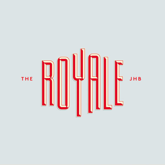
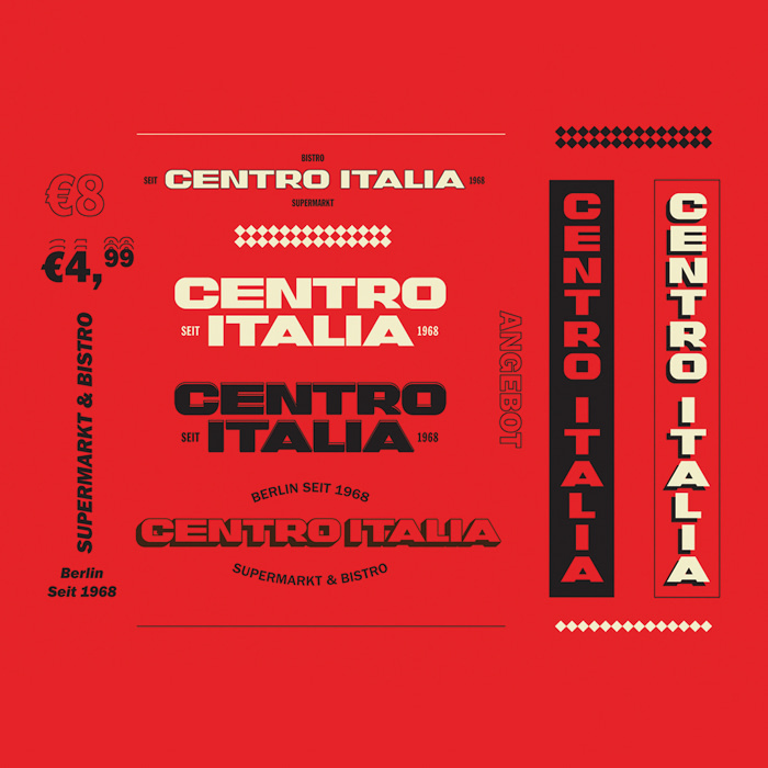
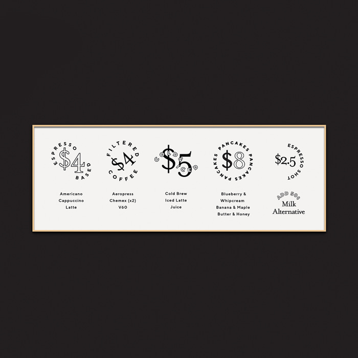
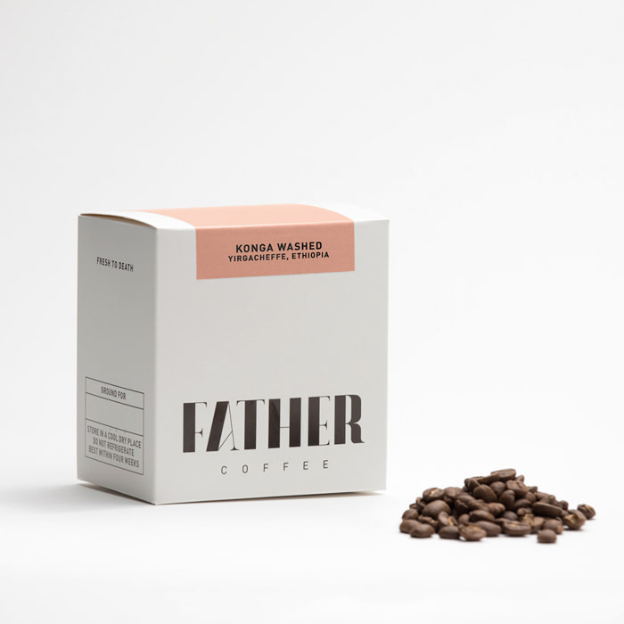
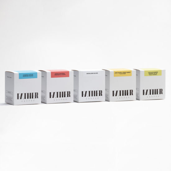
Funnel is the brainchild of Indianapolis-based designer Eric Kass. After spending years working sun up to sun down as an in-house agency designer, Eric realized he wanted to spend more time treating his own brand with the same attention and passion as the ones he created for his clients. Taking inspiration from his vast collection of vintage printed materials with eclectic typography, Eric developed the Funnel brand identity with a custom logotype and no shortage of classic fonts. The typographic diversity showcases Eric’s attention to detail and respect for design heritage.
When Eric is working on a client’s project, he starts with telling the brand story by focusing on their unique elements. “I love visualizing the brand through a system of marks, fonts, colors, and elements that create a unique language to tell the brand story,” Eric tells us. “This creates the foundation for everything to come like stationery, website, interior design, and print collateral.”

For Eric’s personal branded identity, he opted for an eye-grabbing array of fonts and finishes. His Soft Touch Business Cards with Gold Foil brought the Funnel branding to a new level. “The unique typography and design coupled with the distinctive satin feel of the paper and raised metallic gold not only stops people in their tracks but starts a conversation,” Eric says.
Tell your brand story on Soft Touch Business Cards.
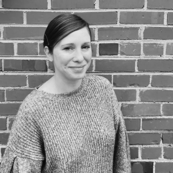
Nicholas Christowitz

Next stop: Berlin, where Nicholas Christowitz has been making a name for himself in the design scene. After growing up in Johannesburg, South Africa, Nicholas moved to Germany with the sole purpose of immersing himself in the art scene and becoming a better designer. He founded a design consultancy in 2014 and has been working with clients ever since.

His surroundings in the design-rich city of Berlin have kept him motivated to push himself as a creator. Along the way, Nicholas has accrued an impressive collection of beautiful fonts that he methodically searches through for each client’s project. “I have a bank of fonts and styles that I always revert back to when I start a project,” Nicholas tells us. “I usually just go with my gut until something clicks.”

Nicholas’ personal Luxe Business Cards are a classic example of letting fonts stand out on the paper. His information and a brief bio is broadcasted in Plantin font. “I fell in love with it after reading Monocle Magazine for years. It is simple, sophisticated, and fairly neutral,” Nicholas explains. Paired with his Luxe cards, his confident simplicity really shines: “The heavy cards let my clients know that I care about quality, texture, and perception.”
Let your fonts shine on Luxe Business Cards
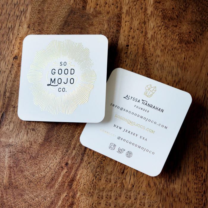
BK + Co.
BK + Co. is a creative studio based in Richmond, VA. Founded by Bridgit Kreutzer, the studio collaborates with creative entrepreneurs to develop strong visual identities and communicate their unique stories. After studying design at Virginia Commonwealth University and at the renowned Gerrit Rietveld Academie in Amsterdam, Bridgit’s passion for design led her to start a business on her own and was inspired and encouraged to do so by the creative community in Richmond. “Everyone here is forging new paths and supporting each other along the way,” Bridgit tells us.

Her work with her own design studio has proven to be a fulfilling endeavor. “It’s a privilege to work and collaborate with clients. Each project creates a different challenge, which helps me bring new things to the table.” To approach each project’s unique nature, Bridgit focuses on fonts first.

On a recent project for a massage therapist client, Bridgit was tasked with communicating tranquility, calm, and an organic connection to nature. The typography she chose was classic and clean, which complemented the simplistic iconography. She printed the designs onto Luxe Business Cards because the matte finish took well to the muted colors of the branding. “When I look at the cards, I feel at ease—like I can breathe,” Bridgit says. We love it when typography gives you all the feels.
Put your branding on Luxe paper
Keep in touch
Get design inspiration, business tips and special offers straight to your inbox with our MOOsletter, out every two weeks.
Share the post
Keep in touch
Get design inspiration, business tips and special offers straight to your inbox with our MOOsletter, out every two weeks.


