Green with Business Card envy
We selected some of our favourite green Business Card designs from the MOO community to inspire you.
-
 The MOO Team
Share the post
Green is the colour of nature. It’s also a colour of growth and rebirth and a symbol of luck. Or, if you’re Saint Patrick, a nod to the Emerald Isle – Ireland. Truth is, there are probably as many shades of green as there are meanings to it. For our greatest satisfaction.
Thinking of going green? We selected some of our favourite green Business Card designs from the MOO community to inspire you.
Nyree Designs: shining in green
Based in Manchester, Holly is the creative director behind Nyree Designs. Since she took the leap and started her business full time, she’s been focusing on brand identity and print for beauty brands and bakeries. Minimalist and feminine, her designs are a real treat – and a goldmine for foil lovers.
For her own Business Cards, Holly wanted to stand out while conveying a sleek and minimal feel. She kept the design simple but balanced it with a shiny Gold Foil finish for its opulent and tactile feel. “I wanted my cards to have a feminine and luxurious feel to them. And I felt gold foil was the perfect way to really elevate my design.”
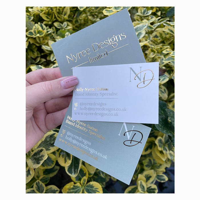
Picking green for her Business Card design was a conscious choice and the result of careful research. “Back when I was creating my own brand identity, I experimented with lots of different colour schemes. But green just felt right, and I found myself going back to it consistently. The colour green represents growth and prosperity, whilst having a real fresh and unique feel.” She didn’t pick just any green, though. “The sage shade in particular felt quite calming, and I love how my Business Cards stand out through being this colour. It’s not often you see green Business Cards!”
The result: a subtly premium, elegant card that perfectly reflects Nyree Designs’ identity. “My favourite thing about the cards is probably the use of my submark on the back, particularly the gold foiled D. I think this adds a luxurious and professional feel. Of course, the colours are a favourite too! I love how well the sage contrasts with the cream and the gold.”
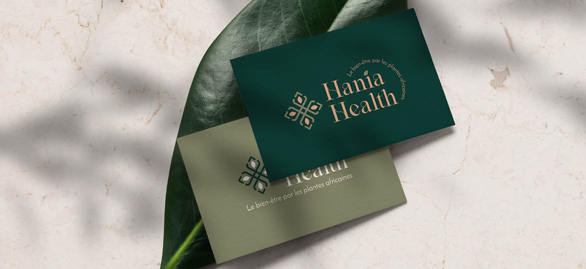
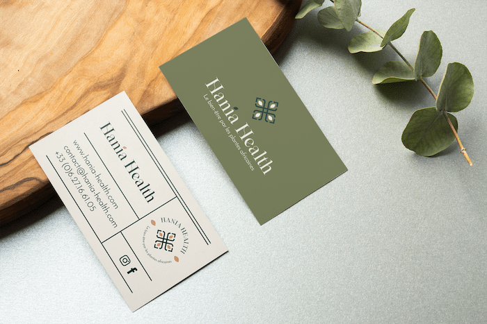
Roubina Tacorie for Hania Health: natural feel
Roubina Tacorie is a branding and merchandising expert based in Paris. She helps small businesses develop their brand image, focusing on creating a powerful first impression. From graphic design to visual merchandising, Roubina accompanies brands every step of the way to create the perfect love story between businesses and their customers. For her, every business deserves their great ideas to come to life, no matter their size.
Throughout her own growth as a business, Roubina developed a passion for African brands and the variety of cultural inspirations and creative possibilities they offer. She plays with subtle references to African cultures in designs that combine multiple influences.
When she created the visual identity for Hania Health, a healthy African food brand, green seemed the perfect choice. “Hania Health offers a range of products made with African plants carefully selected for their benefits. […] Green was a way to evoke both her industry and nature.” She picked two shades of green to create a powerful combination. “I opted for […] an olive green and a deep green to make other shades from the colour scheme stand out.”
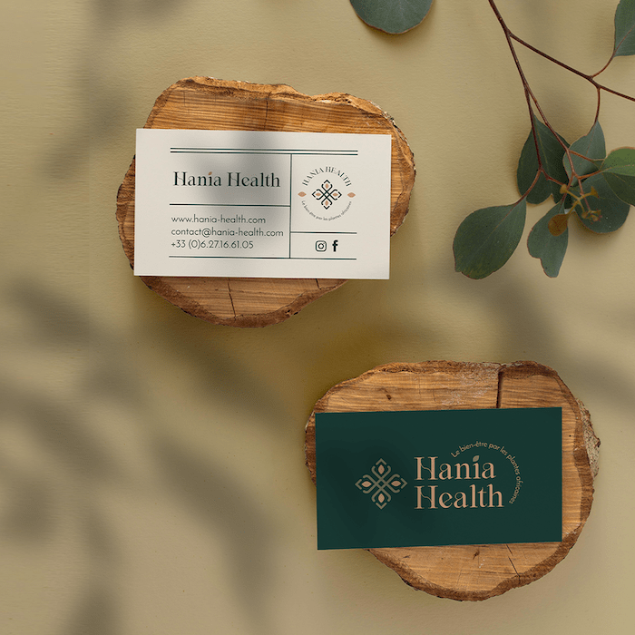
Roubina created a design inspired by old apothecary labels as a nod to natural remedies and ancient knowledge. She picked Super paper to create a multisensory experience that doesn’t stop at sight. “Touch is just as important as sight. It’s something I always take into consideration to translate a brand’s identity. That’s why I chose Super for its strength and the Soft Touch finish that feels so smooth and nice. This sense of softness and comfort is captivating for the senses and perfectly reflects the personality of this wellness brand.”
It’s also what she likes the most about the cards. “The whole design with a soothing Soft Touch finish gives a lot of character by prolonging the wellness experience down to the very detail.”
ReRooted Mercantile: second life
Rae PB Robinson is an artist and illustrator based in Winchester, Massachusetts. She’s also the mind behind ReRooted Mercantile, where she offers paper earrings from recycled goods, home-brewed natural inks, hand-dyed fabrics and prints.
A self-described jack-of-all-trades, Rae wanted to build a shop that could support a surprising catalog, like a modern cabinet of curiosities. And she also needed matching Business Cards. “I wanted this [cabinet of curiosities atmosphere] to come through my card design, so I utilized a vintage layout while making sure to keep the colours crisp and bright with plenty of white space.”
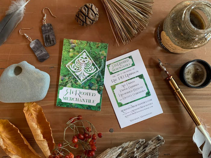
She used the Lotus Eater font for its decorative flourishes and vintage charm and picked the colour based on its symbolism. “Green felt like the obvious choice – it reminds me of nature, witchcraft and environmentalism. I chose a photo of a Highbush Blueberry (personally important to me) and distorted it to have the texture and feel of modern upholstery. Fresh, inviting, and a little loud – just like me.”
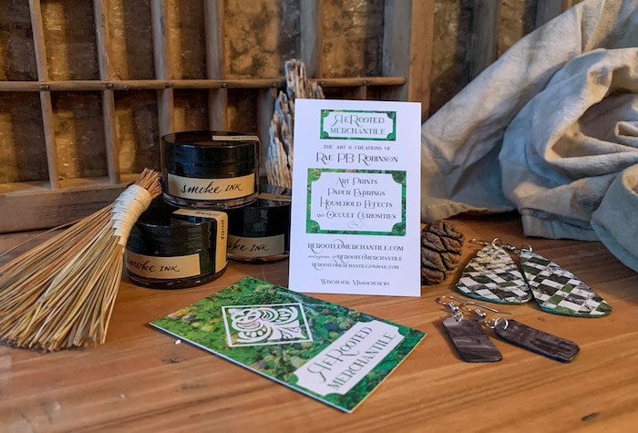
Rae chose the 100% recycled Cotton Business Cards for their green credentials (no pun intended). “It was a no-brainer. The items I make are from either natural or repurposed materials, and I feel like this card is a classy mixture of both. Not only is it cool that the cards are made from recycled t-shirts, but they are soft and durable. And even with their softness, my teeny text is still legible. I didn’t want shiny coatings, I wanted something that felt like I could have cut it out of my notebook and handed it to you.”
For her, the green Business Cards were a success. “These cards look and feel right. I’ve already ordered a second batch.”
Julian State for Lucie Schmidt: emerald energy
Lucie Schmidt is an artist based in Kjipuktuk/Halifax in Canada. She turns found wood into art with acrylics and resin, using fluid painting methods, but also likes to explore different materials – such as clay – with pottery.
When looking to create Business Cards to promote her art, Lucie turned to her brother, Julian State. Together, they designed cards that convey the energy and organic beauty of her work. Starting with emerald green, a recurring colour in Lucie’s pour paintings. “I wanted to be as clear and authentic as possible, so we kept the wording to the essentials and chose one of my paintings as the background and colour inspiration for the whole design.”

A lot of thought went into the logo, too, which they wanted to keep simple yet powerful. “The drip on the ‘P’ is a nod to the pouring action that creates the unique designs. Contrasting bold and lightweight boosts legibility.”
Finally, they chose Super Business Cards for their sturdiness. “They’re the perfect thickness. Sturdy and solid feeling. We went with a Soft Touch finish. It feels so nice and subtly premium.” When asked what he liked the most about the cards, Julian didn’t hesitate: “MOO cards are ALWAYS the best.” Why thank you.
Design your Business Cards today with MOO. Green or otherwise.
October 2022 update: This article references the way we used to make Cotton Business Cards. We now use a different process.
Keep in touch
Get design inspiration, business tips and special offers straight to your inbox with our MOOsletter, out every two weeks.
Share the post
Keep in touch
Get design inspiration, business tips and special offers straight to your inbox with our MOOsletter, out every two weeks.