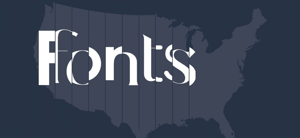
Everything you need to know about our customers’ favorite fonts
-
 The MOO Team
Share the post
We asked over 1,000 of our design-savvy customers about their favorite up-and-coming fonts. Here are their top 5 picks…
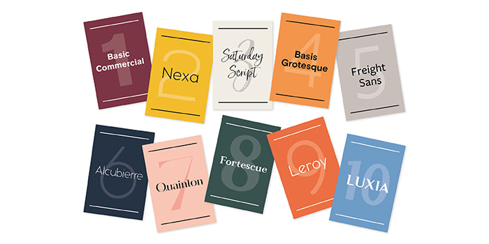
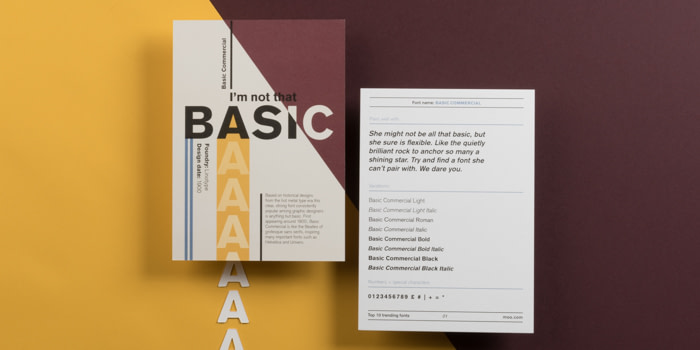
Basic Commercial
Published by: Linotype
Created: 1900
History: Based on historical designs from the hot metal type era this clear, strong font popular among graphic designers for decades is anything but basic. First appearing around 1900, Basic Commercial is like the Beatles of the modern sans serif, inspiring many later grotesque fonts like Helvetica and Univers.
Style: Sans serif
Best used as: A simple, but very versatile font that can used for both headline and body copy. Working on posters or invitations? Basic Commercial’s your go-to.
Pairs well with: She might not be all that basic, but she sure is flexible. Like the quietly brilliant rock to anchor so many a shining star. Try and find a font she can’t pair with. We dare you.
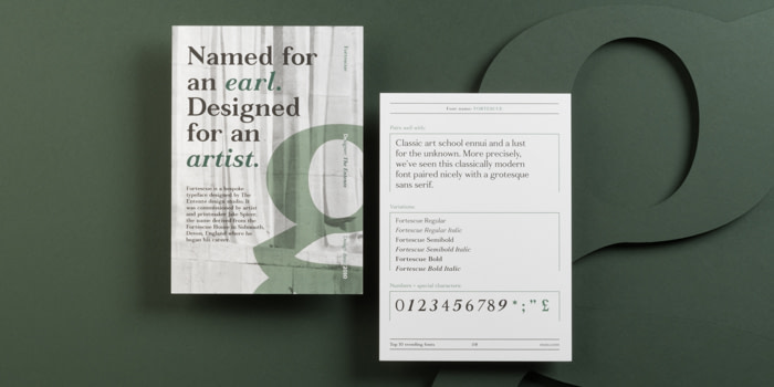
Fortescue
Designed by: The Entente
Created: 2010
History: Fortescue is a bespoke typeface designed by The Entente design studio. It was commissioned by artist and printmaker Jake Spicer, the name derived from the Fortescue House in Sidmouth, Devon, England where he began his career.
Style: Serif
Best used as: Working on a text-heavy print project? Fortescue’s variety of weights makes it the perfect choice for body copy – traditionality and simplicity combined.
Pairs well with:
Classic art school ennui and a lust for the unknown. More precisely, we’ve seen this classically modern font paired nicely with a grotesque sans serif.
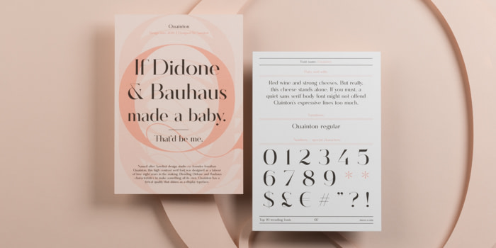
Quainton
Designed by: Sawdust
Created: 2016
History: Named after Sawdust design studio co-founder Jonathan Quainton, this high contrast serif font was designed as a labor of love eight years in the making. Blending Didone and Bauhaus characteristics to make something all its own, Quainton has a lyrical quality that shines as a display typeface.
Style: Serif
Best used as: Quainton’s elegance makes it the go-to for headlines and statement text.
Pairs well with:
Red wine and strong cheeses. But really, this cheese stands alone. If you must, a quiet sans serif body font might not offend Quainton’s expressive lines too much.
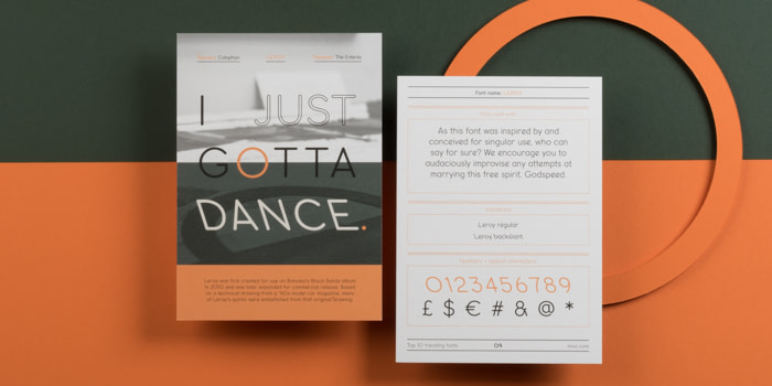
Leroy
Designed by: Oscar & Ewan
Created: 2010
History: Leroy was first created for use on Bonobo’s Black Sands album in 2010 and was later expanded for commercial release. Based on a technical drawing from a ‘60s model car magazine, many of Leroy’s quirks were embellished from that original drawing.
Style: Sans serif
Best used as: Working on branding or web design? Look no further than the fabulously versatile, Leroy.
Pairs well with: As this font was inspired by and conceived for singular use, who can say for sure? We encourage you to audaciously improvise any attempts at marrying this free spirit. Godspeed.
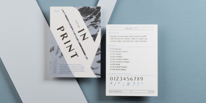
Luxia
Published by: Andrew Herndon
Created: 2016
History: Luxia is a modern Didone with a splash of lavish characters. The Didone type styles, also called Moderns or Neoclassicals, were originally designed by printers and have kept that legacy to this day as a sophisticated choice commonly used in editorial print design.
Style: Serif
Best used as: Luxia loves editorial design. A truly elegant font that deserves to be seen. Why not use it on your next event invitation – your guests will be queueing out the door.
Pairs well with: Moody oceanscapes and a touch of gold foil. Perfect for witchy vibes or when you want to take yourself just a bit seriously. A modern Didone that works perfectly with both sans serifs and serifs – we recommend Akzidenz-Grotesk and Baskerville.
What’s your favorite font? Share your thoughts in the comments below
Keep in touch
Get design inspiration, business tips and special offers straight to your inbox with our MOOsletter, out every two weeks.
Share the post
Keep in touch
Get design inspiration, business tips and special offers straight to your inbox with our MOOsletter, out every two weeks.


