How Warner Music uses Color Cues cards to connect with clients
Discover how Warner Music match clients with the perfect melody for their project with music cards.
-
 The MOO Team
Share the post
When it comes to helping their clients find a track to suit their project, Warner Music have developed an innovative way to match them with the perfect melody. It all starts with their Colour Cues cards.
Colour Cues – what is that?
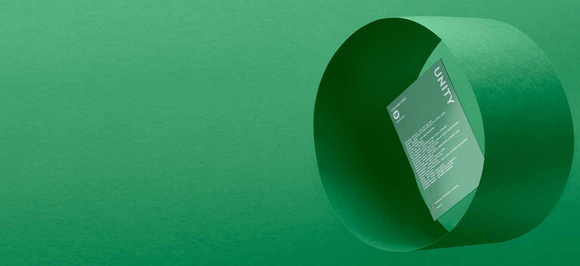
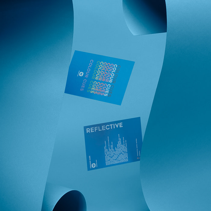
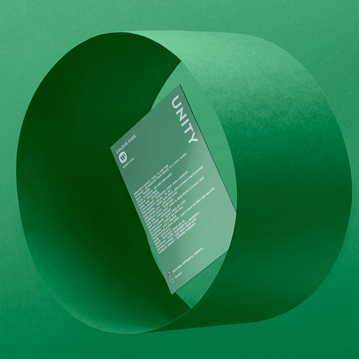
With around 2 million tracks in the Warner Music catalog, clients can often find themselves unsure where to start when it comes to choosing the right sound for their visual content. To tackle this, Warner are tapping into our emotional relationship with colour through the use of their Colour Cues cards — a totally original and interactive approach to selecting tracks. Each Colour Cues box contains a deck of music cards printed in 9 different colours. Each hue represents a different emotion and is complete with a list of tracks that suit the individual mood.
So, how did the colour cards come to life? We caught up with Liam Klimek, Creative Sync Manager who works on the team behind Colour Cues card, to find out how this clever use of print has changed not only the track selection process, but how Warner connect with their clients, too.
Tell us about the role of the Sync team at Warner Music?
Our role as the Sync team here at Warner is all about matching the media our clients are working with to the perfect soundtrack from our artists. We work across industries like film, TV, and gaming, and also run our in-house publishing imprint, W Songs.
What sparked the idea to create Colour Cues?
Most of the clients we work with — film editors, directors and advertising professionals — tend to be very visual in their creative approach, so we wanted to design something that would translate their ideas into music in the most natural way possible for them. Using colour seemed like the perfect vehicle, as it’s a creative language that everyone can connect with.
I’ve been interested in synaesthesia for a long time, and the Sync world is the perfect place to explore the relationship between what we see, what we hear, and what we feel. We were also really inspired by Brian Enos’ Oblique Strategies and the idea of adding a gamification element to creative decision making.
What are the visual inspirations behind these colour cards?
The key inspiration behind the design was a combination of Peter Saville’s work with Factory Records, mixed with the world of Pantone. We wanted something simple, bold and clear.
There’s an online Colour Cues platform. Why did you choose to create a physical product too?
As we’re all finding in the digital age, the use of physical creative tools is becoming less and less common. We’re so used to doing everything at our desks and on our computers, so we hope Colour Cues music cards can be a fun alternative to scrolling through Spotify all afternoon.
The playlist cards kind of complete the circle in connecting sight to sound and touch – although we don’t recommend eating or sniffing the cards to get all the senses involved!
How do Colour Cues change the way you work with clients?
The Colour Cues work best as an interactive prompt for creative discussions, which is why it was so important that we designed physical cards for them to pick up and play around with. They create a really useful thought-starter when asking clients what they are looking to achieve emotionally from a visual piece, while simultaneously giving them examples of complementary music to that particular mood.
How do clients react when you first introduce them to the Colour Cues method?
The response so far has been overwhelming. It’s a great feeling to bring a fresh, creative approach to our peers who we respect so much and have them welcome Colour Cues with open eyes and ears. We love watching somebody empty the box for the first time and hearing their “oooh” when they see the playlist cards. It’s a testament to our natural relationship with colour, and the strength of our feelings towards different hues — it’s just that we rarely connect with them consciously.

Inspired by Warner’s Colour Cues? Design your own creative cards for your next project with our Business Cards and Postcards.
Originally published on Dec 20, 2019
Keep in touch
Get design inspiration, business tips and special offers straight to your inbox with our MOOsletter, out every two weeks.
Share the post
Keep in touch
Get design inspiration, business tips and special offers straight to your inbox with our MOOsletter, out every two weeks.


