Why the best postcard designs do things differently
From colours to layout, here are some tips to get you started.
-
 The MOO Team
Share the post
What makes the best Postcard designs so good, the kind of thing you’d keep on your pinboard for years? First it’s about the quality of the paper and finish. Something that’s made to last, setting the stage for what you’ve got to say. (Full disclosure, we can help with that.) But it’s also about creating something that’s unmistakably you, a design that no other brand would use. So here are three tips to get you started.
1. Play with your palette
Long before CMYK print was invented, print designers had been adding colour to catch people’s attention. Which is hardly surprising, because the best postcard designs use colour in some way – even if it’s very sparingly. Like a pop of red or some gold.
Of course, these days you’re not limited by technology. But you might be limited by your brand’s palette. And that’s generally a good thing. It means having a more focused, more considered range of hues. Colours that are more likely to make an impact.
Just an example…

Here’s what we created for a fictional energy drink brand, Meddo. Their palette’s derived from the natural ingredients they use in their drinks, and they’re all in what you might call the “fruit” spectrum. With those four colours, we’re able to create something striking but simple, allowing the images and words to stand out.
2. Use atypical typography
Another thing the best postcard designs share? They go against type, seeing words not just as information to be communicated – but a design element in itself. The most obvious – and often most effective – take on this is going big. Making your Postcard totally typographical, with letter forms that fill the space. If you have a statement to make, this might be the way to go as it lends itself to slogans and hashtags.
But it’s also about the fonts themselves. So while a few years back, Helvetica was everywhere, now there’s more diversity with all sorts of serifs and custom fonts. It’s about creating a sense of difference, of following your own path.
Just an example…

Roama is a (fictional) travel app for backpackers, with the tagline “More than just A to B”. So we chose a font that evoked that sense of adventure, of taking the path less travelled: one called “Hegante” designed by Mark Caneso. Its brush-like forms suggest something fluid, and even without imagery it looks recognisably “Roama”.
3. Shape things up
Postcards are basically rectangles. It’s what makes them so practical and versatile. But some of the best postcard designs like to think inside that box, exploring shapes that are less expected. Let’s take your standard text or image box. Sure, it could be square and there’s nothing wrong with that.
But even here there are things you can do to create a distinctive style. It might be a case of adding a bevel effect to the corners. Or you could do something more fluid and organic. The point is, even your layout doesn’t have to be standard. Everything’s there to be played with.
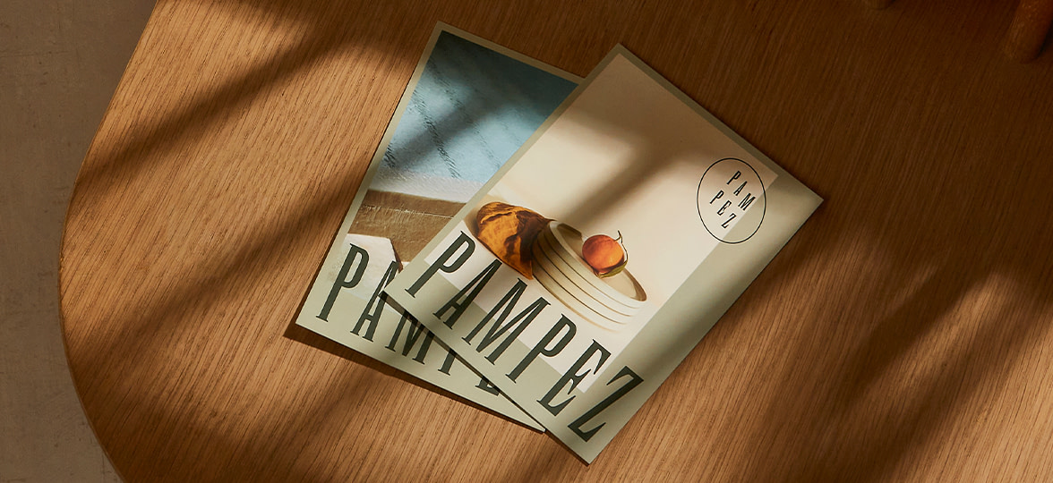
Just an example…
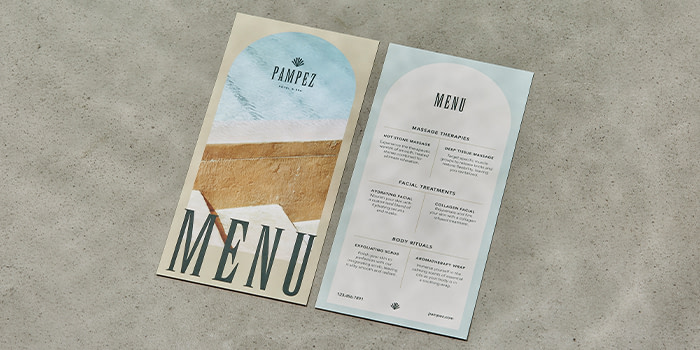
Pampez (again, not a real brand) offers “affordable luxury” experiences to a new generation of travellers. So here we’ve introduced archway shapes to suggest something architectural – an entrance into a world, let’s call it. It’s simple and not too literal, but that subtle change helps shift the Postcard’s feel.
Ready to give something new a go? Remember, with MOO you can print a different design on every Postcard. So you can get experimental and see what works. Because the best postcard designs are always unexpected.
Keep in touch
Get design inspiration, business tips and special offers straight to your inbox with our MOOsletter, out every two weeks.
Share the post
Keep in touch
Get design inspiration, business tips and special offers straight to your inbox with our MOOsletter, out every two weeks.