The best colours for Business Cards with Laura Perryman
Ready to make your Business Cards pop in a pile?
-
 The MOO Team
Share the post

Choosing the right colours for your products is not just about aesthetics – it’s about before you even say hello. When it comes to selecting the best colour for your Business Cards, this is totally subjective. But you might want to give it some extra thought.
We asked colour expert, Laura Perryman, for her opinion on the best colours for Business Cards by industry. And we think her suggestions are really thought-provoking. Read on to get inspired for your next Business Card project!
Understanding colour theory
With a background as a Colour, Materials, and Finish (CMF) designer and consultant, trend forecaster, and the author of ‘The Colour Bible‘, Laura Perryman has been helping businesses create better colour experiences for over 15 years.
Colour theory is all about understanding the significance of colours in conveying a message. This includes how colours are mixed and where they sit on the colour wheel.
Colours can be grouped in various ways, such as by selecting neighboring colours on the wheel or choosing complementary hues. This is where a colour expert plays a pivotal role by guiding you on the best combinations to use.
“The colours you choose for your Business Cards can speak volumes about your brand. Each colour invokes different identities and connotations, which can significantly influence how your business is perceived.
A well-designed colour palette attracts consumers and makes your card memorable. It’s important to consider the psychology of colour when selecting your palette, as different colours convey different qualities and this can reflect on your business.
The best colours for Business Cards consider the power of colour association, and context, and are designed in line with a brand’s desired perception”, explained Laura.
We asked Laura to look at five different industries: creative agency, pharmaceutical, hospitality, finance, and online retail. Want to see her advice for each when it comes to colouration? Keep reading.
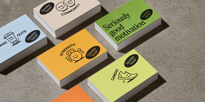
1. Creative agency
For any creative agencies that have stumbled upon this article, know that choosing simple yet eye-catching colour pairings can help your brand stand out.
“Small dots or slices of graphic colour can attract the eye and make your Business Card memorable. For an artistic twist, consider pairing a vibrant lavender with a citrusy bold yellow, accentuated with white for a modern and striking effect.
Lavender and yellow form a highly creative and dynamic pairing. The reason they work well together is because they are from opposite sides of the colour wheel, creating a playful interplay”, Laura told us.
2. Pharmaceutical

While blue is sometimes associated with pharmaceutical branding (representing cleanliness and trustworthiness), healthcare brands should aim to find a colour that identifies the personality and message of their own brand.
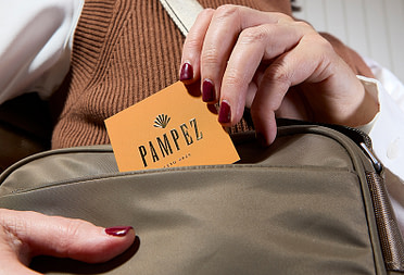
“A pharmaceutical brand needs to prioritize clarity around ingredients and appeal to consumers who are interested in health. Consider using a palette that combines the tactile qualities of cotton paper with tinted whites, warm browns, and blacks. To introduce a natural yet scientific contrast, a touch of light, clean green can be added as an accent”, Laura suggested.
“The colours you choose for your Business Cards speak volumes about your brand. Each colour invokes different identities and connotations, which can significantly influence how your business is perceived”.
3. Hospitality

In the hospitality industry, businesses often have more freedom to experiment with colours and sensory experiences in their branding. Studies have shown that flavors and colours are closely connected and that oranges and yellows can increase appetite.
“In this industry, colours need to be warm. Try a palette of warm shades like zesty lemons, golden wheat, and deep-roasted orange when designing your Business Cards”, said Laura.
4. Finance

According to various studies, people make subconscious judgments about a person, environment, or product within 90 seconds of initial viewing – and between 60-90% of those judgments are based on colour alone.
“When choosing colour – it’s so important to know who you are appealing to. Be specific, if your audience is an older or a younger crowd you’ll have to adjust your colours accordingly.
For the finance sector, It’s important to balance clarity with creativity. How can we achieve that? By selecting colours that are both professional and playful. Harmonize bold blues and soft colours that symbolize stability and growth and instill confidence. Then, inject some personality with a clean black to underscore seriousness without becoming stale”, suggested Laura.
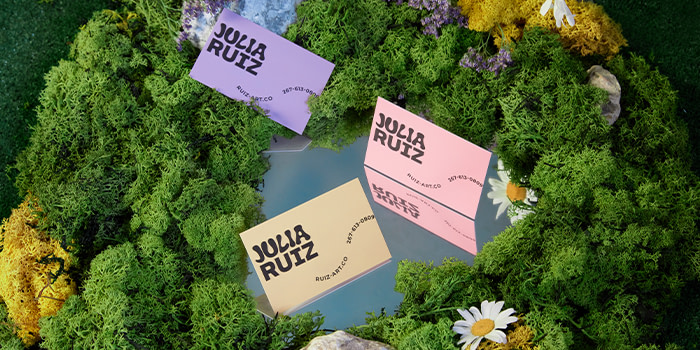
5. Online retailer

Your brand’s online and offline experiences should be aligned, as they are two parts of a smooth and consistent customer journey. It’s therefore important to make sure your colour choices stand out as much on a screen as they do in person.
“For online retailers, colours can afford to be more offbeat, with personality and soul. A virtual indie retailer may have an element of quirkiness and a close online community. Businesses can build brand recognition with dynamic harmonies by combining strong chromatic shades as well as soft pastels. Try a mid-green or lime yellow with pastel pink”, suggested Laura.
Ready to get started? Design your dream Business Card today. And if you need help designing, simply fill in your details below and a member of our team will be in touch.
Keep in touch
Get design inspiration, business tips and special offers straight to your inbox with our MOOsletter, out every two weeks.
Share the post
Keep in touch
Get design inspiration, business tips and special offers straight to your inbox with our MOOsletter, out every two weeks.