The ultimate guide to flyer sizes and dimensions
-
 The MOO Team
Share the post
How big should a flyer be? And how many pixels should you make your design when you’re getting some flyers printed? Here’s everything you need to know about making flyers with MOO.
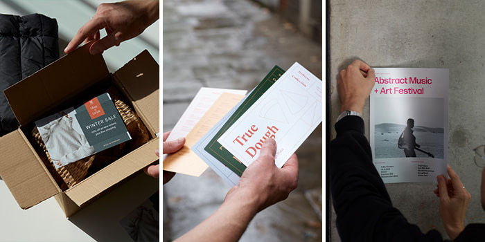
Flyers are a super-versatile way to spread your message, whether you pop them into a publication, hand them out at a trade show or include them in your packaging when you ship out customer orders.
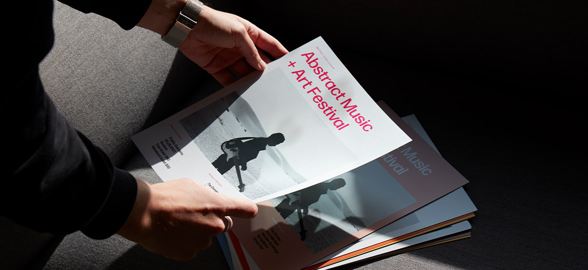
Our customers use MOO flyers to make restaurant menus, price lists for their salons, loyalty cards and even Printfinity-enabled pocket portfolios that show off a range of work in a single pack.
You could turn them into part of a multi-media journey by encouraging customers to Instagram them, or even create a Flyer Flip-book made of subtly different MOO Printfinity designs like comedian Olaf Falafel. It’s no wonder the humble flyer is one of our most popular products.
So having firmly established that flyers are supremely awesome, here’s everything you need to know if you want to create your own.

What size is a MOO flyer in pixels?
Our flyers come in five sizes, from pocket-friendly to poster-ready. Here are their vital statistics, including the full-bleed size for your design in pixels.
What is the standard bleed size for a flyer?
The bleed size is the very outer edge of your design, the part that will be trimmed off when the final printed flyer is cut to size. For this reason, its dimensions are a tiny bit bigger than the flyer itself.
- A6 (small) flyers
105mm X 148mm - Square flyers
120mm X 120mm - DL flyers
99mm X 210mm - A5(half page) flyers
148mm X 210mm - A4 flyers
210mm X 297mm

Which MOO flyer size is best for me?
- A6 (small) flyers
These are our smallest flyers, but they’re more than capable of making a big impact. Choose these if you don’t need to fit a lot of text on the flyers – they’re great for promoting a specific launch or offer, for example as a throw-in for a customer package. They also fit neatly into a pocket, so they’re great for handing out at events or at your bricks-and-mortar store if you have one. Get more inspiration with our small flyer template designs
. - Square flyers
A little quirky, a little different – the square flyer is perfect for showing off your creative approach and fresh thinking. Reminiscent of Instagram, it’s also a great choice for social media stars. See what else is possible with our square flyer template designs
. - Long flyers
These tall and elegant flyers are the perfect format for restaurant and cafe menus, cocktail bar options, salons and spa treatment lists. They also lend themselves to festival programmes and exhibition guides. For more ideas, take a look at our long flyer template designs
. - Half page flyers
Lots to shout about? Look no further than the half-page flyer, which has plenty of room for a complete introduction to your business and some inviting imagery too. Perfect for handing out at trade events where people are discovering your business for the first time. See what’s possible with our half page flyer template designs.
. - Letter size flyers
Our biggest flyers really pack a punch. Pin them in your store window, car or on a noticeboard to promote an event, or use them to showcase gorgeous product imagery so customers can really see the details. Get more ideas on how to use them in our letter size flyer template designs.
Portrait or landscape?
Should your flyers be a top-to-bottom experience or have more of a side-to-side vibe? Of course, it’s completely up to you.
When most people think of a flyer, they’re probably imagining a portrait layout with the main text at the top edge. But there’s nothing stopping you from turning the convention on its edge and doing it landscape style.
Portrait may be a natural choice for most businesses because it echoes the way text is laid out in a book or magazine. It’s easy to sub-divide the content down the page using sub-headings and sections, and you can maximise the impact of a main heading or image at the top because that’s where people’s eyes are used to looking.
If you do take the landscape option, pay special attention to the layout of the flyer and try out a modular structure, perhaps with imagery on the left and text on the right. This will stop your text stretching across the whole length of the page and being tiring on the eye.
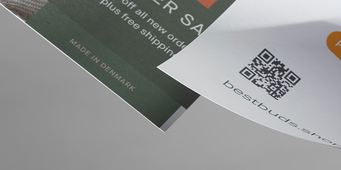
What kind of paper is best for flyers?
Here at MOO, we know that life is too short for flimsy paperstocks, and that sturdier paper and card is more long-lived and better received by those lucky enough to get hold of one of your flyers. But we also know that our customers are creative people who love having plenty of choice. That’s why we offer three grades of beautiful paper. We invite you to think of them as ‘best’, ‘bester’ and ‘bestest’.
- Premium
Available in 80/100lb (matte/gloss) cover weight
Substantial and luxurious feel
. - Pearlescent
100lb
Eye-catching shiny-shimmery finish
High contrast color
Hard-wearing crease-resistant finish
Feeling the inspiration flow? Get started creating your own unique set of MOO flyers.
Keep in touch
Get design inspiration, business tips and special offers straight to your inbox with our MOOsletter, out every two weeks.
Share the post
Keep in touch
Get design inspiration, business tips and special offers straight to your inbox with our MOOsletter, out every two weeks.


