An Open Goal: eight branding lessons from the FIFA World Cup
Eight lessons for brand marketers from the World Cup.
-
 The MOO Team
Share the post
Events don’t come bigger than the FIFA World Cup.
This summer’s competition is predicted to be the most-watched sporting event of all time. More than 5 billion people around the world watched at least some of the tournament in 2022. And with more matches, more teams and bigger budgets, the USA, Canada and Mexico-hosted event looks set to be a blockbuster, with 6 billion people engaging with it.
Now, the popularity of the biggest competition in the world’s most popular sport probably can’t be entirely credited to the FIFA branding department. FIFA itself is not a universally loved brand.
But when a single event pulls in the biggest audiences on the planet, it’s worth paying attention to what they’re doing.
So here are eight things brand marketers can learn from the FIFA World Cup.
1. Play the long game
It may sound obvious, but it takes time to build a brand as strong as the World Cup.
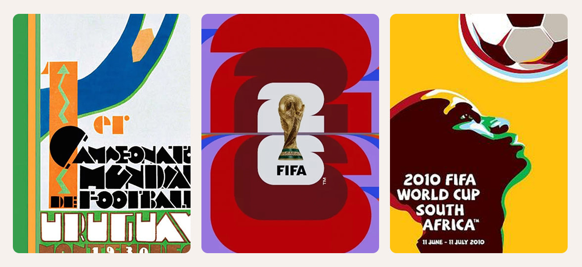
The first competition took place in Uruguay in 1930, with just 13 teams. This summer, 48 teams will compete.
In the 96 years between, the brand has tweaked and evolved to meet the changing times and culture. It’s grown with years of discipline and slow evolution, and is built on consistency, using the same visual language year after year so even a subtle cue now triggers recognition.
MOO Takeaway: don’t expect instant icon status. Build slowly. Repeat what matters. Let time do some of the work.
2. Design for where your brand lives
In the early days, the World Cup didn’t have a brand playbook or a trademarked set of assets. It had a poster. And those early World Cup posters are closer to works of fine art than modern graphic design.
In 2026, brand identities have to work much harder. They need to show up in TikTok videos and paid search, on billboards and TV, on the sleeve of a shirt and the tail of a plane. Everything is brandable, but there’s less time to say anything.
So the path to success is being simple, easy to digest and memorable. It’s harder than it sounds.
MOO Takeaway: design for real life. Think about every place your brand has to work, from the biggest banner to the smallest thumbnail.
3. Keep the main thing the main thing
Almost everyone recognizes the shape of the World Cup trophy. It’s become one of the most iconic silhouettes in branding.
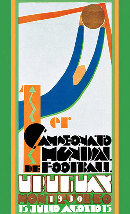
But before 2002, the World Cup branding generally featured a soccer ball at its center. Since then, every competition’s branding has featured the iconic shape of the competition trophy at the center, usually in an abstracted form.
This year’s identity takes that further, with a straight photograph of the trophy, designed for immediate recognition in a faster-moving world.
MOO Takeaway: identify the single most recognizable point of your visual identity, and build everything else around it.
4. Decide what can change and what can’t
The World Cup adapts its branding with every tournament to tell the story of the host nation. There’s no fixed color scheme. Instead, every World Cup comes with a new identity that uses cultural cues and color palettes from the competition’s destination.
Every World Cup needs to feel like the World Cup. But every World Cup also needs to feel like the place hosting it. That’s the balancing act.
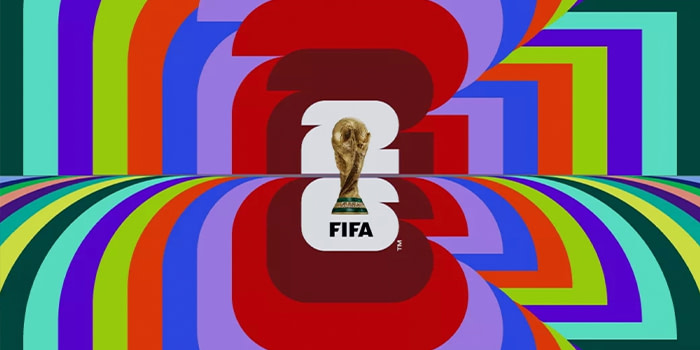
Germany 2006 used optimistic visuals from an expanded German color palette. South Africa 2010 came with patterns and hand-drawn illustrations inspired by African art. Qatar 2022 used flowing forms drawn from regional garments and Arabic aesthetics.
But there are some things that never change. The name of the competition remains the same, and the trophy is always featured.
Brands can expand and evolve to tell different stories at different times. But there must be some consistent foundations that never change. And you need to decide what they are.
MOO Takeaway: decide what can change and what can’t. Then protect the parts that matter most.
5. Missing some fun? Try a mascot.
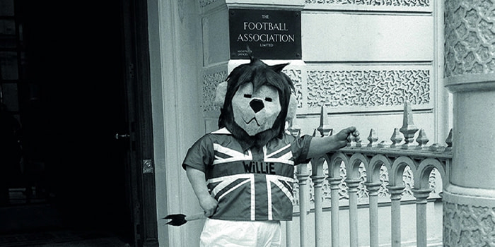
The first World Cup mascot was World Cup Willie, a cuddly lion introduced for England 1966. Italia 90 gave us Ciao, a block figure with a floating soccer ball for a head. Qatar 2022 gave us a ghost.
It’s fair to say these mascots have received mixed responses. But they do something logos often can’t: they give people a character to react to.
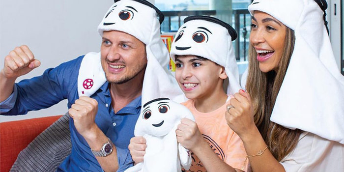
This year’s trio, Maple, Zayu, and Clutch, are a moose, a bald eagle, and a jaguar representing each host nation. They come with their own video game, and FIFA says they embody joy, energy, and togetherness.
Whatever you think of them, mascots are built for conversation. They can be loved, mocked, collected, shared and turned into merch. That’s a lot of mileage from one character (or three).
MOO Takeaway: if your brand is missing warmth, humor or a more human way in, a mascot or character can help. Used well, they give audiences something to connect with beyond the logo.
6. When your audience is divided, go broad
Appealing to an audience spanning multiple countries, languages, cultures, and viewpoints is not easy. FIFA’s approach is to leave space for interpretation rather than push any single message too hard.
The 2026 identity is bold, blocky, and built for social. It celebrates soccer and diversity – without being too specific about what that means. Almost everything beyond the trophy and the year is flexible by design.
A broad, flexible message that’s easy for everyone to get behind is sometimes the best way.
MOO Takeaway: when your audience is broad, your brand idea needs room. Don’t make it vague, but do make it easy for different people to see themselves in it.
7. Merchandise makes your message louder
The World Cup’s visual identity is built with merchandising in mind from the start. There’s no end to World Cup merchandise: the identity is used on shirts, scarves, soccer balls, all kinds of collectibles, and niche memorabilia.
That’s not just a revenue opportunity. It’s a recognition opportunity.
Nothing spreads a brand faster than people choosing to wear it, carry it, gift it or keep it. Merch turns an audience into a network of tiny, walking media placements. Which sounds very corporate, until you remember it can also look like a really good scarf.
MOO Takeaway: design branded merchandise people actually want. Make it useful, wearable, giftable or collectible. The better the merch, the further your brand travels.
8. Keep on going
It’s tempting to go big on branding, exhausting yourself on your first event. But brands that last are built more slowly, through consistency and trust, not fleeting moments.
The World Cup is nearly 100 years old. Its popularity didn’t arrive overnight. The lesson is simple: keep showing up, consistently..
MOO Takeway: keep at it. Keep being recognizable. Keep giving people a reason to care.
Build a brand that lasts with MOO
Whether it’s custom Stationery or Branded Merch, we’ll make sure your brand shows up in all the right places.
Discover our MOO Business Services. To get started, fill out this simple form, and one of our team members will be in touch.
Keep in touch
Get design inspiration, business tips and special offers straight to your inbox with our MOOsletter, out every two weeks.
Share the post
Keep in touch
Get design inspiration, business tips and special offers straight to your inbox with our MOOsletter, out every two weeks.


