The best features of MOO’s design templates
MOO designers walk us through all of the clever design features of our latest design templates.
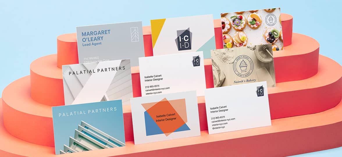
Our Creative team walk us through the smart features of our latest design templates for our range of Business Cards.
At MOO, we have one mission — and that’s to provide great design for everyone. Whether that’s developing a truly unforgettable and tactile paper feel or fully customizable templates for our products — we make design easy and accessible so you can stand out and look your best.
To help you create cards that are as unique as your brand, we’ve created 22 totally customizable Business Card design templates.
From adding your logo, to customizing color schemes, we’ve listened to what you (our creative customers) need from your cards and created templates to help you really get creative (without needing a graphic design degree).
Developing new features for design templates
So, how did these templates actually come to life? We spoke with two of our rockstar designers about all the amazing new details. First up, Head of Design, Millie Davies:
What was the goal with releasing these templates?
Templates are a really good way to inspire people as to what they could create and how they could promote their businesses to the best of their abilities. We looked at a range of different customer segments — from cake makers to designers to stylists.
Although many of the templates are aimed at specific business segments, they’re also entirely editable so you can change the logo, text, photo backgrounds. You really can turn these templates into whatever you need for your business and brand.
As a designer, how did you approach these template designs?
We tackled each template as its own branding exercise. We wanted to treat each design as if we were creating it for a client, imagining what their business was, what it was called and how their branding would look, showing off the best aspects of each business. For example, if you’re a photographer, you’re going to want a lot of options for photos in your template as well as slots for logos and text. We had to make sure we were delivering the best options for each industry’s needs.
Talk us through some of the features of these templates
Previously we’d tried to make the Business Card templates as eye-catching as possible. At times, that meant that the functionality of them was slightly hindered. This time around, we listened closely to what our customers wanted: the option for multiple lines of text and the ability to upload photos and logos. We made sure that these new templates were as flexible as possible so that our customers are able to customize them, making them right for their own business.
So you can add logos to these templates – how did make sure they were integrated within the templates?
Everyone wants to be able to upload logos onto their business cards. We’re making a conscious decision to ensure that, wherever possible, we include a large area that customers can adjust according to the size of their design. From a design perspective, we create fake logos to show customers where theirs can go.
How do you ensure the templates have a level of flexibility?
We worked closely with the Artwork team to make sure we included enough text boxes. The templates are built in another system called Pixel which is what customers see on the website, so we have to build them quite specifically. Partnering with the Artwork team allowed us to ensure the designs had the right level of customization that we were hoping for. They were able to guide us with our design decisions from a technical standpoint which was invaluable.

What do you take into consideration when developing fictional brands aimed to inspire people?
We often work with Product Marketing to make sure that the industries that we pick are ones our customers have searched for or are currently looking for — or even potentially things that we don’t have. When it comes to creating the actual job titles and names, we work closely with the Copy and Creative team to inject some fun and personality to each one.
What kind of testing did you do to make sure the template designs were scalable to multiple industries?
For each template, we made sure there were enough text slots for names, job titles, phone numbers, and website addresses. We also made sure the customer could upload an image or change the colors of their personalized assets.
Once the templates were created, we sent them to the Customer Service team to stress-test the design through a web page mock-up. They provided feedback on how the elements performed, like borders, text boxes or logo slots. The feedback from Customer Service is usually inspired by actual feedback they’re getting from customers on a regular basis.
Designing the Business Card templates
Branding design works best when you get to know the ins and outs of the client and the work that they do. But what about when the branding you are designing is for a fictional company? Well, that’s a different story. And who better to share the details on that process than our very own designer, Phil Bailey, who developed two new templates from an entirely blank slate.
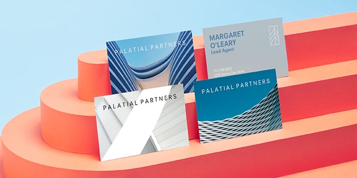
‘Mottled Color’
This design actually developed from a website project to update the page for Luxe — our most premium paper. This project was a bit of an anomaly in that we created this design with the paper stock in mind first, rather than the customer profile. We wanted something that would reflect the premium nature of the product and show the quality of the stock, so we decided to go for a pared-down design.
The speckled creative is inspired by the popular terrazzo trend. Terrazzo is associated as a luxurious, contemporary material, so we wanted to translate that same feeling into the visual identity for our fictional creative agency, ‘Vibe’. We went with a clean typeface, but the template is simple enough that, if a customer wanted a more decorative script or serif font, it would still work really nicely – with our templates, we’ve really tried to ramp up the versatility to give customers as much control as possible.
As we were initially thinking product-first when it came to designing, we wanted to really highlight one of the cool features of our Luxe range – the colored seam. The seam comes in 8 colors, so we created a more muted version of each of the bright seam colors for the front and back of the cards, making the edges really pop.
‘Shape Shifters’
For this design, I created my own fictional customer profile based on the types of customers that we know print with us. This customer, Thomas Laursen, is a German product designer who works in his own studio in Munich. In my head, he’s a product designer; someone who makes really bold statement home furnishings and furniture, like sofas, and lamps.
I wanted to reflect this in his visual identity – using bold colors on geometric shapes to reflect his style. We chose a chunky sans-serif typeface to ensure it didn’t get lost on the busy background, but still feels understated and friendly. We went all lowercase as it’s a very popular trend to print this way – and with this being a modern contemporary business, it suited the customer to a tee.
Bring your ideas to life with our new Business Card templates.
Stickers may be small but they’re hugely versatile. Especially because you can print a different design on every Sticker. Here are five brands creating mini, sticky masterpieces.
Art by Alyah: Rainbow energy
Alyah Holmes is the illustrator and designer behind Art by Alyah. When she’s not working on creative projects for business clients, she sells her prints to a worldwide audience on her website. Her motto? Making people happy through her artwork. Mission accomplished, if you ask us.
And this promise goes beyond her prints themselves. Alyah makes sure every single detail of her packaging puts a smile on her customers’ faces with colorful Round Stickers. “I use my custom Stickers on my art shop packaging. I place them on the back of my framed prints, and all over my poster shipping tubes. It’s a quick and simple way to brand your products, and to add a little something special to your orders.” She goes above and beyond to guarantee the best experience to her beloved customers.
For her (super cute) Sticker designs, she went all in with the colors. “I wanted a color palette that represented my artwork: fun, colorful, bright and tropical.” She rocked bright hues that perfectly complement each other to really pop – just like her art. Her favorite thing about her Stickers? She was free to express her creativity with a variety of designs. “I can use Printfinity to print a different design on each Sticker, so I’m never limited! I also love the small sleek pocket the Stickers come in, as I travel often and it makes it easy to bring my shipping supplies with me.”
Want to power up your unboxing appeal like Alyah? Check out our expert tips.
Lark: Life of the party
Based in Toronto, Lark makes party planning that little bit easier. Originally from Northern Ireland, founder Anna took the leap from comms to a product-based business – and rose to the challenge with panache. Lark curates and sells stylish and modern party kits for all the occasions, from paper cups to candles and wooden utensils.
To kick off her business in style, Anna chose premium quality with MOO Stickers. First, she needed simple circular Stickers to easily add her logo to party kits. Thanks to Printfinity, she was able to feature each and every hue from the lovely color palette she developed with her designer Clawrence. But she didn’t stop there. Printfinity helped Anna solve a packaging problem with minimum costs with a clever Sticker idea. “Each party kit [is different]. I wanted to create custom packaging to hold the kits, but my budget meant that I wasn’t able to print a custom box for each specific kit’s contents. My solution was to have one box design printed and use Stickers to showcase the contents of each kit – meaning I was able to customize the packaging after all!”
When we asked Anna what she liked most about her MOO Stickers, we couldn’t help but blush. “They look so professional, the quality is exceptional, [I liked] the fact that I was able to print a range of Sticker designs at a great price. I loved that I could manage everything online, too. It’s an all-around simple and satisfying customer experience.” Stop it, you.
Carved Color: Say it with Stickers
Taylor Suchy started Carved Color as a way to recover from a brain injury through art therapy. Working with clay allowed her to embark on a creative healing journey. “From throwing the clay to painting it, you are creating a new life from mud and at every step… the process gives back to you.” Based in Southern California, her positivity-filled business is all about educating people about the benefits of art therapy. “I am just trying to brighten up the day, one colorful mug at a time!”

When she launched Carved Color, Taylor knew branding would be key to its growth. “Anyone running a small business knows your craft is only part of the equation. Marketing, sales, branding and social media are some of the many other aspects you must become good at. I use MOO Stickers as a vital part of my branded experience. I want the customer to interact with my brand from receiving the item on their doorstep to unboxing it in their home.” She found a variety of uses for Stickers, from “fragile” labels for her shipping boxes to Sticker seals for the inner packaging. And she didn’t lack Sticker design ideas. “Where the “fragile” sticker has more practical purpose, the product Sticker is more playful and can have branded sayings such as “Real women cook with a kiln” or “Pot it like it’s hot.” The possibilities are endless!”

Her favorite part? “How easy they are to make. I download the Illustrator file, add my artwork, and I am more than halfway there. I also should mention that all the Stickers don’t have to be the same! I can utilize my full color palette and have round stickers with just my logo or a phrase all in the same order.” Printfinity done right.
Wickend: Worth the candle
Located in Québec, Mahika Hache is the brain behind Wickend, a sustainable candle brand based on the principle of upcycling. Committed to having a positive impact on the planet, she created a range of hand-poured candles made of recycled wine bottles. With soft colors and a beautiful, minimalist branding, Wickend can already stand up to even the most established brands.

Mahika used Printfinity to create a range of simple yet pristine product labels for her different candle scents. With Rectangular Stickers, she created premium-looking labels with a variety of colors and designs reflecting the different fragrances available. With their strong, tear-free materials, they’re easy to stick (and unstick) without leaving glue on the candle recipient. A plus for Mahika, who also loves the printing quality of her Sticker designs. “The colors are super vibrant, just like I designed them, and MOO packaging is super cute.” We could say the same about yours!

Inspired by the way Mahika used MOO Stickers as product labels? Find out other creative ways to use them here.
CLAYD Collective: Making clay fun
Canadian brand CLAYD Collective is a bimonthly collection of polymer clay adornments made by Canadian-Indonesian graphic designer Tiffany Sargent. When her ceramics studio closed due to COVID-19 restrictions, Tiffany turned to polymer clay. Using her experience of color theory, she started designing wearable adornments inspired by what she loves and the special people in her life. And thus CLAYD Collective was born.
From backing cards to Thank You Cards and custom Stickers, Tiffany is a MOO enthusiast for her business. “[The] brand is very punny and uplifting. We love having fun with words and want to bring a smile to your face, ear to ear (literally!). We knew that we can’t just settle with one Sticker for our daily use, so we just had to go all out.” That’s where Printfinity came into play. It allowed her to choose as many designs as there are Stickers in a pack, to print all of her great Sticker ideas. “We wanted to make our customer’s day when they receive our order. Each Sticker features fun and light-hearted sayings such as: It’s here! What are you waiting for? Open me! […] Ooh! Your ears must have been burning, […] Eat the cake / donut / nutella / fries. These are one size fits all.”
What she loves most about her MOO Stickers? “What’s not to love? […] These custom Stickers have been a joy to seal each order with. We love that every order has a completely different Sticker and returning customers are always pleased with all the funny stickers that are included in their orders. We love working with MOO because we love and trust their quality, plus they are the only company that offers Printfinity printing. Want to hear a secret? We ordered some extra product cards from another company in a bind and the quality was nothing like MOO’s. Serves us right to order from somewhere else. Never again!” Oops, our heart just melted.
Bring (all) your Sticker design ideas to life with Printfinity here.
Chris Goggs has a special place in his heart for physical print. The designer, printmaker and sometimes potter – in his own words – likes to experiment with different mediums to bring his ideas to life. With his art zine LOOKSEE, he indulges his passion for visual experimentation while exploring the concept of what he calls “creative voyeurism”.
We met Chris to talk about his love for print, the ins and outs of making a zine, and his journey as a queer artist in the UK.

Where does your interest for zines come from?
So, my name is Chris and I’m a graphic designer by trade, but also an avid creator. I’ve always been obsessed with how things are made. Using these processes in my work to explain concepts and shed light on subjects that I think are important felt like a natural fit.
During lockdown, I had absolutely nothing else to do but work and look at the news. So, in my free time, I committed myself to learning new skills away from the computer – from making lino prints and screen printing at home, to learning to develop black and white film using coffee and vitamin C tablets!

Having all of these disparate aspects of my work converge in the form of a zine just felt really natural, and importantly didn’t feel like the heavy hard work of my day job.
What motivated you to make your own zine, LOOKSEE?
LOOKSEE was made as a way for me to focus on something that I’ve dubbed as “creative voyeurism”, which is essentially anything creative that involves looking or being looked at. Think gallery selfies, Riot Grrrls, and LGBTQ+ artists.

As a queer person, I think it’s impossible to get away from the fact that you’re always being looked at, often out of curiosity, but sometimes animosity. I rarely get through a day without someone side-eyeing me, so I thought why not explore this act? Everyone has interests, fears, hates and so on, and we all could do with looking at them from a different perspective, and that’s kind of my aim with LOOKSEE!
Posters and zines have a rich history of activism, particularly for the queer community. What are you hoping to impact with your work, in the LGBTQ+ space and beyond?
I live in South Yorkshire now, in quite a built-up area, but I’m originally from semi-rural West Yorkshire, which isn’t far away, but growing up I definitely felt like a bit of an island in terms of my interests. By making work celebrating the weird and wonderful things I love, I guess I’m looking to let other people with the same interests see that there’s plenty of representation at both the local and global level.

Did you face any challenges in your journey as a queer artist?
I would say it’s harder for all queer people to be taken as seriously as our peers, even in something as queer as the arts. I don’t think I ever really saw my background reflected in the people teaching me at school, college, or even university! Having said that though, I think I had an easier experience than a lot of people, and so much still needs doing to elevate queer voices.

Your visual work mixes typography, illustration and photography, and you also write. As a multidisciplinary artist, why did you choose the zine format?
Zines feel very buzzy at the minute, but I think that’s mainly because of the catch-all nature of the term. A zine could be any size, shape material, or thickness, and can be about anything at all. I’m a part time collector of them as well as making them, and I’ve seen zines on everything, from mushrooms to mountains!
How do you go about creating a zine? What’s your favorite part of the process?
Personally, I love the research stage of making a zine. I read a lot of articles online and always try to collate what I’ve been looking at via the notes app on my phone, and choose the most related subjects as a starting point. For example, I was looking a lot at the artist Artemisia Gentileschi, who had a show at the National Gallery in London last year. At the same time, the artist Maggie Hambling unveiled a statue that got a fair bit of negative press due to it being a female nude. These two subjects then became the starting point and I branched out from there.

You seem to be an expert when it comes to printing. Which medium is your favorite and why?
I’ve always loved silk screen printing. I’m a very image-based practitioner, and I feel like the whole process of turning a photograph into something ink based is very exciting and presents endless possibilities.
As a graphic designer, what do you feel is the importance of physical print in an increasingly digital world?
When I was in university, we were constantly hearing about how “print is dead” and how nobody needs it now we have all we need in our pockets… I think realistically it’s become cyclical, and recently there’s been a push away from digital media, people suddenly love Polaroids again, and zines are now everywhere! It seems that COVID has only exacerbated this, we all dread picking up our phones some days, so I think having print as a form of escape is crucial right now.

How do you use MOO for your business?
I used MOO to print my Business Cards as a graduate, and since then as a designer in the industry as well as in my personal work. I know I can rely on using MOO for a variety of products.

By far my favorite feature is that I can have as many designs as I like in the same product and at the same price [with Printfinity], so I can showcase my lino, riso, or silk screened creations without paying several times over!
Any upcoming projects you’d like to share with us?
I’m currently finishing off a project about exploring the people, places and history of queer identities in the North of England, and after that I might take a break from print and focus on my other passion: pottery!
Do you have any advice for creatives looking to make their own zine?
I think it’s daunting until you do it. I was terrified of how many people might potentially see what I make and hate it, but there will be someone out there that will LOVE what you make – I can almost guarantee that.

Finally, how will you be celebrating Pride this year after a year in lockdown?
This year we all need to go support our local Pride marches, you really don’t realize how powerful something is for representation until it’s not there anymore. We have all been through so much in the last 18 months, but from my own experience there’s been such a massive outpouring of support on social media, and we need to make sure that support can be taken onto the streets! I’ll be doing my best to keep it up and give support wherever I can.
Print is not dead! Let your creative juices flow and put your ideas out there with MOO.
Great products and services are just the tip of the iceberg. To really create a relationship of trust and loyalty with your customers, you’ve got to give them your best. Not just when they buy your product. Or when they have a question. All. The. Time. That’s called customer care, and that’s how you build a brand that really resonates with your audience.
So, what’s customer care exactly, and how can you make it a key part of your company culture? Get the basics right and deliver delight with our handy guide.
What’s customer care?
First, let’s clear up one thing: customer care and service aren’t the same thing. Customer service is the support you provide to your customers throughout their purchase experience. Its main goals are to answer customer queries about your products and services and resolve any problems they might have when interacting with your company.

Customer care, on the other hand, is the way you interact and support customers through their entire experience with your business – before, during and after they make a purchase. It’s all about putting yourself in your customer’s shoes. Customer care includes all the different touchpoints between them and your company. It goes way beyond customer service, but is also key to its success as it fosters trust and helps build loyalty with your audience. Both customer care and service are about customer satisfaction, but one is more passive (offering support) while the other is active (listening to customers’ needs).
The perks of great customer care
Your customers deserve great customer care. That’s a given. But taking care of them beyond simple support also has loads of benefits for your brand.
- Loyalty. Pampered customers come back for more. Someone who feels heard and taken care of is more likely to develop a strong emotional bond with the brand and become a repeat customer.
- Awareness. Happy customers spread the love. Reviews and word of mouth are some of the strongest factors in attracting new customers – that makes customer care a key way to develop brand awareness.
- Insights. Actively listening to your customers is essential to develop products and services that perfectly answer their needs. In a people-first approach (one of the pillars of design thinking), customer care is an incredibly important ally to create better products and services.

In practice
Here at MOO, we’re committed to always delivering delight. That’s because we’re obsessed with print and design and we care about quality as much as you do. We’re only happy when you’re happy! Here’s some of our best customer care tips to keep your customers thrilled day in, day out.
Put yourself in their shoes
Don’t wait until your customers flag issues to improve your business – strive for excellence! Use analytics to understand potential pain points for your customers throughout their experience, and look at what competitors are doing to see if there’s any great feature they’re missing when purchasing products and services from you. Also think about what would make you excited as a customer. That’s how we came up with Printfinity, our exclusive award-winning technology that lets you print a different design on every print product in a pack.

(Really) listen
There’s listening, and then there’s really listening. Seek feedback, don’t wait for customers to come to you with a complaint! Ask them how you could improve and be an active listener. Read between the lines. Check social media. Read the reviews. You might find inspiration for your next product launch! That’s how we came up with our new Sticker sizes – by listening to you!
Keep it human
Show people they’re not just a ticket or an order number – and you’re not either. Customer care is all about reminding customers that a company is made of humans and not robots designed to take advantage of them. For example, encourage your customer care representatives to use their name when interacting with customers. There’s nothing colder than an email signed “Support Team”. Try to answer their queries in their own language whenever possible, and make your customer service team both visible and accessible.

Personalize their experience
Go the extra mile by crafting a customized experience for your customers. It can go from using their name in emails to suggestions based on their past purchases and shared preferences. Add a little something to make them feel unique and valued. Spotify did a great job helping users get an insight into their content consumption with original, highly personalized campaigns.
Give back
Caring for your customers is also about giving back. Reward them for trusting you, it could be with discounts, treats, early access to new products and services, or even a customer highlight. Here at MOO, we love seeing the beautiful print products our amazing community creates with us on social media – so we share them with the world! Whether it’s in emails, on the homepage or in a blog article, we love to share the beautiful work of our most creative customers. You can read more about them in our Interview category.
Curious how these customer care tips translate in real life? Experience them first-hand by shopping at MOO.
You’ve perfected your bakes and cakes. Now mix your bakery and branding for the ultimate showstopper when it comes to promoting your business. Indulgent color palettes, icing-glossy finishes and frosting-like lettering can make a mouth water before even taking a look at your cakes. And Business Cards are the perfect taster for your brand – slipped into every order and in every hand.
Looking for inspiration for your bakery’s branding? Discover three bakeries with Business Cards that leave you hungry for more.
Devour Cakes by Jamylia Haren
Jamylia Haren is the founder of Devour Cakes, a custom cake business based in Idaho. The self-taught baker creates edible works of art that look and taste amazing. A one-woman business, she puts all her artistry and personality into mouth-watering, highly Instagrammable cakes and cupcakes.
Represent something that is unique to you
To promote her growing business, Jamylia created beautiful Business Cards that reflect her brand – and herself. She combined both seamlessly with a minimalist line drawing by Attabeira that’s sure to stand out from traditional baker Business Cards. “I wanted it to be unique and aesthetically pleasing. So, I came up with the thin line drawing that resembled me with my curly hair, holding the cake with the expression that I was indulging in it – or in my case Devour-ing it!” As a solo business owner, it was key for Jamylia to show the face behind the cakes – but also the promise of a delicious, indulgent time. “You can see the feeling you’ll receive from devouring my cakes. But you can [also] see me, which I feel is most important when having a small business – to represent something that is unique to you.”

She chose our sturdy Super Paper with a Soft Touch finish to give her bakery Business Cards the quality they deserved – and one that matched her cake creations. “My favorite thing about [them] is the matte finish. It’s sleek and with no shine, you never get a glare and are able to see the card in its full glory. With the soft touch, the feel just screams quality. I constantly get complimented on how smooth and sturdy my cards are. All around it has been one of my greatest investments for my business.”
Funny Face Bakery by Lucy Jennings
Here at MOO, we’ve been fans of Lucy Jenn’s work ever since her colorful Business Card designs first popped up on our Instagram feed (you can read all about it here). Based in London, the graphic designer and illustrator has a gift for bringing brands to life with playful, vibrant designs. One of Lucy’s very first clients as a freelancer was Funny Face Bakery, a groovy New York bakery specializing in beautifully hand-painted cookies of objects, animals and people (no, your own face is not off-limits). A match made in heaven.

For Funny Face Bakery’s Business Cards, she didn’t lack inspiration. “The client came to me with so many wonderful ideas and influences, drawing from art history, traditional fairytale books, classic Disney, Wes Anderson films and old school bakeries in Europe. [They’re] well-known for their […] custom portrait cookies, so in addition to their main logo I created a secondary crest featuring a mirror (because you can see your own face on one of their cookies if you wish!).” The Funny Face Bakery team also wanted to reference the fact their cookies are hand-painted, so Lucy created some bold line work illustrations based on famous paintings from art history. She rocked a playful (and mouth-watering) color palette to give the design a more contemporary spin and used the Futura typeface as a nod to Wes Anderson.

Lucy went for Square Business Cards with rounded corners to make her designs really pop. “Going for a non-traditional shape is a great way to stand out and be memorable. There’s also something about the square shape that reminds me of pastry and cake boxes, when all the packaging comes together it just works so well.” As a final touch, she used Raised Spot Gloss to highlight key elements of the design. “I love making cards that people would like to hold on to. The Raised Spot Gloss Finish gives the cards another layer of grandeur. It’s a great way to make your cards feel special without having to commit to using Gold or Silver Foil in the design.”
Esme Bakes by The Creative Studio
Based in Bristol, The Creative Studio is a graphic design studio specializing in all-things branding – from logos to web design to packaging and marketing materials. Working with a variety of businesses, founder Jessica has a special place in her heart for beauty salons and bakeries, which she focuses on in the UK and internationally. With their beautiful, indulgent creations, Bristol baker Esme Bakes was the perfect client.

To convey Esme’s creativity and talent on paper, she chose Spot Gloss Business Cards with rounded corners. Their luxurious feel makes the powerful design and bold colors (literally) stand out. With their pink and red color palette, soft touch and rounded corners, we almost want to try a piece of this mouth-watering design – and the glossy lettering is just the icing on the cake. Jessica’s favorite thing about the baker’s Business Cards? “They have an amazing quality finish. They are so affordable yet the print quality is remarkable.” We couldn’t put it better ourselves.
Add the icing on the cake with Business Cards.
Aries Moross has built a career on versatility. From graphic design and animation, to typography and illustration, they bring color and originality to every project – and the Journal collaboration with MOO is no exception.

Starting out as a designer on the London music scene, Aries Moross now runs a studio in the city, working with global names, including Disney, Uniqlo and Kiehl’s. They’re not afraid to do things differently – and have maintained a bold aesthetic and attitude throughout the journey from solo-designer to studio-boss.

MOO talks to Aries about the small steps the studio has taken to reach success, the importance of designers giving something back, and the colorful Journal collaboration.

How did your career take off?
I studied graphic design at the University of the Arts, London (UAL), and in my early 20s would hang out at clubs and gigs. I experimented with making flyers and posters for the indie music scene, and eventually started getting paid. Almost without realizing it, design became my job.

Over time, I became hungry for more span in my work, trying things like video, animation and art direction. In 2012, I was sharing a studio space, but while I loved the atmosphere, my peers weren’t very open to projects that sat outside their perception of coolness. In contrast, I love working on a brand that’s not so cool – to me, that’s much more of a challenge.
I realized I had to look for like-minded people, so I made my first full-time hire – Oliver, a graphic designer who’s still with us – then bought some Business Cards and launched a website.
Your work’s super colorful – what inspires you?
I guess color is my brand. Why be boring? Why be the same as everyone else? That’s the message I tell myself all the time. In the West, everything’s becoming the same – there’s a homogenization of fashion, design, art and music, and everyone’s consuming the same products, wearing the same clothes and desiring the same aesthetics.
For me, cool isn’t about being trendy – it’s about self-expression and a lack of self-consciousness about what other people think. I don’t want to follow what everyone else is doing, I want to do things my own way.
I love travelling – trying different foods, seeing different cultures and hearing people’s views on their own sociology. I believe the world is far more interesting when everyone is different and expresses their true self, whatever that may be, so I like to express myself as much as possible, visually as well as in what I say and in the work that I create.

How did you approach the Journal collaboration with MOO?
I came up with the idea of three Journals with three different purposes, which are kept together in a case. As well as being colorful, fun and playful, they’ve been carefully designed so they’re really useful.

MOO hadn’t done a to-do list book before, and I thought it would work perfectly with the notebook and sketchbook. Those are the formats I find most useful for what I do as a designer, and I thought other people would feel the same.


The idea is that once you’ve finished with the books, they’ll sit together in their case on a shelf as a kind of time capsule of the project you worked on at that particular moment. I hope people enjoy them – they’re quite tactile and colorful, and different to what you’d usually see in a meeting, so they’re a bit of a conversation starter as well.
You work on a range of projects – how did you develop your multidisciplinary approach?
I had to really hustle to take on more design and art direction work, because I was known as an illustrator. At the time, people weren’t so aware of people who are multi-disciplinary – they’d think, “Oh, Aries is a letterer.” But I also do everything else.

I’m still pushing the vision of how creatives are perceived, and fighting the world from the generalist point of view. I want to show people you can be OK at lots of things – you don’t have to be amazing at one thing, or at everything. There’s value in understanding and approaching lots of different media and types of work, and it doesn’t mean your work is less valid.
How do you choose which briefs to take on?
If a brief resonates with me or I think the message is powerful, I’ll illustrate it. Some people approach me to do work because they assume my values align with theirs, but they don’t – so I say no.

Although I’m part of the LGBTQ+ community and want to represent them in my work, I’ve turned down campaigns when I haven’t agreed with the approach. I don’t want to be part of a rainbow capitalist movement. And although visibility is important to me, I don’t want to be tokenized, fetishised or positioned by someone else.
Back in the day, before Instagram, the creator wasn’t part of the conversation. You were just the hired hand, and had the choice to be invisible. Now, if you write or create something, you’re responsible for the message too, so I have to be careful with how my voice is put out there. Luckily, I’ve always had a robust filter for the kind of work I do, so there’s nothing I regret doing.

How do you balance being creative and business-minded?
Early in my career, I had to decide if I wanted to be the kind of artist who’s incredibly cool and only works with high-end brands. And although that world was very tempting, I thought, “You know what? I’d really like my work to be accessible. I’d like to design for brands that are broader and appeal to a wider range of people, not just those who have money.”
I’m really happy I made that choice. I don’t do my work for free, but I disperse my work and studio skills across a wide range of clients, some completely pro bono and some with a large commercial budget.
Starting a business is one of the most rewarding, yet most difficult things I’ve ever done. I’ve had amazing support from family members who work in business, but a lot of it has been instinctual and a natural part of my personality. A lot of what I do is trying to make sure we operate in a way that’s fair and good – that’s my constant project.
Bag yourself Aries’s colorful Journals
Starting from scratch can be difficult, especially in design. That’s why customizable templates are great to show off your brand at its best if you’re new to branding and graphic design. Promote your brand with a set of striking Postcards that will make you stand head and shoulders above the rest with our personalizable Postcard templates. Add your logo and brand colors – then you’re all set!
Get inspired with four of our community’s favorite Postcard design templates.
Gifted: Designed to treat
With a lovely shade of pastel pink and a clean, minimalist Postcard layout, Gifted is the perfect template for your gift cards and vouchers. It’s got all you need on the front: space to add the sender and recipient, address, date issued, but also a little message to give your gift certificate more personality. That means you can get extra creative with your Postcard’s back design.

Choose from five back options with beautiful floral imagery. You can use one, a few or all five in your pack and replace the pictures with your own imagery. Use this opportunity to showcase your best-selling products, some shots from your place of business, or even some fun illustrations or inspirational messages.
Sea Change: Thanks are in order
Don’t let its name fool you: Sea Change is very much about stability. This Postcard template was designed to reward your most loyal customers with a promotional code or any other treat you want to share with them. With its sharp design, the front layout lets you share your message in a simple yet powerful way – brand the front of your Postcard with your logo and add a bespoke message for your customers. You can also change the background color if you want it to match the other side.
Sea Change is all about gratitude. Your Postcard’s back design says it loud and clear with a big thank you standing out from a beautiful sea background. Keep the original imagery or replace it with your own for an even bigger impact. Just make sure you pick an image that contrasts enough with the text, we wouldn’t want your thank you to be missed. You can also change the text, font, color… Make it yours!
Finnish Line: Big sale energy
Announcing a big sale? Finnish Line packs a punch. With a big, impactful layout, this Postcard design makes sure your sales and promotions never go unnoticed. Discount, dates, conditions, address… Nothing’s missing. Add your own colors or change the font to match the front of your Postcard with your branding – you can even add a QR code, logo or image on the left.

Flip it over. The deconstructed teaser text stands out from a lifestyle product shot that’s announcing what’s to come. Replace it with your own product imagery to get customers excited and you can also add your logo here.
Highline: The sky’s the limit
Highline aims for the stars with a minimalist design that delivers. This template is all about making an impact with a modern, subtly branded design. You can keep the front messaging as is, or add more text to say more about your brand. Swap the icon for your logo or a QR code – your front design is ready.
You have three back options in this Postcard design template. You can use one, two or all three in your pack. Experiment with different colors, messaging and images to reflect the various facets of your brand. Or keep it simple with a clear, impactful messaging. The sky’s the limit!
Ready to get started? Explore our free Postcard design templates and create your very own Postcards with MOO.
Queer art has a rich history of activism, from the rainbow representation and AIDS awareness to centering marginalized communities and questioning the concept of gender. Exploring the question of identity and community, LGBTQIA+ artists often put their creativity at the service of representation.
Here’s six LGBTQIA+ artists and designers who left a mark – and are still creating for change.
Gilbert Baker: Behind the rainbow flag
You might not know him, but you certainly know his most famous work. Born in 1951, American designer and activist Gilbert Baker is the creator of the pride flag. When his friend, filmmaker Artie Bressan, asked him to design a new, more positive symbol for the queer community to replace the pink triangle – a symbol of the gay movement at the time, he drew inspiration from the vibrant night life of the late 1970s to create the rainbow flag.

The flag became emblematic of the queer community, a constant symbol of positivity and belonging. In 2015, the MoMA in New York ranked it as an internationally recognized symbol just as important as the recycling symbol. Baker remained a fervent gay rights activist until he passed away in 2017, and paved the way for future generations of LGBTQ+ artists and designers. It also laid the foundation for the most recent pride flag by Daniel Quasar in 2018, which features black and brown stripes to represent people of color, and baby blue, pink and white to include the trans flag in its design.
David Wojnarowicz: Still burning
Born in 1954, David Michael Wojnarowicz was an American multidisciplinary artist, musician and AIDS activist. Moving from New Jersey to Manhattan as a teenager, he became a prolific mixed media artist in the early 1970s New York art scene and gained recognition through his stencils of houses on fire in the East Village. Refusing to settle in one signature style, he continued experimenting with various media throughout his career.

When photographer Peter Hujar, his mentor and lover, died of AIDS in 1987, Wojnarowicz learned he was also HIV-positive. His already politically charged art became more explicitly activist, focusing on the inadequate government response to the AIDS epidemic with striking collages, paintings and photographs.
Keith Haring: Silence = death
Keith Haring’s contribution to art is invaluable. Born in 1958 in Pennsylvania, Haring quickly developed a passion for drawing. Twenty years later, Haring moved to New York and discovered the alternative art scene he was longing for, befriending fellow artists like Jean-Michel Basquiat. Outside the established art institutions, he thrived creating art on the street, subway and in clubs. Graffiti became Haring’s main form of expression, as a way to make art more accessible to everyone.
“Art is nothing if you don’t reach every segment of the people.”
Haring quickly reached international recognition in the early 1980s. Despite his popularity with big art institutions, Haring was committed to making his art accessible and created more than 50 public artworks throughout his career, often with a strong social message. Diagnosed with AIDS in 1988, he quickly established a Foundation, with the primary goal to support AIDS organizations and children’s programs and provide them with imagery. In his last years, Haring created many artworks to raise awareness about HIV and support AIDS activists.

Zanele Muholi: The other half
South African artist Zanele Muholi is one of the most prominent figures of contemporary photography. The multidisciplinary artist – who describes themself as a visual activist – gives a platform to Black lesbian, gay, transgender, and intersex communities. As a queer artist, visibility is at the core of their work.
“If I wait for someone else to validate my existence, it will mean that I’m shortchanging myself.”
With a focus on identity and gender throughout their work, they both celebrate LGBTQIA+ identities and document the reality of violence and prejudice against these communities with series’ such as “Only Half the Picture”. In their latest project, “Somnyama Ngonyama” (“Hail the Dark Lioness”), Muholi revisits Black identity in a series of self-portraits as alter egos challenging prejudice and stereotypes about Black people.

Aries Moross: Elevating voices
Aries Moross is a British designer and creative director. Specializing in lettering, their bold and colorful visual signature seeps through their every project – from Kiehl’s packaging to MOO Journals. Committed to elevating the voices of the non-binary and LGBTQIA+ communities, Moross applies their creativity to projects reflecting their ethos. Their work for Netflix’s Transgender Awareness Week campaign and RuPaul’s Drag Race – with Studio Moross – is a testimony of their dedication to queer visibility and representation.

Jes Fan: Between biology and identity
Jes Fan is a Canadian-born, Hong Kong-raised and Brooklyn-based artist exploring the intersection of biology and identity. Often experimenting with biological materials such as blood and hormones, they use science as a medium to question the concept of otherness. With their organic sculptures and installations, Fan dares the viewer to revisit their perception of gender, race, culture and sexuality.

WeWork and MOO combine efforts to keep members safe and eco-friendly in a new partnership.

Workplaces redefined for wellbeing
We’ve got exciting news! MOO and WeWork have teamed up to bring planet-friendly products to WeWork locations all over the US.

Our team loves their Boston WeWork location for its inspired designs, customizable features and the power to personalize. Well, it turns out that WeWork loved the same things about us – so now you’ll find MOO’s planet-friendly Paper Face Masks in WeWork spaces across the US. As well as tree-free cotton Business Cards and Postcards to boot.

And that’s not all. WeWork has been working around the clock to reimagine their spaces to prioritize health, safety and personal space to help people collaborate in person with peace of mind.

“We’re excited to partner with MOO to offer safe, sustainable and well designed masks to our US-member community. MOO and WeWork mutually recognize the importance of collaborating safely, and we’re proud to offer an additional resource to help our members get back to creating together in person comfortably”
Julie dePontbriand, Global Head of Partnerships @ WeWork

Revolutionary tree-free paper. Revolutionary spaces to work.
The Paper Face Masks will sit front and center at WeWork’s US locations, on hand for anyone who’s forgotten their own (we’ve all been there). We’ve lab-tested them and the good news is they’re just as effective as single use plastic masks – but without the environmental impact. Bonus, they’re made in the US too!

Our masks are also proudly planet-friendly, created with our tree-free, one-of-a-kind cotton stock made from 100% recycled T-shirt offcuts – the stuff that usually gets thrown away. So when you wear your mask, you can know you’re doing good for the planet and each other.
Lone ranger, start-up or big biz, grab your own tree-free goodies and Paper Face Masks here.
Everyone knows that notebooks make great presents for employees and clients. But creating a custom one makes it even more memorable.
Here’s three stationery-loving businesses who’ve created branded Notebooks and Journals with MOO…
North Coast Wine Co
Based in beautiful Geyserville, California, North Coast Wine Co recently launched their Outerbound range of wines. A collection that’s all about exploration and discovery. To mark the occasion, and take the adventure further, they worked with MOO to create a very luxurious Full Print Hardcover Notebook.
Inspired by North Coast Co’s style, the custom branded Notebook is about pushing boundaries. A Gold Foil line winds through a forest of pine trees, like a path through the California wilderness. And the dark cover really makes the gilded lettering pop.
Fellow Inc
This Minneapolis ad and branding agency likes to bring the human and the high tech together. For them, it’s about making connections. And that’s why creating a Custom Softcover Journal made sense. A physical gift that clients and employees could get their actual hands on.

Working with MOO, they built a design around words, which was actually inspired by Fellow’s own website. The idea was to get across that spirit of innovation and human-ness. For the cover, they wanted to play up that sensory niceness you get with notebooks. Which is why they went for a deboss. On one level it’s about helping brands make their mark, on another it’s just really nice to touch and feel.
JJ Butterfly
Jyoti Sharma loves butterflies – so much so that in 2020 she named her business after them. And as JJ Butterfly provides spiritual good stuff to customers everywhere, what better way to help folk journal their holistic journey than with a custom branded notebook?

With its dark blue cover and Gold Foil design, the Cloth Hardcover Notebook looks just like the night sky. And phrases like “sparkle like the moon” further the astral vibes. The aptly named Sun, Moon, Star Journal is, in Jyoti’s own words, “luxury with some serious sparkle”.
Ready to create your own custom branded Notebook? Our team of design pros are ready to take your vision from cover to cover. To get started, just fill in this form to get in touch with one of our Account Managers.