6 ways to make stock images work for your project
-
 The MOO Team
Share the post

Stock images aren’t all generic photos of people in suits shaking hands. Here’s how to find the gems in a stock image library – and make them truly reflect your brand.

With the right eye and a few savvy search skills, a good library image can be a true asset to your design project. And it can save you and your clients a lot of money if the alternative is hiring a photographer.
Whether you’re working directly from a stock image site or using a selection that clients have provided, we’ve got tips to help you make stock pictures look natural, professional and unique, while avoiding a few common hiccups.
1. Look out for the competition
Step into your client’s shoes when browsing a potential image and give it an eagle-eyed once-over to make sure it doesn’t portray any competitor products or technologies. Look out for brand colors (even if the logos are blurred) and distinctive product shapes or designs. Yes, we are thinking of a certain iconic brand with a silvery-colored fruit-themed laptop…

2. Keep it local
Stock images come from all around the world, which is one reason they’re so numerous and varied. When you’re picking out a photo for a client, make sure the picture’s content is in line with the rules and customs for their territory.
Currency is an obvious one – you wouldn’t give a US client an image of people at a cafe where the prices are in euros. Weather is another one to watch – skip the sun-drenched Californian snaps when working for a client based in snowy Stockholm.
Finally, if there are vehicles or road markings in the picture, check which side of the road cars are driving on and whether they’re left-hand or right-hand drive. For most of the world cars keep to the right and drivers are on the left of the car, but in Australia, India, the UK and a few other places, these rules are reversed.
Quick trick: sometimes a single image can be cropped in different ways to give you a set of pictures with complementing colour and theme. Great for maintaining consistency within a small project.
3. Be brand-savvy
Many companies have brand guidelines related to imagery, and hopefully you’ve had the chance to check these out along with examples from their website and printed materials.
But sometimes there are unwritten rules too, based on individual preferences or strategic priorities within their business. If possible, see if you can grab a chat with a friendly in-house designer or brand executive to get a deeper sense of what look and feel they prefer.
Some stock images are processed and have a heavily stylized, filtered look. Whether you use these is an area worth checking with your client before you start your selection process. On the one hand, they’re in keeping with modern trends. (Hi, Instagram!) On the other, they may not be a fit for your client’s brand, and if they are, there’s probably a rule about things like color temperature, vignetting, and saturation.

4. Keep the stock cliches at bay
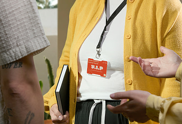
You probably don’t need us to tell you that overly posed images aren’t going to look great. For most clients, it’s best to avoid people looking directly at the camera or sporting a facial expression that has no relationship to what they’re doing – such as the infamous ‘women laughing alone with salad’.
Symbolic cliches, those images that have been staged to help illustrate an abstract concept, are best approached with caution too. For example, the crossroads sign to indicate making choices, the piggy bank as a shorthand for savings, or the businessperson with a megaphone to represent communication issues in the workplace.

5. Work those keywords
There’s a special art to finding the images you want from a large stock library. The search terms you use can really make the difference between hours of scouring and a quick decision-making process. Using a ‘long tailed’ search, with multiple keywords, will help you narrow down a search quickly. You can also choose to exclude certain keywords, which can be as important as what you leave in.
Finally, make full use of the stock image site’s filters when you start to search. On the larger sites these can be impressively detailed, covering everything from image orientation to aspect ratio, country of origin or number of people featured.
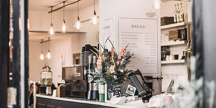
6. Use all your senses to find pictures that pop
Texture and sensory cues can be powerful in stock images, Whether you’re designing an event flyer, an email graphic, a webpage or a Business Card. A snuggly-looking blanket, a fresh vase of flowers or a luscious-looking dessert will generate positive associations. And on the flipside, photos taken in dated or cheap-looking interiors, or posed with unappealing props can make an image that’s otherwise right feel wrong to your client.
Quick trick: Always choose the highest resolution available within your budget. This will give you lots of options for zooming and cropping the image, and will make sure you avoid the dreaded pixelated look.
For more smart tips on photography, try our guide to taking great product photos.
Keep in touch
Get design inspiration, business tips and special offers straight to your inbox with our MOOsletter, out every two weeks.
Share the post
Keep in touch
Get design inspiration, business tips and special offers straight to your inbox with our MOOsletter, out every two weeks.