What fonts reveal about you: Type Tasting
MOO caught up with Sarah Hyndman of Type Tasting to uncover the astonishing power of typography — and to find out how it can express the personality behind your brand.
-
 The MOO Team
Share the post

Hidden in plain sight, typography is all around us — and for brands, using the right font is a crucial way of communicating.
Typefaces are big part of our everyday life — but more often than not, they linger on the periphery, influencing our choices without demanding our attention.
And according to Sarah Hyndman, founder of type studio Type Tasting, it’s this subtlety which makes typography such a potent way of communicating. MOO caught up with her to uncover the astonishing power of typography — and to find out how it can express the personality behind your brand.
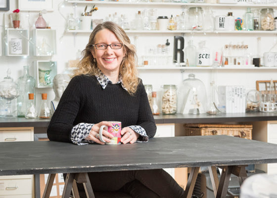
Passing on a passion
As a child, Sarah was struck by, and grew to love, the colourful typography on her favorite candy packages. But despite her appreciation blossoming at such a young age, after 10 years running her own graphic design business, Sarah found herself falling out of love with typography.
“I got to a point where I was working really long hours, and a lot of that time I wasn’t doing the design work — I was just managing the accounts,” she says. “So I took a step back to do something that would help me fall back in love with design.
“I wanted to bring back the excitement and joy of my childhood, and introduce my love of typography to an audience beyond the design studio. Type isn’t all high-brow — it’s also enveloped in pop culture experiences.” And so, five years ago, Sarah launched Type Tasting.
With a laser-focus on typography, Type Tasting offers events, talks and workshops designed to teach designers and the design-curious alike about the psychology of type — like wine tasting, but for type, Sarah explains.
She’s also published a book, Why Fonts Matter, which looks at how fonts influence us and the subtle power they wield. They can even, Sarah says, alter the taste of our food.
“If a menu or recipe is written in a Serif typeface, the chef is perceived as more skilful, and the recipe is assumed to taste better,” Sarah says. “The point of Type Tasting is to look at type in this way, from the consumer’s point of view.”

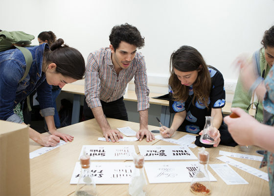
Uncovering a hidden world
Type Tasting’s hands-on, experiential events are designed to make the fascinating facets of a world Sarah describes as being “hidden in plain sight” accessible to all.
Events on offer include Type Safari, in which attendees are taken through the history of type to show why different typefaces are relevant.
Type & Perception includes ‘typography karaoke’, which demonstrates “how type can be your voice,” while Font Fortunes reveals what your preferred typefaces say about your personality.
The response to these events has been hugely positive. “People are surprised by the sessions, and there’s lots of laughter,” Sarah says. “People who didn’t think they knew anything about type discover they’re already experts at reading these visual codes.”

The subtle voice of type
Sarah understands better than most the effect typography can have on our perceptions, and why that makes it a powerful brand-building tool.
“Type is our voice, so the typeface you use very much reflects your personality,” she explains. “It works as a first impression, in a very similar way to our clothes. For example, if I set something in a serif typeface, it’s the equivalent of me wearing my glasses — it’s been shown that people interpret words in serif as well researched and more intellectual.”

Every detail of Type Tasting, down to Sarah’s Business Cards, are informed by her passion for typography, as well as for design.
“I chose Luxe for my Business Cards, partly because of the strip of colour around the seam, but also because they’re heavy,” she says. “The heavier the object, the more gravitas it has, and the more important it feels when you hold it.
“My Business Cards also have a game built into them that explains what I do — effectively my elevator pitch — so they become a talking point. Somebody recently said that a Business Card designer is actually creating ‘really cool first impressions,’ so that’s what I strived to do.”

Typography that tells a story
So, what advice would Sarah offer to a small business or brand looking to revamp their identity?
“Think about your brand and the story you want to tell about it to connect with your customers in an authentic and meaningful way,” Sarah advises. “Your branding should reflect your personality or attitude — serious and well informed, open and modern, or relaxed and casual.
“It could evoke a story — for example, the Cooper Black font says ‘70s nostalgia and sunshine’, while Benguiat says ‘80s authentic’ (think Stranger Things). Or you can use it to communicate with a particular tribe, using typefaces and tone of voice to connect with your target audience.”
Sarah offers Coca Cola and Pepsi as strong examples of typefaces embodying a brand’s values.
“Coke’s casual script reflects its 50s heritage. It’s an everyman drink, evoking baseball and Americana. Meanwhile, Pepsi’s logo reflects that fashion of each era, and is more about pop culture and change.”
Ultimately, if Type Tasting can give people an insight into and appreciation for the art and psychology of typography, Sarah considers her job done.
“Typography is one of the most important ways to make a first impression and to communicate your story,” Sarah says. “Isolate just the type styles of a brand, and they communicate a huge amount.
“It’s not about the kerning — it’s about the impression it makes on our subconscious.”
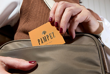
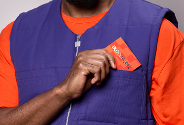
Put your brand on Business Cards.
Keep in touch
Get design inspiration, business tips and special offers straight to your inbox with our MOOsletter, out every two weeks.
Share the post
Keep in touch
Get design inspiration, business tips and special offers straight to your inbox with our MOOsletter, out every two weeks.