These gradient designs blend in to stand out
Get inspired with some of our community’s most creative gradient designs to elevate your brand.
-
 The MOO Team
Share the post
A delightful throwback to the 90s, gradients are making a comeback. From energising candy hues to soothing pastels, colours are blending to give depth and personality to modern design. Playing with negative space and contrasts, colour transitions can create subtle evocations – whether it’s sweet treats, divination or the changing skies.
There are infinite ways to use gradients in graphic design. Here’s just some of our community’s most creative gradient designs.
Annie Lefforge: blossoming talent
Impatient to start her career, Annie Lefforge didn’t wait to finish her studies to develop her own brand. A full-time student in North Carolina, she moonlights as a freelance graphic designer, with a professional branding that reflects her fresh take on design. She chose a modern gradient design to convey her light-hearted approach in an engaging way. “Gradients are fun, funky, and very on-trend – I love how they’re not too serious and instantly make a brand more playful and dynamic.”

From her portfolio website to her Business Cards, Annie adapted her new visual identity to a variety of mediums. She chose Cotton Business Cards for their simplicity and elegance. Their matte, naturally textured finish perfectly makes the gradient colours stand out on the front, with a delicate serif type. On the back, she used a floral detail as a subtle reminder of the fresh gradient. “I love the flower detail on the top left of the backside of my card. It’s so simple and cute! Plus, it ties the back and front of the cards together so seamlessly.”

Old Flame: lake meets sky
Based in the heart of London, Old Flame is a branding and graphic design studio, partnering with passionate brands and people to help them find their identity – or simply revive the old one. For them, gradients in graphic design are a great way to add character and tell an enticing brand narrative. “We love using gradients in our work because they are so versatile and do a much better job at conveying emotions and movement than flat colours.”

For their client The House Group, a German real estate company in Lake Garda, Old Flame created Business Cards with a subtle gradient design to reflect the brand’s minimalistic visual identity while evoking the dream destination. “We paired the white outline of Lake Garda with a beautiful light blue gradient, which recalls the changing colours of the lake and the Italian sky.” They used Luxe Business Cards for a textured, premium feel to reflect The House Group’s premium services in a multisensory way. “We picked the Luxe Business Cards because of their striking quality: the heavy and beautifully textured paper feels luxurious and stands out from the usual business cards. As soon as you pick one up, you feel like you’re holding something special in your hands.”
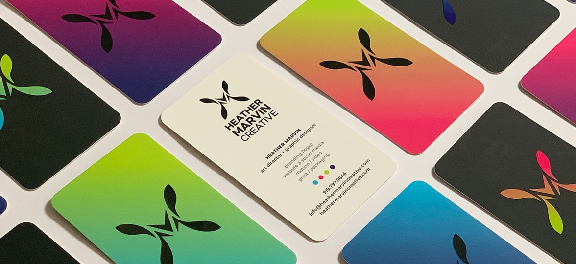
Heather Marvin Creative: transition and transform
Founder of the eponymous studio Heather Marvin Creative, Heather Marvin specialises in art direction and graphic design. From logos and websites to social media, motion, and print, the North Carolina-based designer has a knack for branding that packs a punch. To her, first impressions are key to building trust and confidence in a brand. That’s why creating Business Cards with a powerful design is essential to grow your business. “I [want] to intrigue the person from the very start, and go beyond simply providing contact information.”

For her own Business Cards, Heather left nothing to chance, and the cards convey her brand identity down to the last detail, from the gradients to the logo. “I carefully chose elements and finishes that would reflect me as a designer and how the client’s experience with me will be.” Starting with our strong and durable Super Business Cards: “I chose [this paper] to communicate the reliability and good quality a client will receive in working with me.” Reflecting her multifaceted business with a tactile Raised Spot Gloss finish, she appeals to her potential clients’ every sense. “I often see a person rub their thumb and fingers across one of my Business Cards when they first hold it in their hand. The touch of the finishes are grounding and create an imprint in their mind, so I become memorable.”
My using gradients as a key part of my design also communicates my ability to “transition and transform” over time
When it comes to gradients, the graphic designer wanted to demonstrate creativity, playfulness and wit, while conveying a sense of stability and professionalism. “I feel like the clean and minimal layout emphasising my logo, with the spread of bold colour gradients, represent those aspects well. The variety in colours convey that I am multifaceted as a graphic designer, and can be creative and bold in thinking outside of the box, yet professional and reliable at the same time. The look of the card also demonstrates that my design style is relevant and moves with design trends, all the while being unique.” Heather likes the idea of fluidity that comes with gradients. “A characteristic of gradients is that they transition from one colour to another. So my using gradients as a key part of my design also communicates my ability to “transition and transform” over time. I also specifically chose colours that were bold individually, yet transition smoothly with each other, creating a cohesive blend.”

She took advantage of Printfinity to create different colour journeys for each of her cards. “I printed 8 different colour gradient variations. I wanted to present my card as a collection, that would give the person the opportunity to select what colour gradient appeals to them. What they select gives me an idea of who they are and what they gravitate toward from the very beginning. The intent is to have the prospective client feel involved in the start of their creative experience with me.”
Hana imagines: versatility in colours
British creative designer Hannah Bona is the mind behind creative studio Hana Imagines. Starting with digital oil-inspired paintings, she took advantage of her experience at a multidisciplinary agency to take the leap and venture out on her own as a creative designer, expanding her business into brand identity, illustration, animation, website design and more.

Hannah used a modern gradient design based on her brand palette to convey her versatility as a graphic designer. “I wanted colours that were subtle but strong when used together, which I felt was best executed when combined as a gradient. I loved the fluidity that [it] provides and how it represents me as a designer. I don’t fit in one box of design or style, I love changing myself and exploring new ideas and concepts to help my clients. To me, this is what design is all about.” She chose Luxe paper to reflect the look and feel of her business and make her gradient Business Cards pop with a bold colour seam. “I love the simplicity of the layout and how it is heightened with the use of the gradient which takes it onto the next level, which was brought together with the quality of the print and card I received.”

Created by CC: cosmic hues
Based in Cornwall, CC is a graphic designer who thrives on helping local communities and businesses grow by bringing their vision to life. A student at Falmouth University, her interest in political and social movements influences her work, where references to current events are sometimes apparent. When revisiting her own branding, CC approached the design concept in the same way she does with her clients – by looking at her personality and values, and how to translate them into a visual experience.

Passionate about the world of divination, she decided to use this interest as a starting point with a series of four Business Cards inspired by the four main suits of a traditional tarot deck – swords, coins, wands and cups. “My colour palette was [also] heavily inspired by spirituality and my personal interests. Blue, purple and pink hues often imply some sort of cosmic, spiritual awakening and it was really fun to play around with these colours to create a gradient design that linked well with my tarot Business Cards. The colours also play into my identity as a young bisexual woman, incorporating the colours of the bisexual flag.” This playful gradient ties together the different facets of CC to open a window on her personality. “My branding is all about celebrating who I am and showing my clients that I will celebrate their brands and personalities first and foremost.”

For her gradient Business Cards, CC chose rounded corners and a Silver Foil to make her design stand out with a little extra shine that reminds of her keen interest for divination. “I love that the paper stock of these cards gives off that professional and sophisticated energy, which works well with my playful foil finish. […] I never expected any printing to come out so vibrantly, and the overall look of my final cards is just so juicy! I really love that I have managed to incorporate so many parts of my identity through the colour scheme and particularly like that some of these are not so obvious to people who may not know me so well.”
Cake NV: a piece of cake
A full-time mother, wife and HVAC employee by day, Natasha Vasquez is also the owner and pastry chef of Cake NV. A lover of all things sweet, Natasha indulges her passion by baking for all celebrations big and small from her kitchen in North Brunswick, New Jersey. When she decided to refresh her branding to better reflect her vision for the company, the multitasking expert was ready to design her own business cards.

Stumbling upon our Initially gradient Business Card template, she realised she needed to look no further. “I fell in love with the Square Business Card and gradient design. I was inspired by the blending of colours. Because I was in a season of growth and transition, this design spoke to me. [With] the colours used in the template, I immediately thought of happiness, celebration, and fun.” Making the design her own with rounded corners and her business information, conveying her brand identity was a piece of cake for Natasha (pun intended). “My favourite thing about my cards is the whole look. They are sophisticated and elegant! I LOVE how they turned out and I can’t stop looking at them. I receive so many compliments…”
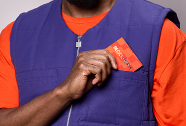
Bloc Print: a multisensory experience
Chelsea Smith is nothing if not a multi-hatted creative. A junior graphic designer at MOO (it’s us!), she works in the London Design Services team to create custom print material and stationery for brands big and small – always going above and beyond to inspire and meet our customer’s needs. In her spare time, Chelsea runs her Etsy shop Le Petit Pin and works as a freelance graphic designer specialising in print and branding at Bloc Print.

For piercing and jewellery brand Twilight London, she created a full branding and packaging suite including beautiful Thank You Cards. She picked our sturdy Super paper with a Raised Spot Gloss finish to create a luxurious and tactile experience for customers and went for our Small Postcard size. “[It] was the perfect size to fit inside the preexisting mailing boxes. For the other products designed in the print suite, I made sure to choose lots of different sizes to create a nice visual composition through layering when the package was opened.” Chelsea created a subtle gradient design to highlight the spot UV finish and give a soft, creative twist to the typography. “For the design, I wanted to enhance the Raised Spot Gloss finish with a ‘shine’ ink gradient underneath. I chose to use a really simple and bold typeface and a subtle graphic arrangement so that the focus was mainly on the finish.”
Tiny Brushes: wavy shades
Meagan Knight is a graphic designer and nail artist from Los Angeles. From Pinterest to product packaging and the kid’s clothing section at Target, she draws inspiration from the world around her to create colourful, joyful designs that really pop. For her own Business Cards, Meagan wanted a design that would reflect her colourful personality in a timeless way. Starting with her hand-lettered logo, she used Silver Foil to make the wavy type stand out in style. “I needed that Silver Foil shine to really seal the deal with the design I had in mind. Actually, the foil is the cherry on top. The heavier stock and soft matte were more of a priority.”

The choice of a gradient background was the result of a careful creative process. “I thought of making fun or abstract patterns. I messed around and nothing really stuck. Ultimately I realised that I didn’t want to restrict myself to a pattern. So when I was done fussing around with that idea, I accepted that there was no way I was going to pick less than 12 colours for this card. So I just did all of them. Rainbow everything!”
Her favourite thing about her cards? “The last time I felt a real thrill was when I opened up my box of MOO Business Cards (mostly kidding, I think?). I really love the way they feel ( Soft Touch is the way to go. I’m telling you) and how beautifully sharp the printing is, especially with the Silver Foil. I also thought my rainbow gradient turned out perfectly. It’s a solid card.” A high-quality card for a high-quality girl.
Add gradients to your logos, backgrounds and illustrations to give depth and personality to your designs. Let your creative juices flow with custom Business Cards and Postcards.
Keep in touch
Get design inspiration, business tips and special offers straight to your inbox with our MOOsletter, out every two weeks.
Share the post
Keep in touch
Get design inspiration, business tips and special offers straight to your inbox with our MOOsletter, out every two weeks.