The psychology of branding: what it says about your business
Find out how your branding choices reflect your business personality.
-
 The MOO Team
Share the post
Branding and psychology go hand in hand. The choices you make about style, tone, look and feel are the blueprint of your brand. Here’s how they reflect your business personality.
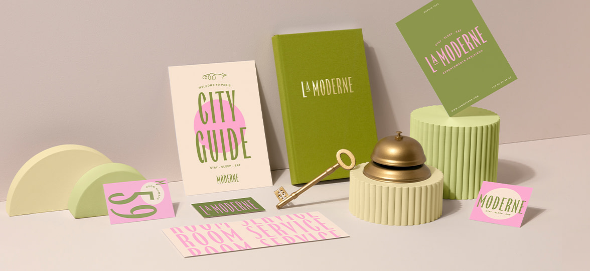
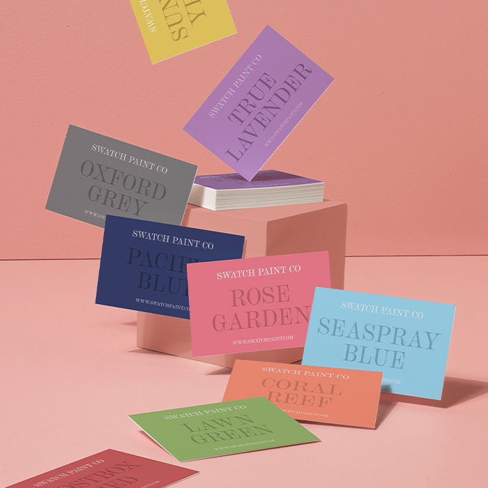
Branding colours
When considering your business branding, colours are often the first thing that springs to mind. There are some established associations between colour and mood. Everyone’s associations are slightly different though, depending on their life experiences – so these are trends, not rules.
- Red is bold, exciting and energetic
- Purple is creative and calm
- Green is peaceful and natural
- Yellow is optimistic and positive
- Orange is fun and confident
- Blue is trustworthy and strong
Beyond this, your colour choices mean something in your particular industry. Blue, for example, might be standard for a bank but a distinctive choice for a bookshop. What’s typical for businesses in the same niche as yours? Whether you tap into the established norms or break the mold with a new approach, your brand’s colours will say something about who you are as a company.
“We want everything our customers touch, feel and see to feel like ‘Mustard’. For us that is the ‘secret sauce’ (see what I did there!) to building a strong and memorable brand identity and experience.”
Mustard
Branding fonts
We love fonts and we can pretty much talk forever on how to use them in your branding. Because fonts have such a rich cultural history, lettering style can have a huge impact on how you’re perceived. Here are a few font branding considerations:
Serif or sans serif?
Serif fonts are classic and elegant, and carry a sense of tradition and authority. Sans serif fonts are more modern, minimal and a little bit cool. Think Times New Roman vs Helvetica. One to think about if you’re mulling over some Business Cards.
“Playing with a mix of modern serif and sans serif fonts on a warm brown background, the cards reflect flawlessly the mission of the salon.”
Myon Dwong – Brows First
Multiple fonts or one?
Using several fonts at once adds energy and could even make things look a little busy, indicating a brand that’s full of ideas and always has something new happening – which would be ideal on a Flyer or Postcard. Sticking to a single font means you’ll come across as calm, purposeful and deliberate, with a no-fuss approach to getting things done. Probably more suitable for a branded Notebook.
Script and decorative fonts
If you choose decorative or script-style fonts, you can create a trendy throwback aesthetic or a timeless, classic feeling. And depending on your font choice, a handwriting-like style can also create a more personal, casual feel. Fun fact: you can use any font you like on our customisable Water Bottles.

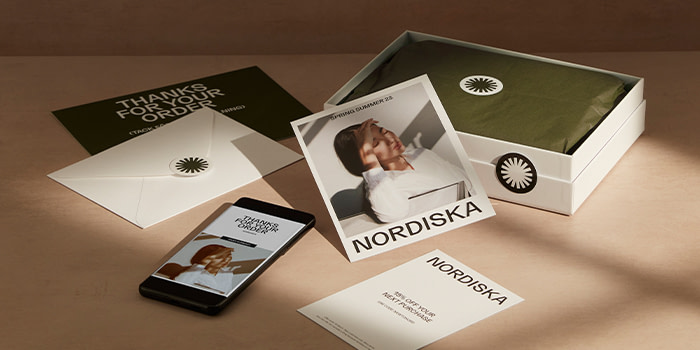
Branding illustration styles
Few aspects of design are as expressive as illustration, and every artist has their own take on crafting editorial or creative imagery. That said, there are a few trends that most brands fall into. If you’re using digital illustration, there are two primary branding styles:
- Curvy, stylized digital vector brand illustrations are modern, fun and clean-looking. They often go hand in hand with tech and innovation, and are a staple among start-ups. Flat colours and clean lines are hallmarks of this style, which is often used in infographics. Vector illustrations can be easily edited in Adobe Illustrator CC, for print, web, and mobile-friendly designs.
- The hand-drawn digital illustration style, on the other hand, uses line, hatching and shading to emphasize a human element in your business and suggest creativity and artisan skills.
Of course, any kind of art can be part of your brand, from collages to watercolour, but generally, choosing analog formats rather than digital will give your brand more of an old-school, handmade identity.
Brand tone of voice
Tone of voice isn’t just about what you choose to say – the way you say it also plays a big part.
- Does your brand use contractions (isn’t, we’ll)? Do you talk about yourselves in the first rather than the third person? (“We started out…” vs “Acme Company was founded…”) If so, you have a more informal tone of voice. This is a friendly tone that makes you more approachable to new customers.
- A popular tonal approach is to use lyrical and witty language, which can be tricky to pull off – one person’s playfulness is another person’s silly. But if you do this well, you’ll come across as clever, approachable and competent.
- Then there’s the minimal style. If you use short statements with few descriptive words and allow images or data to take center stage, your tone of voice suggests that you’re confident and quality-oriented – you let the products and services do the talking.
Whatever your approach, take note – if your brand tone originates with a single founder or staff member, it will only be with you as long as they are. Write down a few style rules to make sure it lives forever! Read more about capturing your brand’s spirit in our guide to building your brand culture and our step-by-step primer on building brand values. Plus, some tips on writing your tone of voice guidelines.
Consistency is key
A brand is like a sports team – every player counts, and they all need to work together. To make sure your “team” of brand elements is performing at its best, make sure they all show up when they’re needed, every time, every place.
So if your design is on point and your tone of voice is perfect, but your font choices are random and unplanned, it’s never going to be a winning combination. Likewise, if you’ve got beautifully branded merch but your website design isn’t recognisably similar, your brand personality won’t always shine through.
“We have a very intricate, detailed McBride family crest that appears on all our materials. MOO’s printing perfectly replicated the crest across all our brand collateral, ensuring the marketing materials stayed true to our brand standards.”
McBride Sisters
Now you know the basics of branding psychology, why not start designing beautiful Business Cards and Flyers to get the word out? Or you could go one step further with MOO Business Services, our print and design plans for companies of all shapes and sizes.
Here’s what you need to know. You’ll gain access to an exclusive range of branded stuff that you won’t find anywhere else. Like Business Cards with extra bells and whistles on them. Or special printing sizes. And you’ll enjoy design support from our friendly team, corporate pricing, and much more.
Sound like something your business might benefit from? Pop in a few details below and we’ll get back to you.
Keep in touch
Get design inspiration, business tips and special offers straight to your inbox with our MOOsletter, out every two weeks.
Share the post
Keep in touch
Get design inspiration, business tips and special offers straight to your inbox with our MOOsletter, out every two weeks.


