Give power to your palettes with colourful branding inspiration
These designers ramped up the pigment on their print to create colourful branding.
-
 The MOO Team
Share the post

Nothing turns heads like a burst of vibrant colour or a beautifully harmonious palette. Meet three designers who pumped up the pigment on their print to create stand-out branding.
Dozy Rose
Founded by Roza Hamta during the third year of her Graphic and Media Design degree, Dozy Rose is a UK-based illustrative design company that spans a range of creative disciplines. From branding to animation, Roza melds her passion for illustration with traditional graphic design principles to create a bold, playfully millennial aesthetic that is popping with colour.
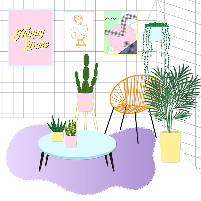
“I use colour to portray personality and drive the narrative within my work. Every illustration has a story behind it, and the colours I use are carefully considered,” says Roza. “My palette is part of my brand identity. It developed over time through a combination of gravitating towards colours I like to use and inspiration from creatives I follow on social media. I never thought I’d claim pink is my favourite colour, but gone are the days of Barbie and fuchsia—we’re now living in an age where millennial pink is everywhere, and I’m not complaining.”

When it came to designing her print materials, Roza chose Cotton Square Business Cards to perfectly match the square format of her illustrations. “The reaction to my cards on social media has been wonderful. They’ve often been described as ‘pocket size works of art’,” she says. “They’re one of my most shared pieces of work and have attracted a lot of new followers. I also love having the eco-conscious choice to use MOO’s Cotton Business Cards made from recycled t shirt off-cuts.”
Add texture to your colours with Cotton Business Cards.
Sareka Unique
From wall hangings to prints and stationery, surface designer and illustrator Sareka Unique brings a splash of pattern and colour to everything her art touches. With a background in graphic design, Sareka is building her freelance career while juggling her day job in trade compliance, picking up freelance work to help her transition to full-time designer.
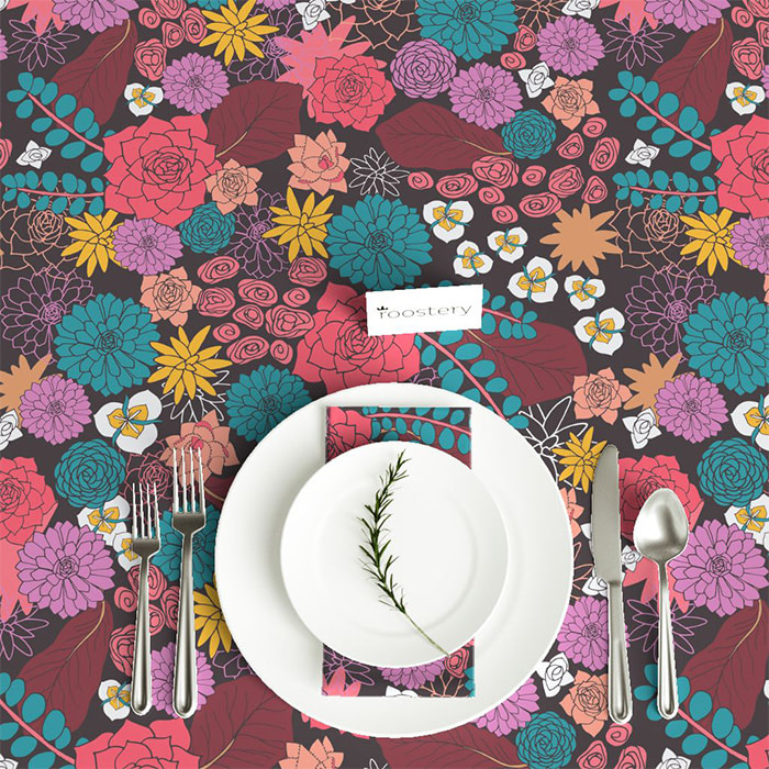
Drawn to vibrant colours, Sareka has infused her passion for loud palettes throughout her work. “Playing with colour is my favourite part of the creative process. It has the ability to invoke a range feelings and emotions. When you add colour to a design or an illustration you are automatically saying, ‘this is how I want people to feel when they see my work’. I want my artwork to lift people and make them feel love and happiness.”
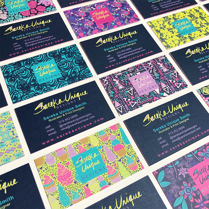
Sereka chose Luxe Business Cards made with Printfinity not only to display her extensive patterned portfolio, but to also demonstrate the care and attention she brings to her projects. “My Luxe Business Cards are my absolute favourite. I really love the premium quality and how the coloured seam pulls all the designs of my cards together. It shows I care about the small details – something I want all my potential clients to know when I hand out my card. Plus with Printfinity, it’s fun watching them pick their favourite design to take away.”
Create a premium pocket portfolio with Luxe Business Cards.
Pauline Ferrand
French graphic designer and illustrator, Pauline Ferrand approaches her design work experimentally, playing with brushes, storytelling, colour and paper, to produce work that focuses on themes of communication and culture. After completing design school, Pauline started an art course to help shape her drawing and conceptualisation skills. She now works as a full-time freelancer.
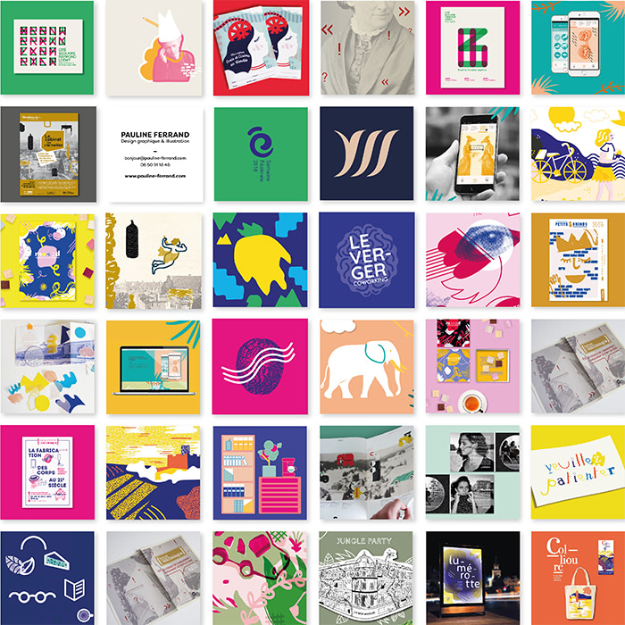
True to her experimental ethos, Pauline explores contrast through her choice of hues. “Colour is a big part of my work. I always try to create something dynamic by mixing together opposing tones. I want to make people curious when they see my work, and showcase my versatility through a range of formats and mediums – and colour!”
As many of her designs were created for the Instagram square format, Pauline chose to print her creations on Square Business Cards to mirror the images on her feed. “The shape is also really fun and eye catching – people have often said to me they’re like playing cards!”
Get your ‘gram grid in print with Square Business Cards.
Keep in touch
Get design inspiration, business tips and special offers straight to your inbox with our MOOsletter, out every two weeks.
Share the post
Keep in touch
Get design inspiration, business tips and special offers straight to your inbox with our MOOsletter, out every two weeks.


