5 fonts (that aren’t Helvetica) to help you tell your brand story
We’ve picked 5 typefaces to inspire and delight, from open source indies and lesser-known classics to brand new fonts on the block. Which one is your favorite?

Use this hand-picked list of fine fonts to spark your imagination, for design and illustration, or just to add some typographical loveliness to your day…
Akzidenz Grotesk
Despite the unflattering name (‘grotesque’ just means sans serif in font language), this is an elegant, clean and tidy font with an impressive reputation as the first-ever sans serif. It creates a mood of calm and clarity with just a hint of softness.
Aksidenz Grotesk comes in a myriad of weights and widths, thanks to its trail-blazing popularity – it was created in Berlin in 1896 and sparked a wave of sans serif styles that spread from Germany across the world. Today, it’s the official font of the American Red Cross, and has also popped up in the branding of various US sports teams like the Brooklyn Nets.
Basic Commercial
It’s been around since 1900, but this hero of a font still looks as fresh as a daisy. A true classic, it was created by Linotype, one of the leaders in early ‘hot type’ printing, and influenced by the fonts of that era. Since its turn-of-the-century days, it has gone from strength to strength, inspiring other sans serif fonts and appearing in iconic places. (The signage for the New York City subway system, to name one.) Versatile, flexible, timeless – what’s not to love?
Black Slabbath
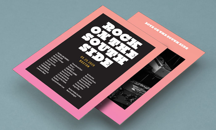
Who could resist a pun like that? Dubbed ‘the heaviest font in the world’, Black Slabbath belongs to the slab serif group of fonts, and is suited to gigantic, impact-making slogans and headlines. The white space in between the hulking letters is delicate by comparison, helping to balance out their impact. Not to be confused with the curlicued font used by the 1970s metal band, this one is much newer, designed in 2008.
Cormorant
Another open-source favorite, Cormorant is a Google Font that was created as a tribute to the classic Garamond, which dates back to the 16th century. It’s a serif style with a thick-and-thin feel that suggests delicate calligraphy, although it’s clean and uncluttered enough to work well in paragraph text as well as display headings.
With Cormorant, Garamond’s sophisticated yet homely feel was given a revamp, with greater contrast between the light and heavy. Crisper, sharper points and thinner lines have a pixel-perfect precision that wasn’t possible in the old days of analog metal typesetting.
Inkwell
A handwriting font that isn’t *that* handwriting font, Inkwell has many variants that range from glossy and professional to fun and a little bit goofy. Each of its incarnations offers the warmth and personality of handwriting, whether it’s dressed up formally to tell stories in text form, or twisted into runic shapes and doodle-like decoratives for headings and illustrations. Buying the whole 48-piece set of fonts doesn’t come cheap, but the vendor offers them sliced and diced in various smaller, more affordable packages depending on the style you’re after.
Keep in touch
Get design inspiration, business tips and special offers straight to your inbox with our MOOsletter, out every two weeks.
