Readying the MOO brand for a new era
Find out all about MOO’s fresh new look, and what 2024 has in store.
-
 The MOO Team
Share the post
If you’ve noticed anything different around here, then well spotted. Yes, we’ve recently updated our brand identity.
Some changes may seem subtle right now. Some more obvious. But, all together, they’re going to provide the foundations for a year of transformation that we’re excited to start revealing to you. From a new platform and fresh services, to a whole new selection of credible custom products and gifting options.
It’s the first time we’ve revisited our own brand in around eight years (in our defence, we’ve been concentrating on making sure your brand looks great). But a lot has changed since then, in design, in our business, in the world. So it’s about time.

We partnered with design agency Anagram to help shape our fresh new look. You’ll immediately start to see the results as we roll-out the newness across our social channels, in emails, on banners, and over time on packaging and here on moo.com. We’re evolving what we do, not just how we look.
Why now?
MOO started with a vision to disrupt the staid, dusty world of print. We made business cards…fun, irreverent, desirable even. Things that people, real actual people, choose to share. With bold colors, friendly rounded typography and a personality that was anything but a boring ‘business’ brand.
We loved it. You, our customers, seemed to love it. And some of our competitors definitely took notice. Over time, the bold, flat color backdrops, plinths and attitude that helped make our name seemed to be everywhere.
It was flattering, but it’s not very us to blend in with the competition.
New exciting things ahead
So, yes, our brand look and feel became less ownable. But our need for change is also more fundamental than that.

We started as a brand intent on disrupting the print industry. Now as we get ready to launch more custom products, we’re ready to tackle an even bigger foe: big merch. The branded merch industry currently creates mountains of giveaway, throwaway waste every year. It’s terrible for the environment, and damaging to the businesses that put their brand name on it.
We see a different way, one that focuses on making less but better.
This new brand identity allows us to focus on that goal with a clear, confident attitude and tone of voice that comes through in all we do.
What’s changed?
Our brand is inspired by all the businesses and people who use MOO today. We get you, because we are you. The work encompasses new design, color palette, tone of voice, illustrations, and photography. So let’s have a look at some of it…
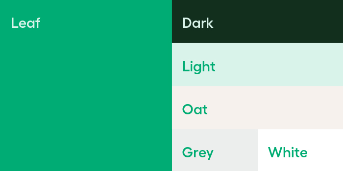
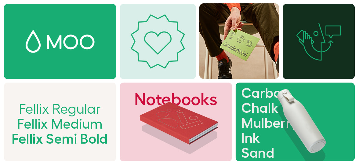
Back in green
In a corporate ocean of blue, green is still our thing. We’ve gone a little bolder, to stand out on even the smallest screens. But it’s not a change that’s likely to make you fall off your ergonomic office chair.
The importance for us here is to be more consistent in using our core brand color. Helping us stay instantly recognisable wherever you find us. There is also a supporting palette designed to work alongside this, which allows our brand colors to work in harmony with our photography and any new product colors.
Print, products and, now, people
Like many brands within our sector, we admit we’ve sometimes had our heads down, focused on our products. Both in our photography, and in our messaging.

But we’re nothing without the brilliant, talented, visionary business owners, brands, founders, marketing managers, HR departments, entrepreneurs, keyboard CEOs and everyone else who uses MOO everyday.
Photography with a renewed focus
So now we’re looking outwards, with photography that showcases the people who use MOO, and the reasons they use MOO. In a world that’s increasingly cold and clinical, showing our human side is more important than ever.
Our product photography has also been refined. With a new MOO pen, stationery and drinkware coming soon, you’re going to want to be able to see what they’re all about. Closer cropping, clean, clinical lines and less distractions help you to fully appreciate the designs – and just how great your brand will look on them.
A fresh typeface
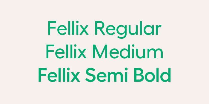
We’ve also introduced a new typeface. Fellix sits neatly with our MOO logo, thanks to the circular shapes that connect gracefully onto its vertical stems. It’s modern, versatile and has great legibility. We always have ‘great design for everyone’ in mind when making these decisions.
A whole lot more
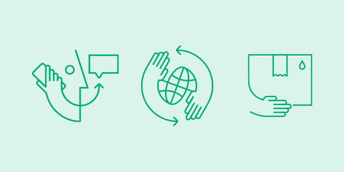
There’s also fresh new illustrations and icons, increased emphasis on our motion design and more. It’s been a lot of work, but it’s also a fantastic reminder of what you, our MOO customer, may well be going through in your own business.
So that’s a brief introduction to our new look. But really, it’s just the beginning. As we start to introduce a whole new range of quality products and tools, you’ll see this freshly updated identity in all its glory, doing what it does best – helping your brand to shine.
If you’ve got a brand you’re ready to show off, get in touch. Just fill out the form below, and we’ll get back to you to discuss how MOO Managed Services can support your business.
Keep in touch
Get design inspiration, business tips and special offers straight to your inbox with our MOOsletter, out every two weeks.
Share the post
Keep in touch
Get design inspiration, business tips and special offers straight to your inbox with our MOOsletter, out every two weeks.


