4 Luxe Business Card designs that made us go “oooh”
Get inspired with four creatives who made their business shine with premium Business Cards.
-
 The MOO Team
Share the post

Luxury is a state of mind. It’s about quality, elegance, and a little bit of boldness. That’s how we developed our 32pt Luxe Business Cards and their coloured seam – and how these brands made the most of them.
Get inspired with four creatives who made their business shine with extra-thick, extra-memorable Business Cards.
Melanie Martin: premium appeal
Based in Germany, Melanie Martin is a freelance multidisciplinary art director and graphic designer specialised in editorial, corporate design and print. She describes herself as a typography enthusiast and visual researcher – which shines through in her own business cards.
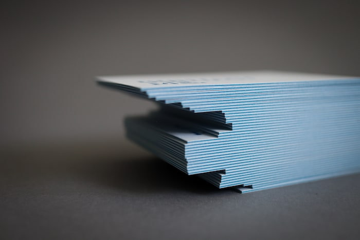
Melanie chose Luxe for its multisensory quality. “The eye-catching colour seams and the extra thick paper just appealed to me. The Luxe Business Card not only has a great haptic but is also an absolute eye-catcher.” Choosing a blue seam, she matched it to her design, with blue lettering on one side and a blue background on the other.
As a designer and art director, she knew the impact of cleverly used negative space. “Since my logo is only a lettering, I wanted to place my contact details on one side in a reduced form and address the recipient of the business card directly on the other side.”
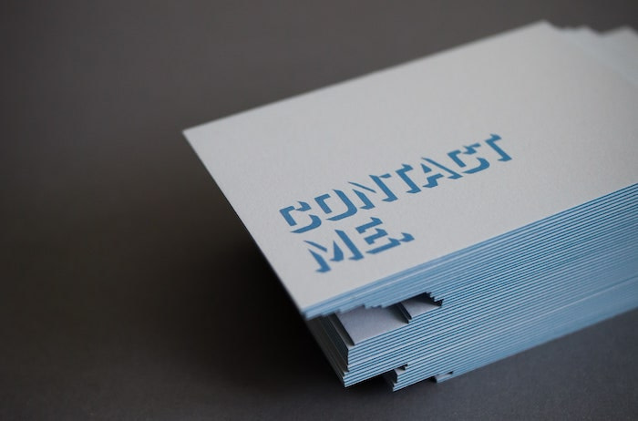
She created three variants for the back, all in one batch thanks to Printfinity. A simple reminder spelt out in big letters, “Oh, hello”, “Nice to meet you”, or “Contact me” invites the recipient to take the next step using a simple yet bold geometric font. Her favourite part? “I like the colour seam and the thickness best, because the overall picture is simply extraordinary and will be remembered.”

Ten Partridge Road: flying high
Sue Krevlin is a jewellery designer and maker based in Westchester, New York. A graphic designer by trade, she moved to jewellery in search of a craft that would require more tactile work, indulging her sense of touch. With Ten Partridge Road, she makes what she calls “wearable graphic design”, using semi-precious and precious stones to create the perfect balance of colour, shape, space, and scale.
For her business cards, Sue wanted to convey the story behind her brand. “My studio name comes from the place where I grew up, 10 Partridge Road. It’s where my creativity was fostered and where I was given the space to play with making things. I loved the idea of using an illustration of a partridge, both to represent that home, and because my mom is a fan of birds.”

Drawn to yellow for its cheerful quality, Sue matched her design with the Luxe Business Cards’ seam. She used the Winslow Book font by Kimmy Design for its subtle details. “[It has] the perfect lower case “g”. It has a little plume that I thought was birdlike, and even though partridges generally don’t have head feathers, I loved that detail.”

The result is a memorable design, making a great use of space to make the brand stand out. “I knew I wanted to try the Luxe for my own business because of the weight, the texture, and the ability to add colour to the edges. […] My favourite thing about my cards is that they feel substantial, and at the same time, not too “precious”. The material makes them more memorable.”
Boushi Boots: the right feeling
An Australian based in Tokyo, Sinead is the founder of handmade hat brand Boushi Boots. Her colourful, 100% cotton hats are designed and printed in Japan, reversible, and made to order. In other words, they tick all the boxes.
Sinead knew how important good business cards would be to grow her business in Japan (you can learn more about the etiquette here). “Business cards are a big deal in Japan. The exchange of them between two parties is almost ritualistic. I wanted a business card that was weighted, soft to the touch and had flair.” With a focus on sustainability, she also wanted to find a supplier that aligned with her brand values. She found out how Mohawk and MOO developed Luxe in a respectful way to the environment, from sourcing to production.

When it comes to design, Sinead let the premium paper stock speak for itself with a minimalist yet bold design, matching the colour seam to Boushi Boots’ pink logo. “I wanted a simple yet artistic business card that reflected my love for colour and design. I kind of let the card paper handle that with its bright pink seam colour. The rest of the design was kept really bare with only the logo and necessary information to be printed on either side.”

Her favourite part? “How they feel in my hands. The natural texture and double thickness speaks quality to me – even without looking at them. And then when you do, POW you’re delighted with the colourful seam. They make anyone who holds them smile.”
Commoner design co: style and substance
Based in Atlanta, interior designer Emma Flynn taps into her experience in architecture, hospitality, and commercial design to create beautiful, functional spaces. With her studio Commoner design co. she bridges the gap between luxury design and interior decor, combining premium expertise with a warm, friendly service.
For the brand’s business cards, she used Luxe paper with a bold square format to double her impact. “I decided on the Luxe Business Cards because they offered a more substantial feel, a unique square format and something more than just your typical flimsy card that often gets tossed or lost in a sea of sameness.”

Emma worked with Vania Lin to design her official brand mark. “When deciding on and designing a brand mark we decided on a square as the most basic building block of any foundation. Using it as a symbol of accessibility, openness, plus the stability that comes with putting down roots. Everything the commoner brand encompasses.”

Using Printfinity to showcase her brand palette on the cards, she chose the white seam colour for an elegant look. The result is a unique design that conveys her brand identity in a powerful way. “I love that they stand out! Everyone is surprised by the shape and the substantial weight of the cards. It is something not everyone is used to seeing. I love breaking the mould of what is perceived as the norm – why not let that translate into my business cards too?”
Tell your story and leave your mark with Luxe Business Cards.
Keep in touch
Get design inspiration, business tips and special offers straight to your inbox with our MOOsletter, out every two weeks.
Share the post
Keep in touch
Get design inspiration, business tips and special offers straight to your inbox with our MOOsletter, out every two weeks.


